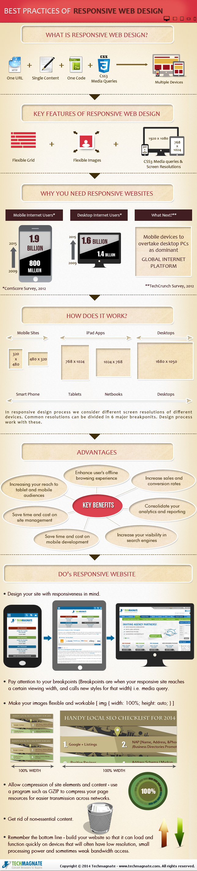
Responsive design is the popular title for a website designed to respond or adapt to users across multiple platforms. The idea is to make a responsively designed website equally as functional on your smartphone as it is on your desktop.
Of course, one way to make a website function properly on smartphones and desktops is to create a unique version of your site for each platform. What makes responsive design so special is its ability to take one site and make it work across devices, without the alternate versions.
With current estimates suggesting traffic from mobile devices may tie the numbers for desktop traffic, it is no mystery why it would be important for your brand to ensure your website is accessible and functional for everyone attempting to view it. Responsive design seems like the natural fit to solve this problem, and in many cases it is. But there are some drawbacks and problems you may need to be aware of before you start thinking responsive design is any kind of magic solution.
Tech Magnate created an infographic to explore the advantages and disadvantages of responsive design, as well as a guide for the common best practices used in the industry. If your business is online, but doesn’t have a site designed for a mobile experience, the infographic you see below can help you decipher whether responsive design is right for you.
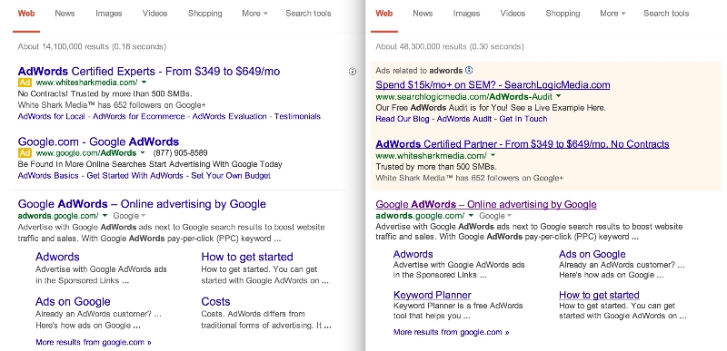
By now you’ve probably noticed your search results don’t look like they used to. Google told the public their new look was just an experiment earlier this week, but now everyone is getting to see Google’s search results pages with the new design.
Jon Wiley, Google’s lead designer for Google Search basically made the announcement the new style was rolling outto desktop when he said on Google+. “you may have noticed that Google Search on desktop looks a little different today.” He specifies desktop users because the style was showing up much more prominently on mobile before the full roll-out.
As many have noted, the new SERPs have much larger titles and the underlines have been removed. Jon also notes that Google “evened out all the line heights,” which he claims “improves readibility and creates an overall cleaner look.”
Most of those changes won’t have a huge impact on the usability of the search engine, but visitors will have to become accustomed to a different way of marking ads. Google has used smaller yellow tags to pinpoint which results were part of ads on mobile, but desktop users have still been relying on the lightly colored boxes Google has relied on for years to mark ads. Google says the change is intended to unify the mobile and desktop search experience. Jon explained:
Improving consistency in design across platforms makes it easier for people to use Google Search across devices and it makes it easier for us to develop and ship improvements across the board.
There are bound to be plenty of complaints about the redesign. I personally don’t enjoy it as much as the old style, but most will acclimate to it fairly quickly. But, it isn’t a high-profile site redesign unless people initially throw a small tantrum in the meantime.
00Taylor Ballhttps://www.tulsamarketingonline.com/wp-content/uploads/2018/07/TMO-Logo.pngTaylor Ball2014-03-14 13:37:292014-03-14 13:37:29Google Rolls Out New Search Results Design for Everyone
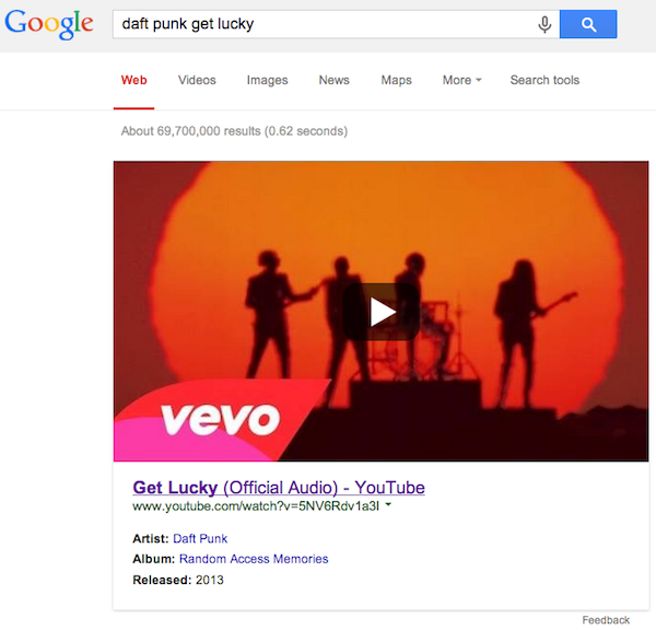
Looking for your favorite music video? Since MTV hasn’t shown music videos for the past 20 years, you will probably turn to Google. Now, Google is making it easier to find the videos your searching for by giving more prominence to the top playable music video result. So, if you’re searching for “Get Lucky” by Daft Punk, it will be hard to miss the official version of the video at the top of the page.
The thumbnail images for the videos look like they would be playable on the page, but in actuality they link back to the page for the video. It’s possible they play icon on the image might hint towards future usability for YouTube videos, or it might just be a little misleading.
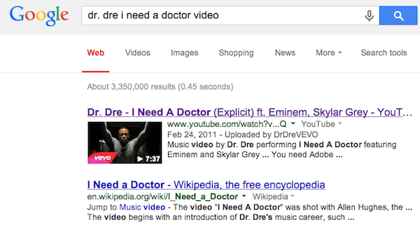
Of course, the tool isn’t perfect, and you shouldn’t expect to get the “official” video or a video from the artist’s official account every time. For example, Search Engine Watch highlights a case where searching for “Let Me Ride” by Dr. Dre doesn’t pull up a video from the DrDreVEVO account, because that video hasn’t been uploaded to the official account.
Similarly, searching for “I Need a Doctor” by Dr. Dre doesn’t trigger the new large YouTube thumbnails, even though there is an official video uploaded to the account.
“This was already available in September 2013 when you searched for an artist and then clicked on a song – you’d see a preview of the music video if it was available to display,” said a Google spokesperson. “Yesterday we made it easier to get to – you can now just search for a song directly and see the video screenshot right away.”
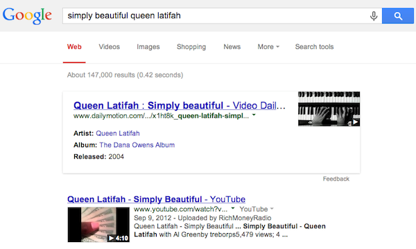
It is notable that the huge thumbnail appears to be exclusive to YouTube. When Google pulls from other sources like Dailymotion, it shows the smaller thumbnail and link layout. For example, the video for “Simply Beautiful” by Queen Latifah looks like this:
00Taylor Ballhttps://www.tulsamarketingonline.com/wp-content/uploads/2018/07/TMO-Logo.pngTaylor Ball2014-02-10 10:48:562014-02-10 10:48:56Google Gives Music Videos More Prominence On the Results Page
Keeping your website design fresh and modern is an important part of your brand, but it is also essential for SEO success. Search engines tend to favor sites which are regularly refining their site to offer new features and better user experience, as Matt Cutts recently confirmed in one of his Webmaster Chat videos.
But, there is a lot to consider before redesigning or modifying your website. A good website should be able to feel modern for at least a couple of years before needing another serious overhaul, and you are investing considerable resources into having the site designed in a way that communicates your brand well while keeping up with modern design styles.
There are also several factors behind the scenes you need to consider. Great usability and style are important, but several modern design practices seemingly go against some of the biggest search engines suggested practices. If you aren’t careful, you may do some damage to your SEO while trying to improve your site.
Kannav Chaudhary recently broke down how some of the most popular web design practices of the moment can affect your SEO. Usability and keeping your brand modern are important, but finding the right style for your brand also means choosing the paradigm which won’t hurt your other efforts.
Parallax Design
Parallax design recently became popular with web designers for it’s unique way of restructuring a site in a visually exciting way. You build your entire website onto one page, but with responsive scrolling which delivers the content in impressive style. Sites with parallax design are incredibly easy for most users to navigate, as they simply have to scroll through the page, but it raises some issues with optimization.
Simply put, most modern SEO practices rely on creating a lot of content over numerous pages so increase the impact of keywords. You show off your skill and reputation through your content, while showing search engines you are relevant for these keywords. When all of your content is on one page, it can dilute the impact of those keywords, and Google can be unsure about how to view your site.
The key is really understanding when to use parallax design. It is great for product or contest pages, because there isn’t much content on those types of sites in the first place. Parallax design can showcase a product and rank for a few key phrases, but it will struggle with presenting a full website to the search engines.
Infinite Scrolling
If you are pumping out a lot of content on a regular basis, but want it to be easily available from a single page, infinite scrolling can be the perfect solution Social Media sites like Facebook and Twitter popularized the design practice, but it can be found all over the web these days, especially on blogs.
If you use the wrong method of implementation for infinite scrolling, you may run into some SEO issues, but the current practices avoid the lion’s share of drawbacks. Most web designers use frameworks such as Backbone or Bootstrap with crawlable AJAX so you can present your information on one page, while avoiding the problems of parallax design. Best of all, it loads quickly, so everyone will be happy.
Fixed Width Navigation
Navigation will always be an important part of web design, and lately many designers have been using fixed width navigation to keep their menus in place while users move down the page. This way, you can always jump to another part of the site you want to find, even when you’re at the bottom of an article.
Thankfully, this design practice has very little effect on SEO. Your content will still be spread over plenty of pages, but you’ll want to make sure your navigation widget is indexable so that Google can also explore your site.
Conclusion
At the end of the day, you’ll always want to fully understand the new design trends before implementing them for your brand. Most of the time their SEO drawbacks can be mitigated with careful practice, but occasionally you will find one that just isn’t right for your site. As long as you keep user experience as the highest priority, you’ll be able to manage any of the SEO problems that pop up along the way.
00Taylor Ballhttps://www.tulsamarketingonline.com/wp-content/uploads/2018/07/TMO-Logo.pngTaylor Ball2014-01-28 14:12:282014-01-28 14:12:28How Does Modern Web Design Affect SEO?
As a business trying to keep up with the constantly changing internet, it can be hard to decide which trends to follow and what works best for your business. It is important to have a modern and up-to-date website, but if you chase every trend you’ll often end up falling behind and adopting practices that don’t suit your own business.
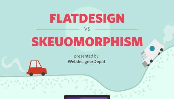
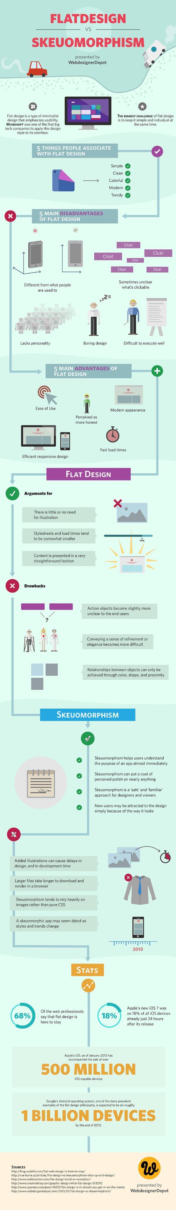
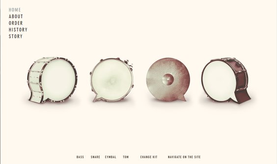
The biggest decision many web designers and business owners have had to make in recent history is whether or not they should adopt the flat design craze that has swept the web over the past year, or whether they should be using more traditional skeuomorphic design practices for their brand. As the flat design style has become a staple of many big businesses, many brands are also forced whether they run the risk of becoming cliche by picking up flat design or if they will fall behind the times with the older style.
If you aren’t familiar with the whole flat design vs. skeuomorphism debate, there has been a major shift in popular web design trends that really gained steam in 2013. Chances are, your web design has relied on skeuomorphic design principles at some point, even if you’ve never heard the word.
Skeuomorphic designs rely on recreating objects and visual styles from the three-dimensional world in order to make web design more easily relatable to users. By using stylistic cues and layouts from things such as calenders or notepads, users are immediately able to feel familiar with a website or application.
However, as computers, tablets, and smartphones have made technology a constant part of day-to-day life, flat design proponents have pushed for designs that are created “for the screen.” As a guiding principle that is understandable, but flat design activists have translated that mantra into strict stylistic principles as grounded in minimalism as they are web design.
Flat designs use simple elements and a strict two-dimensional approach that eschews all added effects such as drop shadows, bevels, and embossing. Flat design has also been heavily associated with the flourishing popularity of more complex typography.
The loudest voices for flat design have made it sound as if the new design style is a revolution in how we design, and on some levels it is. The basic guiding principles of “designing for the screen” can open up many new ways of thinking about web design which are fertile for innovation. As a style based on minimalism and strict stylistic rules however, flat design is a trend with more lasting power than some of the more fleeting crazes.
It is more important as a business owner to decide what design styles benefit your brand the most, rather than which trends are the most popular at the moment. There are numerous benefits of flat design, but skeuomorphism has been a long standing way of making products and web designs the most usable and familiar they can be for their audience. Plus, as Apple has shown, you can make your designs more flat to benefit usability without entirely going to Flat Design.
To help you understand which design style benefits your brand and business the most, WebdesignerDepot released an infographic highlighting the biggest advantages and drawbacks to skeuomorphism and flat design. It may help you find which style works for you.
00Taylor Ballhttps://www.tulsamarketingonline.com/wp-content/uploads/2018/07/TMO-Logo.pngTaylor Ball2014-01-24 15:11:182014-01-24 15:11:18Skeuomorphism Vs. Flat Design Round 2: What Works Best For You
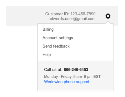
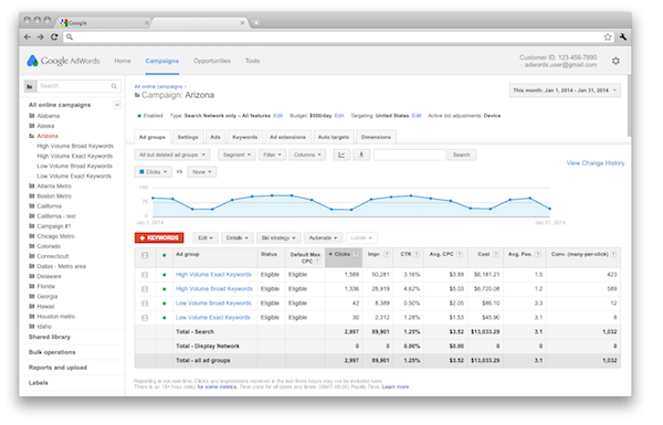
Over the past year Google has been pushing to streamline the look and functionality of many of their products. They have redesigned several of their products, and replaced many tools webmasters rely on with new tools with better performance. AdWords is the next tool on their list for an overhaul, as Google announced earlier this week while highlighting “more screen real estate to the tools and reports you love.”
Their announcement also assures you, “By updating AdWords to the look and feel that we use across Google, you’ll spend less time getting where you want to go in your account, and more time focusing on growing your business.”
The redesigned AdWords will be implementing several stylistic and functional aspects from Google’s broader network, such as moving navigation links like billing, help, and account setting into the gear icon.
They have also shifted key campaign information above the fold in the dashboard, so you won’t have to scroll to get to the information you’re looking for. You can also quickly see who is signed in for accounts with multiple users
On the purely aesthetic side, Google has brought more white space into the page, especially within charts and tables. They also softened their color palette to make AdWords “easier on the eyes.”
You can expect to see the changes appear within the next couple of weeks. In the meantime you can acclimate yourself to the updates with a short video Google released focused on navigating the redesigned AdWords.
00Taylor Ballhttps://www.tulsamarketingonline.com/wp-content/uploads/2018/07/TMO-Logo.pngTaylor Ball2014-01-24 13:22:402014-01-24 13:22:40Google Gives AdWords a New Look and Feel
The New Year is here and many are already looking forward, making resolutions and formulating predictions about the year to come. But, we can’t know what is going to look for in the future without looking back at 2013. The past year brought big changes to online marketing thanks to some big revisions in Google’s policies and the ever-changing world of design.
Whether you spent the past year doing the Harlem Shake or actively following all the notable blogs to keep your site up to the latest standards, you might want to refresh yourself on the big events and articles from the past year. With that in mind, we thought we would share our most popular posts from 2013. You can remind yourself what mattered in 2013, and see what might be important in 2014.
While most people outside of designers don’t tend to follow color trends, it can be surprising how much they affect what you see every day. Most consumers would be surprised to hear that colors come in and out of favor in design on a regular basis, and those trends affect marketing, purchasing decisions, and your perception of a brand or object.
One of the leading influencers in color studies and usage is the Pantone Color Institute, known for their widely used color system. Not only do they provide an organized way to communicate about color in exact terms, they also regularly analyze media, socio-political events, and technological advances to help decide the Color of the Year.
In 2014, you can expect to see a lot more “Radiant Orchid”, as the purplish-pink color has been chosen as the color of the year, as reported by Web Designer Depot.
Last year’s chosen color was the more recognizable Emerald, though the specific hue wasn’t what most actually associate with emerald. It was a bold but relaxing color of green “symbolizing growth, renewal, and prosperity”, which then became extraordinarily popular among the fashion and design world.
“Radiant Orchid reaches across the color wheel to intrigue the eye and spark the imagination,” says Leatrice Eiseman, executive director of the Institute. “An invitation to innovation, Radiant Orchid encourages expanded creativity and originality, which is increasingly valued in today’s society.”
It is hard to tell whether the analysis is so accurate that the team can predict a color that will become popular on its own, or whether Pantone’s influence is the primary factor making these colors so ubiquitous for a year. But, it is almost guaranteed 2014 is going to have its fair share of Radiant Orchid.
00Taylor Ballhttps://www.tulsamarketingonline.com/wp-content/uploads/2018/07/TMO-Logo.pngTaylor Ball2013-12-18 16:01:422013-12-18 16:01:42Pantone Announces The Color of the Year for 2014
Web design changes all the time. New trends come and old trends go as quickly as the crowd catches up to them. Some of these trends can be long lasting and have a huge impact on how we interact with the internet like responsive design, others can be more fluid and fleeting like flat design. The design community has made its name by always pushing to create the most visually exciting and effective user experience the technology allows, but that means we also have to let go of bad habits as we grow.
As the new year draws closer, designers are reflecting on the changes web design has undergone in the past year. While many are using this reflection to predict what is going to be popular next year, Maryam Taheri looks at what we need to get rid of to improve looking forward.
Homepage Sliding Banners
The sliding banners have become a hallmark of news and culture websites across the web, as well as many retailers. But, the banners are becoming dangerously close to cliche and users seem to be mixed in their response. Many find them to be distracting and annoying. While there may be ways to make these sliding banners more enjoyable for users, it could very well be in our best interests to instead turn to more interactive design methods such as single-page scrolling.
Extensive Fill-Out Forms
While we will always have to fill out lengthy forms for legitimate purposes like online shopping (at least the first time!), there is no need to make users fill out a full length form for optional areas of your site. Chances are, they will just avoid that area of your site to avoid giving personal information, and it could severely hurt your trust with many of your online customers. Asking for an e-mail address is fine. Asking for their life story isn’t. Thankfully, the majority have already realized this.
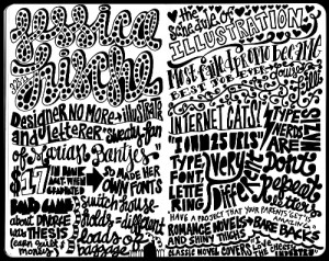
Overuse of Fonts
It works in a sketchbook, not on your site. Source: Carolyn Sewell
Typography is enjoying a new wave of interest in all areas of design, but it has its limits. A good designer can match a select number of fonts (no more than three) to create a pleasing website. But, it is far to common for less experienced designers to choose the “more is better” approach to diminishing returns. A mish-mash of fonts only makes a site look cluttered and schizophrenic. If you want to make your header or your copy pop but don’t know much about fonts and typfaces and kerning, it is wise to limit yourself to two fonts. If you can make two fonts compliment each other, you’re design won’t need any more.
Complicated Design
If there is one thing the favored trends of the past year have shown us, it is that users want their web experience simple. This seems like common sense for the large number of mobile users accessing the web while out and about, but it also stands true for desktop users. You don’t have to choose flat design or convert to the church of minimalism, but successful websites are increasingly focused on creating the best experience for users. If your website confuses or overwhelms, you’re doing it wrong.
00Taylor Ballhttps://www.tulsamarketingonline.com/wp-content/uploads/2018/07/TMO-Logo.pngTaylor Ball2013-12-17 17:38:102013-12-17 17:38:10Web Design Trends That Should End in 2014
The best websites are all designed with the unique needs of a business and their customers in mind, but don’t think there isn’t some common ground between them. Web designers have their own process and plan when it comes to making a new site, but they all share some web design elements that simply can’t be left out.
These elements make a site go from boring to exciting and they ensure users are always happy with their online experience. Today, Carrie Cousins shared 10 different parts of a website you can’t neglect if you’re hoping for success.
1. Space
Beatbox Academy
Space is the basis for all web design. Space dictates the flow, readability, mood, and style before you’ve even begun to consider the details of your site. The best designers all have a solid grasp on how to use space and they experiment with space in ways no one else is. Whether designers are playing with the idea of wide open space or creating a more clustered environment, you have to take the time to actively decide how you want to manage space if you want a successful design.
Space also plays a strong role in determining the focus of your page. Any image or text surrounded by open space will automatically seem more important and even larger than a design element crammed next to other aspects fighting for attention.
2. Simple Navigation
Visitors can’t actually use your site if they can’t easily navigate it. Every website should have obvious, easy to use, easily identifiable navigation. Even the most complex sites should be able to be fully explored from a set of five to ten menu items.
Navigation doesn’t always have to come in the form of a menu up at the top. Navigation can also be simply telling your visitors how to use your site, such as adding arrows to a parallax scrolling website.
3. About Us
While it may not be the most exciting part of web design, including an ‘About Us’ page is indescribably important for a smaller business or site owner to tell visitors who they are and what they offer. While it may not be as essential for major companies, you will notice even they tend to include one of these pages.
The trick is to keep it simple. You want to tell visitors enough about your brand and what you bring to the table to interest users, but you don’t want to bore them. This shouldn’t be just a simple template page. It should be kind of like a long-form business card. Short and sweet, but informative, and visually interesting enough to help you stand out without distracting.
4. Contact Information
Without contact information, how are you expecting to get feedback from visitors? Contact information is important for letting your visitors reach out to you, but it also helps validate that you are who you say you are. Nothing makes a site seem sketchy like not being able to find a way to contact a business easily.
To make it easier for users to find and reach out to you, you want your contact information to be highly visible and contain all of the modern ways users might want to connect. A phone number and physical address are absolute musts, but you should consider including social media profiles of yours such as Twitter and obviously an email address is expected for any website.
5. Call to Action
Most websites are created with an objective in mind. Whether you want to make a sale, educate the public, or gather contact information to more thoroughly connect with your audience, there is some goal you are hoping to achieve. A call to action is how you get your users to fulfill your goal, and it should be obvious and strong.
You wan to start out by determining exactly what your objective is, then design it so that action is immediately obvious. Color, contrast, and space are all useful tools for drawing users to the buttons and pages you want.
Even a common signup form is an example of a call to action in web design. The best way to use one of these sigup forms is to place it in a prominent location on the page and make it simple enough to not disuade users from filling it out.
6. Search
It is absolutely shocking how many sites feel they don’t need a search function. Think about all the times you wanted to look up some older information but you weren’t able. Chances are, if you use a site regularly, you will eventually want to search for something, and being stonewalled by a negligent designer can be a real problem.
Implementing search bars is rather common practice, and you all have to do is design that box to be unobtrusive but available. If you want to use an icon, the magnifying glass is accepted shorthand for search, using something else can be confusing.
7. Informational Footer
Many sites use the footer area as a dumping ground for all the information that would otherwise clutter up their site. These unorganized blocks of links aren’t entirely wrong, but they fails to take advantage of the space. Instead, you should try to use the area to communicate a short message or important information in a condensed form, while including those important links in a clear and organized form.
The footer should be simple and streamlined, but it is a good place to include contact information, a small site map, and a selection of important other information. Make it easy to use and understand.
8. Obvious Buttons
It should seem pretty obvious, but every button should look like a button. Pick a visual cue for your site and stick with it so every button is clearly available to users. Not only do you encourage user to click around your site more, but you’ll avoid frustrated users who can’t navigate your page. Using a consistent style is important for web design and branding.
9. High Quality Images
Consider how people are accessing the internet. Smartphones, tablets, and even gaming consoles are all used to browse the web, and most of these have high resolution screens which leave little to the imagination. Users want images to create a visual interest, but you can’t skimp. Low quality images are going to look awful on a ‘Retina’ display. However, with just a few high quality custom images, you can make your site stand out from the crowd.
10. Web Fonts
Just a few years ago, the internet ran on just a few typefaces for everything. They were considered to be the most readable and they solved the issue of making sure every visitor could see text. But, those limitations no longer exist. You can use almost any font you want and you won’t have too many problems.
However there are two reasons web fonts are still important: compatibility and licensing. When you use a web font service, you ensure your search engine optimization won’t be hurt and your site will look consistent on every platform.
00Taylor Ballhttps://www.tulsamarketingonline.com/wp-content/uploads/2018/07/TMO-Logo.pngTaylor Ball2013-11-21 14:42:112013-11-21 14:42:1110 Web Design Elements You Can’t Forget
 The New Year is here and many are already looking forward, making resolutions and formulating predictions about the year to come. But, we can’t know what is going to look for in the future without looking back at 2013. The past year brought big changes to online marketing thanks to some big revisions in Google’s policies and the ever-changing world of design.
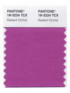 While most people outside of designers don’t tend to follow color trends, it can be surprising how much they affect what you see every day. Most consumers would be surprised to hear that colors come in and out of favor in design on a regular basis, and those trends affect marketing, purchasing decisions, and your perception of a brand or object.
 Last year’s chosen color was the more recognizable Emerald, though the specific hue wasn’t what most actually associate with emerald. It was a bold but relaxing color of green “symbolizing growth, renewal, and prosperity”, which then became extraordinarily popular among the fashion and design world.
