The Typographic Principles of Flat Design
It is no secret that flat design is the biggest trend right now, and it has raised many questions from designers trying to get caught up on the trend. One of the more common questions pertains to fonts, specifically which fonts “work best” with flat design.
Typographic focus in one of the biggest aspects to flat design and the attention to simplicity, so choosing which font you will be working with is an important step. Of course, the main point of good typography of all styles is that it is easy to read and matches the look and style of the page overall, so there is no way to suggest a font that will work in every situation.
However, for flat design you will usually be better off working with very simple fonts and font pairings, as flat design is inherently minimalistic and simple. Whereas past wisdom suggested maxing out at three font pairings per design or page, flat design streamlines it down to two fonts, and sometimes just one.
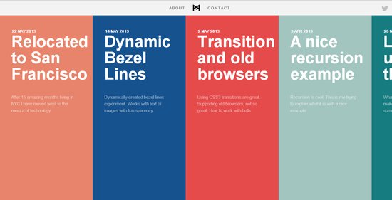
Because of flat design’s bright color schemes, lettering relies heavily on font weights and clean lines. Designmodo suggests using typefaces with even strokes that contrast against the color palette, and are bold enough to read. You also may want a dash of flair to really bring life to the page.
The trick with flat design is to not fall into boring patterns. The general trend suggests using sans serif typefaces, but it is also possible to work with novelty typefaces as well. The sans serif typefaces are popular for their easy to read nature and great contrast against backgrounds, while serif typefaces come off as formal and against the nature of the simple style, thanks to their usual embellishments.
Novelty typefaces can work well to draw visual interest to areas with bigger text that demands more attention, but it is discouraged to use these for smaller text blocks. Because of this, it is suggested to always choose a second sans serif font if your big text is in a novelty style.
The most forgotten aspect of using text in flat design is that the words you use are just as important as he typeface. Flat design demands simplicity, and overly wordy pages won’t sit within the trend. Use direct language that is brief but effective, and always cut to the point. You don’t need full sentences unless there’s a full paragraph of content. Otherwise, stick to simple word pairings.
There are other serious considerations for designers as well, such as how you use text against color as well as capitalizing on size and space opportunities within flat design. Carrie Cousins discussed those issues earlier this week in her article about typography in flat design, and she even suggested some fonts that lend themselves well to the trend.


Leave a Reply
Want to join the discussion?Feel free to contribute!