Google Gives AdWords a New Look and Feel
Over the past year Google has been pushing to streamline the look and functionality of many of their products. They have redesigned several of their products, and replaced many tools webmasters rely on with new tools with better performance. AdWords is the next tool on their list for an overhaul, as Google announced earlier this week while highlighting “more screen real estate to the tools and reports you love.”
Their announcement also assures you, “By updating AdWords to the look and feel that we use across Google, you’ll spend less time getting where you want to go in your account, and more time focusing on growing your business.”
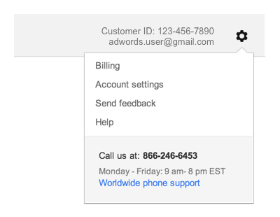
The redesigned AdWords will be implementing several stylistic and functional aspects from Google’s broader network, such as moving navigation links like billing, help, and account setting into the gear icon.
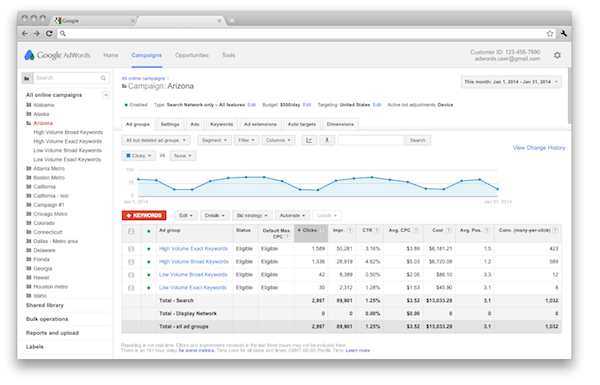
They have also shifted key campaign information above the fold in the dashboard, so you won’t have to scroll to get to the information you’re looking for. You can also quickly see who is signed in for accounts with multiple users
On the purely aesthetic side, Google has brought more white space into the page, especially within charts and tables. They also softened their color palette to make AdWords “easier on the eyes.”
You can expect to see the changes appear within the next couple of weeks. In the meantime you can acclimate yourself to the updates with a short video Google released focused on navigating the redesigned AdWords.

Leave a Reply
Want to join the discussion?Feel free to contribute!