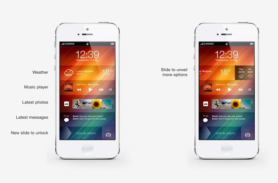
iOS7 concept by Andre Almeida
It appears that flat design is taking the lead over skeuomorphism, as Apple’s new iOS is rumored to be receiving a huge overhaul in the near future. The most recent speculation claims that the new iOS look is going to be largely monotone and understated, as well as abandoning the textures and “realistic” drop shadows of the past.
Web Designer Depot reported the claims which have also been going around most design blogs, which also state that the new mobile OS is rumored to be announced at the Apple WDDC on June 10th, where there is also speculation about a new iPhone announcement.
One of the leading reasons many designers have been slowly migrating is that it is incredibly easy to make a flat design also responsive, especially compared too skeuomorphic designs. Flat design follows the ideology that effects simulating the 3D world such as drop shadows or textures that mimic real objects are not only deceitful, but becoming increasingly irrelevant in an online world.
This isn’t to say that skeuomorphism is completely dead; there are still many designers promoting the strategy. But, Apple has long been cited as one of the biggest proponents of the trend, with their iconic mobile OS styles.
The rumors all started when Apple tapped Jonathan Ive to head the design of iOS7. Ive, Apple’s Vice President of Industrial Design and the man responsible for the iPhone, iPad, and iPod touch hardware, is known to have a strong dislike of skeuomorphic design, which was heavily promoted in the company by Steve Jobs and former iOS head Scott Forstall.
No one will know for sure what is coming with the Apple conference until the 10th, and many skeptics claim that Apple is likely to be implemented incrementally rather than suddenly with an iOS update.