Everyone knows social media is fickle. You can share something you think is great and get no response, while an offhand post that you threw up blows up with likes, comments, and shares. So what makes the difference?
Of course, there are countless reasons that some things perform better than others on social media, but one of the biggest factors is likely something you haven’t considered – timing.
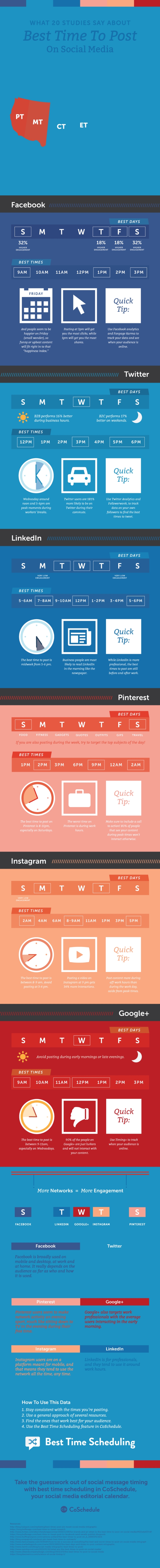
Timing really is everything on social media, but it can be hard to discern exactly when the best time is for you to start posting. The right time on Twitter may not be the right time on Facebook, LinkedIn, or Instagram. Complicating things more, the best times are different for varying industries.
So, how do you figure out when the right time is for you? You could just try different things until something works, but I suggest using the infographic below to take a more informed approach.
The infographic from CoSchedule combines all the best data about timing on social media to give you a complete guide for discovering the prime time for your social media activity. Check it out below or head over to CoSchedule’s site for a more in-depth breakdown.
00Taylor Ballhttps://www.tulsamarketingonline.com/wp-content/uploads/2018/07/TMO-Logo.pngTaylor Ball2017-07-27 14:44:342017-07-27 14:44:34Timing is everything – When to post on social media [Infographic]
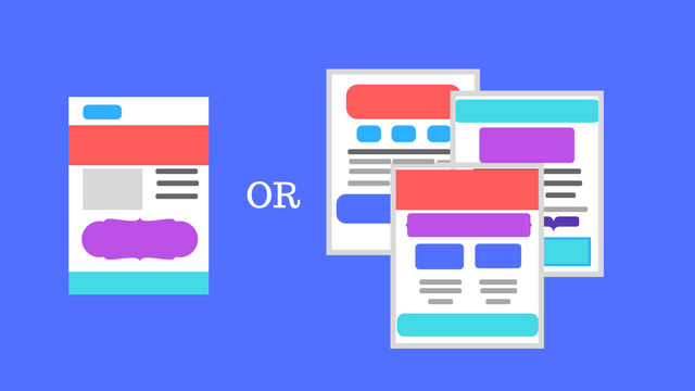
Single-page websites have taken over the internet lately. More and more businesses are choosing to streamline their sites to get straight to the point, and newer brands are opting to avoid paying to create a dozen or more pages. The question is whether single-page websites are actually good for you and your brand.
Admittedly, there are a few clear benefits from single-page websites. They tend to work well on mobile devices and load more quickly than a site with numerous pages. Since more than half of all searches are now coming from mobile sources, these can help you ensure people on smartphones don’t have to wait to check out your stuff.
There are also a variety of free tools that can help set-up a stylish one-page site, while designing a full multi-page site can cost thousands of dollars.
However, it’s not all roses and sunshine when it comes to single-page websites. Here are a few things to consider before you decide to go minimalist with a one-page website for your brand:
Lack of info
The biggest problem with single-page websites is simply cramming everything your potential customers want to know all on one page.
On a multiple-page website, you can publish all sorts of content and valuable information that helps your visitors become informed and excited about your products or services. When you cut all that down to one page, you lose a lot of the details that can be a deciding factor in turning someone from a visitor to a customer.
Even with a great layout that includes separate sections for different topics or types of services, it is nearly impossible to include everything your variety of visitors want to find.
SEO limitations
Since you can’t fit in as many types of content or information, it is also hard to target as many keywords or phrases as you have in the past. Sites with lots of pages of content can cover a huge range of keywords related to your business, helping you rank on diverse search pages that might draw in different parts of your audience.
On that note, it can also be hard to keep your site looking “active” since you are only updating it for new products or when you change your business’s phone number. Rather than keeping people up-to-date, single-page websites are typically planned to be “evergreen” and need minimal updating. That may sound nice, but search engines tend to prefer sites that are regularly adding new information and resources – not stagnant sites that are only updated a few times a year at most.
Cost vs. Effect
One of the most common reasons I hear for going single-page is that it is cheaper. You don’t have to hire a web designer to customize numerous pages with unique layouts and images or have a writer fill all those pages with copy and content.
That can all be tantalizing, but as the saying goes: “you get what you pay for.” If you use a free or cheap template for your single-page website, you risk looking bland and forgettable because others are using that exact same layout.
Even if you hire someone to create a great single-page layout, it becomes hard to make your page effective. Strategized approaches get cut to fit within the limited mold, and your copy becomes broad to cover as much as possible as quickly as you can.
All-in-all, single-pages require a ton of work to be anywhere as effective as a traditional website. You have to fight an uphill battle to optimize your site for search engines and hope your content is so insanely precise that you aren’t missing any details your customers want. So, if you are choosing a one-page site for its low-cost, you should realize it will cost you one-way or the other down the road.
The final verdict
As with any trend, it can be hard to resist the urge to be up-to-date and hip. But, trends are fleeting because they often aren’t fully thought through. There will always be a small number of brands who benefit from going to a single-page site, but most discover it’s not as great or easy as they thought it would be.
00Taylor Ballhttps://www.tulsamarketingonline.com/wp-content/uploads/2018/07/TMO-Logo.pngTaylor Ball2017-07-26 14:12:552017-07-26 14:12:55Three big problems with single-page websites
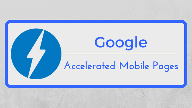
Since their launch, Google’s Accelerated Mobile Pages (AMP) has been gradually growing in popularity and functionality. More than 2 billion pages now utilize the stripped-down and sped-up content system, and a new survey shows users are also responding very well to AMP.
A poll conducted by 9to5Google indicates that more than half of all internet users prefer to click on AMP content over regular links to full content hosted on your website.
The question posed by Justin Duino from 9to5Google asked: “Are you more inclined to click on an AMP link than a regular one?”
With almost 1500 responses so far, 51% of people say the “Yes, I prefer the stripped down versions of websites when reading something.”
The other responses include:
No, if I want to read something, I will open the link whether it’s AMP or not – 24%
No, I prefer loading the entire website – 13%
Yes, but only when my device is using mobile data and I don’t want to load a full website – 9%
Other – 2%
Of course, informal online polls are hardly considered incontrovertible proof. The results are open to interpretation and informed by numerous factors. For one, the people who frequent 9to5Google’s site are more likely to be tech-inclined and informed about the latest news and features in search. They also likely view Google in a more positive light than the average person.
Still, there is plenty of evidence that content producers and brands love AMP, but there’s been little effort to actually ask users how they feel about the format. Based on this, they are largely in favor of the stripped-down content that lets them get straight to what they clicked on with as little loading time as possible.
00Taylor Ballhttps://www.tulsamarketingonline.com/wp-content/uploads/2018/07/TMO-Logo.pngTaylor Ball2017-07-21 13:21:042017-07-21 13:21:04People prefer Accelerated Mobile Pages according to new poll
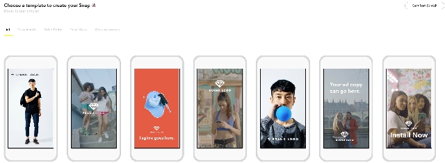
One of the biggest hurdles keeping advertisers has always been simply making ads for the platform. While you can use the same horizontally-oriented videos for YouTube, Facebook, Instagram, and more, Snapchat has always demanded that you use vertical videos only. Typically, that meant creating a video specifically for Snapchat from scratch.
That changes this week with the launch of Snap Publisher.
Snap Publisher is the new browser-based ad creation tool that promises to help you create a stylish Snapchat vertical video ad in just a few minutes – even if you don’t have a vertical video ready.
The tool is able to take any photo or video – including horizontal formats – and turn them into vertical video ads. Snap Publisher also allows you to import and use any photos or videos from your website, though it says you “may only import from sites in which you have the legal right to obtain media from.”
From there, you can either manually crop and edit the video or images or let Snap Publisher do it for you. The most practical use would be to chop longer videos or ads into shorter scenes fitting Snapchat’s three- to 10-second limits.
If you don’t have any videos or images that work as vertical ads, you can also choose from 13 templates Snap Publisher provides. The templates include a number of photos, videos, logos, and text you can use or customize to get the style and message you want.
With just a few minutes of tweaking, you can build a complete Snapchat video ad in just a few minutes, with or without any pre-existing footage or photos.
AdWords has launched a new feature allowing advertisers to remarket search ads to anyone who has watched their videos on YouTube, making it easier to funnel potential leads toward converting.
YouTube already lets advertisers remarket YouTube ads to people who have interacted with their channel, but the new change allows you to use the same list of people to show search ads to them as well.
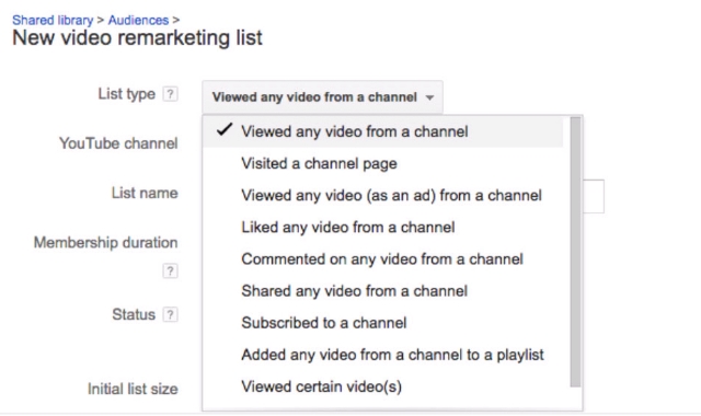
Setting up your search ad retargeting can be done by logging into AdWords and navigating to Shared library > Audiences > New video remarketing list.
From there, you can select which type of interaction you want to use to decide who to retarget to, including anyone who has viewed any video, liked a video, or left a comment.
Thanks to this, you can show ads specifically to people already familiar with your brand and what you offer, letting you re-connect with them any time they search for a relevant keyword for your business or industry.
00Taylor Ballhttps://www.tulsamarketingonline.com/wp-content/uploads/2018/07/TMO-Logo.pngTaylor Ball2017-07-14 11:19:422017-07-14 11:19:42AdWords introduces search ad remarketing for your YouTube viewers
Google has made it easy for businesses to tell users what accessibility features they provide before they ever visit the store with their latest addition to Google My Business listings.
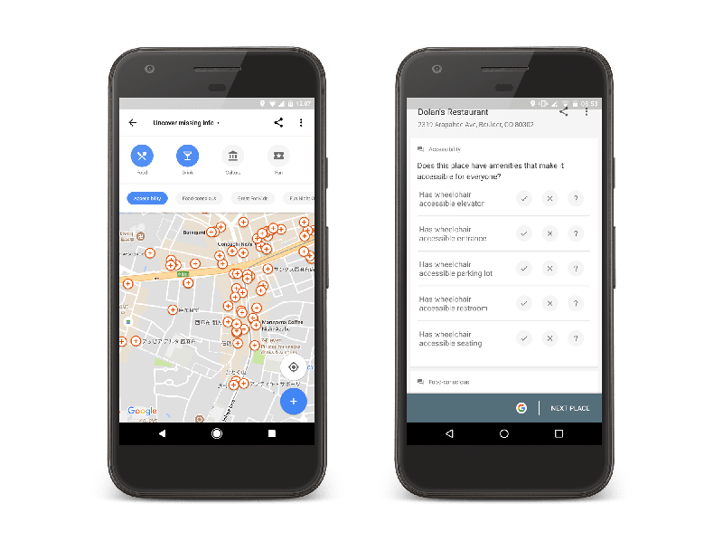
Now, you can add accessibility information about your business or search for places which provide accessibility features like wheelchair ramps and wheelchair-accessible parking.
You can update your listing by simply going to the main menu of Google Maps for Android, pulling up the main menu, and tapping on “Your contributions.” From there, go to “Uncover missing info” and sort by “Accessibility.”
This pulls up locations near you that are missing accessibility information, including your business. Then, you can begin adding accessibility attributes as needed, including:
Wheelchair-accessible entrances
Wheelchair-accessible elevators
Wheelchair-accessible seating, and
Wheelchair-accessible parking
The set-up of the new feature allows any users to add accessibility information about any business they visit, but business owners can take the initiative to update their own listings to alert shoppers about what they offer before they make the trip themselves.
Since the release of the new listing information, Google says users have added accessibility information to almost 7 million places worldwide.
00Taylor Ballhttps://www.tulsamarketingonline.com/wp-content/uploads/2018/07/TMO-Logo.pngTaylor Ball2017-07-12 14:58:232017-07-12 14:58:23Google lets you add accessibility features to your business listings
Snapchat has quickly become one of the most popular social image sharing platforms around, breaking out of its teen-centric image to reach a wide audience of users. With this growth, the platform has also made extensive changes to make it easier for brands to connect with users.
This week, the company released one such new feature with the launch of “Snapchat Paperclip”. The Paperclip feature lets anyone – including brands – to attach a link to any Snap before it is shared. Until now, the only way you could include a link in a Snap was through paid ads.
The launch of Paperclip puts Snapchat ahead of the other most prominent social image platform, Instagram, which only allows links within the bio section of profiles. The only exception to Instagram’s rules is for users with over 10,000 followers. These popular figures can also include links in Instagram Stories.
The ability to include links in individual Snaps may seem like a small change, but it could be a huge win for brands looking to build an organic following. Instead of paying for ads, you can now rely on high-quality content to get users engaged and interested in your site and products. It also allows you to reach more ad-averse audiences, such as tech-savvy users who tend to block or ignore ads.
The Paperclip feature already available around the world for both iOS and Android users and is easily accessible by tapping the paperclip icon within Snapchat’s toolkit.
Along with the launch of Paperclip, Snapchat has released two other new features more aimed at average users. Voice Filters give users the ability to modify the way their voice sounds even when no using a visual lens. The other feature, Backdrops, lets users swap out the background of images with custom designs or colors.
You can see all three new features in action in this video shared by Josh Constine:
00Taylor Ballhttps://www.tulsamarketingonline.com/wp-content/uploads/2018/07/TMO-Logo.pngTaylor Ball2017-07-06 12:06:252017-07-06 12:06:25Snapchat makes it easier to link to your website in Snaps