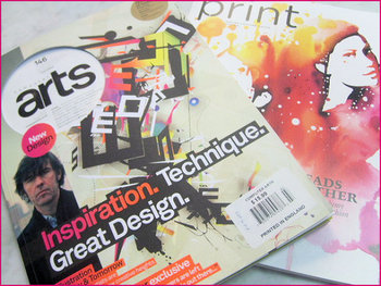
Typography is one of the most deceptively complex components of design imaginable. I mean, to the outsider, it is just arranging letters and picking fonts. The uninitiated have no idea about the complexities and the history of typography; they don’t know typography has a rule book all its own.

Now, I’ve said infographics will tell you “all you need to know” about a couple different design aspects, but the truth is, you can never learn too much about design, and just about every part of design has books upon books worth of material to learn. But, reading books about design seems kind of boring right? Everyone in the field at this point got into it because we love looking at awesome images.

Instead of reading a book about typography – which you should totally do – you can always look at infographics which will put all of that information in visually stimulating ways. Typography lovers and experts certainly love making them.

Jacob Gube collected ten different infographics from across the web on Design Instruct. I am posting one of the ten below, but you’ll have to go to their site to see the rest. The one I’m showing you is “A Brief Introduction to Typography”, which you will notice is not particularly brief. That should give you an idea just how much there is to say about the “simple science” of “arranging letters”. Click on the image to see the full size.

Brief Introduction

Some people think that no matter what URL structure you have, search engines will be able to make complete sense of it and be able to index the site. While this is true, to an extent, they then use this idea to say that there is no such thing as SEO-friendly URL structure. Clearly, they missed part of the point of using “friendly” URL structure.

While making sure a site is crawlable and loads fast enough are important to an SEO, because they require both to do their jobs, SEO is more focused on getting people to the site, ranking that site as high as possible, and getting a solid ROI.

Web developers are the other people working on a site that are concerned with URL structure, but they are usually those thinking any URL structure will work. They have different focuses than SEOs and as long as the URL is indexable, they have been successful in that aspect. In other words, what web developers consider to be an alright URL structure may not work for the SEO working on the site.

There are a few simple rules to making a SEO-friendly URL structure. Firstly, the URLs should be straightforward, with absolutely as few redirects as possible. Making everything organized helps keep the site structure more cleaner and keep visitors from getting confused. You should also make the URLs meaningful. Keywords, or just in general some form of language, is better than seemingly nonsensical numbers and punctuation. Most importantly for SEOs, it is important to know which URLs are most important, and which need to be hidden from search engines.

Alesia Krush explains SEO-friendly URL Structure at Search Engine Journal, but most importantly she shows how you can achieve it on your site in just five easy steps.

You may have heard of Zappos, a web site known primarily for selling shoes. They recently revealed some of their online marketing strategy, including some successes and failures, that could be helpful to many businesses, both big and small, as Laura Stampler reports for Business Insider.

For instance, Zappos’ Digital Marketing Director calls sponsored posts on Facebook “a necessary evil” and “the difference between 1000 likes versus 10.”

He also discusses a shift in their message on Facebook. Rather than talking about what was happening locally around and in their home offices, they emphasize their products and have seen an increased response. This particularly seems like a simple and obvious change, but one that might be helpful to apply to your own Facebook page.

One other important message from Zappos was the far reaching effect of the right wording. Posting an identical message, but with slightly improved wording can be the difference between seeing 10 people share your story and 100. Zappos saw a 7-percent increase in users who created a story on social media about their purchases after such a slight change in verbiage. That adds up to a much larger audience over time.


WordPress has gone from a simple blogging platform into one of the most popular tools for sharing a variety of different web content. We use it, and chances are so do many other websites and blogs you visit. Whole sites can be run with the platform, but WordPress’ heart will always be with blogging.

With the huge rise in popularity, and extensive fleshing out of WordPress, the bar has been risen in regards to what visitors demand of a blog’s look and layout. Ugly layouts diminish credibility in the eye’s of the viewer, plus no one wants to stay on a blog long enough to read even the best content if it hurts their eyes or sense of taste. If you are new to blogging, but want to get your page up to the level visitors desire, Jo Stevenson offers a few tips for how to get the jump on WordPress blogging.

One of the key moments in establishing how well your blog will look comes with choosing a template. Pretty much no one builds their blog from the ground up. There is a whole community out there dedicated to creating and sharing templates, often for free, and unless you have been coding for years, this will be almost any blogger’s first stop. The trick is finding one that suits the content and focus of your blog. News or politics blogs should look formal and authoritative, while cooking blogs might be a lively green or warm red palette with welcoming fonts.

Once you have a template, it is time to begin refining the structure of your blog. Directing the reader’s eye where you want it to go is essential in keeping their interest, and if the wrong thing dominates the screen, the reader may not be able to find the content you want them to see. Stevenson suggests video-heavy blogs would likely benefit from single column formats, while text-laden blogs would likely benefit from giving the copy room to breathe with a two or three column layout.

Most important for making a blog with a look that fits it perfectly is to learn to code, even if you just learn a little bit. Just a small amount of HTML and CSS knowledge will help you customize a template to make it your own, and eventually you may learn enough to design an entire site from scratch.

All backlinks are not created equal. Everyone knows that. But, with the number of linking opportunities out there and the number of backlinks a site is expected to have, inexperienced SEOs tend to take a quantity over quality approach that can end in penalties from Google.

Vetting your backlink sources isn’t hard, but it takes a bit of extra time for sorting through the massive number of sources at your fingertips. Think of it as choosing sources for a paper you had to write in high school or college. You’re expected to have a certain number, but your grade, or in this case your site’s ranking and reputation, can be hurt if your sources aren’t reliable sources.

But, do not fear young SEOs. If qualifying your potential backlink sources still seems vague or daunting, Sujan Patel from Search Engine Journal created a list of seven questions you can ask of your link opportunities to ensure that you’re only spending your energy on links that will help your site. Having a ton of backlinks is counter-productive if none of them have any value.

Wrist Watch

Your daily schedule is pretty tightly booked. Usually, trying to cram in some time to optimize your AdWords campaigns to get the most out of your online advertising budget is pretty low on the list of priorities. But, if you put in a little time upfront, you can run an efficient and effective campaign for just minutes a day.

That’s the premise that Ben Cohen works from in his article for Business2Community. He’ll tell you where to allocate your precious time and how to set up your account so you can manage it quickly and get on to your other duties. If you have an AdWords account already, you understand how valuable this information could be. If you’ve been hesitant to start an account because it is so time consuming, this could be just what you need to get started.

High Voltage

For companies looking for an SEO, the process can be confusing. There is a lot of jargon that the uninitiated business owner likely doesn’t know, and the field is absolutely full of companies offering what initially look like the same thing. But, as they say, the devil is in the details.

There are certain things the uninformed local business owner can keep an eye out for to help the process. Stoney deGeyter knows these warning signs as well as anyone, as he writes about small business SEO all the time, and has seen more than a few SEOs offering questionable or outdated methods.

Some SEOs will advertise that they can get you ranked on a selection of websites like MSN, Ask.com, or AltaVista. The more search engines they can get you on, the better right? Nope. I personally have seen sites offering to get you on MSN rankings which is an immediate red flag considering MSN isn’t a search engine anymore. It changed to Bing years ago. Ask.com is the fourth most used search engine and it only pulls in around 3-percent of all searches. The point is, if they can’t get you on Google or Bing, they won’t actually be able to help you much.

Another misleading promise is to get your site the number one spot in the rankings, no matter what. If this was possible, SEO would be stunningly easy, but it is not possible and SEO is far too competitive and complex for any guarantee of this kind to be anything but a bluff. SEO companies have no direct control over where search engines rank sites. Our job isn’t to achieve a certain ranking, but to get your page ranking as high as possible over numerous keywords in a competitive market. A good SEO should certainly be able to raise your ratings, but you can’t expect to get the top ranking for “local restaurant” just because a company promised it.

One way to tell if an SEO is out of touch with the current SEO climate is to look to see if they advertise search engine or directory submission services. This went out of vogue in 1998, but there are still companies proclaiming their services as if they are useful. Aside from Pay-Per-Click, and Pay-To-Be-Included type results, the only way to get your site found is to design it to be found. There is a reason Google doesn’t have a submission option. They haven’t been needed in years.

There are tons of other warning signs to watch out for, and deGeyter shares four more in his article. Unfortunately, SEO has just enough bad eggs that uninformed local business owners are often taken advantage of with false promises or downright ineffective methods. Some are actively trying to pull one over on innocent business owners, some are just out of touch with current SEO, but either way they aren’t worth your dollar.

Magazine DesignSometimes I find myself, as well as plenty of others, writing about web design as if it is entirely separate from other mediums. Sure, there are plenty of things that distinguish web design, such as coding and even specific layout patterns for the internet, but there are a lot of principles of layout and design that can be easily transferred onto every medium.

Cameron Chapman got her start in magazine publishing, but she is now a web and graphic designer and prolific blogger. She knows better than anyone that good design rules can often transcend the medium they were established in and help designers across the board. She used her experience in magazine publishing to choose a few design principles that almost any design grad has heard and shows how easily they can be applied to web design.

The first principle seems to be common sense, but a simple background makes reading easier. This is why magazine background colors are almost always white, or at the very most a simple solid color. Readers give up if text is hard for them to read, but yet some less well known websites still present their text over busy images or colors without enough contrast to offset the text. Even if your page’s background is a large image, it is easy to offset your text with a simple text box to deliver your message.

Some websites have numerous pages that all look like different versions of a website. The “about” page may be professional looking and understated, while their “services” or “product” pages are vibrant and sometimes cluttered. If you look at a magazine, every page or section retain several cues from other areas of the magazine. Fonts remain the same, layouts are fairly standardized, and images are shown in the same style. While each page of your site can be a little different from others, it is important to establish consistency by presenting the bulk of your information in similar formats.

One of the most important rules that websites break all the time is clearly marking advertising. In magazines, it is tradition to clearly separate the advertising from the actual content. Even if the advertising is designed to match the style of the magazine in some ways, as some magazine ads have begun doing, there are clear labels added to ensure readers know where the articles end and the ads begin. The same should be implemented in web design, but some sites allow their ads to either be entirely intrusive or sometimes indistinguishable from the content. When readers can’t tell if you are selling them something or delivering them information, they stop trusting your content.

There are plenty of other design rules that web design can learn from, and Chapman explores more of them in her article for Web Designer Depot, but she doesn’t want you to focus on the specific rules she outlines. The most important thing she hopes for you to understand is that any design rule you learn should be at least experimented with in other mediums. Sometimes it won’t transfer well, but most of the time it will make your site look better.

Smartphone

AdWords’ cost-per-click has fallen over the last five quarters. Perhaps that’s why there recent efforts have been to enhance their keyword advertising with respects to mobile users.

As Steven Musil reports for CNet, Google’s AdWords Enhanced Campaign seeks to simplify advertiser’s experience when dealing with multiple device platforms. As with most advertising platforms, there is still a mystery surrounding how to get mobile users, on tablets and smart phones, to click ads the way desktop and laptop users will.

The AdWords Enhanced Campaign also includes ad copy, links and extensions for mobile optimized ads. Ideally, this is an update that helps both advertisers and Google without sacrificing user experience, but that may be too idealistic to hope for.

DocumentsOne of the best parts of the SEO online community is how happy everyone is to share their knowledge, tips, strategies, and tools for others to use. Maybe it is because some of the best SEO practices actually involve sharing information, and we all get into a habit of being genuinely happy to help others out, or maybe nearly everyone in SEO is just happy to share the knowledge, but for all SEO’s problems, lack of information isn’t one of them.

While blogs tend to be the go-to source for public sharing of information, there are also lots of documents passed around “behind the scenes” through Google Documents. It isn’t that they are secretive, but most of these documents are only found by those who directly ask experts for information, or those who explore some of the more technical minded blogs. Search Engine Journal isn’t where you would normally expect to find many of these documents, but Benjamin Beck shared some of the most helpful Google Docs that he has found while working in SEO.

One Google Doc by Annie Cushing is a well organized list for just about every tool out there for keyword research, SEO analysis, and numerous other areas of SEO you will ding helpful. Other documents, like the one from Stoked SEO help make link prospecting easier by scaling the prospecting on queries that have initial positive results. No matter what your needs are, there is likely a document in Beck’s list that will help.