Keyword Planner Screenshot

The time has come. As of yesterday, the Google Keyword Tool is officially dead. The sentiments are mixed as the tool has been frequently used by webmasters and SEO professionals across the world, but Google has offered a replacement called the Keyword Planner which has some advantages over the old tool. It also has some drawbacks associated with the switch.

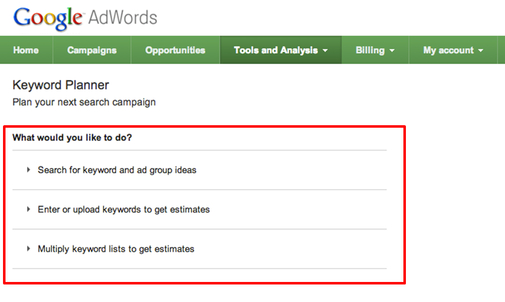
In Google’s opinion, the Keyword Planner can accomplish all the important tasks the Keyword Tool could, as well as that of the Traffic Estimator. There are even some new features included which neither of the older tools offered. Matt Southern from Search Engine Journal broke down the pros and cons of being forced to make the change, which are shared below. Chances are in a few months you won’t even remember using the old Keyword Tool, but the transition could take some getting used to.

Positives

The Keyword Planner allows local SEO professionals and marketers to acquire keyword search volume data down to a city level with better geographic segmentation than the Keyword Tool and Traffic Estimator. It also has the ability to bundle geographic regions together.

SEO professionals and marketers are also able to upload up to 10,000 keywords from their own list to get performance data. The planner displays search volume by ad group, landing page, and any other categorization established by the user.

Negatives

The most common gripe I have heard about the Keyword Planner is that, unlike the Keyword Tool, the planner required users to be logged into AdWords before being able to use the tool. However, there are some functions removed from the Keyword Tool which will have a larger impact on how you view and understand the data.

The Keyword Planner does not feature match type data for search volume, device targeting, and doesn’t include global vs. local monthly searches. The ability to filter by closely related search terms is also missing, though Google has stated it will be back within the coming weeks. They explained the missing match types and device differentiation in a statement, which read:

In general, you’ll notice that the average search volume data is higher in Keyword Planner as compared to the exact match search volume data you got with the Keyword Tool. That’s because we’ll show you the average number of searches for a keyword idea on all devices (desktop and laptop computers, tablets, and mobile phones). With Keyword Tool, we showed the average search volume for desktop and laptop computers by default.

Sprout Serif


There is something inherently nostalgic and sweet about handwritten fonts in design projects. Not only do they make designs feel more personal and loan some much needed personality to your projects, they immediately draw the eye in ways that your more standardized and formal typefaces don’t. They elicit emotion and a personal connection. You can’t say the same for Times New Roman, for sure.

Of course, handwritten fonts are all unique and can be used for a huge array of design projects. There are script fonts with extensive flourishes which look right at home on wedding invitations and greeting cards, but there are also the more shaky fonts designed to recreate the look and feel of journal entries or rushed messages. There might literally be a handwritten styled font for every occasion.

Naturally, these fonts work as well in digital or web design as they do in print media. Websites can strongly benefit from the more intimate appearance their copy adopts when using a handwritten font. You can charm visitors or make them feel more comfortable with the right font selection, but the key is knowing how to pick and use these styles.

For instance, many of the fonts that look handwritten push the bounds of legibility. There are those which look scrawled out in thick marker, as well as the extravagant scripts which can be obscured by their own ornamentation. These styles can absolutely work well, but they are best reserved for headers or isolated small blocks of text intended to make an impact, because readers absolutely won’t spend their time trying to make sense of blog articles or extensive copy that is hard to read. These styles attract visual interest, but don’t work in excess.

There are plenty of handwritten fonts that do work for blurbs or more extensive copy, though you have to walk a fine line when using them. It is still best to use traditional fonts for comprehensive blogs or anything that will take more than a handful of seconds to read, but front page sections such as navigation or small “about us” blurbs can be made more interesting with a immediately legible but unique handwritten style.

Maryam Taheri collected 12 handwritten fonts that work in a variety of situations. You won’t find the swirly decorative script fonts most tend to imagine when they think of handwritten typefaces, but you will find a wide variety of fonts which will make your site seem charming, intimate, and unique.

Don’t say Google doesn’t at least try to listen to webmasters. Though many webmasters have some pretty big (and often legitimate) grudges against the biggest search engine, it can’t be said they don’t at least try to reach out for opinions. One example of Google trying to receive feedback from site owners appeared last night, as Matt Cutts, Google’s head of webspam, tweeted out a call for webmasters and SEOs to fill out a survey.

Specifically, Cutts called for owners of small but high-quality websites who believe they should be doing better than they are in the rankings. It won’t end up affecting your rankings immediately, but it may give Google some information that will help them keep the playing field vaguely even for small businesses and big companies alike. The form reads:

Google would like to hear feedback about small but high-quality websites that could do better in our search results. To be clear, we’re just collecting feedback at this point; for example, don’t expect this survey to affect any site’s ranking.

The survey only asks two short questions. First, it calls for the name and URL of the small site you believe should be ranking well. Secondly, Google would obviously like to hear your opinion about why the site should rank higher. It is extremely straightforward, and shouldn’t take all that long for most webmasters to complete.


According to an announcement from Google late last week, you can now opt out of five new ad format options when creating AdSense ads.

Their announcement said:

“These enhancements are designed to improve the performance of your ads, but we know that sometimes you may prefer not to include them. Based on your requests for more control over the ways ads are served on your site, we’re happy to let you know that you can opt out of the following advanced ad format features[…]”

  • Similar Sized Display Ads – This feature shows smaller ads that are performing highly in larger ad units
  • Enhanced Text Ads – Displays text ads with performance enhancing features such as product ads or clickable arrow icons.
  • Expandable Ads – Displaying rich media ads that can expand beyond the original ad size after a user-initiated action.
  • Enhanced Display Ads – Shows display ads with performance-enhancing features such as mouseover highlights.
  • Animated Display Ads – This feature allows you to display non-static ads that were created using Flash or animated Gif formats.

AdSense obviously isn’t rolling back these new features, but simply trying to give publishers more control over their ads. More control is never a bad thing, right?

SEO has more than its fair share of myths, legends, and misconceptions. The search engines are in no hurry to give away the deep details of how they rank websites, as more than a few people would immediately try to take advantage of their methods, and there are countless “experts” weighing in and giving their opinion on every little event.

To combat all of these wild misunderstandings throughout the SEO field, Ranjana Jha fro SEO Best Practices attempted to refute the most common myths you’ll run into.

  1. Brands don’t need SEO – Many believe big brands don’t need optimization because they are going to automatically rank well, but those people misunderstand SEO. Optimization is a process that influences every aspect of a webpage from design, to content, and site construction. Not only that, but SEO plays a role in many off-site factors that increase visibility such as social media and creating a natural high-quality link profile. Even the biggest brands wouldn’t be doing as well online without all of these practices.
  2. Content generation is your ace – Content generation is the new trend in SEO as links are being more downplayed, but far too many people are missing the point. Google has been turning to content and site quality because they want to offer sites with real value to their users. Putting up new content all the time just for the sake of posting something doesn’t benefit anyone. Content can be a great tool, but if you aren’t offering something valuable, you’re wasting everyone’s time and you won’t maintain your rankings.
  3. Links are Golden – This myth is slowly fading out as Google gets more and more strict about their linking policies, but there are still some who believe links are the best way to get high in the rankings. Similar to content, links only matter if they have real value. Google can spot cheap or low-quality links from a mile away. If you aren’t fighting to earn real high quality links, you’re more likely hurting yourself.
  4. Keyword stuffing still works – This is an old practice which Google is well-versed in fighting. Filling any available space with excessive keyword usage or key phrases only makes you look desperate or fake, and Google isn’t going to do you any favors.
  5. Commenting on blogs with key anchor texts – This is another one that is fading out, but there are many who are still trying to exploit this strategy using random anchor texts and linking to unrelated content. However, most webmasters are using the “no follow” tag, so those links aren’t getting any benefits.
  6. Paid anchor links on popular sites will give you a boost – This one didn’t actually use to be a myth. But, Google has caught on and now buying link space for the singular purpose of inflating your page rank doesn’t accomplish anything (aside from wasting money).
  7. SEO means Meta tags, keywords, and content – Trying to break SEO down into just a couple of factors is a fools game. Many will list those aspects as the basic SEO elements, but optimization extends much further beyond those simple steps.

In his attempt to fix some confusing wording Google has been using, Matt Cutts, Google’s head of webspam, used his latest Webmaster Help video to clarify that page load speed is not any more important for rankings on mobile than it is for desktop searches.

This comes after Google has been publicly emphasizing the need for sites to load quickly, noting that mobile users are highly likely to leave a page if it doesn’t load fast enough. While Google isn’t backing off of that stance, Cutts wanted to make it clear that there isn’t a difference in how this speed is ranked from mobile to desktop.

If all things are equal, meaning all other aspects of two sites are ranked evenly, the site that loads faster will almost certainly be given the higher ranking in search results by Google, but that is true on smartphones and desktop computers alike. It is also just a sensible part of the algorithm, as slow pages will likely lose a large number of visitors just during the loading time, making it a lower-value site.

But, as internet speeds across devices and across the globe vary, Cutts said Google doesn’t have plans to give an exact amount of seconds your site should load in, but if it becomes obvious to Google that mobile users are getting more frustrated by slow sites than their desktop counterparts, they may consider weighting loading speed more for mobile searches. It just isn’t the case yet, and there are no plans currently to make it so.

WhatIsFont Screenshot

Choosing the right font has always been one of those tasks that sounds deceptively easy, but can slowly drive you crazy. It has become easier thanks to new websites with better searchability, but if anything we are now dealing with the problem of too many options. While we used to have to scavenge for the best fit from the low quality fonts available for graphic design ten or fifteen years ago, now we have to choose the exact best fit from countless options.

Thankfully, as with all design quandaries, there is a new tool to help us out. WhatFontIs allows you to find the exact font you are looking for by uploading an image containing the font or directing the tool towards a URL with the font present on the page.

All in all, the whole thing only takes around 10 seconds. You upload the image or enter a URL, then you confirm the letters the website recognized. From there, you’ll be given a list of font options that you can easily download. It is as easy as it sounds, and if for some reason, you can’t find the exact font you’re looking for, you will almost definitely be given an option that will get the job done well. They currently have a database cataloguing around 280,000 fonts, so you’ll always have options.

Example of the Stock Photo InterfaceFacebook advertisers won’t have to rely on expensive stock photo subscriptions of licenses soon, as Facebook has announced they have formed a deal with Shutterstock to allow advertisers to access millions of stock photos for all Facebook ad formats, provided at no extra cost. They will be fully searchable and accessible directly through the ad creation tool, making it much easier to add quality images to your ads.

The announcement from Facebook said, “High-quality, engaging photos often increase the performance of ads, particularly in News Feed. And now, through our collaboration with Shutterstock, it will be easier for businesses to integrate beautiful photography into their Facebook ads.”

With the addition of this new feature, Facebook advertisers will also be able to create multiple ads at a time with several images. The image uploader has been improved to allow users to select from a range of photos from your Page, as well as previous ads and the Shutterstock library. This also opens up the possibility of creating multiple ads for a single campaign and testing images to increase performance.

Bing LogoWhile Google may own a huge share of the search market, Bing is no slouch. They have undertaken a serious campaign to raise their profile and earn a larger amount of the searches happening every day. Part of this campaign is very straightforward; Bing wants to educate you about why they are a better search engine than Google.

To do this, Bing has undergone some high profile marketing (the “Bing it On” Challenge), but they’ve also upped their transparency and have been reaching out to interested consumers through the Bing Blog. Last week, Senior Program Manager Meenaz Merchant did just that, attempting to explain why Bing is the superior search engine for image searches.

Entity Understanding – Bing claims to be able to determine whether a search is for a person, place, or thing. By being able to distinguish the object of searches, they are able to deliver more accurate results to the user.

Big Data – According to Bing, Google doesn’t incorporate any image click data from the web or social signals into their search engine. Bing, on the other hand, includes user interaction data based on visual and text features to better match results for your interests.

Computer Vision Technologies – Bing uses deep learning to interpret dimensional data from the world to understand images more accurately than Google. They claim they are able to process images similar to the way the human brain does, allowing for more thorough cataloging and delivery of image results.

Thematic Intent Focus – Supposedly, Google treats image searches almost exactly how they handle text or web searches. Bing however says they are able to differentiate between the intent of users’ searches using specific methods for image searches.

Exact and Near Duplicate Images – Unlike Google, Bing is able to recognize and flag exact duplicates or near duplicate images from their searches, allowing for them to be filtered out of search results.

Aesthetics and Easy Viewing – Bing makes it easier to see multiple images in a single glance by more consistently sizing the results across the page. Google’s results tend to directly reflect their image size, creating a slightly jumbled view, while Bing’s is more cohesive, so that you can see all the images at once.

High Quality Images – Bing favors image quality above all, and they make it easy to see a full-size, high quality image after the first click. On other search engines, you often have to click through a page or two to actually see the full image.

Large Format PrinterChances are no matter what medium you work in, you consider yourself a designer. Not a web designer, or a print designer, but simply a designer. It is increasingly rare to find a designer that restricts themselves to a specific medium. Why should they when they have almost limitless possibilities for matching their design to the best medium?

The biggest distinction that still lies between digital and print design is the language. Every medium has its own technical jargon, and as a designer it is important for you to understand and be able to speak the language. Even if you think you don’t, Carrie Cousins points out there is a good probability that at some point a client will ask for print components to go with the website. Eventually a client will want to be able to put part of the design onto posters, or business cards, or pamphlets.

You don’t want to be caught off guard and look amateurish in that scenario, and getting informed isn’t difficult. All you need to do is add some new words to your vocabulary. Design Shack put together a list of the ten most important terms. I’ve explained some of them below, but there are always more terms you could learn to be a more rounded designer.

1) DPI

Dots per inch is a literal measure of printing quality. Many traditional printing methods still being used today work by creating tiny dots to create an image. The more dots used per square inch, the higher quality and accuracy of the detail. Most print jobs use 300 or 600 DPI, but lighter papers require lower DPI to prevent color bleed and over saturation.

Many programs include settings to increase or decrease DPI, but the settings only refer to print design. Increasing the DPI will increase a file size, but it means absolutely nothing to digital projects because screen resolution is measured using pixels, not DPI. DPI can improve the quality of printing, but it doesn’t intrinsically affect the quality or size of an image.

2) CMYK

Digital designers are familiar with the RGB color profile, but printing uses a CMYK color model. The CMYK model refers ro a four-color (or plate) process of printing where each letter refers to a color used in the process: Cyan, Magenta, Yellow, and Black (K equals black).

This means any design you create on a computer for a print design needs to be created with CMYK profiles so that the color is accurately reproduced. Many printers will even require that a job be converted before being submitted. Above all it creates consistency across all print jobs.

3) Large Format

Large format refers to any project that needs to be printed on a specialty printer, usually larger than 16 by 20 inches. Usually these types of print jobs are for banners, posters, and sometimes billboards. These types of projects are also made to be viewed from afar, and are usually rather low quality or pixelated up close. From a distance however, they look great. It does require a high quality image to print these projects, but they also tend to be printed at lower DPI.

4) Pantone Color

Pantone is the worldwide standard for color. The company has been around since 1963, and they have established a universal system for understanding and matching colors created by mixing a set of standard colors in precise combinations. This way, they can be precisely printed across different presses and substrates.

The colors are identified by number, but what sets the system apart is the detail they take into consideration. They include information on how to account for different types of paper based on a lettering system.

5) Overprint

Overprint is exactly what it sounds like; it is the process of printing on top of other things. Specifically overprint is when inks are printed directly on top of each other. The effect ca be used to create special effects, but it can also create issues during the printing process if not taken account for. The most common issue is the use of pure black, which can become richer when overprinted, and tends to overwhelm images. Instead, it is suggested to use rich black created with all four color plates to prevent overprinting.