Tag Archive for: Web Design

Logo design is one of the most deceptively difficult jobs in all of design. It sounds so easy, pick a font, type out the company name, and maybe underline or circle it. There are designers out there who really do think that way. But, if you actually care about delivering a quality product, its much more complicated.

There are endless brands and logos out there today, and the vast majority fall away into the noise. To create a truly successful logo in the modern day, you have to design something simple but brilliant enough to make people instantly take note. In the best logos, the viewers don’t even realize why they are so attracted to the logo.

But, how do you actually create a logo that accomplishes this? It takes some studied knowledge of design and a bit of ingenuity. Joshua Johnson from Design Shack has a few ways you can approach logo design to create something truly remarkable.

1) The Visual Double Entendre

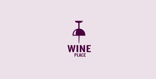
Many of my favorite logos can be interpreted in at least two ways. The visual entendre is exactly this tactic, which wraps two images into the same visual object. There are quite a few examples of this design strategy out there, but the example Johnson uses is too perfect to ignore, the WinePlace logo.WinePlace LogoThe logo is shaped like a thumbtack, seemingly marking a place or location, but if you look for more than a split second you will easily see the object also looks like an upside down wine glass. This sort of visual “trickery” encourages viewers to look a little longer and absorb the image (and brand name) more than the average glance. It is memorable for its creativity, but also because you force people to pay attention for longer.
Another added benefit of the strategy is that by nature your design must be simple to play two objects into the same image. As you’ll see, simplicity is a great rule of logo design.

2) Pay Attention to Color

One of the most basic facts of design is that color is not simply an aesthetic decision. Every color and tint carries a specific set of meanings and ideas, which often seem so embedded in our brains that our reactions are subconscious.

Many brands will have already noted this and might very well require you to stick to a very specific brand palette, but thats not always the case. On the chance that you have freedom to choose the colors of the design, you will want to pay close attention to picking the colors that will not only look good together, but also represent the nature of the brand.

On top of this, you should make sure the logo will also look clear and distinguishable if it must be printed in grayscale. Not every memo and press release will be full color, and you don’t want to lose the impact or recognizability of the logo just because someone xeroxed a company report.

3) Avoid Cliches

Trends are something that are unavoidable, but you might think twice before playing into what is hot at the moment with your logo design. Sure a popular styled logo might gain you some favor in the moment, but your logo is intended to represent your brand for years to come. You want it to be memorable enough that your logo outlives the current trends.

Fake Hipster Logo - Source: Design Shack

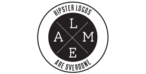
The current example is the dramatic overuse of the circular logo, generally styled vaguely like an old college patch or badge. Circles are popular in design and these types of logos are slightly retro, but just modern enough to have become a terribly common site across the web. But, it also means they are all interchangeable. I don’t remember any brand using the style because they all look the same eventually.

4) Custom Type Never Goes Out Of Style

Coca-Cola Logo

Some of the most popular logos throughout time rely on very little to be successful. Just think of Coca-Cola’s logo. All they need is their signature red color and a custom typeface so notable it has become the source of countless rip-offs and parodies.

The best part of using custom type is that it isn’t immediately able to be copied. Designers looking for a quick and easy way to jump on a potentially successful bandwagon are quick to begin using a font. But, if you have your type hand-designed, it takes a lot more effort to mimic. The irregularities that make custom type so special also make it too unique for a simple conversion to a font.

5) Keep It Simple

Apple-Nike Logos

While custom fonts are certainly a simple but effective way to make your mark, some designers don’t specialize in illustration or typography. That doesn’t mean they are out of luck. Many of the most famous logos in the modern day don’t feature any type whatsoever.

These logos take design to an even simpler stage, where all you need are simple shapes that are as iconic as they are refined. Apple began with their trademark bit apple shape, but originally it was striped with color. Gradually, they began to shift the logo to what looked like a brushed metal apple, but these days you won’t find any of those flourishes. All they need to be memorable is the silhouette of the apple, with that special bite taken out.

Conclusion

There are of course many other approaches you can take to making a memorable logo. For example, Johnson also brings up a discussion of symmetry and proportion in logo design that is better fit for a more in-depth analysis. Simply put, great logos don’t leave things to chance. But the truth is, if you want a truly memorable logo, you might start by trying to create something unlike those before.

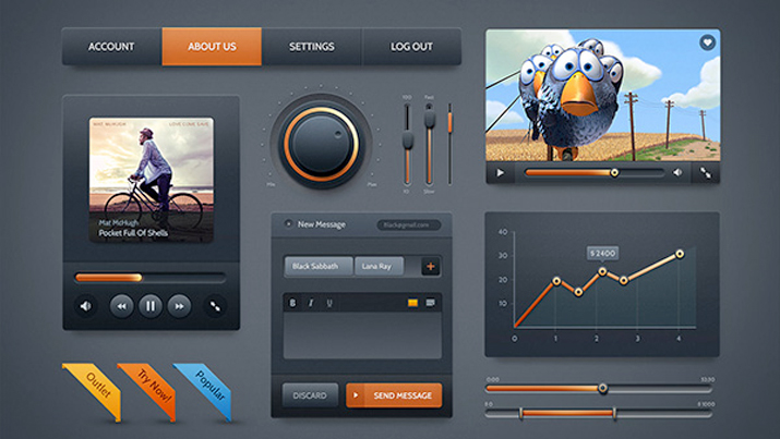
Design Kit Screenshot

In general, web designers seem to like tools and resources that speed up their work and ease some headaches. This is most notable by the sheer number of them available. Nearly every design blog or website offers some unique design kit or has a recent blog post sharing the best recent kits.

You might be asking what a design kit is, but these kits aren’t uniform. They come in all shapes and sizes, varying wildly in scope and cost. They also range in quality from ‘incredibly useful’ to ‘waste of harddrive space.’ The best definition for a design kit is any prepackaged tool or piece of software which aids in the creation of a digital design project.

Some design kits come with interface packs, buttons, and graphics all intended to be used together. They may come with a specific color and font palette, but they are almost always customizable. Some kits are niche designs aimed at solving a specific problem, while others are catch-all assortment or full design templates.

The thing is, while these design kits can definitely help a designer in a time-crunch, they have their fair share of drawbacks, as Carrie Cousins discussed in her recent article for Design Shack.

  • Costs – One of the biggest issues with these kits is they don’t always come cheap. There are some great free kits available, but you should expect to pay for kits filled with premium features. For some budgets, this alone can rule out using a specific design kit. Thankfully most kits are relatively cheap for single license use.
  • Too Similar – Some kits begin to look bland because all of the parts are designed to be used together, but without a full finished design in mind. This can result in kits with 50 nearly identical buttons in an assortment of colors. It is up to the designer to choose parts that will look interesting together, but it can be tiring trying to sort out a repetitive and boring kit.
  • Incomplete Kit – Be careful to read all of the details for any kit before you buy so you know what you’re getting. A 1,000 piece kit may seem really useful and interesting until you discover it is largely made or elements you can’t really use. Many kits are themed and only contain certain types of icons such as social media buttons or calendar icons. Don’t spend money on something that doesn’t offer what you need.
  • Looks Too Much Like Another Site – Obviously the biggest problem with using pre-made tools and elements is eventually you’re site will look astonishingly like someone else’s who also used the tool. Many designers aspire to work solely from scratch specifically to avoid this problem, but you don’t have to completely swear off design kits to be original. Use the kit as a starting point. If you use all the elements and layouts as they came, you’re much more likely to look like any other site. If you spend the time to give these elements your own personal touch, you’ll look equally unique.

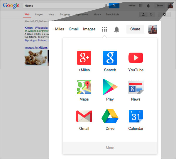
Google LogoYesterday you may have noticed a couple changes when you opened up Google. The first is the most obvious – it was accompanied by a little help box explaining the change – but Google has officially implemented their new app launcher in the main Google navigation bar for quick and easy access to other Google products.

You’ll be familiar with this app launcher if you use Android devices or Chromebook computers. Search Engine Land also reports that the grid-style launcher has been in testing since February or earlier.

Google App Launcher

The other change is a lot more subtle, but still of note for the design community. Google has flattened their logo, keeping up with the hot trend. Flat design is especially popular at the moment as Apple’s new flat iOS also rolled out earlier this week. The colors in the Google logo are also slightly different, but you won’t be too thrown off by the tweaks.

Many will have already seen the updates, but if you’re Google page still looks the same as it always has, be patient. Google says it should be completely rolled out over the next couple months on most Google products.

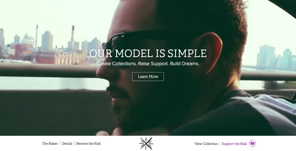
Risk Everything


For much of the history of the internet, one of the biggest guiding pressures was to fit as much content into the immediately visible area of the page while also providing an aesthetically pleasant view. The focus on “above-the-fold” design meant most sites generally have a header taking up 20-30 percent of the screen, including navigation, with content immediately available below. But, these days many designers are eschewing the old ways in favor of going big.

Many web designers are using oversized layouts with large, gorgeous images and videos, and luscious typography to immediately catch visitors’ attention. They make a statement immediately, and encourage users to begin interacting with the site. By opening the composition of your page and expanding everything, you push users to take in the sight and then start scrolling to see more, especially when combined with parallax scrolling and effects. As Carrie Cousins explains, “because the design is divided into screens that are unique, having something supersize on each is a great way to keep users interacting with the content.”

These types of websites also show that the designer or brand pushes past the standard for something more. Rather than relying on stock images, these oversized layouts are based on unique and visually exciting imagery. You get to showcase great visuals, which then showcase your own work.

The copy on your page also gets more attention on oversized layouts. There are less huge blocks of text to overstimulate the user at once, while the impressive layout draws attention to the text. Oversized layouts also allow designers to increase the size of text, demanding the attention of viewers. This is all bolstered by the use of quality typography which is allowed to standout on these types of layouts.

Cousins has a few other tips which will help designers play with the new larger possibilities of web design. While many clients may call for something more traditional, some projects allow you to expand your abilities and demand more of viewers while rewarding them with a gratifying user experience.

iOS 7 IconAs Apple announced last Tuesday, iOS 7 will be here September 18, and everyone with an iPhone or iPad will be seeing drastic aesthetic changes to their device. The redesign also inspired quite a bit of controversy and argument, but at this point there is little use fighting the new “almost flat” design requirements for apps and the Apple interface. The new iOS will be here in a few days, and designers have to either get on board or get left behind.

With a new iOS comes a complete redesign of most apps as well. Apple has already released guidelines for users to update their apps, and many have already shown drastic changes. But, many designers are still trying to figure out how to adapt their old app to the new style and interface requirements. But, there are many tools to help you along with the redesign. Alvaris Falcon compiled 10 of the best high quality tools and UI kits that will speed up the whole process. Best of all, all of the tools listed are free.

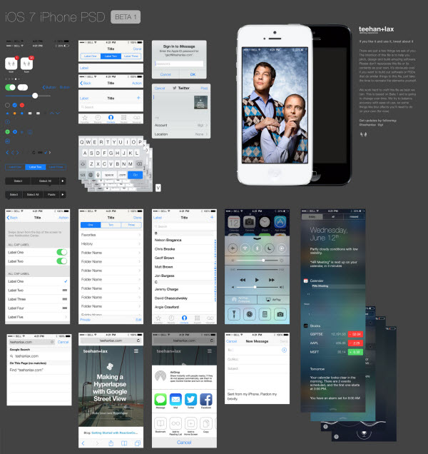
Many of these tools are designed to help you with the entire process all at once. The iPhone GUI from Teehan+Lax, for example, included everything you could need to update an app for the latest version of iOS. Others are more specialized. There is Home Screen, which offers an editable iPhone mockup, complete with home screen designs and icons. The App Icons Template similarly offers a simple template which aims to ensure your new icon looks great and fits all the requirements.

There are plenty of other options at your fingertips and it is up to you to choose the best tools for the way you design. Some will want to rely heavily on complete toolkits, while other designers are only looking for templates and inspiration for their creative jumping off point. Either way, if you choose any of the resources listed by Falcon, you’ll know you’re using a quality tool.

iPhone GUI

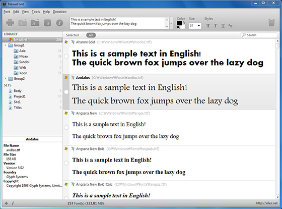
Nexus FontIf you haven’t heard from me and every other web design writer, typography is a really big deal in web design right now. How you decide to use typography on your website can affect how your audience perceives you and judges your quality. But there are so many options. Your font should always be legible, but it also needs to be charming and visually interesting.

If you use the correct font in a design, you can greatly enhance the finished product. But, if you are careless and choose a font that doesn’t fit, it will stick out like a sore thumb. To put it simply, websites are absolutely reliant on typography.

As any designer can tell you however, a font collection can quickly become a huge pain. There are constantly new free and premium fonts coming out that you have to keep up with, or at least regularly browse. Then, you have to actually manage to organize and sort these, then figure out which to use in your next project. This can mean making lists, and doing constant comparisons between fonts.

Wouldn’t you like a tool or program to help you with all this? Of course you would, and of course the web design community has you already taken care of you with many options for both Mac and Windows. Andra Postolache collected a few of the best font management tools. Some are costly, while others are free. The only way to know whats right for you is to try them out.

Google AdWords New Style Test


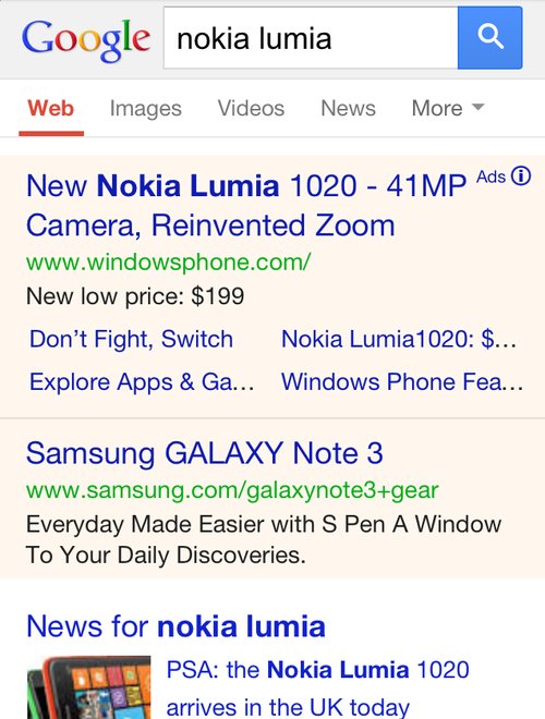
Over the next few days you might notice some changes to the way Google displays their mobile AdWords ads. Search Engine Land reports Google is currently testing out a new look which simultaneously makes the entire result page look more cohesive while keeping ads clearly labeled.

The first change you will likely notice is the way Google is using color. Google have been using lightly colored backgrounds to signify ads, but with this test they may be moving towards placing both ads and organic listings in white boxes in front of a gray background. Similarly, the gray background that has been behind the Google logo and search box is gone.

Instead of identifying ads with colored background, there is a new eye-catching yellow ad icon directly next to the display URL. The icon is significantly more attention grabbing than the old small “ad” that was previously to the right of the headline.

You can see the new style being tested above, while the current version is below.

Google AdWords Test Style Old

Mix and Match Typography Example

Typography has become more important in web design than ever before. Technological advancements have made it possible and practical to use nearly any font that you want on the web.

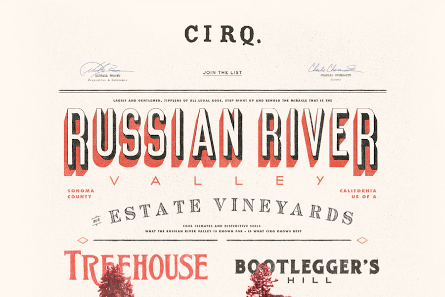
With the rise of interesting and well-thought out typography in web design, we have also seen new trends popping up in how people are using this typography. The first and most notable instance of this is the wave of retro typography on vintage style websites that is still prevalent across the web.

A newer trend we are starting to see has been around for a while in other types of design, but it becoming very popular for websites who want to establish their brand in bold and visually interesting ways. This “Mix and Match” typography relies on the designer’s ability to choose the right fonts to complement not just the message, but the other typographic styles in use.

Some designers opt to use subtly different fonts that are only minutely unique from each other to establish a visual hierarchy of interest while maintaining cohesiveness. Others opt to go all out and harshly contrast fonts against each other to create a visual friction and energy.

Marcin Treder collected 15 examples of this “Mix and Match” typography so you can get some inspiration to try out the style yourself. The rule of thumb for using fonts in web design has long been to never use more than three fonts in a design. It is clear that modern designers are finding ways to break that rule while creating classy and attractive designs.

Flat Design Example


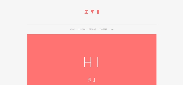
Flat design is undoubtedly one of the most popular design trends of the moment. You’ll find it online, on your phone, and it is even starting to make its way off the screen and onto posters and physical designs. It has already spit off into sub-categories of flat design like the so called “almost flat design” Apple is employing in their new iOS and the newly popular long shadow design.

But, the design style isn’t perfect. None are. The trendy style has numerous things it achieves very well, but there are far too many people glancing over the more problematic side of using flat design. Carrie Cousins wrote about the pros and cons of flat design, but plenty of people are willing to sell you on the upside of flat design. Today, I wanted to focus on the drawbacks.

It’s Trendy – While being trendy can be a positive – no one wants to be falling behind – you also have to be aware that flat design won’t last forever. As we’ve seen with the splintering into new iterations like long shadow design, the trends are already moving away from completely flat design, and there is no way of knowing when it will suddenly seem out of date entirely.

Usability – The simplification that lies underneath flat design can cause usability problems. Flat design can streamline a site, but it can also cause users to feel confused by the minimalistic interface. Many say they don’t know where they are supposed to click or tap, because the style does not do a good job defining what is and isn’t clickable.

Typography – Great typography looks absolutely marvelous in flat design, but boy does the style make it noticeable when typography is weak. Just look at iOS 7. The initial unveiling used an insanely thin typeface which many complained about. With layouts as simple as these, the eyes immediately go towards problem areas, and there is less to hide any flaws. If you aren’t great with fonts, you might ask for help or consider another style.

Too Simple – Not every site needs minimalism. The reason you haven’t seen flat design on many news sites is that the style isn’t good at conveying large amounts of information visually or textually. The style demands short phrases, impactful concise words, and full paragraphs just don’t tend to fit. The style of your site should entirely depend on the needs of your site. If you fill like you’re having to cut too much to fit into the trend, you should choose another design solution.

Sprout Serif


There is something inherently nostalgic and sweet about handwritten fonts in design projects. Not only do they make designs feel more personal and loan some much needed personality to your projects, they immediately draw the eye in ways that your more standardized and formal typefaces don’t. They elicit emotion and a personal connection. You can’t say the same for Times New Roman, for sure.

Of course, handwritten fonts are all unique and can be used for a huge array of design projects. There are script fonts with extensive flourishes which look right at home on wedding invitations and greeting cards, but there are also the more shaky fonts designed to recreate the look and feel of journal entries or rushed messages. There might literally be a handwritten styled font for every occasion.

Naturally, these fonts work as well in digital or web design as they do in print media. Websites can strongly benefit from the more intimate appearance their copy adopts when using a handwritten font. You can charm visitors or make them feel more comfortable with the right font selection, but the key is knowing how to pick and use these styles.

For instance, many of the fonts that look handwritten push the bounds of legibility. There are those which look scrawled out in thick marker, as well as the extravagant scripts which can be obscured by their own ornamentation. These styles can absolutely work well, but they are best reserved for headers or isolated small blocks of text intended to make an impact, because readers absolutely won’t spend their time trying to make sense of blog articles or extensive copy that is hard to read. These styles attract visual interest, but don’t work in excess.

There are plenty of handwritten fonts that do work for blurbs or more extensive copy, though you have to walk a fine line when using them. It is still best to use traditional fonts for comprehensive blogs or anything that will take more than a handful of seconds to read, but front page sections such as navigation or small “about us” blurbs can be made more interesting with a immediately legible but unique handwritten style.

Maryam Taheri collected 12 handwritten fonts that work in a variety of situations. You won’t find the swirly decorative script fonts most tend to imagine when they think of handwritten typefaces, but you will find a wide variety of fonts which will make your site seem charming, intimate, and unique.