Blank gridded notepadConceptualizing a mobile or desktop site has never been as easy as it is today with the huge range of wireframing and prototyping tools at our fingertips. Long gone are the days of sitting down with pen and paper and tossing away pages every time you wanted to change a small detail. To many designers out there, that is a relief, but Lennart Hennigs, writer for Smashing Magazine, suggests it may be better for the final product to revert back to the old ways and undertaking hours of sketching.

Hennigs suggests that these tools which have made getting started on a website faster than ever before are also making us skip over key step that leads to the best results possible: taking to time to actually understand the problem.

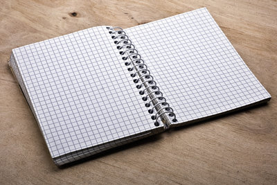
Many designers are afraid of white or empty space. The pressure to start from nothing can sometimes be intense, especially on important projects, but when we start to map out the project and work out the problems we also start to create solutions. We aren’t just fixing problems on the paper when we sketch, though. We also generate new ideas out of the lack of established details. Your brain automatically fills in the blanks, and you can often be surprised by what you imagine. The best part of all of this is exploring these options without being forced to commit.

With sketches, you can have three our four different options for a single screen on a single page, all in progress at the same time. You can explore every option you want, and if something goes wrong, mark that design out or throw it away. With prototyping, it isn’t so easy. Prototyping is slower and when it takes more time to create something, we get more attached to it even when it isn’t the best possible design. It is hard to outright throw away a prototype you’ve spent an hour or more on.

The big reason some designers were so happy to see prototyping tools become widely available is they were sketching wrong. Your sketches don’t have to look good, and you definitely don’t need to spend hours cleaning up lines or making them look good. You are conveying ideas, not the final product. You don’t need to be Rembrandt, you just need to get the ideas on the paper. Think of it like writing, you have to be legible enough to communicate the information, but sloppy penmanship doesn’t matter if it is still legible. Similarly, you’re sketches don’t need to look pretty so long as they formulate ideas and could communicate them to collaborators.

If you’re sold on stepping back one step in your design process and opening yourself to new ideas you normally wouldn’t get during the prototyping step, don’t worry about your artistic skills or anything like that. Hennigs suggests more than a few tips in his article for getting started and how to approach the new old part of design.

Source: Stock.xchangIt took a couple weeks for everything to even back out after the recent Penguin update, and now its time to start looking forward to what is coming up in SEO. It is an especially good time to make predictions for the rest of 2013 as we are just now passing the halfway point in the year and Google has made some of their intentions moving forward very clear.

Google has pulled out the big guns in their fight against spam, and have publicly stated their interests in user experience through site design and quality content. None of that is a surprise, but at the turn of the year none of it had actually been confirmed by people within the search engine juggernaut. A few months later and Matt Cutts basically confirmed everything we assumed before. Focus on the user and don’t try to cheat or loophole your way to the top and you should be fine.

Still, Google isn’t content to simply focus on one or two things at a time, and there are bound to be quite a few other changes in the near future that we haven’t been told about. Jayson DeMers analyzed all of the evidence from Google’s more subtle changes and announcements in the past few months to attempt to make predictions for what we might be seeing in the next year or so in SEO. They are all just guesses from the information available, but it’s always good to stay ahead of the curve and aware of changes that may be on the horizon.

User experience is more important now than ever. A few years ago, visitors would put up with a glitchy or poorly functioning site because the internet as a whole was less developed. Now, if one site doesn’t work well, visitors will simply look for another that was designed properly and responds how they want it to.

Visitors aren’t the only ones who care about user experience, either. Search engines are putting a bigger and bigger emphasis on how much users will enjoy a site instead of focusing on technical things like linkbuilding that visitors won’t ever notice.

Robert Hoekman has been working in the web industry for thirteen years and has first hand seen the changes happening as user experience became one of the most important aspects of running a website. While there are a few dissenters, Hoekman is part of the majority who are happy to see websites being designed for users, not for designers or search engines. However, he knows some designers have had some growing pains during the transition.

To help designers understand the importance of user experience and why it is the key to creating a well ranked and well liked site, Hoekman created a list of 13 tenets of user experience (one for every year he has spent in the business). If you don’t get what the big deal is or why user experience was bound from the beginning to become the most prized aspect of design, his rules should make it all clear.

Source: Steven Depolo

Source: Steven Depolo

Any honest person working in SEO will tell you the industry has its fair share of problems. While many of these problems are a result of less than straight forward information from search engines about how their algorithms actually work, a large amount of the issues within the industry come from bad SEO consultants who will do anything to get a new client.

This isn’t to say that the industry is a scam or that even the majority of SEOs are bad, but there are more than a few SEO consultants who will tell you just about anything to “make the sale.” How do you know who to trust? You can look at what the SEO tells you to start. For example, if any SEO company tells you they can get you the top spot on Google no matter what or improve your rankings immediately, they are likely a bad choice. But, sometimes it is better to look at what they don’t tell you.

Marketers are trained in knowing what to say and what not to say, but that idea should be reserved strictly for the optimization and actual marketing on the pages they run, not meetings with clients. Pratik Dholakiya has been working in SEO for years and has run into his fair share of bad SEO consultants and recently shared a list of things they will try to hide from potential clients. Most consultants will give you a realistic idea what to expect when you’re considering hiring someone to optimize for you, but if they avoid telling you any of the five things on his list, chances are they are hiding much more and you should think twice before signing a contract with them.

We’ve reached the half-way point in the year, and more than a couple web design websites have started sharing their lists of trends for the year. But, most of these lists seem oddly familiar. Anyone keeping up with the blogs and news has already seen more articles on the popularity of minimalism, flat design, responsive design, and typography.

None of those articles are wrong, but surprisingly not much has changed in web design trends over the past six months. The trends gaining traction at the beginning of the year have just ingrained themselves even further into web design, but there are a couple things that have managed to start gaining traction that are worth noting.

Creative Overflow recently shared one of these lists of “new” trends in web design, but surprisingly not a single entry on the list is the least bit new. Minimalism goes hand in hand with responsive design which is quickly becoming a standard. Minimalistic sites also rely strongly on typography because they forsake all the other common embellishments. Elsewhere, the rise of high definition screens on everything from our phones to our computers has led many designers to begin using lush background photography rather than simple colors, because there is now a high enough resolution to differentiate the text from more complex images.

At this point, there is little doubt you’ve heard about all of these issues, but there are a couple more trends slowly spreading that have been less discussed, though they’re far from new.
Detailed illustrations have been a popular part of the internet for quite a while now, but on sites that want to appear light-hearted or nostalgic these illustrations have almost become prerequisite. The illustrations tend to give a sort of hand-crafted charm to sites as well as shying away from the edgy or dramatic moods prevalent on more “serious” minded sites.

An even more popular trend that has been steadily growing for the past couple years is the use of circles. We tend not to think about it, but the internet has been largely rectangular for much of its history, but with the advent of smartphones and touch screens, the use of circles has become shorthand for interactive features. If you want someone to touch something on the screen, make it a circle. Of course, it has outgrown the touch-focused usage, and circles are now just a hugely popular motif in design. Once touch interfaces turned to circles instead of squares, it opened up the floodgates for designers of all kinds to step outside the box based designs.

When most people think of SEO, they see it as a way to earn the top spot (or close to it) on the search engine result pages (SERPs). Markets can be highly competitive, and if SEO can get you above others in your industry than most companies see the process as being worth their time and money. While that is true in some ways, it is also far from the whole truth.

The wide perception about SEO implies that it is only really important for largely internet based businesses or those in competitive markets. However, SEO can benefit anyone who wants to develop an online presence and make themselves available to the ever-increasing number of consumers who use the internet as their primary shopping tool.

Small or niche businesses with limited resources may ask what the point of investing in SEO could be when there is little to no competition. What is the point when you’ve already earned the top spot, with no signs of losing it in the future? Amanda DiSilvestro has spent quite a lot of time considering this issue (enough for two separate articles across different sites) and the conclusive answer is that SEO can help businesses in niche markets in tons of ways that may not seem apparent at first.

Optimization means improving usability

Between Google’s recent shift of focus from links and keywords to quality usability for users, many aspects of optimization are centered entirely on improving how your site functions for the people that actually use it. SEO can be perceived as a marketing tactic, but it is more importantly a usability tactic. Sites that readers enjoy using are more valuable than those that barely function, and Google recognizes that and ranks sites accordingly.

You’ll have competition eventually

No matter how niche your business is today, eventually the vast majority of companies will see competition. Chances are, if you don’t see competition eventually your niche is in danger of becoming irrelevant. Either way, it is always best to be ahead of any competition that arises, and solid SEO essentially helps you fortify your grasp on the market. Rather than battling a new competitor when they show up, you’ll be prepared and far ahead of their attempts to overthrow you.

You want to be the best, not the only option

Ignoring SEO means your site isn’t living up to its potential. Customers view site usability and professionalism as indicators of the reputability of the company running the page. Because SEO is becoming synonymous with usability, optimizing your site communicates your value to search engines and your users at the same time. If consumers see you as the only option, but think your site and brand look sub par, they will view you as the only option they have rather than the best possible option. That pushes potential customers away and could even cause an enterprising individual who notices your weakness to try to enter your little market.

Conclusion

SEO isn’t immediate. It takes a lot of time to get the results you want. While you may feel comfortably established as the top (or only) option in your niche, things always change eventually. Getting ahead of the curve will save you stress in the long run and make potential customers trust your company more.

grid4


Apple’s keynote event earlier this month made news across the world, and few were impacted by the announcement of the new mobile operating system iOS7 more than designers and developers. While consumers will be receiving an updated user experience and new aesthetics on their phones and iPads in the next few months, designers are rushing to update apps and icons to keep their content up to date and optimized for the new operating system.

These designers won’t be forced to redesign from the ground up, however. There are already numerous resources available to help update to the new iOS. Designmodo is gradually collecting the best of these resources, and they recently highlighted two different icon grids for iOS, which are templates which you build icons on top of.

Beyond offering a few simple grids to assist the icon redesign process, there are also tons of examples of updated icons to help get designers steered in the right direction before the public has even gotten a hands-on turn at the operating system.

For those still pushing backlinks as the golden goose of SEO, a recent revision to Google’s Ranking help guidelines could be potentially frightening. But, if you’ve been watching the changes in SEO over the past few years it shouldn’t come as much of a surprise. Google has become more and more strict about backlink quality and linkbuilding methods, and links were bound to be dethroned.

As reported by Search Engine Watch, it was spotted late last week that Google updated the Ranking help article to say “in general, webmasters can improve the rank of their sites by creating high-quality sites that users will want to use and share.” Before, it told webmasters that they could improve their rank “by increasing the number of high-quality sites that link to their pages.”

There have been countless signs that Google would officially step back from linkbuilding as one of the most important ranking signals. There were widespread complaints for a while about competitors using negative SEO techniques like pointing bad links to websites, and every Penguin iteration that comes out is a significant event in SEO.

To top it all off, when Matt Cutts, the esteemed Google engineer, was asked about the top 5 basic SEO mistakes, he spent a lot of time talking about the misplaced emphasis on link building.

“I wouldn’t put too much of a tunnel vision focus on just links,” Cutts said. “I would try to think instead about what I can do to market my website to make it more well known within my community, or more broadly, without only thinking about search engines.”

Tools, templates, plug-ins, and script libraries are all a huge part of web design. If we create absolutely everything from scratch, we often end up spending way more time than necessary to get the same results. We keep complete creative control, while streamlining our process to keep our work fast enough to keep clients happy and stay competitive.

So many tools come out every month, that some websites run weekly round-ups of all the new fancy toys we can use to make beautiful websites without draining all of our time and energy on individual products, but this also means many great tools get lost in the mix, or downloaded to be used once and forgotten.

To keep you from wading through duds, out-dated tools, and countless versions of tools that achieve essentially the same thing, Speckyboy collected 50 of the best resources and tools that have been released over the past year. Time is priceless to designers and all of these tools strive to make sure every minute you spend designing counts.

If you’ve ever doubted the importance of SEO and high rankings, a new study from online ad network Chitika shows the higher the rankings, the more traffic sites get. And the differences are drastic. First place rankings pull in 33 percent of the web traffic from search engine results pages. Second place can receive as much as 18 percent of the visitors, and traffic steadily drops off from there.

The recent study has very similar results to one the team ran in 2010, which suggests that there is little expected change in how users are interacting with search engines and highlights the importance of SEO in receiving web traffic.

Chitika Search Analysis


Chitika said in their announcement, “While being the number one result on a Google search results page is obviously important, these numbers show just how big of an advantage websites of this type have over any competitors listed below them. The importance of SEO for online business is seemingly quantified by these latest statistics, which, judging by their similarity to those observed as part of the 2010 study, are not likely to change significantly in the near future.”

Another expected find of the study is the drop off of traffic from Page 1 to Page 2 of results pages. The search engine result page users see gets 92 percent of all traffic, so getting stuck a couple pages back can result in practical invisibility for your site. However, if you aren’t showing up on the first page, it appears gaining the top spot of whatever page you are on will get you higher rankings than the others on that page.

If you’re interested in Chitika’s methodology for the study, you can see their full report, and Jessica Lee provided further analysis over at Search Engine Watch.