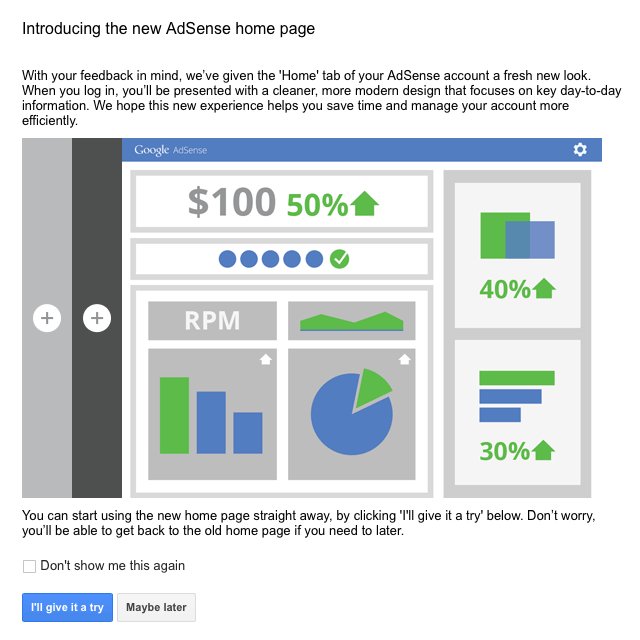
The gradual remodeling going on over at Google has made its way to AdSense. After subtly redoing their homepage and their logo, as well as those for select other Google products, the search engine is testing a new home page design for the AdSense publisher console.
The new design can be seen immediately by logging into google.com/adsense. You will be presented with an option to try out the design or continue using the older style for the moment. They also clarify that you can return to the original home page if you decide you aren’t enjoying the new layout, which intends to help you “focus on key day-to-day information.”
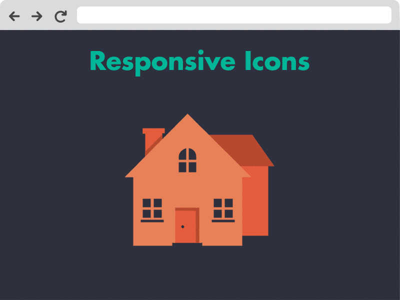
All of the big design trends of the year have settled in to the point where they no longer seem new. Responsive design, flat design, responsive typography, and even longshadow design have all reached wide awareness in design. So, obviously that means it is time to find the next big thing. Last week, Paula Borowska asserted that is going to be responsive icons.
What is It?
Responsive icons aren’t what you probably imagine. These days, responsive usually indicates a design element that responds to screen size, but responsive icons are only based on the size they are presented in. Because they can be shown in different sizes multiple times on the same page, screensize is irrelevant to determining the appearance of the icons. It is all about the actual size of the icon itself.
Source: Designmodo
The difference between icons is the level of detail. When you’re gifted with a huge icon (500px by 500px), you’re able to squeeze in a lot of detail. But, as you shrink it, you will want to take away a bit of that detail at a time without losing the intended message. At 250px by 250px, you want to keep the general form, but cut some decoration, while a 25px by 25px icon needs to be as simple as possible to keep the message clear.
Why Does This Matter?
With the rise of incredibly high detail screens on all of our devices, it is necessary to make sure every aspect of our pages maintain uniformity while also working in every size. While a responsive icon doesn’t always respond to screen size, a responsive site with responsive icons may resize the icons as it needs while keeping everything looking great.
Font icons, responsive websites, and minimalistic designs have not only raised the popularity of using icons in design, but it has changed how we use them entirely. This gives us the opportunity to take our icons a step further and improve the entire experience of your site.
Borowska offers some deeper analysis on the icons as well as discussing groups attempting to make responsive icons easier to create; right now they are pretty tricky. It may seem like a small unnoticeable flourish, but in web design the details matter most. I’d keep your eyes on these icons going into the next year.
00Taylor Ballhttps://www.tulsamarketingonline.com/wp-content/uploads/2018/07/TMO-Logo.pngTaylor Ball2013-11-15 11:51:252013-11-15 11:51:25Responsive Icons: The Next Big Trend in Web Design?
CSS has so many measurement units that it can be difficult to keep everything straight. Each measurement system has its own benefits, and it is easy to find yourself wondering which one is correct. Many designers just decide to use a single unit for everything, but you are limiting yourself by not putting some thought into the units you decide to use in CSS. Thankfully, demosthenes.info put together a great list of guidelines to help you pick the best measurement unit for the task.
Pixels (px)
Pixels are best used for hairline borders and general elements when creating fixed-width designs. It is also a good choice for CSS shadow displacement. But, when using pixels as your unit you need to avoid @media breakpoints, because they break pages when zooming – use rem or em instead.
Don’t use for: typography, except when setting a base font-size in a CSS reset.
Percentage (%)
This is great for making responsive images and containers, as well as setting height on the body in certain situations.
Don’t use for: typography, except in a font-size CSS reset.
em, ex
Use em or ex or typography and elements related to it, such as margins. However, as the guidelines point out, em and ex have subtle “gotchas” when used in complex layout. In this case, rem should be substituted.
Points and picas
These are only good for print stylesheets. Seriously, don’t use them for anything else.
rem
This is a more capable and predictable replacement for em and ex, that is best used for the same purposes, as well as @media query breakpoints.
Viewport units (vh & vw)
These are best for responsive typography and so-called “perfect” responsive containers.
Character (ch)
Use this for sizing and adjusting monospaced fonts, though browsers do have some issues with this unit.
https://www.tulsamarketingonline.com/wp-content/uploads/2018/11/tv-channel-3413659_1280.jpg7131280Taylor Ballhttps://www.tulsamarketingonline.com/wp-content/uploads/2018/07/TMO-Logo.pngTaylor Ball2013-11-14 12:44:452013-11-14 12:44:45Choosing The Best CSS Measurement Unit For The Situation
A few weeks ago, select Firefox users noticed a new “card” layout in the About page for local listings. Beginning Tuesday, it appears the layout has begun to roll out world wide. Mike Blumenthal explained the new layout, saying:
The big difference is that the page now can be displayed in either a single, two or three column layouts depending on browser window width as opposed to the current fixed two column display. Reviews will now follow the same columnar structure as the rest of the page and will not be limited to a current one column display. While this view is not yet visible in mobile, one assumes that if the view were to become universal it would likely push to mobile as well.
The page adds three iconic based calls to action near the top; review, directions & photos. The review summary has been moved up the page and photos have been moved down the page. Geo information including street address, category, hours, description and map are now consolidated into a single card near the top titled “Contact Information. “Similar Places” from around the web no longer show and “reviews from around the web” have been moved up the page to be nearer the top.
But, with the change has come an issue with reviews, at least temporarily. As of Tuesday, the number of reviews listed in the information for local businesses has dropped or begun to show wildly inaccurate review counts. It is unclear whether the actual reviews have disappeared or whether the counts are the only aspect to be affected, but users are reporting as much as a 30 review count drop. It is safe to assume the issue will be resolved quickly as the new layout is ironed out.
00Taylor Ballhttps://www.tulsamarketingonline.com/wp-content/uploads/2018/07/TMO-Logo.pngTaylor Ball2013-11-13 14:01:282013-11-13 14:01:28Google Rolls Out New Card Layout For Local Listings
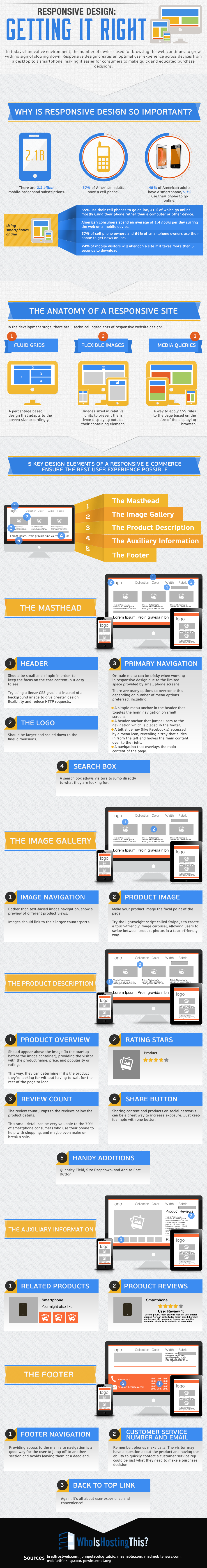
Creating a website that works well on the huge range of devices is no easy task. In fact, creating a website with a solid user experience on every device being used to access your site may actually be impossible. You have to account for a variety of screen sizes, creating a site that loads quickly enough to keep a user from losing interest, and the fact that no everyone has the newest devices for browsing the web. In fact, many are using devices that are quite outdated, which can be an issue for modern designers.
Responsive design is the popular solution for these problems, but it isn’t a magic fix. Responsive design methods certainly make it easier to account for the huge range of devices connecting users to information, but without relentless testing and tweaking there will invariably be a few devices which run into problems accessing your website.
However, responsive design is still the best current solution for these issues. Your only real alternative solution is creating different websites for mobile and desktop users, but this still requires massive amounts of testing to make these sites usable for every device. It makes more sense to do all that work towards a single site, rather than two.
As Marianna Gallano explained, the most common approach to responsive design is to split pages into multiple elements, such as the header, image galleries, and product descriptions. Each element stands on its own in terms of functionality, but seamlessly transfer their look and user experience to various devices and screen sizes. This way, images are able to automatically scale and resize, while text always stays legible, even on the relatively small screen of a smartphone.
WhoIsHostingThis, a site covering news for webmasters and webhosting, created an infographic to break down what responsive design really is, why it is so important, and how each element of a site functions within the whole while responding to a variety of screen sizes.
00Maxhttps://www.tulsamarketingonline.com/wp-content/uploads/2018/07/TMO-Logo.pngMax2013-11-05 15:42:162013-11-05 15:42:16The Most Important Information You Need About Responsive Design [Infographic]
Most people may not know this, but web design has two distinct sides. You’ll notice this when you begin to build a site and learn you need to hire a designer and a web developer, or one of those rare few who are great at both. But, what does this actually mean? Why do you need two separate people to build one site?
The Designer
To understand why web design has these two distinct facets, you have to understand the basics of how a site is created. A web designer creates the look and style of your page using graphics and design software such as Photoshop. But, this design isn’t a functional site. To bring everything to life, the design has to be coupled with code.
The designer is generally considered to be creative side of the team. Their job is to work with the client to dream up a look and feel that matches the brand. These are the artists who you imagine working to create a website. A web designer succeeding in the current market will be able to tell you all about color and typography, the importance of spacial relationships, and how these effect your audience.
The Developer
The developer is the “behind-the-scenes” person who makes everything run. These are the people who actually build the skeleton and muscles to the designer’s skin. They use HTML, Javascript, JQuery, and CSS to make everything technically work together.
This is the technical side of the creation process. These people usually have a degree in computer science or programming, and are very technologically minded. While a designer may be creative, a developer will likely be more detail-oriented.
Why Not Both?
While these sound like separate jobs, they are both working towards the same goal. You can’t have one without the other. But do you really need two separate people for this? In the current market, the answer is most often yes. While many designers are relatively informed on coding, and developers are aware of the creative process establishing the look of the site, these are both complex jobs which require specialized talents.
There are those who bill themselves as both, and many are perfectly capable of building an entire site by themselves. However, these are few and far in between. The best designers and developers have read up on the other side of the process, and may even have a fair amount of technical skill. But, you’ll benefit from building a team instead. The extra set of eyes will spot any flaws before resources are invested in the wrong areas, and you’ll have someone specially suited for sides on either side of the aisle.
00Maxhttps://www.tulsamarketingonline.com/wp-content/uploads/2018/07/TMO-Logo.pngMax2013-10-29 15:18:412013-10-29 15:18:41Why Do You Need A Designer and a Developer For Your Site?
Now that the dust has settled after some extended debate, it seems clear that responsive design is here to stay. It won’t last forever, but it certainly isn’t a flashy trend that is going to fade away soon. It makes sense responsive design would catch on like it has, as it makes designing for the multitude of devices used to access the internet much easier than ever before.
Almost as many people accessing the internet right this moment are doing so using a smartphone or tablet, but they aren’t all using the same devices. A normal website designed to look great on a desktop won’t look good on a smartphone, but similarly a site designed to work well on the new iPhone won’t have the same results on a Galaxy Note 3.
This problem has two feasible solutions for designers. Either you can design multiple versions of a website, so that there is a workable option for smartphones, tablets, and desktops, or you can create a responsive website which will look good on every device. Both options require you to test your site on numerous devices to ensure it actually works great across the board, but a responsive site means you only have to actually design one site. The rest of the work is in the tweaking to optimize the site for individual devices.
That all explains why designers love responsive design as a solution for the greatly expanding internet browsing options, but we have to please other people with our designs as well. Thankfully, responsive design has benefits for everyone involved. The design solution is even great for search engine optimization, which is normally not the case with design and optimization working together. Saurabh Tyagi explains how responsive design benefits SEO as much as it does consumers.
Google Favors Responsive Sites
SEO professionals spend a lot of their time and efforts simply trying to appease the Google Gods, or trying to follow the current best practices while also managing to outplay their competition. Google has officially included responsive design into its best practice guidelines, as well as issuing public statements calling for websites to adopt the design strategy, so naturally SEOs have come to love it.
One of the biggest reasons Google loves responsive sites is that it allows websites to use the same URL for a mobile site as they do for a desktop site, instead of redirecting users. A site with separate URLs will have a harder time gaining in the rankings than one with a single functional URL.
Improves the Bounce Rate
Getting users to stay on your page is actually easier than you might think. If you represent yourself honestly to search engines, and offer a functional, readable, and generally enjoyable website, users that click on your page are likely to stay there. By ensuring your website is functional and enjoyable on nearly every device, you ensure users are less likely to hit the back button.
Save on SEO
Having a separate mobile site from your desktop site means double the SEO work. Optimization is neither cheap, fast, or easy, so it doesn’t make sense to waste all that extra time and work on basically duplicate efforts. Instead of having to optimize two sites, responsive websites allow SEOs to put all their efforts into one site, saving you money and providing a more focused optimization effort.
Avoids Duplicate Content
When you’re having to manage running two sites for the same business, it is highly likely you will eventually end up accidentally placing duplicate content on one of the sites. If this becomes a regular problem, you can expect punishments from search engines which could be easily avoidable by simply having one site. Responsive design also makes it easier to direct users to the right content. One of Google’s biggest mobile pet peeves of the moment is the practice of consistently redirecting mobile users to the front page of the mobile site, rather than to the mobile version of the content they asked for. Responsive design avoids these types of issues altogether.
00Maxhttps://www.tulsamarketingonline.com/wp-content/uploads/2018/07/TMO-Logo.pngMax2013-10-25 12:18:472013-10-25 12:18:474 Ways Responsive Design Is Great For SEO
If you’ve spent much time online in the past year or two, it is almost certain you’ve come across an infographic. They are highly enjoyed by the public, as well as being educational. This is why more companies and content creators are using infographics to communicate and share knowledge with the public than ever before. Some may say it is just a trend, but either way the data shows that searches for infographics have risen over 800 percent in just two years, from 2010 to 2012.
Even if you don’t know what an infographic is, the chances still favor that you have seen one either in your Facebook feed, a news article, or maybe even your email. Infographics are images intended to share information, data, or knowledge in a quick and easily comprehensible way. They turn boring information into interesting visuals which not only make the information easier to understand, but also make the average viewer more interested in what is being communicated.
According to Albert Costill, multiple studies have found that 90 percent of the information we retain and remember is based on visual impact. Considering how much information take in on a day to day basis, and that means you’re content should be visually impressive if you want to have a hope of viewers remembering it. If you’re still unsure about infographics, there are several reasons you should consider at least including them occasionally within your content strategy.
Infographics are naturally more eye-catching than printed words, and a well laid-out infographic will catch viewers attention in ways standard text can’t. You’re free to use more images, colors, and even movement which are more immediately visually appealing.
The average online reader tends to scan text rather than reading every single word. Infographics combat this tendency by making viewers more likely to engage all of the information on the screen, but they also make it easier for those who still scan to find the information most important to them.
Infographics are more easily sharable than most other types of content. Most social networks are image friendly, so users are given two very simple ways to show their friends their favorite infographics. Readers can share a link directly to your site, or they can save the image and share it directly. The more easily content can be shared, the more likely it is to go viral.
Infographics can subliminally help reinforce your brand image, so long as you are consistent. Using consistent colors, shapes, and messages, combined with your logo all work to raise your brand awareness. You can see how well this works when you notice that every infographic relating to Facebook naturally uses “Facebook Blue” and reflects the style of their brand.
Obviously you shouldn’t be putting out an infographic every day. Blog posts still have their place in any content strategy. Plus, if you are creating infographics daily, it is likely their quality will suffer. Treat infographics as a tool that can be reserved for special occasions or pulled out when necessary. With the right balance, you’ll find your infographics can be more powerful and popular than you ever imagined.
00Maxhttps://www.tulsamarketingonline.com/wp-content/uploads/2018/07/TMO-Logo.pngMax2013-10-25 11:27:502013-10-25 11:27:504 Reasons You Should Be Including Infographics in Your Content Strategy
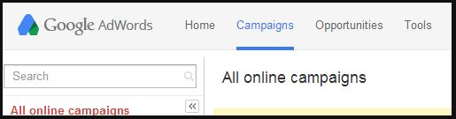
It seems like everything looks different over at Google these days. Not only has their logo subtly flattened out, but the way we see a significant number of searches has been greatly altered with the introduction of the Google Carousel. Now, AdWords seems to be following suit as reports have started to come in of a new logo and web UI design.
As Search Engine Land reported, Rick Galan tweeted out a screenshot of the new appearance. The logo is now integrated directly into the navigation bar and the green coloring of the bar has been replaced by Google’s widely used desaturated blue-grey.
The new AdWords logo might by signaling a redesign of all Google product logos towards a more flat design, such as what they have done with their flagship logo. Their old logo is below for comparison.
It could also simply just be a test as Google has not released any public statement or announcement for the logo, so much is unclear, especially how long a roll out might take. No one knows when we will see the change, but don’t be surprised if your AdWords experience looks different in the near future.
00TMOhttps://www.tulsamarketingonline.com/wp-content/uploads/2018/07/TMO-Logo.pngTMO2013-10-10 14:15:042013-10-10 14:15:04New Google AdWords Logo and Web UI Begins to Appear
Typography has become a fundamental part of design in every way, even making its way into web design over the past few years. You can’t just spill out words and letters onto a page and expect it to look good, and designers have turned the art of making typography look great into a science over hundreds of years.
Somehow, designer Ben Barrett-Forrest manages to condense all of this into a five minute long fun and informative stop motion animation about the history of fonts and typography, called… The History of Typography.
The short film starts out at Guttenberg and Blackletter, but manages to trace the history all the way through Futura, to pixel type and the technology that allows everyone to create their own typeface if they desire.
Barrett-Forrest used 291 paper letters, 2,454 photographs, and 140 hours of work to create the film.
https://www.tulsamarketingonline.com/wp-content/uploads/2018/07/TMO-Logo.png00TMOhttps://www.tulsamarketingonline.com/wp-content/uploads/2018/07/TMO-Logo.pngTMO2013-10-03 14:29:292013-10-03 14:29:295 Minute Animation Tells The History of Typography
 CSS has so many measurement units that it can be difficult to keep everything straight. Each measurement system has its own benefits, and it is easy to find yourself wondering which one is correct. Many designers just decide to use a single unit for everything, but you are limiting yourself by not putting some thought into the units you decide to use in CSS. Thankfully, demosthenes.info
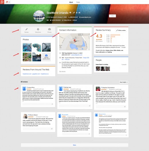


 It seems like everything looks different over at Google these days. Not only has their logo subtly
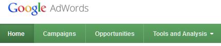
