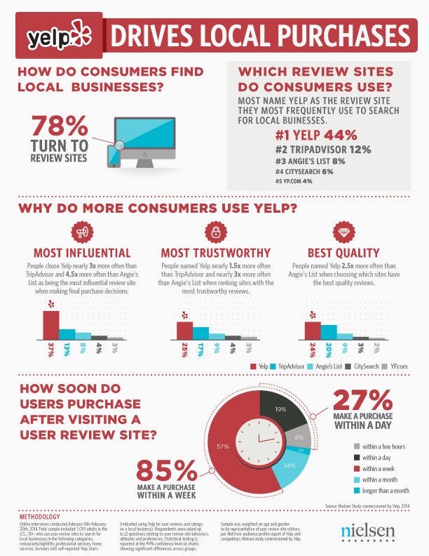
Earlier this week we reported on a recent study highlighting the growing influence of online reviews, and there is no service as closely associated with online reviews as Yelp. Of course, Yelp agrees and they’ve commissioned a new study from Nielsen survey data to show it is the most frequently used, most trusted, and even the highest quality local reviews site. But, many are skeptical of their findings.

The study used a sample of just over 1,000 US users of review sites, including competitors such as Angie’s List, Citysearch, OpenTable, TripAdvisor, YP, and Zagat. The survey consisted of 22 questions in all and the sample was weighted for age and gender to be representative of Nielsen’s NetView audience. In a blow to the credibility of the survey however, it seems only a few of the results were released – presumably the results which favored Yelp.

Out of what was released, the survey showed that 78 percent of consumers use review sites to find local businesses and help make purchase decisions, with Yelp taking the lead in several categories such as “most influential,” “most trustworthy,” and “best quality reviews.”

Another source of apprehension for this study was the decision not to include Google or Facebook. When asked, Yelp told Greg Sterling:

Our findings specifically around review sites came after we included Google and Facebook in a question on what sites people use to find local businesses, but those sites aren’t solely focused on local business discovery. We dug deeper into those sites that are.

That led Sterling to the conclusion that Google and Facebook likely exceed Yelp as a source for local business information, but it isn’t dishonest to exclude them from a study focusing specifically on “local business discovery” because both platforms have such broad usage.

The study isn’t completely invalid because of these inconsistencies. It goes without question that Yelp is at the forefront of local business discovery and reviewing and several other studies show that Yelp is in fact influential in local purchasing decisions. This study reinforces the fact that Yelp is a major player in these categories, but obviously it should be taken with some skepticism.

You can see the graphic displaying Yelp’s findings below:

6a00d83452b44469e201a73de98db6970d-800wi

You can find countless articles offering SEO tips filled with practical advice about how to stay within Google’s guidelines and optimize the code on your website. You’re also likely to find plenty of buzzwords and catchphrases like “content is king.” But, all of these practical tips won’t do you much good if you are approaching SEO with the wrong perspective.

It seems counter-intuitive, but good SEO means you need to stop thinking about yourself. You have to think about what your audience wants and how to reach people in new and interesting ways. It is hard to do this if your entire motivation is to “rank higher” or “get more traffic.”

ResultFirst shared an infographic that can help you reshape the way you think about SEO and use a perspective that favors your audience, because a happy audience always leads to growth and success for your business.

SEOTips

Despite all the advances and changes in online marketing in recent years, email marketing is still one of the most valuable tools any business or marketer has at their disposal. It is so effective that up to 66% of online consumers have reported making a purchase just because of an email marketing message.

To highlight the importance of email marketing, digital marketing agency Fathom created an infographic complete with a 6 step guide to email marketing, 7 ways to improve your emails, and even a few interesting facts.

If you’ve been neglecting your email marketing in favor of social media or content creation, you’re hurting yourself as much as you are helping. The newer platforms for online marketing can be very effective and useful, but sometimes the traditional methods stay popular for a reason. Email marketing is powerful and won’t be going anywhere anytime soon. It’d be best not to cast it out before it loses its effect.

EmailMarketingInfographic

HTML5 has been called one of the most important web design languages in history, and some go so far as to call it nearly perfect. But, as you’ve probably guessed, a fair amount of that was hyperbole and overstatement. HTML5 has some great benefits, but there is no such thing as an ideal design language. This infographic, designed by Kony, breaks through the gimmicks and PR to examine the real pros and cons of HTML5, as well as the current and projected trends to come.

HTML5 Infographic

By now you may have heard the claims that internet traffic from smartphones and tablets will outpace traffic coming from desktop computers any day now, but yet a large amount of the internet isn’t optimized for mobile devices in any viable way. If you’ve ever wondered why, it is because many businesses don’t see the value of investing in mobile traffic, due to lack of information and misunderstandings of their audience and the market.

The question most businesses need answered isn’t “how much traffic is coming from mobile devices?” If we spent all the time that has been used answering that question every few months on instead answering “how valuable is all that mobile traffic” most businesses of every size would already have perfectly usable mobile websites.

It is true that the mobile market is constantly growng, but the most interesting data is how mobile internet users are doing online. Compared to desktop traffic, mobile users are exponentially more likely to take action. People tend to do in-depth research and general browsing on desktop systems, so each visitor you receive is as likely to politely look around and leave as they are to convert. In fact, they are statistically much more likely to not take action.

However, each study on the consumption behavior of smartphone users only shows that people are using their phones more and more to purchase or take action every day. The latest study from comScore.com and Search Engine Watch says 80% of local searches coming from mobile phones lead to conversions.

There are a few industries that benefit the most from these conversions, as mobile searches for localized results tend to favor restaurant, auto service, and arts queries. You can read the whole breakdown of the report at Search Engine Watch, but if you are a local business owner who has been telling yourself that mobile websites only benefit major businesses you are likely selling yourself short.

The team from Neustar also created an infographic highlighting the results of the study, which can be seen below:

cross-device-infographic-neustar-15miles

Responsive design is the popular title for a website designed to respond or adapt to users across multiple platforms. The idea is to make a responsively designed website equally as functional on your smartphone as it is on your desktop.

Of course, one way to make a website function properly on smartphones and desktops is to create a unique version of your site for each platform. What makes responsive design so special is its ability to take one site and make it work across devices, without the alternate versions.

With current estimates suggesting traffic from mobile devices may tie the numbers for desktop traffic, it is no mystery why it would be important for your brand to ensure your website is accessible and functional for everyone attempting to view it. Responsive design seems like the natural fit to solve this problem, and in many cases it is. But there are some drawbacks and problems you may need to be aware of before you start thinking responsive design is any kind of magic solution.

Tech Magnate created an infographic to explore the advantages and disadvantages of responsive design, as well as a guide for the common best practices used in the industry. If your business is online, but doesn’t have a site designed for a mobile experience, the infographic you see below can help you decipher whether responsive design is right for you.

best-practice-of-responsive-website-design

Getting online is only half of the battle to actually expanding your brand via the internet. Once your website and profiles are all set up, you have to start leveraging them to interest and excite your audience. The only way to do this is by actually understand who you are trying to connect with and their habits.

A new study recently released by retail engagement firm Parago offers just that type of insight, as it explores how consumers research and buy across several product categories. The entire report can help you more deeply understand how people buy online and in-person.

Nathan Safran from Search Engine Land also took the study even further, by putting a magnifying glass onto the portion of the study that examined consumer behavior once the buyer is already in purchase mode.

There is a ton to be gained from the full report, and Safran’s work takes it a step further. The findings also break many of the misconceptions held by online marketers, especially when it comes to social media’s role in purchasing.

The graphic below breaks down where people prefer to look for certain types of goods, but it is just the tip of the iceberg contained in Parago’s report.

Source: Paradago

Source: Parago

Online video has reached a new level of importance in our lives over the past few years. YouTube is still the dominant service for free online video hosting and sharing, but several other platforms have taken YouTube’s lead and expanded on it in numerous ways.

Instagram and Vine have imposed limits on their video lengths to make them as sharable as possible, while Vimeo has focused its efforts on hosting primarily high-quality and visually stunning videos instead of the shaky cell-phone footage so prevalent on YouTube.

The question remains, which services do you invest your energy and resources into? If you are hoping to use the social video site to increase your brand’s visibility, you want to tailor the content you are creating to the platform most suited to your demographic.
You can get a complete breakdown of all of the major services in the infographic below.

The graphic was created by Russel Cooke, and explains what makes each service unique, as well as how each could benefit a business. If you know your market, you should be able to identify which service is most likely to connect you with your audience. From there, it’s just a matter of making content that will excite them.

SocialVideo-637x4897

SkeuoVsFlatBanner

As a business trying to keep up with the constantly changing internet, it can be hard to decide which trends to follow and what works best for your business. It is important to have a modern and up-to-date website, but if you chase every trend you’ll often end up falling behind and adopting practices that don’t suit your own business.

The biggest decision many web designers and business owners have had to make in recent history is whether or not they should adopt the flat design craze that has swept the web over the past year, or whether they should be using more traditional skeuomorphic design practices for their brand. As the flat design style has become a staple of many big businesses, many brands are also forced whether they run the risk of becoming cliche by picking up flat design or if they will fall behind the times with the older style.

If you aren’t familiar with the whole flat design vs. skeuomorphism debate, there has been a major shift in popular web design trends that really gained steam in 2013. Chances are, your web design has relied on skeuomorphic design principles at some point, even if you’ve never heard the word.

Skeuomorphic designs rely on recreating objects and visual styles from the three-dimensional world in order to make web design more easily relatable to users. By using stylistic cues and layouts from things such as calenders or notepads, users are immediately able to feel familiar with a website or application.

However, as computers, tablets, and smartphones have made technology a constant part of day-to-day life, flat design proponents have pushed for designs that are created “for the screen.” As a guiding principle that is understandable, but flat design activists have translated that mantra into strict stylistic principles as grounded in minimalism as they are web design.

Flat designs use simple elements and a strict two-dimensional approach that eschews all added effects such as drop shadows, bevels, and embossing. Flat design has also been heavily associated with the flourishing popularity of more complex typography.

The loudest voices for flat design have made it sound as if the new design style is a revolution in how we design, and on some levels it is. The basic guiding principles of “designing for the screen” can open up many new ways of thinking about web design which are fertile for innovation. As a style based on minimalism and strict stylistic rules however, flat design is a trend with more lasting power than some of the more fleeting crazes.

It is more important as a business owner to decide what design styles benefit your brand the most, rather than which trends are the most popular at the moment. There are numerous benefits of flat design, but skeuomorphism has been a long standing way of making products and web designs the most usable and familiar they can be for their audience. Plus, as Apple has shown, you can make your designs more flat to benefit usability without entirely going to Flat Design.

To help you understand which design style benefits your brand and business the most, WebdesignerDepot released an infographic highlighting the biggest advantages and drawbacks to skeuomorphism and flat design. It may help you find which style works for you.

New Image

Google Updates Banner

No matter what you personally think about Google, there are two undeniable facts about the massive company. They are the number one source of online searches by a wide margin, and they are constantly changing. Trying to keep track of all the individual updates from Google can be dizzying. It seems every time you are almost adjusted to one change, there is a new update popping up.

But, following the changes over at Google is important for anyone running a website. There are some pretty clear patterns in Google’s updates over the past year, and if you want your website to be successful through 2014, you will need to be prepared for the types of changes on the horizon.

To assist you in reviewing the changes from last year, E2M Solutions produced an infographic that covers a few of the most important updates on Google Search during 2013. As you might expect, Penguin and Panda are both big parts of the infographic. But, there are also some less known search updates such as Google Hummingbird.

The infographic isn’t perfect however. Search Engine Land points out that Hummingbird was not rolled out on August 20, 2013, as it is listed. Also, “Link Devaluation” has never been confirmed by Google, and thus it is only speculation. It is arguably pretty clear that links have lost some of their power in the past year, but it can be debated how that was actually implemented.

You can view the infographic below, or over at E2M’s website.

 11-Most-Important-Google-Algorithm-Changes-2013