Establishing yourself on social media and gaining plenty of followers and friends has numerous benefits for your search engine optimization and even site traffic, but just being retweeted and getting plenty of likes doesn’t necessarily translate to paying customers or conversions.

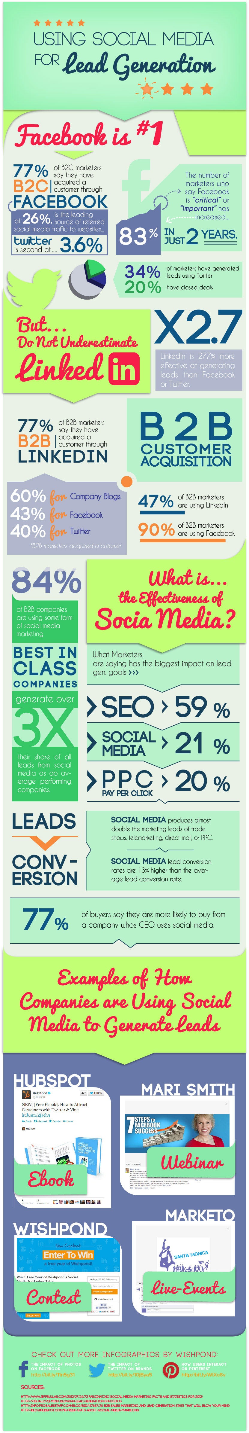
As Entrepreneur shared, Wishpond, creator of numerous social-media focused marketing applications, surveyed companies and found that roughly 77 percent of business-to-consumer (B2C) marketers have gained customers through Facebook, but business-to-business (B2B) marketers tend to be more successful on LinkedIn.

Just knowing that little bit of information can help focus your social media strategy and mold it to fit your marketing strategy, but it is just the tip of the iceberg. An under-informed social media campaign is like blindly shooting at a target and hoping to get a bullseye. Sure, it’s possible, but you have much better chances if you keep your eyes open and aim your weapon.

Thankfully, Wishpond created an infographic (seen below, click to enlarge) with tons of information which can help you create an informed socia media marketing campaign, and turn likes into conversions. With all this information, you can create an effective social media campaign that matches your marketing strategy.

How To Use Social Media To Create Conversions

Click to Enlarge

Easy Infographics Graphic


It is undeniable that social media has completely changed the ways we share information. Gone are the days when loaning a book was the best way to help your friends learn about a topic. Even long form blog posts are often smothered by easy-to-understand content delivered in direct and immediate formats that are fun to read and tempting to share.

This is clearest when you look at the infographic, poster styled graphics aimed at informing people in depth on topics, similar to the way some of the more detailed posters you find in schools function. The difference is that infographics tend to give much more information than any of those posters ever could, thanks to the removal of site constraints.

Infographics engage users and attract them with stylish graphics and colors, which make readers more interested in the information that would normally be boring. Because of how easy it is to digest the information and get excited about what they present, infographics are incredibly popular on Facebook.

For a while, creating one of these infographics basically required a dedicated designer on staff, as no one gets interested in equally boring or sterile graphics without any of the style that bring infographics to life. That has changed much over the past year however, with a lot of credit belonging to the number of free tools and web applications that quickly help put together infographics with minimal design knowledge.

Crazy Pixels shared 10 of these free resources for businesses or bloggers hoping to share a lot of information in an exciting way. Of course, if you just slap something together on one of these applications, it is still going to come out bad. But if you take the time to compose the graphic and market it towards the proper audience, the rest will take care of itself.

Color is one of the most important aspects of graphic design as well as branding and advertising. It can be used to give emphasis, depth, and even motion to a design but it also helps establish the overall feel or atmosphere of the design.

As designers, we do more than just create nice looking compositions. We also connect and communicate to others through images, text, sites, sound, and yes, color. Color is one of the strongest tools we have as a designer, because color decides a large amount of how a viewer perceives a design. It can set off emotional or visual cues, or it can be used simply to pull viewers in.

One of the most important parts of learning how to use color in your designs is learning the understandings and meanings of different colors. They don’t just set the mood, but colors can actually mean quite a lot about companies, sites, and even people. You The Designer recently created the infographic seen below which details “The Psychology of Color” for designers and they lead into it with an insight about color from American stage director Vincent Minnelli who once said, “I use colors to bring fine points of story and character.”

We don’t tend to work much with characters as graphic designers, but in some ways we do tell stories through our sites. Our clients want their websites to represent their company or brand as a whole, including its history and reputability. We weave these stories through our websites through imagery that supports the brand story they want to tell. Color plays a big role in this through making connections to preconceptions we already have. If you’ve ever seen a green logo for a health food store, or a red fast food sign, you’ve already seen the principle in action.

AColorGuideForDesigners_51087f68f22e5_w587


Every time I read something about on-page SEO, it seems like the authors are always just beating a dead horse, or at least trying to teach that dead horse about meta tags and keyword density.

Any SEO who has been around a little while knows there is much more to on-page optimization than just keywords and meta tags. There are plenty of advanced SEO strategies that improve your site, not only in the eyes of the search engines, but also from your visitors’ perspective.

Rather than drown you in another simple list of tips and charts that you’ll find most places, the folks at Backlinko decided to create an infographic, which you can see below, that you can turn to if you want to move your on-page SEO past the very basics. As a bonus, they even included the tips and charts on their page, for those of you who prefer the traditional style.

On-Page SEO Infrographic

Source: Backlinko

Facebook ads INFOGRAPHIC

Simply because they are the relative new ad on the block, there seems to be some confusion about how to implement and get the best ROI for Facebook ads. When it comes to Page Post Ads, you’re essentially getting the opportunity to put your message into users’ news feeds, whether they’ve liked your page or not.

To get a better idea of what is possible and how to use Facebook ads, check out the included infographic from Ampush, which comes via Marketing Land.

These days, everyone has an app. Apple has over 800,000 apps in their store, and Android is close behind. Search for anything you need an app for, and there is little chance you won’t find an option delivering the solution, quite possibly even for free.

With that many apps out there, making one of your own has more than a few risks. How do you attract users? How do you find a market not already covered? How do you improve over the already available options? You’re trying to get people to flock to your application when, according to Noupe, over 60-percent of apps in Apple’s store have not been downloaded a single time.

The truth is, getting your app in front of others’ eyes requires creating a quality product, then optimizing the heck out of it. App stores work just like search engines, and there is plenty of App Store Optimization to be done.

However, just like with SEO, simply optimizing a bad product isn’t going to get you far. There are numerous concerns you must address if you want your own app to stand a chance before you even get to the optimization stage. New Relic, an analytics service, recently released a new product specifically for Apps, and they accompanied the release with an infographic any App designer would be smart to keep around for their next project.

MobileAppDevIG_final

I believe pretty much every web designer that hasn’t been living under a rock knows what responsive web design (RWD) is, but for the few that might be unaware, responsive design is a technique that allows websites to have flexible layouts that change depending on the screen size of the device accessing the site.

I’ve already discussed the pros and cons of responsive design at length, but there is much more to know about the technique than simply what it is good and bad for. There is so much to know, in fact, that it can fill ten whole infographics, like the ones compiled by Jacob Gube at Design Instruct.

Of course, there is an infographic devoted entirely to simply stating the beneficial aspects of RWD, and the obvious infographic focused on explaining exactly what responsive design is in clear visuals. But, other infographics contain basic tips for RWD I haven’t heard elsewhere, or the numbers on how many people are moving to mobile devices and how our use of the web is impacting how people interact with web pages.

Enjoy the infographic showing you what exactly responsive design is below, and you can see the rest at Design Instruct.

Responsive Web Design Infographic

It can be hard to notice, but Google’s search engine results pages (SERPs) are constantly changing. Sometimes it is a result of new algorithms or updates to Penguin or Panda, but often it is a result of Google’s non-stop tweaking of their formula. If you weren’t consistently studying and analyzing SERPs, you probably haven’t even noticed.

SearchMetrics does just that type of analyzing of SERPs, and they just released their study of last years result pages, and there are some interesting points for all search marketers wanting to know what Google is favoring in their results. The highlights of the study, as pointed out by Search Engine Journal, are:

  • A small decline in video integration
  • A significant increase in image integration
  • A sharp decline in shopping
  • A large increase in news integration

The decline in video integration is one of the most surprising, as I’ve heard more than one analyst predict video will be one of the most popular mediums for content marketing this year. If they’re predictions are true, video makers will have stiff competition getting their content onto the SERPs.

Similarly, eCommerce pages are on the rise, and the data suggests business owners should be considering paying into the Google Shopping network to have their products seen by more people.

On the other hand, the big increase in news shows big opportunities for content creators reporting on events and doing news worthy journalism.

SearchMetrics made an infographic to go along with the release of their study, which you can view below or here.

rsz_universal-search-in-the-google-serps

Google has been fighting spam with algorithms and manual penalties, but the best tool this whole time may have been information. Google has offered Webmaster Guidelines for ages now, but there has still been quite a bit of misinformation as to how exactly search works. Those who don’t spend their time reading tech and internet books, blogs, and websites probably don’t have any idea how search works.

As Search Engine Journal pointed out on Friday, Google has heightened their resolution towards open information with an infographic entitled How Search Works. The infographic is broad and won’t give a lot of new information towards exactly what search signals are being favored or what the best methods are (that’s what the Webmaster Guidelines are for after all) but the infographic will be very helpful to those who may not understand how Google handles indexing the entire internet.

What may be of some interest to SEOs and other internet professionals is the additional information Google released along with the unveil of How Search Works, including Search Quality Rating Guidelines, charts of what type of spam they have been removing, and how often Google gets Reconsideration Requests. Even when they don’t give a lot of specifics, any information directly from Google is always great for those of us trying to make our websites fit their requirements as well as possible.

Typography is one of the most deceptively complex components of design imaginable. I mean, to the outsider, it is just arranging letters and picking fonts. The uninitiated have no idea about the complexities and the history of typography; they don’t know typography has a rule book all its own.

Now, I’ve said infographics will tell you “all you need to know” about a couple different design aspects, but the truth is, you can never learn too much about design, and just about every part of design has books upon books worth of material to learn. But, reading books about design seems kind of boring right? Everyone in the field at this point got into it because we love looking at awesome images.

Instead of reading a book about typography – which you should totally do – you can always look at infographics which will put all of that information in visually stimulating ways. Typography lovers and experts certainly love making them.

Jacob Gube collected ten different infographics from across the web on Design Instruct. I am posting one of the ten below, but you’ll have to go to their site to see the rest. The one I’m showing you is “A Brief Introduction to Typography”, which you will notice is not particularly brief. That should give you an idea just how much there is to say about the “simple science” of “arranging letters”. Click on the image to see the full size.

Brief Introduction