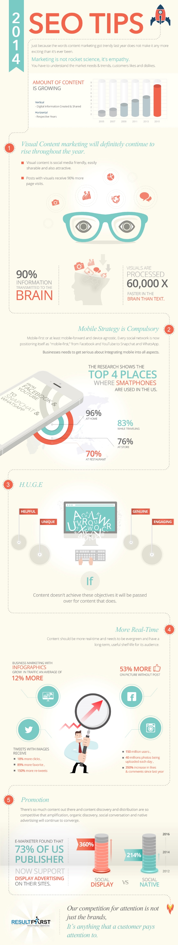
You can find countless articles offering SEO tips filled with practical advice about how to stay within Google’s guidelines and optimize the code on your website. You’re also likely to find plenty of buzzwords and catchphrases like “content is king.” But, all of these practical tips won’t do you much good if you are approaching SEO with the wrong perspective.
It seems counter-intuitive, but good SEO means you need to stop thinking about yourself. You have to think about what your audience wants and how to reach people in new and interesting ways. It is hard to do this if your entire motivation is to “rank higher” or “get more traffic.”
ResultFirst shared an infographic that can help you reshape the way you think about SEO and use a perspective that favors your audience, because a happy audience always leads to growth and success for your business.
00Taylor Ballhttps://www.tulsamarketingonline.com/wp-content/uploads/2018/07/TMO-Logo.pngTaylor Ball2014-06-26 12:42:252014-06-26 12:42:25SEO Tips That Will Help You Get a Better Perspective [Infographic]
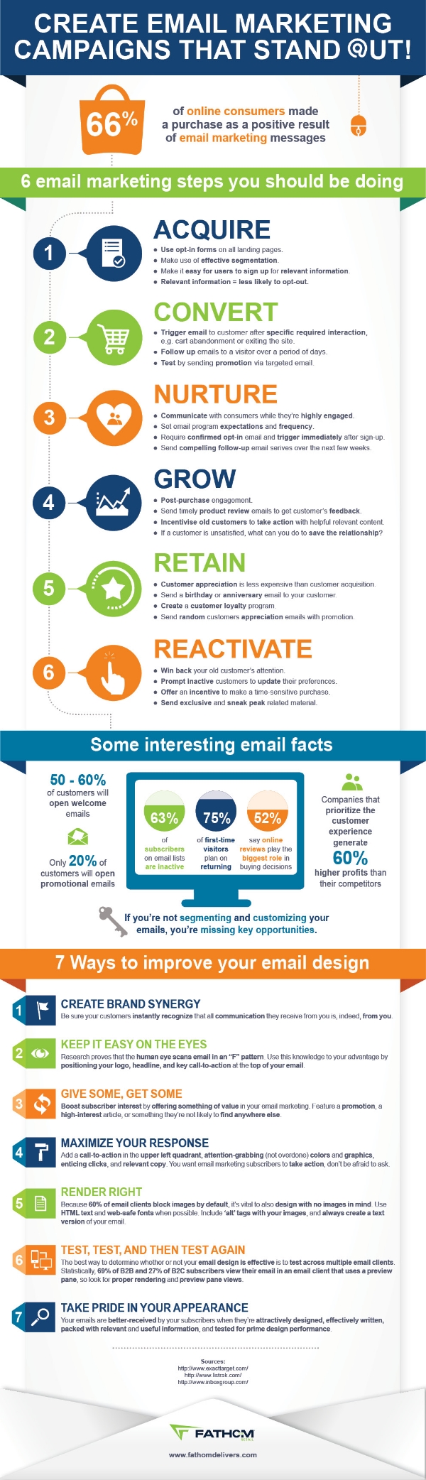
Despite all the advances and changes in online marketing in recent years, email marketing is still one of the most valuable tools any business or marketer has at their disposal. It is so effective that up to 66% of online consumers have reported making a purchase just because of an email marketing message.
To highlight the importance of email marketing, digital marketing agency Fathom created an infographic complete with a 6 step guide to email marketing, 7 ways to improve your emails, and even a few interesting facts.
If you’ve been neglecting your email marketing in favor of social media or content creation, you’re hurting yourself as much as you are helping. The newer platforms for online marketing can be very effective and useful, but sometimes the traditional methods stay popular for a reason. Email marketing is powerful and won’t be going anywhere anytime soon. It’d be best not to cast it out before it loses its effect.
00Taylor Ballhttps://www.tulsamarketingonline.com/wp-content/uploads/2018/07/TMO-Logo.pngTaylor Ball2014-05-27 12:39:312014-05-27 12:39:31Email Marketing is Still One of the Best Strategies for Marketers
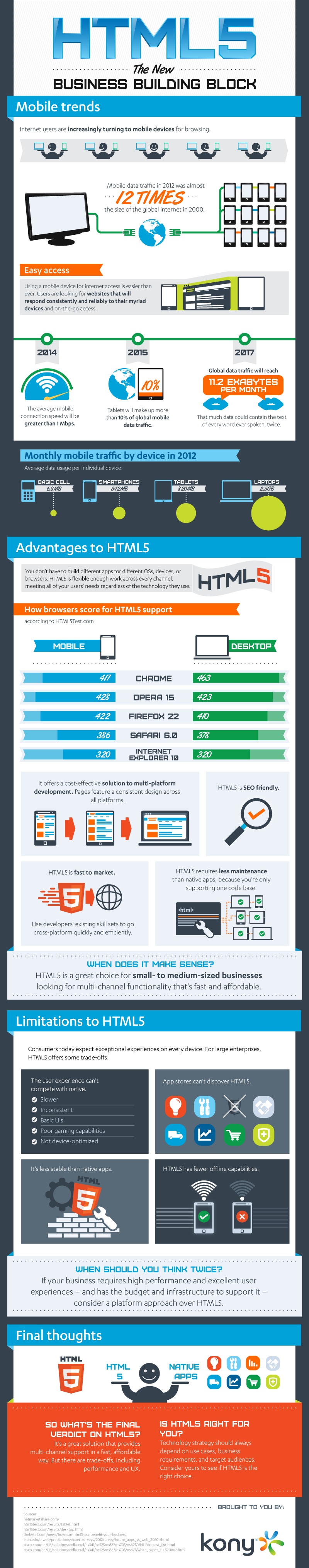
HTML5 has been called one of the most important web design languages in history, and some go so far as to call it nearly perfect. But, as you’ve probably guessed, a fair amount of that was hyperbole and overstatement. HTML5 has some great benefits, but there is no such thing as an ideal design language. This infographic, designed by Kony, breaks through the gimmicks and PR to examine the real pros and cons of HTML5, as well as the current and projected trends to come.
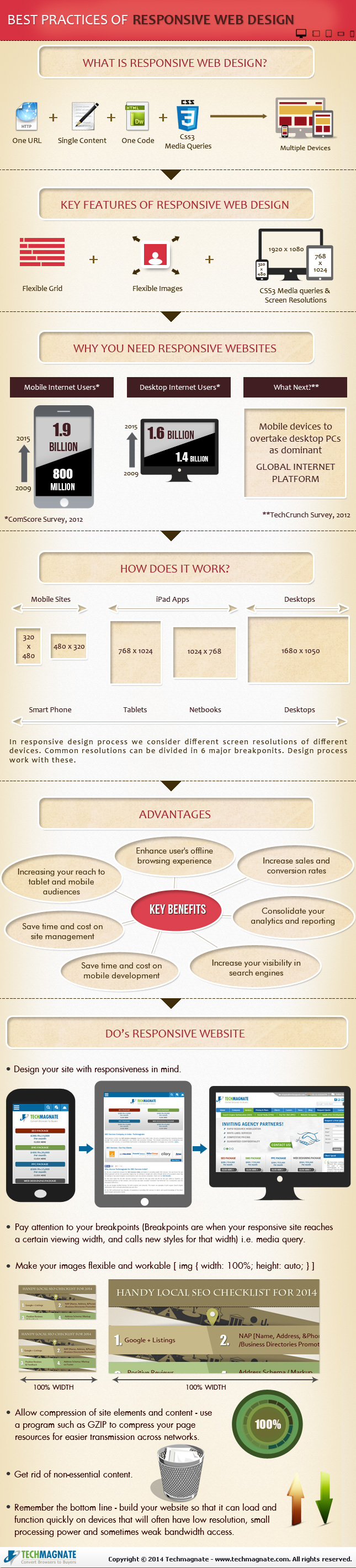
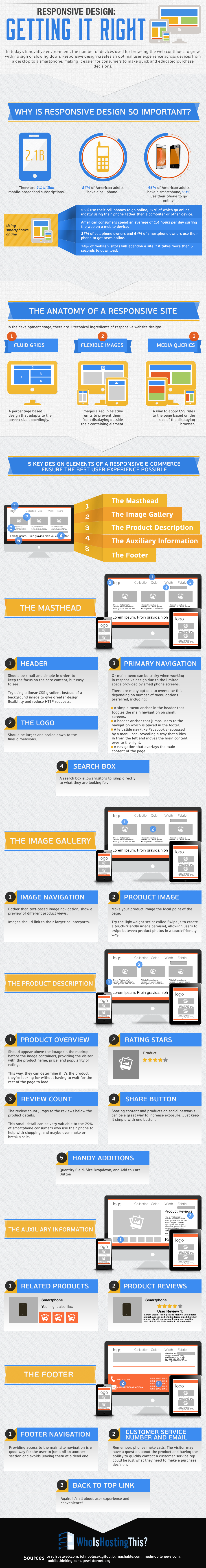
Responsive design is the popular title for a website designed to respond or adapt to users across multiple platforms. The idea is to make a responsively designed website equally as functional on your smartphone as it is on your desktop.
Of course, one way to make a website function properly on smartphones and desktops is to create a unique version of your site for each platform. What makes responsive design so special is its ability to take one site and make it work across devices, without the alternate versions.
With current estimates suggesting traffic from mobile devices may tie the numbers for desktop traffic, it is no mystery why it would be important for your brand to ensure your website is accessible and functional for everyone attempting to view it. Responsive design seems like the natural fit to solve this problem, and in many cases it is. But there are some drawbacks and problems you may need to be aware of before you start thinking responsive design is any kind of magic solution.
Tech Magnate created an infographic to explore the advantages and disadvantages of responsive design, as well as a guide for the common best practices used in the industry. If your business is online, but doesn’t have a site designed for a mobile experience, the infographic you see below can help you decipher whether responsive design is right for you.
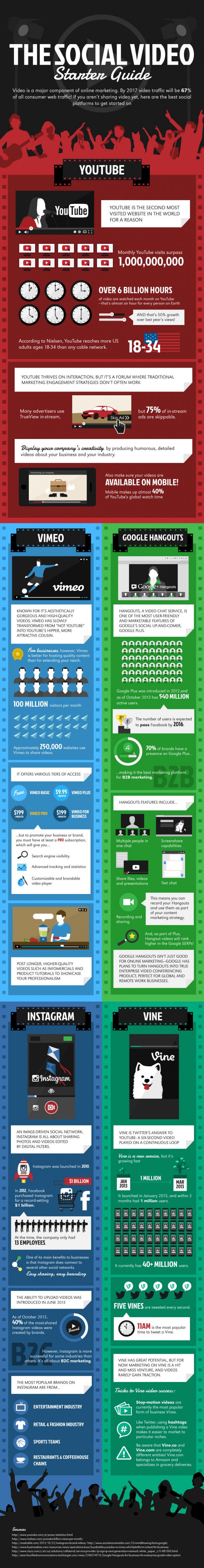
Online video has reached a new level of importance in our lives over the past few years. YouTube is still the dominant service for free online video hosting and sharing, but several other platforms have taken YouTube’s lead and expanded on it in numerous ways.
Instagram and Vine have imposed limits on their video lengths to make them as sharable as possible, while Vimeo has focused its efforts on hosting primarily high-quality and visually stunning videos instead of the shaky cell-phone footage so prevalent on YouTube.
The question remains, which services do you invest your energy and resources into? If you are hoping to use the social video site to increase your brand’s visibility, you want to tailor the content you are creating to the platform most suited to your demographic.
You can get a complete breakdown of all of the major services in the infographic below.
The graphic was created by Russel Cooke, and explains what makes each service unique, as well as how each could benefit a business. If you know your market, you should be able to identify which service is most likely to connect you with your audience. From there, it’s just a matter of making content that will excite them.
00Taylor Ballhttps://www.tulsamarketingonline.com/wp-content/uploads/2018/07/TMO-Logo.pngTaylor Ball2014-04-03 15:27:122014-04-03 15:27:12The Comprehensive Social Video Infographic
As a business trying to keep up with the constantly changing internet, it can be hard to decide which trends to follow and what works best for your business. It is important to have a modern and up-to-date website, but if you chase every trend you’ll often end up falling behind and adopting practices that don’t suit your own business.
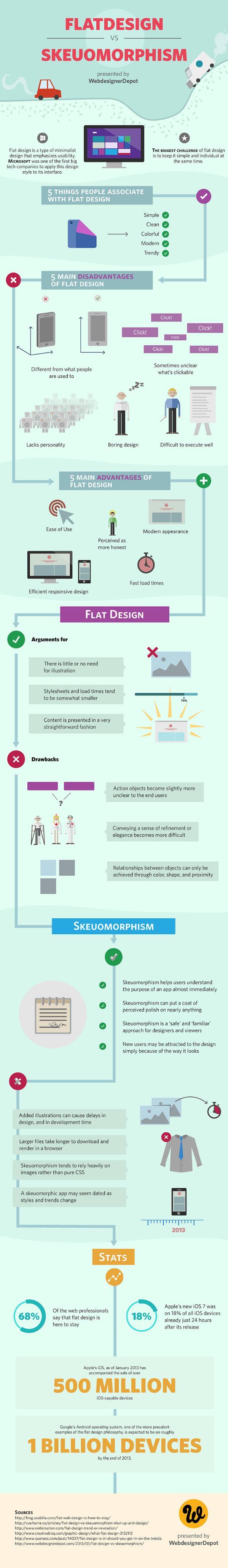
The biggest decision many web designers and business owners have had to make in recent history is whether or not they should adopt the flat design craze that has swept the web over the past year, or whether they should be using more traditional skeuomorphic design practices for their brand. As the flat design style has become a staple of many big businesses, many brands are also forced whether they run the risk of becoming cliche by picking up flat design or if they will fall behind the times with the older style.
If you aren’t familiar with the whole flat design vs. skeuomorphism debate, there has been a major shift in popular web design trends that really gained steam in 2013. Chances are, your web design has relied on skeuomorphic design principles at some point, even if you’ve never heard the word.
Skeuomorphic designs rely on recreating objects and visual styles from the three-dimensional world in order to make web design more easily relatable to users. By using stylistic cues and layouts from things such as calenders or notepads, users are immediately able to feel familiar with a website or application.
However, as computers, tablets, and smartphones have made technology a constant part of day-to-day life, flat design proponents have pushed for designs that are created “for the screen.” As a guiding principle that is understandable, but flat design activists have translated that mantra into strict stylistic principles as grounded in minimalism as they are web design.
Flat designs use simple elements and a strict two-dimensional approach that eschews all added effects such as drop shadows, bevels, and embossing. Flat design has also been heavily associated with the flourishing popularity of more complex typography.
The loudest voices for flat design have made it sound as if the new design style is a revolution in how we design, and on some levels it is. The basic guiding principles of “designing for the screen” can open up many new ways of thinking about web design which are fertile for innovation. As a style based on minimalism and strict stylistic rules however, flat design is a trend with more lasting power than some of the more fleeting crazes.
It is more important as a business owner to decide what design styles benefit your brand the most, rather than which trends are the most popular at the moment. There are numerous benefits of flat design, but skeuomorphism has been a long standing way of making products and web designs the most usable and familiar they can be for their audience. Plus, as Apple has shown, you can make your designs more flat to benefit usability without entirely going to Flat Design.
To help you understand which design style benefits your brand and business the most, WebdesignerDepot released an infographic highlighting the biggest advantages and drawbacks to skeuomorphism and flat design. It may help you find which style works for you.
00Taylor Ballhttps://www.tulsamarketingonline.com/wp-content/uploads/2018/07/TMO-Logo.pngTaylor Ball2014-01-24 15:11:182014-01-24 15:11:18Skeuomorphism Vs. Flat Design Round 2: What Works Best For You
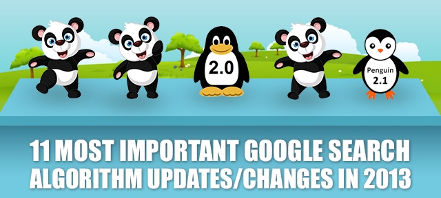
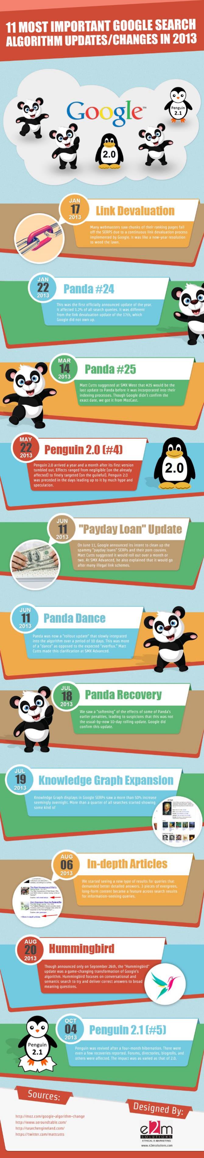
No matter what you personally think about Google, there are two undeniable facts about the massive company. They are the number one source of online searches by a wide margin, and they are constantly changing. Trying to keep track of all the individual updates from Google can be dizzying. It seems every time you are almost adjusted to one change, there is a new update popping up.
But, following the changes over at Google is important for anyone running a website. There are some pretty clear patterns in Google’s updates over the past year, and if you want your website to be successful through 2014, you will need to be prepared for the types of changes on the horizon.
To assist you in reviewing the changes from last year, E2M Solutions produced an infographic that covers a few of the most important updates on Google Search during 2013. As you might expect, Penguin and Panda are both big parts of the infographic. But, there are also some less known search updates such as Google Hummingbird.
The infographic isn’t perfect however. Search Engine Land points out that Hummingbird was not rolled out on August 20, 2013, as it is listed. Also, “Link Devaluation” has never been confirmed by Google, and thus it is only speculation. It is arguably pretty clear that links have lost some of their power in the past year, but it can be debated how that was actually implemented.
You can view the infographic below, or over at E2M’s website.
00Taylor Ballhttps://www.tulsamarketingonline.com/wp-content/uploads/2018/07/TMO-Logo.pngTaylor Ball2014-01-02 15:01:382014-01-02 15:01:38The 11 Most Important Google Search Updates of 2013 [Infographic]
As part of their year-end wrap up, Bing posted some of their highlights from the past year in the form of an infographic on the Bing Search Blog. The infographic summarizes some interesting facts and statistics from 2013 that mostly puts a spotlight on their recent growth. But, there are some parts of the infographic marketers and business owners might take interest in.
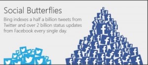
For one, you have probably heard how important social media is to establishing a brand online and engaging internet users, but you might not know that Bing is often more attentive to social media than Google. While Google’s rankings may factor in social media data for website owners, actual users see very little social media presence outside of YouTube and Google+.
Meanwhile, Bing has been actively attempting to make Twitter and Facebook a significant part of their search engine. According to their end of the year stats, Bing indexes up to half a billion tweets from Twitter every day and over 2 billion Facebook status updates every single day. You might keep that in mind when considering which search engine you want to cater your social media efforts to.
You might also be surprised by where Bing is being used. Google is almost ubiquitous with web search, but you use Bing more often than you might think. The search engine is used on Facebook, Yahoo, Siri, and even some Android devices.
Other facts from the infographic include:
If everyone that sees the Bing Home page image each month were to hold hands, they could form a human chain stretching around the circumference of the Earth.
Search activity on Bing Video more than doubled in 2013.
If you were to line up even just 5% of the pixels that make up Bing Maps, you could make four round trips to Venus with trillions of pixels to spare.
It would take 150 years to watch the 800,000 films indexed by Bing.
00Taylor Ballhttps://www.tulsamarketingonline.com/wp-content/uploads/2018/07/TMO-Logo.pngTaylor Ball2013-12-18 14:32:582013-12-18 14:32:58Bing Uses An Infographic to Sum Up Their Past Year in Search
Just a few years ago it would have been impossible to imagine how much social media has grown and become a part of our lives. Even during the heyday of Myspace and the rise of Facebook, no one could have predicted the sheer number of social media apps and websites available and popular these days. We tweet out our random thoughts, we Instagram our pictures, and using the right social media platform for your market can even help you get a job.
The big news is that social media is not slowing down. With the app store flooded by social media apps, you would think their popularity would begin to wane, but social media continues to grow in just about every market. It isn’t a fad. Social media is a part of our lives.
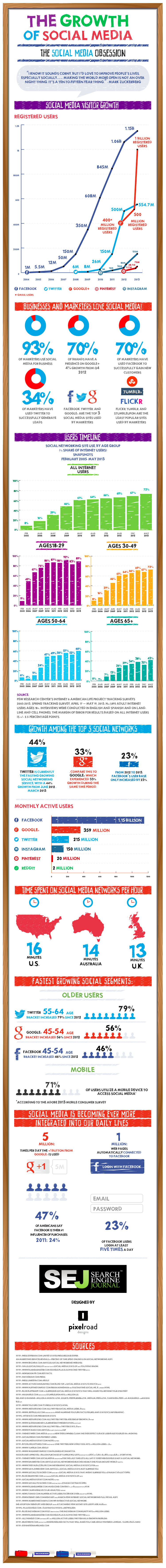
Just over 2 years ago Search Engine Journal published an infographic called the Growth of Social Media. Looking at the infographic now is practically nostalgic as it lists tons of platforms that have fallen entirely off the map, and it reminds us how quickly Pinterest, Reddit, and all the current sites flourished. But, the graphic is woefully out of date.
That is why SEJ decided to update their graphic to reflect the state of social media today. No surprise, the numbers are even better now than they were before. You can see version 2.0 of The Growth of Social Media below, and the original version is still available at their site.
Creating a website that works well on the huge range of devices is no easy task. In fact, creating a website with a solid user experience on every device being used to access your site may actually be impossible. You have to account for a variety of screen sizes, creating a site that loads quickly enough to keep a user from losing interest, and the fact that no everyone has the newest devices for browsing the web. In fact, many are using devices that are quite outdated, which can be an issue for modern designers.
Responsive design is the popular solution for these problems, but it isn’t a magic fix. Responsive design methods certainly make it easier to account for the huge range of devices connecting users to information, but without relentless testing and tweaking there will invariably be a few devices which run into problems accessing your website.
However, responsive design is still the best current solution for these issues. Your only real alternative solution is creating different websites for mobile and desktop users, but this still requires massive amounts of testing to make these sites usable for every device. It makes more sense to do all that work towards a single site, rather than two.
As Marianna Gallano explained, the most common approach to responsive design is to split pages into multiple elements, such as the header, image galleries, and product descriptions. Each element stands on its own in terms of functionality, but seamlessly transfer their look and user experience to various devices and screen sizes. This way, images are able to automatically scale and resize, while text always stays legible, even on the relatively small screen of a smartphone.
WhoIsHostingThis, a site covering news for webmasters and webhosting, created an infographic to break down what responsive design really is, why it is so important, and how each element of a site functions within the whole while responding to a variety of screen sizes.
00Maxhttps://www.tulsamarketingonline.com/wp-content/uploads/2018/07/TMO-Logo.pngMax2013-11-05 15:42:162013-11-05 15:42:16The Most Important Information You Need About Responsive Design [Infographic]
 For one, you have probably heard how important social media is to establishing a brand online and engaging internet users, but you might not know that Bing is often more attentive to social media than Google. While Google’s rankings may factor in social media data for website owners, actual users see very little social media presence outside of YouTube and Google+.
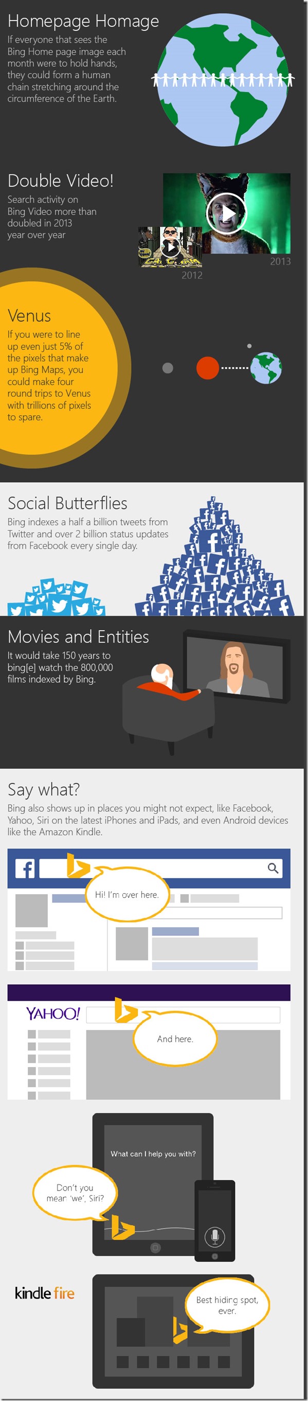
