Tag Archive for: infographic

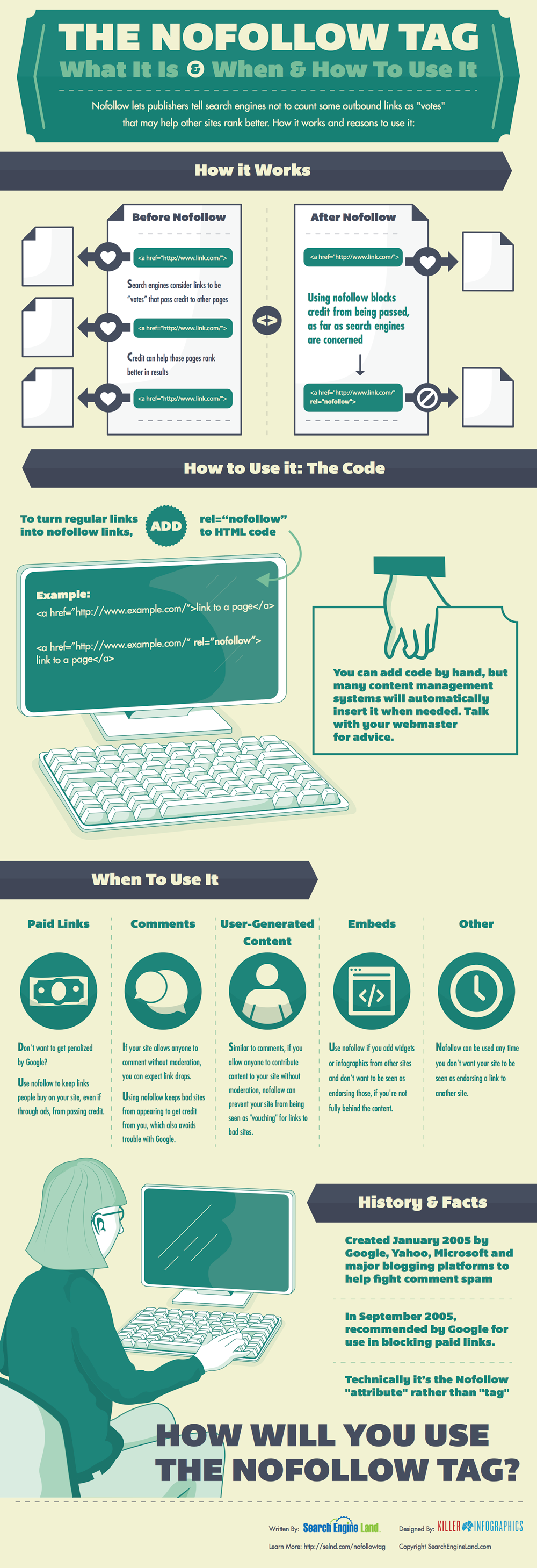
If you have been reading up on SEO, blogging, or content marketing, chances are you’ve been told to “nofollow” certain links. If you’re like most, you probably didn’t quite understand what that means, and you may or may not have followed the advice blindly.

But, even if you’ve been using the nofollow tag for a while, if you don’t understand what it is or how it works you may be hurting yourself as much as you’re helping.

The nofollow tag is how publishers can tell search engines to ignore certain links to other pages. Normally, these links count similar to votes in favor of the linked content, but in some circumstances this can make search engines think you are abusing optimization or blatantly breaking their guidelines. Nofollowing the right pages prevents search engines from thinking you are trying to sell you’re influence or are involved in link schemes.

To help webmasters and content creators understand exactly when to nofollow, and how it affects their online presence, the team from Search Engine Land put together an infographic explaining when and how to use the tag. They also created a comprehensive guide to the tag for those who prefer long walls of text to nice and easy infographics.

Social media has gone from internet oddity to one of the strongest tools in an online marketer’s toolbox. These days, social media presence can be just as important to your online marketing as your website. In some markets, social presence can be even more vital.

Many companies have already stepped up the the plate to meaningfully incorporate social media marketing into their brand experience, and they’ve found that the tactic can be a serious powerhouse for marketing at a fraction of the cost of many campaigns. The trick is knowing exactly how to use the medium.

The successful marketers on social media aren’t yelling about their products at every turn, they aren’t taking part in silly novelty marketing attempts (Chipotle’s recent Twitter “hacking” …), but most importantly they aren’t ignoring their customers. Social media creates a brand new opportunity for consumers to directly interact with the brands they purchase and create a real relationship between businesses and their audience.

Social media is new, and the companies finding success are experimenting and taking advantage of the real benefits the platforms provide, but they aren’t playing completely by ear. There may not be a rule book set in stone for social media marketing yet, but there are definitely some guidelines.

MarketingProfs tried to tie down some of these guidelines and guiding traits of successful social media marketers, and they put the results into an infographic (seen below). If you’re struggling to find your brand’s voice in the social arena or simply haven’t lept into action yet, this infographic will help you develop a useful approach.

10 Superpowers of Social Media Marketers

ZeroLag Illustrator Shortcuts

Adobe Illustrator is almost as important to web designers and creative professionals as Photoshop. For some, it is even more essential. Most of the veterans probably have every keyboard shortcut memorized, but when you’re getting started it can take quite a while to really get the shortcuts down. Thankfully, the folks at ZeroLag put together a cheat sheet so you can always quickly find the shortcut you need. Before long, you’ll know them like the back of your hand.

Before you can use the cheat sheet, you’ll need the key to understand the image. The grey text show Adobe Illustrator tool shortcuts, while the orange text stands for an action shortcut. The tool shortcuts only require you to press the corresponding key. The orange shortcuts require you to hold the Command key, then press the action shortcut indicated by the orange text.

There are also a multitude of shortcuts not shown directly on the keyboard. Some are listed below on the graphic, but over time you’ll find even more that wouldn’t fit. They are usually found through a combination of the Command or Shift button and a specific letter key.

It can seem overwhelming trying to commit all of these shortcuts to memory, but the ones you use regularly become second nature extremely quickly. For all the others, you’ll save more time by checking the cheat sheet rather than searching through all the menus in the program.


Every brand with a reasonable web presence should be aware of the importance of making your content accessible to the legions of smartphone wielding consumers out there. Nearly everyone has a smartphone now, and mobile web use shows absolutely no signs of slowing down.

But, “going mobile” isn’t exactly an exact science. There are many options for a mobile strategy with pros and cons for each. Of course, at this point the most popular options are building responsively, building a mobile only site, or building a mobile app.

Responsive design takes a bit of a one-size-fits-all approach and relies on the assumption that everyone wants to interact with your content in the same manner, but mobile sites split traffic and create numerous logistical issues. Building a mobile app on the other hand can be an incredible part in establishing yourself on the mobile web, but it simply can’t replace having an actual website.

So how do you decide what approach to take? For most brands, I personally would suggest an approach combining responsive websites and a mobile app, but many companies don’t have the resources to do both as well as they need to be done. That’s when it becomes decision time. To help make the decision, the folks at Web Designer Depot put together an infographic (seen below) to show the facts about mobile design, and going into more detail about the benefits and drawbacks.

To App or Not to App Infographic

Establishing yourself on social media and gaining plenty of followers and friends has numerous benefits for your search engine optimization and even site traffic, but just being retweeted and getting plenty of likes doesn’t necessarily translate to paying customers or conversions.

As Entrepreneur shared, Wishpond, creator of numerous social-media focused marketing applications, surveyed companies and found that roughly 77 percent of business-to-consumer (B2C) marketers have gained customers through Facebook, but business-to-business (B2B) marketers tend to be more successful on LinkedIn.

Just knowing that little bit of information can help focus your social media strategy and mold it to fit your marketing strategy, but it is just the tip of the iceberg. An under-informed social media campaign is like blindly shooting at a target and hoping to get a bullseye. Sure, it’s possible, but you have much better chances if you keep your eyes open and aim your weapon.

Thankfully, Wishpond created an infographic (seen below, click to enlarge) with tons of information which can help you create an informed socia media marketing campaign, and turn likes into conversions. With all this information, you can create an effective social media campaign that matches your marketing strategy.

How To Use Social Media To Create Conversions

Click to Enlarge

Color is one of the most important aspects of graphic design as well as branding and advertising. It can be used to give emphasis, depth, and even motion to a design but it also helps establish the overall feel or atmosphere of the design.

As designers, we do more than just create nice looking compositions. We also connect and communicate to others through images, text, sites, sound, and yes, color. Color is one of the strongest tools we have as a designer, because color decides a large amount of how a viewer perceives a design. It can set off emotional or visual cues, or it can be used simply to pull viewers in.

One of the most important parts of learning how to use color in your designs is learning the understandings and meanings of different colors. They don’t just set the mood, but colors can actually mean quite a lot about companies, sites, and even people. You The Designer recently created the infographic seen below which details “The Psychology of Color” for designers and they lead into it with an insight about color from American stage director Vincent Minnelli who once said, “I use colors to bring fine points of story and character.”

We don’t tend to work much with characters as graphic designers, but in some ways we do tell stories through our sites. Our clients want their websites to represent their company or brand as a whole, including its history and reputability. We weave these stories through our websites through imagery that supports the brand story they want to tell. Color plays a big role in this through making connections to preconceptions we already have. If you’ve ever seen a green logo for a health food store, or a red fast food sign, you’ve already seen the principle in action.

AColorGuideForDesigners_51087f68f22e5_w587


Every time I read something about on-page SEO, it seems like the authors are always just beating a dead horse, or at least trying to teach that dead horse about meta tags and keyword density.

Any SEO who has been around a little while knows there is much more to on-page optimization than just keywords and meta tags. There are plenty of advanced SEO strategies that improve your site, not only in the eyes of the search engines, but also from your visitors’ perspective.

Rather than drown you in another simple list of tips and charts that you’ll find most places, the folks at Backlinko decided to create an infographic, which you can see below, that you can turn to if you want to move your on-page SEO past the very basics. As a bonus, they even included the tips and charts on their page, for those of you who prefer the traditional style.

On-Page SEO Infrographic

Source: Backlinko

These days, everyone has an app. Apple has over 800,000 apps in their store, and Android is close behind. Search for anything you need an app for, and there is little chance you won’t find an option delivering the solution, quite possibly even for free.

With that many apps out there, making one of your own has more than a few risks. How do you attract users? How do you find a market not already covered? How do you improve over the already available options? You’re trying to get people to flock to your application when, according to Noupe, over 60-percent of apps in Apple’s store have not been downloaded a single time.

The truth is, getting your app in front of others’ eyes requires creating a quality product, then optimizing the heck out of it. App stores work just like search engines, and there is plenty of App Store Optimization to be done.

However, just like with SEO, simply optimizing a bad product isn’t going to get you far. There are numerous concerns you must address if you want your own app to stand a chance before you even get to the optimization stage. New Relic, an analytics service, recently released a new product specifically for Apps, and they accompanied the release with an infographic any App designer would be smart to keep around for their next project.

MobileAppDevIG_final

Facebook Post Time Infographic

So you’ve got your page’s social media profile built. You have an audience in place and a message you want to get out. The question is: when is the best time to unleash that message?

There are a number of factors to consider in order to maximize not only the number of eyes on your message, but also the number of users who will interact with the message. Assuming that the message itself is worthy of ‘RT’ and ‘Likes’, you have to think about who it is you are trying to reach and what they will likely be doing when you are trying to reach them.

For most industries, your consumers will likely be at home when they are cruising through social media with time to click and interact with anything they find interesting. This means that sending out your message on weekends or evenings could get you the best results. However, the exception here would be if your key demographic is suburban housewives. If you’re trying to reach individuals who spend their day at home, then you’ll probably want to reach them before their families return to make their lives hectic.

You will probably notice that posting more gets your more interaction and probably builds your audience too. There is a limit though. Having a steady, consistent stream can paint you as a reliable, familiar source, but it’s easy to cross over into an annoying nuisance who users dread seeing in their news feed.

Be sure to take a moment to peruse the included infographic, courtesy of JCK, and think about when the best time to reach your audience would be.

It can be hard to notice, but Google’s search engine results pages (SERPs) are constantly changing. Sometimes it is a result of new algorithms or updates to Penguin or Panda, but often it is a result of Google’s non-stop tweaking of their formula. If you weren’t consistently studying and analyzing SERPs, you probably haven’t even noticed.

SearchMetrics does just that type of analyzing of SERPs, and they just released their study of last years result pages, and there are some interesting points for all search marketers wanting to know what Google is favoring in their results. The highlights of the study, as pointed out by Search Engine Journal, are:

  • A small decline in video integration
  • A significant increase in image integration
  • A sharp decline in shopping
  • A large increase in news integration

The decline in video integration is one of the most surprising, as I’ve heard more than one analyst predict video will be one of the most popular mediums for content marketing this year. If they’re predictions are true, video makers will have stiff competition getting their content onto the SERPs.

Similarly, eCommerce pages are on the rise, and the data suggests business owners should be considering paying into the Google Shopping network to have their products seen by more people.

On the other hand, the big increase in news shows big opportunities for content creators reporting on events and doing news worthy journalism.

SearchMetrics made an infographic to go along with the release of their study, which you can view below or here.

rsz_universal-search-in-the-google-serps