Tag Archive for: infographic

INFOGRAPHIC

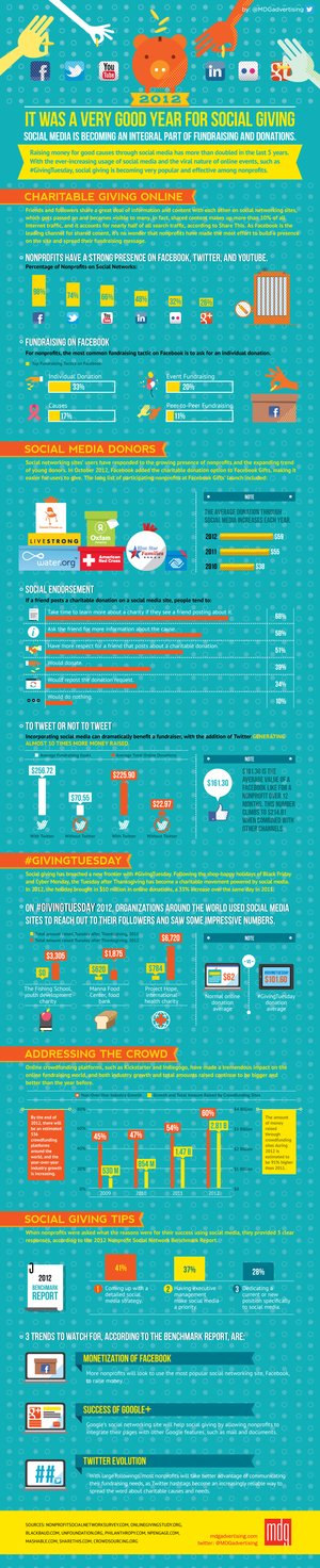
In 2012, even nonprofits were utilizing social media. MDG Advertising looked into this developing trend and found that the inclusion of social media marketing meant more exposure and more donations for these organizations, as reported by The Huffington Post.

The innovation of ‘Giving Tuesday’, which grew over social media, is a glowing example of what is possible when online marketing is utilized properly. The model used by nonprofits is not revolutionary. Rather, it is simply a testament to why putting the time and effort into social media marketing is necessary.

While you browse the included infographic, think about how you can increase your conversions through a better social media strategy.

As the year draws to a close, everyone of course looks to what the past year indicates for the one coming up. I’ve already covered one article of year end analysis, and now Search Engine Watch and Mavenlink have made an infographic covering what SEO professionals are saying about the state of SEO in 2012.

What is notable about both of these year-end opinions is that they are both extremely optimistic about the future of SEO. As the internet becomes somehow even more pervasive in our every day life, more and more opportunities for SEO to grow become apparent, and there is no sign of it slowing down.

Budgets are growing, companies are paying more attention, and SEO teams are getting bigger. SEO is finally even beginning to be seen as an entity seperate from regular marketing. Before long, SEO might be really known outside of the marketing community.

You’ve probably already heard about the importance of images on the web. They catch the eye, foster interest, and statistically make people spend more time on any text than they would without pictures.

It’s all true, visual media is consistently present in your life, and the amount of websites and social media platforms centering on visual media are becoming more and more popular. In a society where almost everyone has a smartphone with a respectable quality camera, pictures are only going to become more ubiquitous.

Veer, a service for images, illustrations, and fonts, made an infographic to try to convey the importance of images online today. The graphic covers the history of internet graphics, and the popularity of image-based social media such as Flickr, Pinterest, and Instagram. They also have an animated version of the infographic here.

Think of logos for the biggest businesses right now. Maybe you’re thinking of Facebook, or Twitter, or maybe you went towards technology manufacturers like Intel, Philips, or Dell. You may have even thought of a huge company like GE. Either way, the logos you thought of were most likely blue.

The colors of a logo are always important, as they decide how viewers will respond to your company. Restaurants or people handling food will often use green to convey a healthy image, or red because it supposedly stimulates appetite. While those colors work for that market, blue works for almost any non-food related business.

Helen Bailey from Web Designers Blog wrote one of many articles exploring why blue works so well for branding, but if you really want to explore the use of blue for branding, check out the infographic from Template Monster. The static version is below, but they have an interactive version at their site.

The UK web hosting company Heart Internet wanted to find out who web designers are and what their opinions are on their profession. They asked 500 designers and while that is far from being representative of the entire industry, the results are pretty much in line with what you would expect.

Firstly, Heart Internet found that 78% of all web designers are male. There are definitely female designers out there, but I think most figured web design was still a male majority.

Eighty-percent believe work is hard to find, and three-fourths don’t expect it to get better in the near future. That makes it shocking that 77% feel secure in their job security, probably because most designers are freelancers anyways.

The rest of the results are compiled into this infographic. There are some very interesting findings.

When Siri was announced with the iPhone 4S, it didn’t bring about a revolution in search activity on phones. Most still search by typing keywords into Safari or Chrome. However, gradually, Siri and mobile apps are changing search habits and creating new opportunities for search marketers.

The Alchemy Viral crew gives us an infographic which helps cover everything about searching with Siri and mobile searching in general.

There is one error, which Search Engine Land helps point out. The infographic says Siri draws from social services, but Siri can only help users post things to Twitter or Facebook. It can’t help them get information back from those social sites.

With mobile searching poised to overtake desktop within two years, this infographic can be helpful to anyone interested in mobile searching.

Oh, and the creator of the infographic isn’t bad with spelling. They are just British, hence “optimisation,” instead of the American spelling.

[INFOGRAPHIC] Quality Score

The quality score of your site is extremely important. If you’ve got a high score, Google makes it easy for your page to prosper. You’ll appear higher in search results, your ads can appear in the top, shaded region of results and it will cost you less per click of your ads.

As Neil Spencer reports for Business2Community, in order to ensure you get these advantages, you need to know how Google judges your site and how you can improve it.

Your ads should be specific and highly targeted. Google is looking for the relevance of the keywords you’ve chosen to your landing page and your ads. Also, make sure your landing page contains relevant, original content that’s updated often and is easy to navigate.

The included infographic is courtesy of DigitalNetAgency

It is becoming undeniable that responsive websites are becoming the norm. As more people use tablets and smartphones to browse the internet, responsive web designs that easily adapt to different devices are becoming the smartest way to design a site.

The problem, as with any new design method, is getting started when you don’t know much about making your site responsive. Luckily for anyone with this issue, we have a comprehensive infographic from Helen Bailey at Demortalz that covers all of the basics of responsive design, from basic vocabulary and suggested reading to free PDF books and a suggested toolkit. There is even a dynamic version available that is designed like a game.

No matter which version you prefer, this infographic will help you get started making responsive designs which are quickly becoming standard.


Consistently creating good quality content is not easy. For copywriters, good content is something that really connects with readers, and while some can churn out content like robots, most of us have to invest a lot of time and effort.

Of course, practice will always make you a better content creator. Having an intimate understanding of copywriting and how it works is the foundation you will be building on. We all know a solid foundation is important.

Thankfully, the folks at ABC Copywriting have everything you could ever need to know about the copywriting processes all in one infographic. They include a walkthrough of every step of copywriting, as well as tips for quality sales letters, information documents and webpages. With it, you will have a solid base of information to become a great content creator and copywriter.

While infographics are often a great way to attract attention, there are times when they are not the proper solution for a client. Here are six instances where infographics don’t provide a good return of investment for the client and shouldn’t be used.

  1. Sites with Questionable Links – All SEO experts know about the huge shift created by Google’s Penguin and Penguin algorithms. Owners of penalized sites will often ask if infographics can solve their problems. Infographics can assist in varying backlinks, but it can’t solve all of the issues. Before recommending an infographic, you need to know about the specific penalties.  Also, many sites with “grey links” haven’t been penalized. Infographics can cause these sites to be identified and then get hit by penalties. Investing money for an infographic (which can cost thousands of dollars if independent research and design is needed) is not a wise recommendation when a website may be already on the edge of penalties.
  2. Under-developed Sites – So, you have a brand new website. Wouldn’t an infographic be a great and easy way to advertise your site to the world? Probably not. They don’t just bring links. They also help place your brand in front of the proper audience. By publishing on an under-developed site, clients may get the impression that you are sloppy or lack experience. Also, like is commonly found in SEO, the ROI relies on how you leverage the assets you already have. Infographics may help leverage your Social Media status and RSS subscribers, but you’ll want to make sure that these are all up to date beforehand.
  3. Lack of Social Media Plan – A real social media plan is not just having a Facebook or Twitter. Infographics are designed to be viral and attract tons of social-media savvy people to your website. If your social media accounts aren’t updated or lack content, these visitors are unlikely to become an audience. Before you use an infographic you need to update your content frequently, court a number of followers and have a stategy for identifying members of your demographic.
  4. Lack of Mailing List – Using an infographic without a mailing list means missing out on a massive opportunity. Having 10,000 unique visitors sounds wonderful initially, but is not likely to provide a long term audience. However, having just 50 people sign up for your company’s mailing list is an essential part of converting visitors to leads.
  5. No Budget – While numerous places offer infographics for relatively cheap, they don’t allow you to rise above the clutter of the internet. According to Topsy, in 2012 17,000 tweets included the word “infographic”. That means a mediocre infographic will not capture the attention of the biggest markets. Making an infographic requires a skilled team and usually costs over $1,000. If you can’t afford that much, you’re more likely to see a return on your investment with link bait articles or guest postings.
  6. You Don’t Understand Infographs – Infographs are for good content but that content may not always be what you personally enjoy. It is aimed at your demographic and the online sources that focus on that market. Trying to squish a long detailed report may seem like a great idea, but it is unlikely to go viral. It may be visually appealing, but it won’t convert potential customers.

To see the original article by Danny Ashton:
When NOT to use an Infographic: 6 Examples