Tag Archive for: mobile

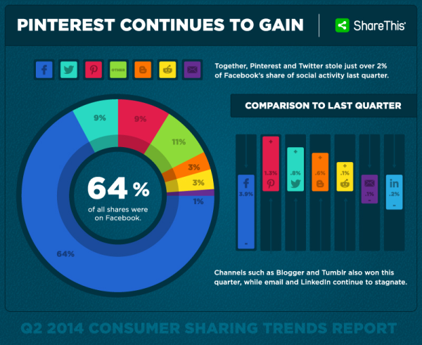
Adobe Flash and mobile devices go together like oil and water. Since the release of the first iPhone it was clear that Flash, Adobe’s multimedia based web site technology, would not be coming to cell phones any time soon.

Years later, after the release of several generations of smartphones and the release of tablets, and it is even clearer that Flash is all but dead and will never be a part of the modern ‘device agnostic’ approach to web design. Unfortunately many webmasters still use it.

flash-serp-note-border-300x107That may not be the case for long, as Google has stepped up their fight against the technology. Google announced that starting today they will be warning mobile searchers when the search engine’s algorithms detect a web site is not supported on the device they are using due to Flash.

Rather than outright omit sites utilizing Flash from the search engine – which would garner heavy criticism – those using smartphones and tablets to search may see a warning that allows the user to attempt to view websites using Flash or to look for alternate search results.

The warning reads “Uses Flash. May not work on your device. Try anyway | Learn more.”

It seems pretty unlikely that many users will choose to press on knowing that the site likely won’t work for them.

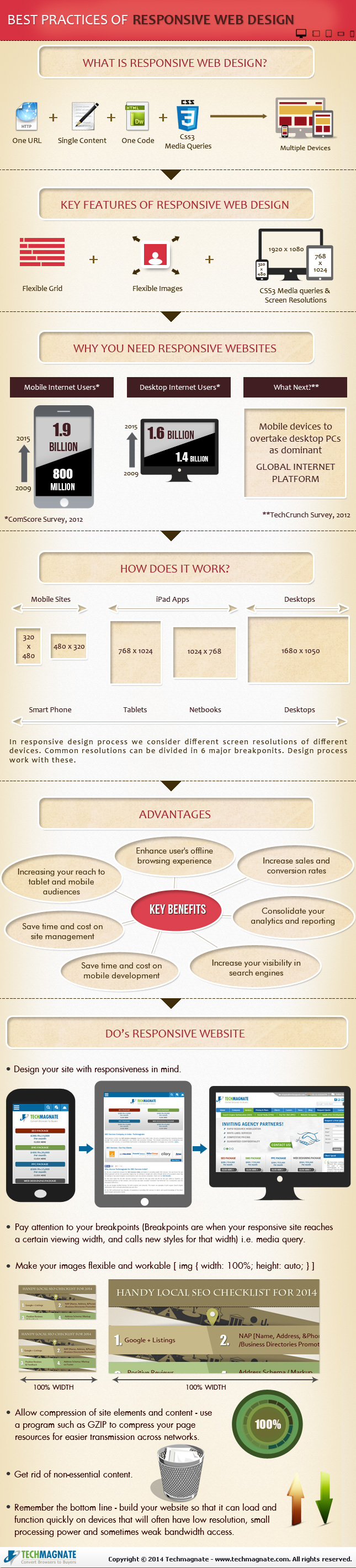
In lieu of using Flash, Google highly recommends updating to HTML5 and upgrading sites to support that technology because it works in mobile devices and desktop browsers alike.

Google’s Keita Oda, Software Engineer, and Pierre Far, Webmaster Trends Analyst said, “fortunately, making websites that work on all modern devices is not that hard: websites can use HTML5 since it is universally supported, sometimes exclusively, by all devices.” Google simultaneously launched two new resources to help webmasters make the upgrade:

  • Web Fundamentals: a curated source for modern best practices.
  • Web Starter Kit: a starter framework supporting the Web Fundamentals best practices out of the box.

With each new study focusing on consumer behavior, smartphones are proven to be even more integral to our purchasing habits than many of us may realize. I think everyone is aware of the increased importance of smartphones and mobile browsing in the market, but it may still be surprising that the majority of consumers (up to 60 percent) exclusively rely on mobile for purchasing decisions within the categories of telecom, restaurants, auto, and entertainment.

Numerous analysts suggest the rise shown in the third-annual Mobile Path-to-Purchase report from xAd and Telemetrics could be partially caused by an increase in consumer satisfaction in mobile devices and tablets, both rising 2 percent from 2013. Smartphone satisfaction grew to 61 percent, with tablets increasing to 68 percent.

satisfaction-mobile-xad-telmetrics

According to the study, the most common reasons for dissatisfaction included not enough information, slow connection, or a small screen. While website owners can’t control the size of screen their users have, they can improve the amount of information on their site, increase load speeds, and optimize their design for smaller mobile screens.

More than 40 percent of consumers cited mobile as the most important media source for information as well. Print industry continues its march towards complete irrelevance as it was called the most important source by only 5 percent of those surveyed.

media-source-of-info-xad-telmetrics

The increasing relevance of smartphones in shopping habits continues, with smartphones showing a 26 percent increase from 2013, with 29 percent citing it as the most important shopping tool in 2014. A quarter of users also said they utilized mobile devices on the entire path to purchase, from research, to comparison, to conversion.

“Capturing consumer engagement points throughout the mobile path to purchase is essential to optimizing mobile ad programs to reach consumers when they are most open to options for fulfilling their purchase needs,” said Bill Dinan, president of Telmetrics.

SEO and online marketing have changed drastically over just the past couple years, especially with the rise of social media and huge changes to how search engines are able to analyze and rate websites for users. However, some things have stayed the same through it all, such as the importance of email marketing.

It could be easy to think that social media would usurp the place of email marketing in building a relationship between consumers and your brand by gradually letting potential customers see who you are and what you represent. However, you would be wrong as emails still hold their place by offering a direct line to interested users that even social media can’t match.

The majority of businesses realize this, judging by the continued prevalence of email signups and calls-to-action deliberately designed to get visitors onto an email list. What some of those companies may not understand is that they may be missing out on some of the potential of their email list by marketing to the wrong device.

A new report from Movable Ink’s Q1 2014 US Consumer Device Preference Report shows that email opens are continuing to migrate away from desktop to tablets and smartphones. At this point, desktop opens are actually the minority compared to mobile devices.

Screen-Shot-2014-05-09-at-6.22.28-AM

Greg Sterling has an analysis of the data from the report, but to me the findings show that a large amount of email marketing is missing the mark by targeting users sitting at a desktop computer browsing through a day’s worth of email. This may have been the norm a few years ago, but today the majority of emails are opened while out and about and emails should be designed to fit this purpose and be able to catch users’ attention from the smaller screen.

You can start making your email marketing strategy more mobile friendly by making your emails explicitly mobile friendly as well as the associated landing pages these emails direct to. In a day-and-age when the majority of people are checking their emails and doing browsing from smartphones there is no excuse to be sending users emails they can’t easily view or sending users to landing pages that require non-iPhone friendly Flash plug-ins.

With the constant stream of news coming out of the SEO industry, it can be hard to keep up with all the latest updates without missing some important information. Below, we will go through all of the news from the week that we missed the first time.

Yahoo’s Market Share Dips Even Lower

Yahoo’s Q1 2014 earnings gave some optimism that the company had some life in it, but don’t get too hopeful. The latest market share analysis of the search market shows that Yahoo is still falling, while Microsoft benefits and Google stays comfortable with their two-thirds of the market.

Older Generations Embrace Mobile as Local Shopping Companion

The idea of senior citizens being out of touch with technology is becoming increasingly questionable, as a new survey conducted by Thrive Analytics and the Local Search Association shows that older generations (including Boomers an Seniors) are embracing mobile to inform their local shopping process.

Google is Testing Showing Ads in The Knowledge Graph and Carousel

Google’s Carousel interface is less than a year old, but new screenshots suggest Google is already looking at the possibility of showing ads from the paid Google Shopping results within the content bar across the top of some search result pages. Pete Myers shared a screenshot of the test on the Moz Google+ page, and notes “almost everything above the fold is a paid result.”

Facebook Introduces New ‘Nearby Friends’ Feature

Facebook announced the roll out of a new optional feature that will make it easier to find friends that are close-by. The new feature will notify you when friends get within a certain distance so that you can get in touch with them. The feature is completely optional and can be turned off at anytime, but both users must have the feature turned on to receive notification when they come within close proximity.

Why Yahoo’s Not Going To Steal The Search Default For iPhone

Rumors have been swirling that Yahoo is hoping to leverage Apple’s dislike for Google in order to become the default search provider for iPhones. Media outlets everywhere jumped at the chance to report on these rumors, but as Danny Sullivan shows, it would take something close to a miracle for Yahoo to have any chance of becoming the big search option for Apple’s mobile users.

By now you may have heard the claims that internet traffic from smartphones and tablets will outpace traffic coming from desktop computers any day now, but yet a large amount of the internet isn’t optimized for mobile devices in any viable way. If you’ve ever wondered why, it is because many businesses don’t see the value of investing in mobile traffic, due to lack of information and misunderstandings of their audience and the market.

The question most businesses need answered isn’t “how much traffic is coming from mobile devices?” If we spent all the time that has been used answering that question every few months on instead answering “how valuable is all that mobile traffic” most businesses of every size would already have perfectly usable mobile websites.

It is true that the mobile market is constantly growng, but the most interesting data is how mobile internet users are doing online. Compared to desktop traffic, mobile users are exponentially more likely to take action. People tend to do in-depth research and general browsing on desktop systems, so each visitor you receive is as likely to politely look around and leave as they are to convert. In fact, they are statistically much more likely to not take action.

However, each study on the consumption behavior of smartphone users only shows that people are using their phones more and more to purchase or take action every day. The latest study from comScore.com and Search Engine Watch says 80% of local searches coming from mobile phones lead to conversions.

There are a few industries that benefit the most from these conversions, as mobile searches for localized results tend to favor restaurant, auto service, and arts queries. You can read the whole breakdown of the report at Search Engine Watch, but if you are a local business owner who has been telling yourself that mobile websites only benefit major businesses you are likely selling yourself short.

The team from Neustar also created an infographic highlighting the results of the study, which can be seen below:

cross-device-infographic-neustar-15miles

Responsive design is the popular title for a website designed to respond or adapt to users across multiple platforms. The idea is to make a responsively designed website equally as functional on your smartphone as it is on your desktop.

Of course, one way to make a website function properly on smartphones and desktops is to create a unique version of your site for each platform. What makes responsive design so special is its ability to take one site and make it work across devices, without the alternate versions.

With current estimates suggesting traffic from mobile devices may tie the numbers for desktop traffic, it is no mystery why it would be important for your brand to ensure your website is accessible and functional for everyone attempting to view it. Responsive design seems like the natural fit to solve this problem, and in many cases it is. But there are some drawbacks and problems you may need to be aware of before you start thinking responsive design is any kind of magic solution.

Tech Magnate created an infographic to explore the advantages and disadvantages of responsive design, as well as a guide for the common best practices used in the industry. If your business is online, but doesn’t have a site designed for a mobile experience, the infographic you see below can help you decipher whether responsive design is right for you.

best-practice-of-responsive-website-design

It is no secret that our use of the internet is becoming more and more mobile, but the day when we actually favor mobile search over desktop connections may be sooner than previously thought.

While speaking at SMX West last week, Google’s Matt Cutts told the crowd he “wouldn’t be surprised” if mobile search exceeded desktop queries by the end of this year. Another Google speaker during an informal round-table gave a similar comment at the International Franchising Association conference in New Orleans earlier this year.

Screen-Shot-2014-03-17-at-6.49.09-AM-600x347

Google refused to give an official statement, but it makes sense. Google doesn’t want anyone to be picking sides. Instead, they want to focus on cross-platform experience and marketing so that we can make the internet equally efficient and useful on every platform.

The comments are assumed to be referring to the global query volumes rather than the US or North America. Globally mobile traffic lies around 30 percent of all internet traffic, and North America has relatively similar ratios. However, many developing countries, such as India, already use mobile search far more often than desktop.

It is inevitable that one day mobile and desktop traffic will either reach a stalemate, or mobile traffic will begin to eclipse home desktop use. But, whether it will be this year is anyone’s guess. Personally, I’d be wagering on sooner rather than later.

Google is attempting to bridge the gap between apps and normal internet use, and it appears their first step is to make apps part of the search results for Android users. When logged in, you will also be able to see what apps you have and search the content within them.

“Starting today, Google can save you the digging for information in the dozens of apps you use every day, and get you right where you need to go in those apps with a single search. Google Search can make your life a little easier by fetching the answer you need for you – whether it’s on the web, or buried in an app,” Scott Huffman, VP of engineering, announced on Google’s Inside Search blog.

Google App Search Graphic

These results won’t be ads for apps. Instead, when the best results for a query come from an app, Google Search will include the app in the result and make it easy to download or access. If you already have the app, you will just have to touch “Open in app” and you will be taken to the relevant content.

The app results will be grouped together, so don’t expect them to hurt many sites’ rankings or visibility. These results are just another option added for user convenience.
Currently only a few apps are compatible with the Open in App feature, including:

  • AllTrails
  • Allthecooks
  • Beauytylish
  • Etsy
  • Expedia
  • Flixster
  • Healthtap
  • IMDb
  • Moviefone
  • Newegg
  • OpenTable
  • Trulia
  • Wikipedia

“This is just one step toward bringing apps and the web together, making it even easier to get the right information, regardless of where it’s located,” Huffman wrote.

Search Engine Watch reports the new ability is currently limited to English version users of Android 2.3 or higher within the United States.