Tag Archive for: mobile

SuperBowl50

Online searchers are increasingly turning to mobile devices during the biggest trending moments, and this year’s super bowl makes that clearer than ever. According to Google, 82 percent of all TV ad-driven searches during the Super Bowl came from smartphones, a 12-point increase from last year.

Desktop continues to trail mobile searches with just 11 percent of Super Bowl searches during the game, while tablets accounted for only 7 percent.

In total, Google says the big ads during this year’s Super Bowl drove over 7.5 million incremental searches. That is a 40 percent increase compared to last year’s game.

google-super-bowl-ad-searches-by-quarter-800x342

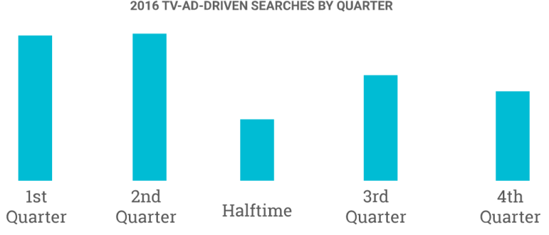
Perhaps due to the close game, the majority of searches driven by Super Bowl TV ads came during the first two quarters of this year’s match. Ad’s related searches dipped significantly at half-time and continued to stay relatively low through the end of the 4th quarter. This is similar to what happened during last year’s close match-up.

This pattern is quite a bit different from 2014, when the Broncos were dominated by the Seahawks. As the score widened in the second half searches increased, suggesting viewers were getting bored with the actual game and paying more attention to ads.

Google’s infographic from the big game shares many other details, like what big brands came out on top and which team won the most searches. The biggest takeaway is that brands who want to capitalize on emerging events and trending moments should prioritize mobile like their audience is.

mobile-closeup-campaign

It has been clear for some time now that neglecting to have a mobile-friendly site can hurt your Google rankings, particularly in mobile search results. However, some have been wondering if the reverse is also true. Does having a desktop-friendly web site have a similar negative impact on your desktop rankings in Google?

Well, last Friday Google’s John Mueller clarified the situation in a Google Hangout, saying you do not need a “desktop-friendly” site in order to rank well on desktop. The only caveat is that your mobile site must still render properly on desktop.

John Mueller said that you need to “make sure that desktop users can still see some of your content, if it is formatted in a way that works best for mobile, that’s perfectly fine.”

“You definitely do not need a specific desktop website in addition to a mobile website,” Mueller added.

If your business depends on desktop traffic and conversions to properly reach your market, it is still highly important to provide a pleasing experience when users come to your site. For that reason, I’d hesitate to suggest going all-in on mobile leaning design utilizing extra-large buttons and minimal navigation.

The most reliable strategy is to use a design technique such as responsive design to provide a great experience for users no matter where they are coming from. If that isn’t an option, it may still be best to keep operating separate sites for mobile and desktop so you don’t wind up losing customers just because they are using a desktop computer or smartphone.

You can see the full video below, or jump to 12:50 in the video to get straight to Mueller’s answer.

Mobile search has gotten a lot of attention this year as it has overtaken desktop search in many metrics, but a new report from mobile loyalty company SessionM shows how ubiquitous the use of mobile devices to aid in the shopping experience has become.

SessionM surveyed 12,000 randomly selected US smartphone users on their mobile shopping behaviors and the findings highlight just how large a role mobile devices play in the shopping process.

The company said 85 percent of respondents reported their m-commerce buying was steady or had increased compared to a year ago while approximately 15 percent told the company mobile buying had increased “significantly.

Personal data security and/or poor user experiences (e.g., too small images or text) were cited as barriers preventing mobile e-commerce from more growth.

According to the findings, more than 90 percent of respondents had made a retail purchase within the past 90 days before the study. The majority (73 percent) of those purchases were made in traditional, brick-and-mortar stores, and approximately 53 percent said they found the in-store experience superior to online/mobile shopping.

However, the study also found mobile search plays a vital role in the in-store shopping process. The overwhelming majority of respondents (90 percent) said they use their smartphones in stores while shopping. The top activities on smartphones while in-stores breaks down as follows:

  1. Price comparisons — 54 percent
  2. Looking up product information — 48 percent
  3. Checking reviews online — 42 percent

SessionM also had recommendations for valuable marketing opportunities for retailers from the data:

  • Opportunity surrounding in-store push notifications about deals/offers (57 percent were more likely to shop at a store if available)
  • Loyalty programs (76 percent would be more likely to shop at a store if available)

The data confirms what several other studies have found in the past. Shoppers are using their smartphones in stores to help them make informed purchases, but many retailers are failing to take advantage of any of the opportunities this presents.

It has been a long time coming, but it has finally happened. Mobile has officially overtaken desktop search, according to a new statement from the company.

Informal reports from Google last year indicated it was all but an inevitability that mobile search queries would officially take the lead this year, and Google finally confirmed the news along with a range of new AdWords and Google Display Network announcements.

The company said “more Google searches take place on mobile devices than on computers in 10 countries including the US and Japan,” however it also declined to elaborate what other countries were involved or how recently this shift happened.

Google did note that mobile queries include mobile browser-based searches, as well as those coming from Google’s mobile search apps.

Google did not include tablets with mobile devices, instead choosing to group searches from tablets with those from desktop devices.

The claims have come under fire from some, who are skeptical in the face of contrary data from outside sources. ComScore previously released a report and graphic comparing the volume of US-based search queries across PC, tablets, and smartphones, which showed only 29 percent of total searches were coming from smartphones and tablets in Q4 2014.

If Google’s data is correct, it would imply either ComScore’s was faulty or mobile search experienced an incredible rise over just a few months. For now, that much is unclear because Google is not commenting on the ComScore data.

Facebook has been slowly but steadily making strides into the domain of local search, and their latest app in testing called “Hello” makes this clearer than ever.

facebook-hello-business-image-370x599

Hello claims to allow mobile users to search for other people or businesses on Facebook using either specific names or business categories, making Hello Facebook’s answer to the phone book. Once you’ve found the person or business you’re searching for, it just takes a single tap to get directions or make a phone call.

“So if a friend tells you about a new restaurant in your neighborhood, you can use Hello to find their hours, make a reservation, and get directions, all without leaving the app,” explains Facebook in a blog post.

Facebook also says the app will use Facebook profiles information to display relevant info about callers onscreen with incoming calls, including a profile picture, name, and number of contacts in common.

The app will also include a privacy feature which allows users to block commonly blocked numbers or specific numbers. Blocked calls will be automatically directed to voicemail, but still appear in the call log.

The test version of the app is available for Android users in the Play Store.

Google’s mobile-friendly algorithm started rolling out Tuesday, and so far it looks like “mobilegeddon” was far from apocalyptic. Most SEO’s and webmasters are reporting little change to their rankings and the world has continued spinning.

However, a report from Google shows one way the new algorithm had an impact before it even arrived.

Shortly before the start of the mobile-friendly roll-out, Google announced it had seen a “4.7% uptick in the proportion of sites that are mobile friendly” compared to their previous stats released two months ago.

While 4.7% may seem like a small number of sites, it is important to consider the number in the context of the absolutely huge number of sites that are not being maintained and offer little value but are currently still resolving. It also shows many webmasters began to realize the importance of going mobile in the wake of the advancing algorithm.

Expect to see even more sites make the change in the coming weeks as the new algorithm begins to have a more pronounced effect and word spreads.

Mobilegeddon

Mobilegeddon

In less than 24 hours, we will all be living in a post-“Mobilegeddon” world. That means Google’s mobile friendly update will start rolling out tomorrow after months and months of rumors and hints. Normally Google doesn’t announce upcoming algorithm changes ahead of time – perhaps because it creates a panic – however this time the company gave webmasters plenty of time to make sure they are prepared.

Basically, the mobile friendly algorithm aims to make sure users who are searching with smartphones are only shown sites that are properly optimized for mobile devices.

Given that Google has been heavily implying this day would come for over a year, it is slightly surprising to see the number of panicked webmasters. Google has given brands every opportunity to ensure their sites are up to snuff, but Zineb Ait Bahaiji of Google’s Webmaster Trends team confirmed the algorithm will have the largest impact of any of Google’s recent algorithms.

Google’s Penguin and Panda algorithms are infamous for their impact on search results pages, but Bahaiji told the crowd at SMX Munich that the mobile algorithm would absolutely affect more than either animal-themed algorithms.

Panda affected 12% of search queries when it was released, while Penguin impacted 3.1% of queries.

If you are concerned your site isn’t prepared for the oncoming “Mobilegeddon”, check out our previous coverage to see what you need to do to appease the search engine’s new algorithm. You can also check to see your site’s status by using Google’s mobile friendly testing tool.

Google’s upcoming mobile-friendly algorithm has webmasters panicking as the deadline fast approaches. As always, when there is fear there is also plenty of misinformation.

In particular, there is one myth going around which is stirring up quite a bit of trouble.

Google has attempted to be clear that their new mobile algorithm will demote pages that don’t pass a mobile-friendliness test when they might appear in mobile search results pages. Unfortunately, that is being misconstrued.

gtxcelpoopoo-1429100580

As Barry Schwartz shared, emails are going around proclaiming Google will be completely removing sites from search results if they don’t live up to the mobile standard. Not demoted, but completely de-listed and removed from Google.

The rumor was noticed when Ashley Berman Hale, an active personality in the Google Webmaster Help Channels, posted an email she recently received with the title “Google Removing Your Site From Search Results This Month!”

The copy of the email then goes on to say, “Did you know Google will demote or delist you from their search results if you don’t have a mobile friendly site by April 21st?”

Now, the mobile algorithm on the horizon is certainly controversial among webmasters, but there is no need to be spreading outright lies. Google’s initial announcement of the algorithm was relatively vague, but they have been working hard to make sure webmasters’ questions were getting answered. It also didn’t take long for many of the experts from Google to chime in and clear the air.

Google’s Gary Illyes posted a response on Twitter:

Google’s John Mueller also posted a short statement on Google+ to make matters perfectly clear:

It’s great to get people motivated to make their website mobile-friendly, but we’re not going to be removing sites from search just because they’re not mobile-friendly. You can test your pages & reach our documentation (including some simple tweaks that might work for your CMS too) at http://g.co/mobilefriendly

Hopefully this settles the matter once and for all. Google’s algorithm WILL demote your site on mobile search results, but it WILL NOT affect you on desktop search results or completely remove you from the listings.

This year is already proving to be a big one for the mobile internet. In the past few months, mobile browsing has overtaken desktop browsing, Google has announced a huge “mobile-friendly” algorithm update, and smartphones are continuing to become even more prominent in American society.

Screen-Shot-2015-04-12-at-5.46.54-PM

A new report from comScore shows just how common smartphones are in the US, and the numbers are staggering. By February of this year, over three-quarters of all American mobile subscribers now on smartphones, and predictions don’t show any sign of slowing down. By the end of the year, it is possible over 80% will own smartphones.

The findings of the study show some shakeups from previous reports, such as Samsung beginning to lose market share while LG is making gains.  Otherwise the findings are relatively flat from last year

Screen-Shot-2015-04-12-at-4.32.06-PM

Greg Sterling took the time to graph the latest findings from comScore with those from the past three years, which gives a better perspective of how things have changed in that time. For example, Apple shows modest growth, while other smaller brands are losing share and Samsung shows stagnation.


Screen-Shot-2015-04-12-at-5.00.56-PM-800x480

Along with the mobile penetration report, comScore also showed new data on the top apps from February 2014 to 2015. The list is largely similar with previous years, however Yahoo Stocks, Yahoo Weather, and the Weather Channel have been usurped by hot apps like Amazon, Google+, and Snapchat.

You would think the sky is falling given how webmasters and online marketing experts are responding to Google’s huge upcoming mobile algorithm. Sites are tossing around all manner of terrifying nicknames such as the mobilepocalypse, mobilegeddon, mobocalypse, or mopocalypse to stir up fear and panic, but the truth is the upcoming update shouldn’t be all that scary for you.

If your site serves mobile users and you care at all about your customers, you should already have made efforts to make your site mobile-friendly. While a big ranking drop seems frightening, the truth is that mobile users are probably already avoiding your site. Don’t think of the upcoming change as being forced to change your site to please search engines. Thank of it as improving your site for mobile users.

Countless sites are talking about the “mobilepocalypse” as if the world is ending, but I’ve already covered the simple set of steps you need to take to check that your site is ready for the mobile update. If you aren’t passing Google’s mobile test, this infographic from Nine Hertz will walk you through what needs to be done before the 21st.

 Mobilepocalypse