
Google’s upcoming mobile-friendly algorithm is fast approaching, and many webmasters have questions about exactly what they need to do to prepare their sites ahead of time. This was especially clear in a recent Google+ Webmaster Hangout which allowed some webmasters to directly ask Google employees all their lingering questions on the new mobile update.
There is a lot of good info to be found in the hangout, but I’ve collected some of the most important parts in case you don’t feel like sitting through the hour-long video.
Expect the Rollout to Last a Week
Initially, Google made it seem like the algorithm would be like turning on a switch, but it sounds like the rollout will actually be more similar to past algorithms. Current estimates say it could take up to a week to fully be implemented. Keep this in mind as you start monitoring your traffic starting the 21st.
There is No Grey Area
Your site is either mobile-friendly or it is not. There is no scale or middle ground. If you live up to Google’s criteria you will be considered mobile-friendly, and otherwise your site will be flagged until you make the necessary changes. Thankfully it is easy to know ahead of time if your site is ready for the rollout with a simple testing tool.
Google Yourself to See if You are Ready
Google’s testing tool is the official way to check your site’s status, but you can also see if your site is mobile-friendly with a simple search from your smartphone. According to the experts, if you see a grey “mobile-friendly” label next to your site in the listings, you are all set. On the other hand, if you don’t see that label you should probably get to work.
Common Mistakes
These tips follow a list of common mistakes websites make when going mobile-friendly, which Google recently published. If you aren’t seeing the “mobile-friendly” label, make sure to check out this list to guarantee you aren’t missing a small mistake.
 Not long ago Google announced its upcoming mobile-friendly algorithm change, but the search engine is making efforts to help webmasters prepare as well as possible. Google has been offering a steady stream of information helping webmasters avoid common mistakes while converting websites to mobile-friendly designs.

 Now that the holiday season is over, several companies including Target and Amazon are releasing statistics related to 2014’s holiday shopping. While there are several interesting facts to be found in the reports, Target’s release may have the most striking bit of information.
 Despite
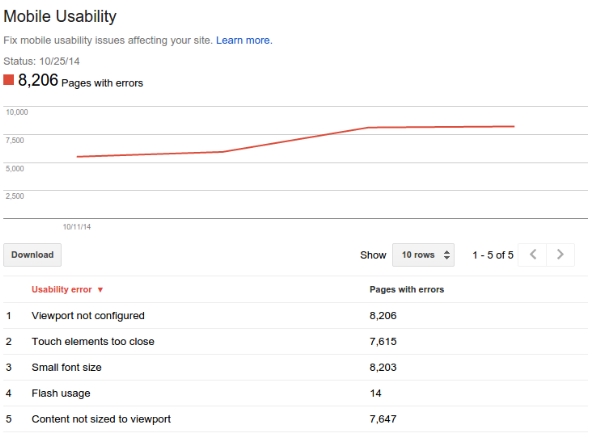

