BingLogo

On October 1st, Bing is shutting down Link Explorer, a link analysis tool that has been available from the company since June 2012, according to a new announcement. This is likely bad news for the many webmasters who used the tool to gain a deeper understanding of their own inbound links or to get a look at the links pointing to competitors’ sites.

According to the announcement, Bing isn’t shutting down the tool due to lack of popularity or demand, but because they had simply outgrown it. The size and architecture of Bing’s index have reached the point where there is just no way for Link Explorer to prove effective.

“We will no longer be able to power Link Explorer inside Webmaster Tools,” the company says — while suggesting its own Inbound Links tool as an alternative. Bing’s Duane Forrester explains the Inbound Links tool is more efficient for assessing your own links.

Link Explorer’s powers were limited since its inception as it only gave a view of a limited sample of your backlinks, meanwhile the Inbound Links tool you can view and export up to a million inbound links in just a few clicks.

Forrester also encourages those who used the tool to evaluate their competition to look for one of the many third-party alternatives available, saying the third party tools “provide even more comprehensive link analysis” than provided by Link Explorer.

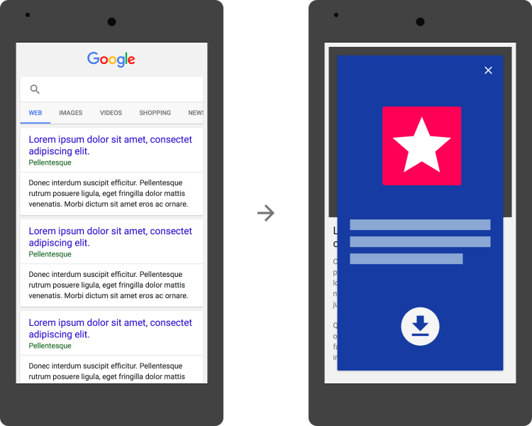
Large overlay advertisements will likely be going out of style fast, as Google has announced app interstitial ads that cover a “significant amount of content” on your page will be considered not mobile-friendly and will not rank as well as mobile-friendly pages.

The change will go into effect on November 1, but Google’s mobile-friendly testing tools are already showing them as not mobile-friendly as of yesterday. In the announcement, Google wrote:

After November 1, mobile web pages that show an app install interstitial that hides a significant amount of content on the transition from the search result page will no longer be considered mobile-friendly. This does not affect other types of interstitials. As an alternative to app install interstitials, browsers [should] provide ways to promote an app that are more user-friendly.

Here is an image to give you an idea of the kind of app interstitials that Google is attempting to do away with:

app-interstitials-google-not-mobile-friendly-750x600

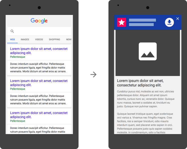
Here is an example of the type of interstitials that will be considered mobile-friendly, according to Google:

app-interstitials-google-yes-mobile-friendly-750x600

This means the native Apple-supported Smart Banners and Google Chrome-supported App Install Banners will continue to work just fine without causing any problems for your rankings, but the extra-large ones that cover up most or all of the page will no longer be mobile-friendly.

If you want to make sure your site is safe, be sure to test your pages that use app interstitials to ensure they pass the mobile-friendly test or the mobile usability test. Either of these tools will show you immediately if your pages have issues with app interstitials or other issues that may make your pages rank poorly on mobile searches.

Google said this only impacts app ads that block content like this while other ads not for apps will apparently remain unpunished. In the announcement, it said, “This does not affect other types of interstitials.”

Nasa Twitter

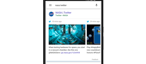
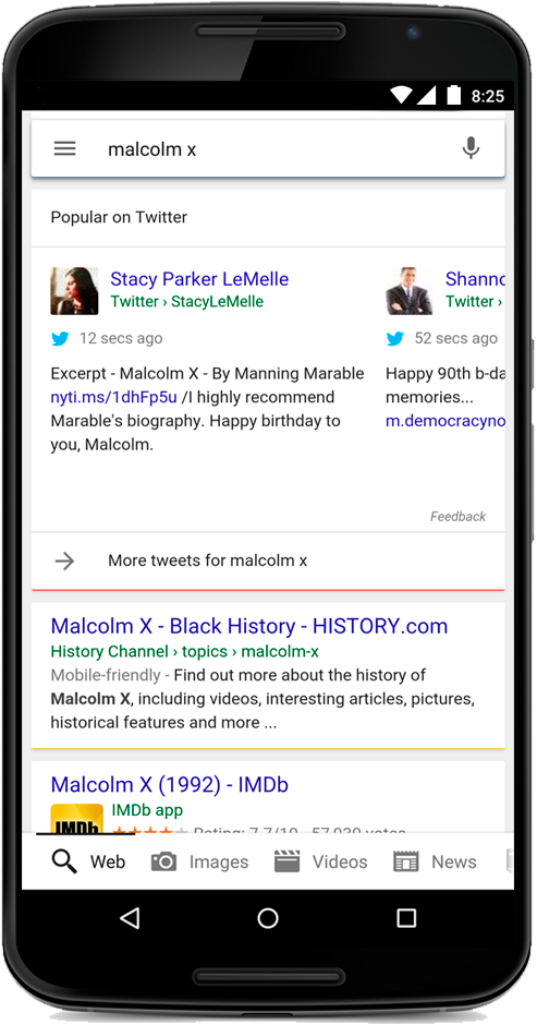
After months of fluttering in and out of Google’s search results as a set of experiments, Twitter is officially a part of the desktop SERPs. Google officially announced the news on Twitter and in an updated post on the Google blog, saying they have expanded displaying Twitter content in the Google desktop search results.

Tweets have been a part of mobile results since May, but the announcement officially brings them to desktop searches as well.

The update is started rolling out to all English users around the globe. Once implemented, Google will show Tweets in a carousel in the main column of the organic search results, but only when Google finds them relevant. Users do not need a Twitter account to see the Tweets in their SERPs or click on the results.

malcom-x

Many are already reporting seeing the Tweets within their results, but it is unclear how long the full roll-out will take.

mobile-closeup-campaign

It has been clear for some time now that neglecting to have a mobile-friendly site can hurt your Google rankings, particularly in mobile search results. However, some have been wondering if the reverse is also true. Does having a desktop-friendly web site have a similar negative impact on your desktop rankings in Google?

Well, last Friday Google’s John Mueller clarified the situation in a Google Hangout, saying you do not need a “desktop-friendly” site in order to rank well on desktop. The only caveat is that your mobile site must still render properly on desktop.

John Mueller said that you need to “make sure that desktop users can still see some of your content, if it is formatted in a way that works best for mobile, that’s perfectly fine.”

“You definitely do not need a specific desktop website in addition to a mobile website,” Mueller added.

If your business depends on desktop traffic and conversions to properly reach your market, it is still highly important to provide a pleasing experience when users come to your site. For that reason, I’d hesitate to suggest going all-in on mobile leaning design utilizing extra-large buttons and minimal navigation.

The most reliable strategy is to use a design technique such as responsive design to provide a great experience for users no matter where they are coming from. If that isn’t an option, it may still be best to keep operating separate sites for mobile and desktop so you don’t wind up losing customers just because they are using a desktop computer or smartphone.

You can see the full video below, or jump to 12:50 in the video to get straight to Mueller’s answer.

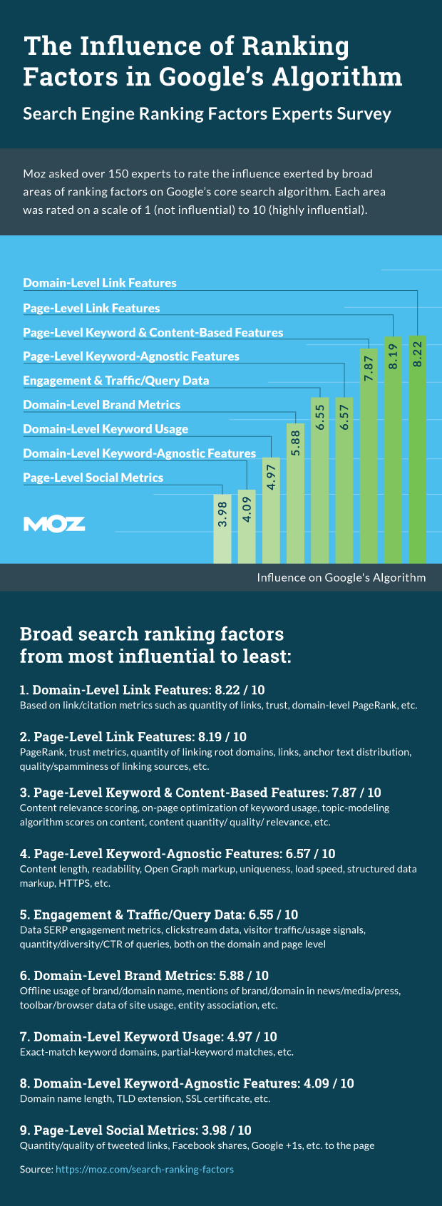
Every year, Moz publishes a complete review of the search ranking factors that most influenced the search results pages for the year. Now, they have released their latest study, which they say is the largest they have yet to do.

The study attempts to lift the veil on Google’s search ranking factors by surveying industry experts and using correlation studies to measure the search results and rankings. This year, Moz interviewed over 150 leading search experts, as well as using data from their own correlation studies and data from SimilarWeb, DomainTools, and Ahrefs.

The most notable finding from the new study is that, despite continuous cries of “links are dead”, links to the domain and page level are still the highest ranking factor for Google. The lowest factors included in the study were social metrics, TLDs, and basic on-page markup such as schema.

The infographic below summarizes the findings of the study, but you can also see the full study for more in-depth details.

rankingfactors-info

letters-718843_640

As you may have heard, yesterday Google announced massive restructuring that included launching a new parent company called Alphabet and appointing a new CEO. This is obviously big news, but it has also left many webmasters scratching their heads wondering what impact the new “slimmed down” Google will have on search.

Under the announcement, which was made by former Google CEO and new CEO of Alphabet Larry Page, Google will now be scaled down to only include the operation of the company’s primary internet products, while the newer research and innovation ventures will fall under the Alphabet umbrella.

For example, these ventures include Wing, a drone delivery system, Calico, a company focused on anti-aging, as well as robotics research and more.

The new, smaller Google will be led by new CEO Sundar Pichai. Since the announcement, several former and current Googlers, such as Matt Cutts, have expressed excitement about Pichai’s new leadership and think he is a great choice for moving the company forward.

Page says the restructuring will allow for a renewed focus on Google and described Pichai as someone who cares deeply about innovation.

While it is hard to predict the long-term implications of the restructuring, it seems as if there will be no immediate changes to Google search or AdWords. So, you can breathe a sigh of relief for now.

Starting now, Page will no longer be a part of day-to-day operations at Google, instead running Alphabet with President Sergey Brin. The pair says they are excited to be able to give attention to “more ambitious” projects, and they have no plans to turn Alphabet into a large consumer brand. Rather, Alphabet is set to be a platform for companies to grow their own brands.

When Google rolled out its Mobile-Friendly Algorithm the results were initially underwhelming. Despite weeks of frightening articles about the so-called “Mobilepocalypse” or “Mobilegeddon”, the search results listings were largely the same in the immediate wake of the algorithm launch. However, a new study from Moovweb shows brands without mobile-friendly sites are starting to feel the pain.

The new study, which tracked clear visibility and ranking, shows consequences are beginning to affect sites who have yet to make their site easily usable for mobile searchers.

Screen-Shot-2015-08-05-at-4.12.51-AM-800x573

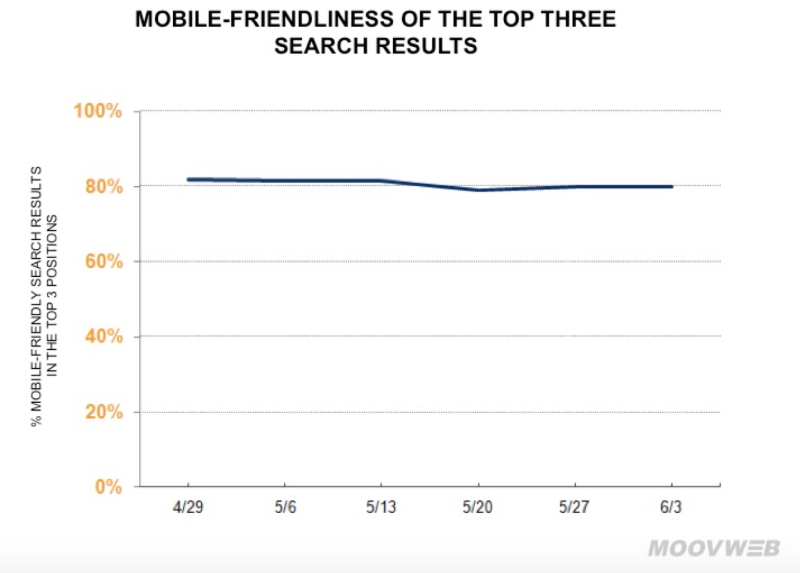
Moovweb has been tracking “1,000 important e-commerce keywords in a range of industries” ever since the rollout of the Mobile-Friendly Algorithm on April 21 to see how the new algorithm is impacting mobile rankings on Google.

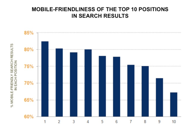
According to the study, top listings for search keywords were mobile-friendly 83 percent of the time, and 81 percent of the time the top three listings were. A review of the full page results showed 77 percent of page one results on Google mobile SERPs were mobile-friendly.

Screen-Shot-2015-08-05-at-4.12.28-AM-800x527

The chart above shows the percentage of mobile-friendly sites in each of the top 10 positions across all keywords tested.

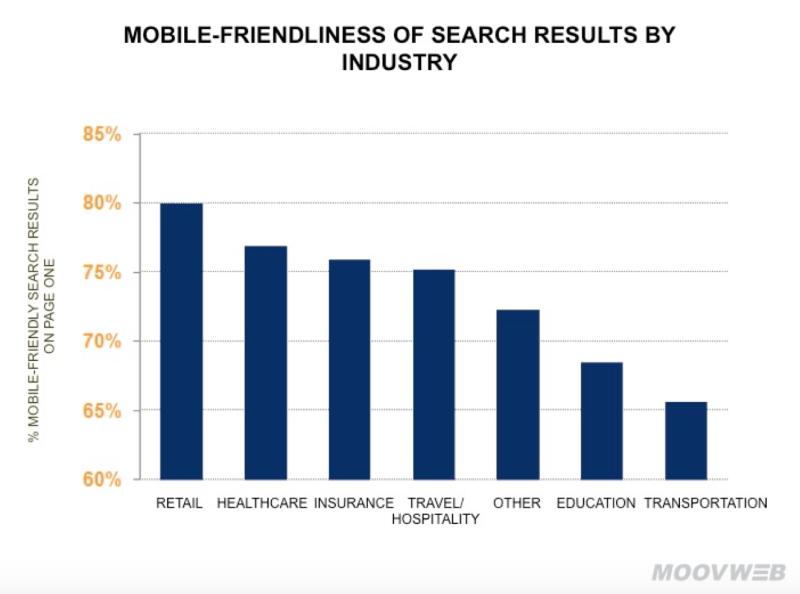
The company says mobile-friendliness in search results varied by vertical, with some industries being distinctly more mobile-friendly than others. Out of seven categories studied, retail had the most mobile-friendly results and transportation showed the lowest percentage of mobile-friendly results.

Screen-Shot-2015-08-05-at-4.12.43-AM-800x594

It may have taken months, but the impact of Mobilegeddon is starting to become more obvious, but there is good news if you are starting to feel the pain. Google’s Mobile-Friendly Algorithm runs in real time, so you can make your site mobile-ready any time and expect to see fast results on mobile SERPs.

The recently announced Google Panda algorithm update raised eyebrows for several reasons. Of course, any Google algorithm news is worthy of attention, but this specific update was unique in several ways that had SEOs and webmasters wondering what the deal was. Finally, Google has given some insight into why Panda 4.2 is so different from past algorithm updates.

There’s still not much information about why there was such a long lull between algorithm updates – over 10 months – but, Google’s John Mueller did recently provide some answers as to why the algorithm update is rolling out significantly slower than normal.

In a Google Hangout session between Mueller and webmasters, John explained the rollout is taking several months instead of the usual few days or weeks due to “technical reasons.” He also explicitly said the long rollout isn’t specifically intend to “confuse people” as some have suggested.

Both the SEM Post and Search Engine Roundtable transcribed Mueller’s comments on Panda:

This [Panda rollout] is actually pretty much a similar update to before. For technical reasons we are rolling it out a bit slower. It is not that we are trying to confuse people with this. It is really just for technical reasons.

So, it is not that we are crawling slowly. We are crawling and indexing normal, and we are using that content as well to recognize higher quality and lower quality sites. But we are rolling out this information in a little bit more slower way. Mostly for technical reasons.

It is not like we are making this process slower by design, it is really an internal issue on our side.

Webmasters have expressed frustration with the long rollout because it is taking much longer than normal to see results from the algorithm, and Mueller’s comments only provide a small window into how the algorithm is functioning.

Here is the video, from the start of the conversation:

 Panda

Google has confirmed it has released a Google Panda refresh over the weekend, over 10 months after the last update to the algorithm.

The latest refresh is unique from past updates as it went virtually unnoticed by webmasters until it was announced by Barry Schwartz. This is because it is being rolled out far slower than in the past. Previous updates were rolled out usually over a period of a few days or at most a couple weeks, but Google says this latest update could potentially take months to fully roll out, even on a site-by-site basis. However, as it is a site-wide algorithm, it will not be on a page-by-page basis.

Google was not willing to provide any information about why the rollout is being done so slowly.

Unfortunately, the slow rollout does not mean you can expect to make any last minute changes to save your site. It is too late to change your fate with Panda 4.2, although it’s always good to make any improvements you know are needed.

Schwartz also noted his personal SEO news site, which was penalized by Panda 4.1, does show an increase in organic traffic since the update. That means others who were hit by the last update may see small improvements as well.

The Panda refresh is expected to impact approximately 2-3% of queries, meaning it is a relatively small update.

While the refresh may be good news to webmasters who were impacted by 4.1, most people are less pleased – particularly by the slow rollout.

It may be months before we know the impact of the refresh thanks to the slow implementation, but, considering there hasn’t been an update since October of last year, it was past time for it to happen.

Mobile search has gotten a lot of attention this year as it has overtaken desktop search in many metrics, but a new report from mobile loyalty company SessionM shows how ubiquitous the use of mobile devices to aid in the shopping experience has become.

SessionM surveyed 12,000 randomly selected US smartphone users on their mobile shopping behaviors and the findings highlight just how large a role mobile devices play in the shopping process.

The company said 85 percent of respondents reported their m-commerce buying was steady or had increased compared to a year ago while approximately 15 percent told the company mobile buying had increased “significantly.

Personal data security and/or poor user experiences (e.g., too small images or text) were cited as barriers preventing mobile e-commerce from more growth.

According to the findings, more than 90 percent of respondents had made a retail purchase within the past 90 days before the study. The majority (73 percent) of those purchases were made in traditional, brick-and-mortar stores, and approximately 53 percent said they found the in-store experience superior to online/mobile shopping.

However, the study also found mobile search plays a vital role in the in-store shopping process. The overwhelming majority of respondents (90 percent) said they use their smartphones in stores while shopping. The top activities on smartphones while in-stores breaks down as follows:

  1. Price comparisons — 54 percent
  2. Looking up product information — 48 percent
  3. Checking reviews online — 42 percent

SessionM also had recommendations for valuable marketing opportunities for retailers from the data:

  • Opportunity surrounding in-store push notifications about deals/offers (57 percent were more likely to shop at a store if available)
  • Loyalty programs (76 percent would be more likely to shop at a store if available)

The data confirms what several other studies have found in the past. Shoppers are using their smartphones in stores to help them make informed purchases, but many retailers are failing to take advantage of any of the opportunities this presents.