instagramlive

Considering the success of live video on Facebook and other social media platforms, it doesn’t come as much of a surprise that Instagram is trying its hand with live video. But, they have put their own twist on it.

Today, the social photo and video sharing platform announced it is rolling out live video within their Instagram Stories section. However, these videos don’t remain once you stop streaming. Instead, they immediately disappear.

The feature is already rolling out and is expected to be available to everyone around the world within the next few weeks. Users are able to share live video for up to an hour and control their streams by notifying friends when they go live and deciding whether to allow comments.

“Live video on Instagram Stories helps you connect with your friends and followers right now,” according to a blog post announcing the update. “When you’re done, your live story disappears from the app so you can feel more comfortable sharing anything, anytime.”

All you have to do to start streaming is swipe right from the home feed and tap the “Start Live Video” button. You can also see who else is live streaming in the Explore area of the app, under the “Top Live” category.

Live video isn’t the only thing disappearing on Instagram, either. The platform is also rolling out the option to have automatically self-destructing photo or video messages when sending direct messages to friends and groups.

The feature operates almost exactly like Snapchat’s well known disappearing photos, which allow users to share content in a “spontaneous, pressure-free way.”

“You can choose a group or create one in just a few taps—and you can also send to individual friends at the same time,” Instagram wrote in a blog post. “Send anything you want, from inside jokes to your worst selfies. Unlike other messages in Direct, these photos and videos disappear from your friends’ inboxes after they have seen them. And you’ll see if they replayed it or took a screenshot.”

Google has already begun rolling out its mobile-first index to some users, but there are still a lot of questions about how exactly the search engine’s new separate index actually functions.

One such question got a surprising answer yesterday during the Google State of Search conference, as Maile Ohye told the audience that Google won’t index the AMP version of your page in the mobile search index – even when you don’t have a mobile-friendly alternative.

Google’s Gary Illyes also confirmed the news on Twitter after the conference:

That means if you’ve been using AMP pages as an alternative to making your website mobile-friendly, the search engine will skip over indexing your AMP pages in the mobile-friendly search index. Instead, it will by default choose to index the desktop version within its older index.

There is a way to force Google to index your AMP pages in this situation using a rel alternate attribute, but otherwise Google’s index will default to your desktop versions of pages.

This is particularly surprising because Google has pushed AMP as the ultimate way to deliver content to mobile users quickly and without losing ad revenue. But, in this case it seems the streamlined design of AMP pages leaves something to be desired. It may be the lack of site navigation options is what made Google decide to favor desktop over AMP in their index.

This change will most likely only affect a very small number of websites, but it is an odd choice for the search engine. The vast majority of websites who have adopted AMP also maintain a mobile version of their site.

GoogleAdWords

Google is giving AdWords’ price extensions a makeover this week to make prices even more prominent in search results, according to an announcement Monday.

Price extensions are one of Google’s many extended ad formats designed to highlight individual products and services and allow searchers to easily compare prices.

The extension was first released in July as a simple list, similar to how sitelinks are displayed. Now, Google has redesigned the extensions to appear in a card carousel near the top of search results. You can get a preview what these cards look like in the tweet AdWords released to announce the change:

The 10 languages included in the release are English, Dutch, French, German, Italian, Japanese, Polish, Portuguese, Russian, Spanish and Swedish.

While the new price extensions put the emphasis on cost, it is also useful for highlighting your brand, events, products, and related services. The ad format includes a header, description, and price.

Unlike some ad formats, price extension ads don’t direct users to a landing page. Instead, they serve as direct links to sales pages for the specific item highlighted.

The best part of this redesign is that price extension ads now take up even more valuable space at the top of search results, without costing any more than a typical ad. That means you get to make an even bigger splash without costing you anything extra.

bingmobileads

Bing is officially expanding their ad format selection to include app install ads in a pilot program open to all US advertisers. These ads are designed specifically to drive users to install apps when searching from their mobile devices.

The new format isn’t exactly revolutionary. Google has offered similar adds which directed searchers to the iOS App Store or Google Play Store for a fairly long time. However, this is the first time these ads have been available for Bing advertisers.

Setting up App Install Ads is easily done when selecting your ad type in your campaign settings screen. Once your campaign is running, Bing will then detect what type of device a searcher is using and show ads with a direct link to installing an app through their device’s app store.

”Using App Install Ads gets app customers to your app store directly, eliminating the extra time, navigation, and clicks they would otherwise need to take from your website.”

App Install Ads do have a few quirks compared to older ad formats. For example, there is no display URL on the ad. Instead, any clicks will take users directly to an app store page. The new ad format is also limited to just iOS and Android apps. There is no indication whether they will eventually support Windows or Windows phone apps in the future.

messenger

Facebook has been expanding their advertising service across every aspect of their platform for years, but one area has remained completely ad-free for users despite this – until now.

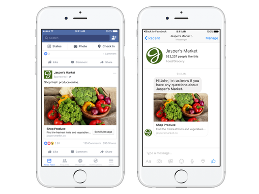
Facebook has officially launched ads within its Messenger app with ad bots.

The company has been testing sponsored messages since April, and now it has announced it is opening the messaging app’s ad format to all brands using Messenger’s developer tools to manage their chats.

636141993368026582-ad

The ads are pretty much exactly like the format they have been testing, with straightforward ad messages. However, you can’t spam out ads to everybody. You can only show sponsored messages to those who “have an open, existing conversation with” a brand, according to Facebook.

To help with this limitation, the company says it is also allowing advertisers to create ads that link directly to their Messenger account to spark more conversations with brands.

The ads are also limited to just one link and photo. Unlike most Facebook ads, sponsored message campaigns also cannot be modified to automatically run on Facebook or Instagram.

In another departure from Facebook’s normal ad formats, the company says it will charge advertisers anytime the ad appears on a Messenger user’s screen in their Messenger Inbox – even if it is never opened.

As announced last month, Google is officially making its first step towards the launch of mobile-first indexing with the test of its mobile-first search index.

The company confirmed the testing has officially started via its company blog:

“Although our search index will continue to be a single index of websites and apps, our algorithms will eventually primarily use the mobile version of a site’s content to rank pages from that site, to understand structured data, and to show snippets from those pages in our results. Of course, while our index will be built from mobile documents, we’re going to continue to build a great search experience for all users, whether they come from mobile or desktop devices.”

This means in the future Google will increasingly prioritize crawling the mobile versions of a site’s content, rather than treating desktop as the “main” version of your site.

The company also gave some quick tips to help you make the most of this change as it is happening:

  • If you have a responsive site with identical content across mobile and desktop, you shouldn’t have to change anything.
  • If you have a site where the primary content and markup is not identical across mobile and desktop, you should consider making some changes to your site.
  • Make sure to serve structured markup for both the desktop and mobile version.
  • Google recommends using the Structured Data Testing Tool to verify the equivalence of structured markup across desktop and mobile by typing the URLs of both versions into the Structured Data Testing Tool and comparing the output.
  • When adding structured data to a mobile site, avoid adding large amounts of markup that isn’t relevant to the specific information content of each document.
  • Use the robots.txt testing tool to verify that your mobile version is accessible to Googlebot.
  • Sites do not have to make changes to their canonical links.
  • If you are a site owner who has only verified their desktop site in Search Console, please add and verify your mobile version.
  • If you only have a desktop site, Google will continue to index your desktop site just fine.
  • If you are building a mobile version of your site, do not launch it until it’s ready. Google says: “a functional desktop-oriented site can be better than a broken or incomplete mobile version of the site.”

accelerated-mobile-pages

The Accelerated Mobile Pages project says it has made its stripped-down superfast mobile pages even more versatile with the ability to support forms in AMP HTML.

AMP uses a simplified version of HTML to provide pages faster than usually possible on mobile devices – where speed matters most to users. However, the format offers limited features compared to full-fledged web pages. Until now, one of those limitations was the lack of ability to include forms.

Now, AMP users can include everything from the standard e-mail address capture form to more complex forms or even interactive polls. In addition to making it easier to communicate or gain information from your visitors, the support for forms can help with allowing customers to select colors or other details on e-commerce product pages.

form-error

As the AMP project says in its announcement, support for forms “enables building experiences ranging from a product color picker on an e-commerce detail page to an email field to capture newsletter signups to an interactive poll to engage readers within an article.”

If you want to start running your own AMP pages to deliver content faster to on-the-go users or you want to start adding forms to your already existing accelerated mobile pages, check out the AMP project’s official guides and documentation.

You can also see live examples of what the forms may look like on your site at AMP by Example.

The AMP project says it plans to continue to expand the functionality of AMP pages and AMP forms based on user feedback, but the overall focus is still on providing functional and engaging web pages to users as fast as possible.

Mobile Internet Usage

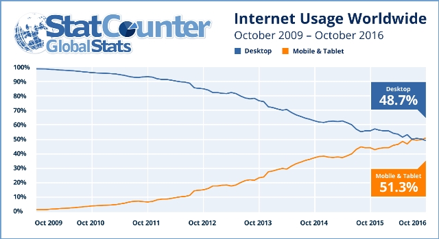
Mobile internet usage has been steadily gaining ground for years, and just last month it hit another milestone. According to a press release issued yesterday from StatCounter, mobile and tablet internet usage has finally exceeded total desktop usage for the first time ever.

Last month, mobile and tablet devices made up 51.3% of total internet usage compared to 48.7% by desktop. This is the first time worldwide monthly mobile internet usage has overtaken desktop according to StatCounter’s measure.

mobileusage

It is almost guaranteed this trend will continue in the long-term, but the short-term gains may not hold up. Mobile web usage has historically increased leading up to the holiday season and may deflate in the first part of next year. Even if this happens, the new milestone shows mobile usage is still consistently growing and will likely be the dominant way to access the web in the coming years.

Aodhan Cullen, CEO of StatCounter, says the new numbers should show businesses how important it is to make mobile a priority now, rather than later:

“This should be a wake up call especially for small businesses, sole traders and professionals to make sure that their websites are mobile friendly. Many older websites are not.”

Of course, mobile usage varies by country. While major markets like the US and the UK still primarily rely on desktop computers. Emerging markets like India overwhelmingly use mobile devices for internet usage and show no signs of slowing down.

social-media-adventure-1

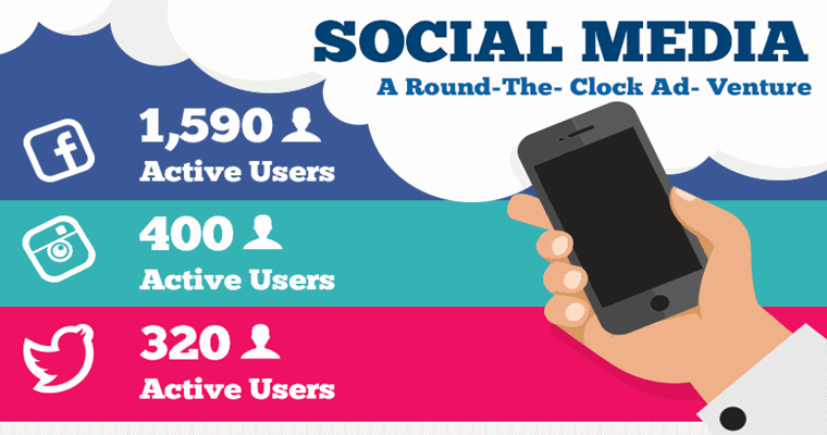
Want to get the most out of your social media efforts? There is no one-size-fits-all method that is guaranteed to give you success across every platform like Instagram, Facebook, and Twitter. Each platform has its own demographics and user behavior that means you must adapt to make sure you are striking when the iron is at its hottest.

Matt Booth from AddPeople made that easy to do with a simple infographic breaking down the demographics, user behavior, and best times to post for the biggest platforms you might be marketing on:

social-media-adventure

vinelogo

Not all that long ago, Vine was one of the fastest growing social apps on the market. The app made its name with short looping videos and a large community that took advantage of the medium to create comedy and even frights.

Since being acquired by Twitter, however, the app has gradually lost its place in the social world as other platforms like Instagram and Snapchat have incorporated their own video features. So, perhaps it is unsurprising that Vine has announced it will be ceasing operations and shutting down in the near future.

According to a post shared on Medium, the website and app for vine will remain online so that users will have time to download their Vines and mourn the loss of the app as a community.

The statement didn’t give any firm timeline of when Vine will fully shut its doors, or any explanation as to why Twitter has decided to shutter the app. It is possible Twitter could possibly choose to integrate the app capabilities entirely within its own platform, but so far the company hasn’t made any indication that it plans to do so.

Back in 2012, shortly after it was bought out by Twitter, Vine was sitting as the number 1 app on the iTunes app store and had a consistent 200 million active users. However, the rise of live video and new video features on competing platforms have pushed Vine out of the crowd. According to data from App Annie, Vine is currently sitting at number 284 in the iTunes app store charts for free apps.

Analysis also suggests year-over-year worldwide downloads of the Vine app have been consistently declining across both the Apple App Store and Google Play.

For what it’s worth, Vine co-founder Rus Yusupov only tweet in the wake of the news suggests he regrets letting Twitter take over the company.