While you won’t meet a web designer who doesn’t know about responsive design, its still relatively new. According to Webdesigner Depot, the term was only coined three years ago by web designer Ethan Marcotte who writes for A List Apart.
While some still treat responsive design as a passing trend, it appears that responsive design isn’t going anywhere until new technology requires a new design methodology or we find a better solution. Responsive design aims to make the user experience as enjoyable as possible, and while that pleases users Google has also made it clear that UX is going to be a major consideration in site rankings going forward.
The internet used to be confined to desktops, but we all know that time is long gone. We access the web from countless devices with constantly changing screen sizes and browsers, often from our phone or tablet while at work, on a bus, or watching tv at home. Responsive design strives to make the experience as gratifying and problem-free as possible no matter what platform you are using.
Mashable called this the year of responsive design, and in many ways they are right. It is clear that numerous hugely popular websites have implemented responsive design, and there are many signs it may be considered standard within just a few more years. If you’re still not caught up with this fairly new design method, Marc Schenker recently broke down the facts everyone needs to know about it.
https://www.tulsamarketingonline.com/wp-content/uploads/2018/07/TMO-Logo.png00TMOhttps://www.tulsamarketingonline.com/wp-content/uploads/2018/07/TMO-Logo.pngTMO2013-06-20 13:33:022013-06-20 13:33:02What You Absolutely Need To Know About Responsive Design
Depending on your skill set, a recent Webmaster video may be good or bad news to bloggers and site owners out there. Most people have never considered whether stock photography or original photography has any effect on search engine rankings. As it happens, not even Matt Cutts has thought about it much.
There are tons of writers out there who don’t have the resources or talent with a camera to take pictures for every page or article they put out. Rather than deliver countless walls of text that people don’t like looking at, most of us without the artistic talent instead use stock photos to make the pages less boring and help our readers understand us more. For now, we have nothing to worry about.
Cutts, the head of Google’s Webspam team, used his latest Webmaster Chat to address this issue, and he says that to the best of his knowledge, original vs. stock photography has no impact on how your pages rank. However, he won’t rule it out for the future.
“But you know what that is a great suggestion for a future signal that we could look at in terms of search quality. Who knows, maybe original image sites might be higher quality, whereas a site that just repeat the same stock photos over and over again might not be nearly as high quality. But to the best of my knowledge, we don’t use that directly in our algorithmic ranking right now.”
Logically, I would say that if Google does decide to start consideration photo originality on web pages, Cutts appears to be more worried about sites that use the same images “over and over” rather than those who search for relevant and unique stock images for articles. Penalizing every website owner without a hired photographer to continuously produce images for every new page would seem a bit overkill.
One of the greatest design benefits of using WordPress is how easy it can be to change themes completely. If you don’t know what I mean by that, consider a time when you’ve gone to a WordPress blog you frequent and noticed a significant change in the appearance or way the site works. A theme is basically the design and layout of the site or blog you’ve been following.
There are thousands of free customizable themes for WordPress available, and even more if you are willing to pay for a professional looking skin, and WP is built for these to be almost interchangeable – almost being the operative word.
When you’ve been running a blog through WP for a while, you accumulate a number of widgets and scripts that are used to improve the performance of your site as a whole. They can run from widgets used for tracking and ads to RSS feeds and an assortment of other additions you’ve made to your blog after you chose the theme you are working to replace or change.
When you change themes, it isn’t uncommon for the new themes to run into problems displaying or running these widgets you’ve built int your site. The standard WP widgets like Archives and Pages are almost always safe, but any special scripts for fighting spam, editing sidebars, and anything else that doesn’t come standard can become break down, bogging down or derailing your site.
OnextraPixel writer Jay Adrianna created a list of 15 things designers or site owners need to do when undertaking a change of themes. If you follow every step, all of your widgets, scripts, and plug-ins will remain safe and sound, and you’re new look will be flawless.
00TMOhttps://www.tulsamarketingonline.com/wp-content/uploads/2018/07/TMO-Logo.pngTMO2013-06-18 12:53:502013-06-18 12:53:50Keeping Your Site Working When Changing WordPress Themes
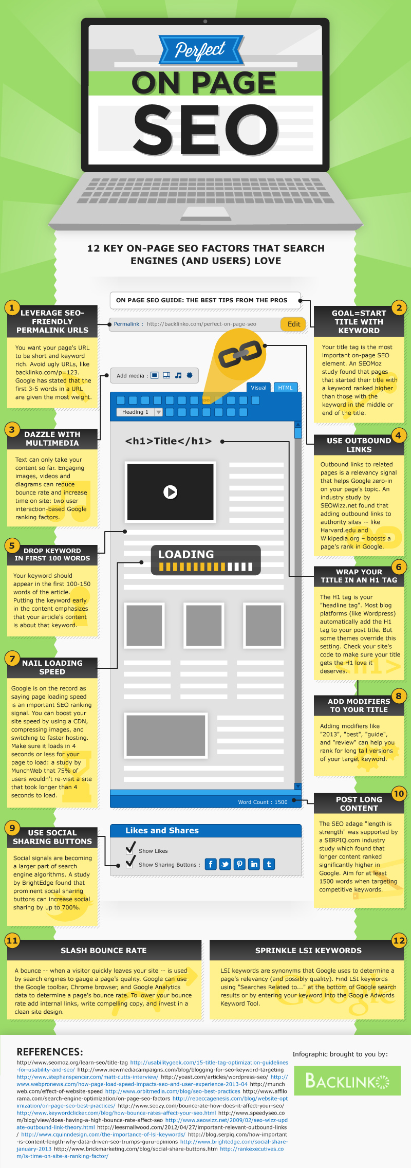
Every time I read something about on-page SEO, it seems like the authors are always just beating a dead horse, or at least trying to teach that dead horse about meta tags and keyword density.
Any SEO who has been around a little while knows there is much more to on-page optimization than just keywords and meta tags. There are plenty of advanced SEO strategies that improve your site, not only in the eyes of the search engines, but also from your visitors’ perspective.
Rather than drown you in another simple list of tips and charts that you’ll find most places, the folks at Backlinko decided to create an infographic, which you can see below, that you can turn to if you want to move your on-page SEO past the very basics. As a bonus, they even included the tips and charts on their page, for those of you who prefer the traditional style.
00TMOhttps://www.tulsamarketingonline.com/wp-content/uploads/2018/07/TMO-Logo.pngTMO2013-06-18 10:33:192013-06-18 10:33:19The 12 Best On-Page SEO Strategies [Infographic]
For those who aren’t watching closely, it can be hard to tell how much the color trends in design change. With such a diverse range of sites using different design styles from neons to earth tones, monotones to color clashing, how can you tell what is part of a trend or just a personal designer’s unique choice?
The truth is, most designers are influenced by design trends. We have to be, as we design for others. We have to keep up with what everyone likes visually, even when they aren’t quite aware what they like about it. This year has seen several distinctive trends either popping up out of almost nowhere, and a few who are finally catching on after slowly spreading. Brandon Hill from Design Madness broke down the color palettes and stylings we’ve been seeing all year, to help you design for what audiences are subconsciously loving.
1) All Emerald Everything – One of the biggest trends of the year isn’t inspired so much by popular tastes but by a simple influential recommendation from Pantone. Every year Pantone chooses a single color as their “Color of the Year” and this year Emerald won the distinctive title, and since then it’s been hard to ignore how prevalent it has become. It works well as a strong background color, accent, contrast, and in many other ways, while still feeling fresh. We’ve recently covered the ways designers are enlivening emerald, but suffice to say the color of the year could quite possibly stick around a while.
2) Blacks and Blues – The web has traditionally been set upon a white or like background color as text has usually been a focus. However, thanks to an increased attention on images, and more flexibility with text styling, dark colors like black, browns, and dark blues have become popular for “edgy” or “aggressive” sites. Whether you want to create a mood of foreboding or mystery, black has become a much more viable way to make your site seem cool or intense.
3) Grays and Accents – Gray has long been a loved neutral color for website designers. It doesn’t feel as empty as white when used as a background, and it pairs well with anything. Lately, designers have been choosing to pair this gray with neons and pastels to create heightened accents and playfulness. The rise of this style could be in part helped by flat design, as it works great as a simple neutral that still makes a page feel full.
4) Monochrome – Blame Facebook and Twitter, but the monochrome look is peaking this year, especially when combined with natural colors such as blues, greens, and often grays. It isn’t uncommon for designers to spice up this style with one or two accent colors to draw attention to important site elements like a call to action, but the monochrome look also creates a sense of cohesiveness which many brands find attractive.
5) Color blocking – Color blocking has come and gone in web design before, but its recent rise has been one of the most noticeable changes in design over the past year. The biggest difference between now and past trends that favored color blocking is the trend is now being used more for website functionality than aesthetics. Color blocks are being used as signifying icons of navigation menus, blocks of content you can select from, site categories, and every other way a designer may geometrically organize their site.
The through line of all of these is a recent focus on simplicity. Flat design is growing, and designers have been streamlining and employing minimalism more and more. The color trends of the year reflect this, while also bringing diverse design techniques that make simple color styles feel exciting and new.
00TMOhttps://www.tulsamarketingonline.com/wp-content/uploads/2018/07/TMO-Logo.pngTMO2013-06-17 12:48:252013-06-17 12:48:25The Color Trends From The First Six Months of 2013
Many small business owners are hesitant to really put an effort into SEO or their online presence because they feel like the web is already conquered by big companies they can’t compete with. It is common to feel like you don’t have the resources, time, or manpower to achieve any sort of success on search result pages, but local businesses actually have a much larger opportunity than they usually think.
Search engines provide a more leveled playing field when it comes to corporations and local businesses. All you have to do for efficient SEO is know where to invest your limited resources to get the most return, and show your value to the search engines. Nick Stamoulis recently discussed three main ways you can achieve SEO success, even with the limited means of a local business.
1) Build links naturally, one quality link at a time
While links have lost some of their influence in SEO, they are still a serious consideration to search engines. Google’s latest updates have many business owners scared of link building, but the truth is it will always be an important part of SEO and you can’t ignore it. The key to link building is to ensure that you are building quality links from various sources, which is best done by focusing on one at a time. This keeps your linking pattern looking natural and stays away from any gray areas.
Some will try to set link building goals or try to take short cuts, but Google has made it clear that if you don’t get penalized for your cheap tricks now, you will eventually. Arbitrary quotas only inspire efforts to get bulk links when your self-imposed deadline approaches, and easy links come with a big target on their backs.
2) Create Content For Your Audience
Content marketing is a buzzword for SEO at the moment, but some have already lost the real reason content has come to have such impact on SEO. Quality content has been favored by search engines because that is what audiences and customers want, and it inspires interaction between businesses and their customers. One of the things lost in the feeding frenzy of tasty blog posts, infographics, and ebooks is that those methods aren’t relevant for many smaller businesses.
Small businesses often offer services that draw customers not looking to spend a lot of time reading or watching videos. Instead, they want to be able to see what businesses have been doing, and what value they are contributing to the community. This can be as easy as semi-frequent announcements or updates on G+ or pictures and status updates on Facebook. Just focus on providing the information customers will want. Answer their questions, direct them to solutions, and provide something of value to those who find you online.
3) Find Your Niche
It is true that if you run a small flower shop you won’t have the same online presence that a national brand like 1-800-Flowers does. However, your smaller local net can catch better fish than a large net a national brand uses. You can establish yourself in your small market by pinpointing a variety of different ways your service can be used. That theoretical florist, for example, can cater wedding parties and high-end hotels, educate gardening enthusiasts, and help decorate local restaurants. Find what small markets aren’t cornered in your local area, and make your place.
Remember, national brands may have more money and people available to use for SEO, but value is what matters to the search engines. Ask yourself why customers keep coming to your local business rather than those corporate giants, and adapt it to the internet. If your site is worth visiting, the search engine results will reflect your worth.
https://www.tulsamarketingonline.com/wp-content/uploads/2018/07/TMO-Logo.png00TMOhttps://www.tulsamarketingonline.com/wp-content/uploads/2018/07/TMO-Logo.pngTMO2013-06-17 10:41:102013-06-17 10:41:10How Small Businesses Can Achieve SEO Success
Spam is a pain in the butt, but we bloggers have to deal with it on a daily basis. WordPress is as bad about spam as any other CMS, but there are a variety of options to help weed out the spammy nuisance. The most popular plug-in is Akismet, which most WordPress bloggers already take advantage of, but it doesn’t do near as much as most of us would like.
Instead of relying on Akismet, it is best to have a multifaceted defense that helps keep spam of all sorts out of the picture. Cats Who Code recently shared a list of snippets and “hacks” all aimed specifically at erasing spam management from your WordPress responsibilities. I’m sharing the different ways you can deal with the spam issue that have been highlighted in their article, but if you want the code for a specific solution, they are all available on their blog.
One method involves targeting any and all comments with extra long urls. If you haven’t noticed, most spam comments come with super long urls, which make them easy targets once you know what you’re looking for. But, there is a code you can paste into your functions.php file that marks any comment with a url over 50 characters as spam.
Similarly, you may also notice that most legitimate commenters are perfectly happy to not include any url at all. They are there to join the conversation, not sell their own site after all. This means you can fight spam simply by removing the url field from your comment form. Some commenters won’t be too excited about the change, as it is nice to get an added boost to your site simply by sharing your expertise on other blogs, but most won’t be too hurt by the decision.
Spammers are very predictable, and the most common trick they use is targeting specific keywords. As such, creating a keyword blacklist that uses the most frequently targeted keywords for spam will allow you to mark any comments using a mess of the target keywords as spam. It is a more focused approach than those above, but it can also affect commenters who just happen to use important keywords in their responses.
You have many more options when it comes to fighting spam, but it is best to take a look at the spam you’ve already been dealing with, so that you will know exactly what you’re dealing with before you start blocking tons of comments for every spammy tactic. You don’t want to accidentally weed out legitimate commenters while you’re on your anti-spam war path.
00TMOhttps://www.tulsamarketingonline.com/wp-content/uploads/2018/07/TMO-Logo.pngTMO2013-06-14 12:30:222013-06-14 12:30:22How To Keep Spam Off Of Your WordPress Blog
Many businesses come to SEO agencies looking for quick and easy solutions to their online problems. More often than not, all they want is to get high up in the rankings on Google, and they want to be there now.
In the past, there were ways to make this possible, though they’ve always been perceived as shady methods of optimization. Now, with Google’s continued push to make search more rewarding for the users rather than the companies fighting for the rankings, most of those techniques are completely obsolete.
That doesn’t mean you won’t find people still trying to sell you on these methods, but you will find that if you follow their advice, you won’t see your site suddenly excelling in the rankings. Instead, you will find Google slamming the door in your face by penalizing your site for your disingenuous optimization.
I found one of these groups still pushing the out of date, insta-SEO methods in a newsletter I recently came across, but I found it humorous. It seems now even the companies selling these “quick and easy” SEO “solutions” can’t even hide the reality of the situation.
The newsletter offers four “solutions” which will all sound very familiar to anyone keeping up with the SEO industry. They suggest buying links from high PR pages, joining backlink networks, using software to get quick backlinks from social sites, and using scripts to quickly fill your website with content. Do those sound familiar? If they do, you’ve probably read a list of what NOT to do in SEO within the past year.
What makes this newsletter so funny to me is that every “solution” comes with the concession that “Google doesn’t like them at all.” Every solution spends one short paragraph detailing how the methods (used to) work, but then they are all paired with a warning underneath explaining how Google has adapted to these methods and learned to cut them out of the rankings.
There is even a checklist at the bottom which tells you when to avoid the methods, and the checklist is basically made up of asking “is the website for a company?” and “do you want to succeed?” If you answered yes to either of those, even the people offering this advice admit you shouldn’t be using “quick and easy” SEO. If I didn’t know better, I would think their advice was satire, however they seem too eager to tell business owners that these methods will get you to the top of Google quickly.
The truth is, SEO is slow and the only way to build long lasting success is to keep up to date with Google’s best practices. If you want quick online success, sure you can use these spammy methods, but they won’t last long at all, and it is better to put your money towards optimization that has some sort of long-term chance of survival.
00TMOhttps://www.tulsamarketingonline.com/wp-content/uploads/2018/07/TMO-Logo.pngTMO2013-06-14 11:07:562013-06-14 11:07:56Is There Really Such a Thing as Quick and Easy SEO?
It is no secret that flat design is the biggest trend right now, and it has raised many questions from designers trying to get caught up on the trend. One of the more common questions pertains to fonts, specifically which fonts “work best” with flat design.
Typographic focus in one of the biggest aspects to flat design and the attention to simplicity, so choosing which font you will be working with is an important step. Of course, the main point of good typography of all styles is that it is easy to read and matches the look and style of the page overall, so there is no way to suggest a font that will work in every situation.
However, for flat design you will usually be better off working with very simple fonts and font pairings, as flat design is inherently minimalistic and simple. Whereas past wisdom suggested maxing out at three font pairings per design or page, flat design streamlines it down to two fonts, and sometimes just one.
Because of flat design’s bright color schemes, lettering relies heavily on font weights and clean lines. Designmodo suggests using typefaces with even strokes that contrast against the color palette, and are bold enough to read. You also may want a dash of flair to really bring life to the page.
The trick with flat design is to not fall into boring patterns. The general trend suggests using sans serif typefaces, but it is also possible to work with novelty typefaces as well. The sans serif typefaces are popular for their easy to read nature and great contrast against backgrounds, while serif typefaces come off as formal and against the nature of the simple style, thanks to their usual embellishments.
Novelty typefaces can work well to draw visual interest to areas with bigger text that demands more attention, but it is discouraged to use these for smaller text blocks. Because of this, it is suggested to always choose a second sans serif font if your big text is in a novelty style.
The most forgotten aspect of using text in flat design is that the words you use are just as important as he typeface. Flat design demands simplicity, and overly wordy pages won’t sit within the trend. Use direct language that is brief but effective, and always cut to the point. You don’t need full sentences unless there’s a full paragraph of content. Otherwise, stick to simple word pairings.
There are other serious considerations for designers as well, such as how you use text against color as well as capitalizing on size and space opportunities within flat design. Carrie Cousins discussed those issues earlier this week in her article about typography in flat design, and she even suggested some fonts that lend themselves well to the trend.
Matt Cutts, head of Google’s Webspam team, recently announced via Twitter that a new ranking update focusing on spammy queries has officially gone live, according to Danny Goodwin from Search Engine Watch. At the same time, Google has made it clear that if you don’t have a quality mobile website, you’re going to start seeing your rankings dropping.
Spammy Queries Ranking Update
The ranking update for spammy queries is supposed to affect 0.3 to 0.5 percent of English queries, but it shouldn’t be much of a shock to anyone who has been listening to what Cutts says. It was one of the most notable updates Cutts spoke about in an earlier Google Webmaster video where he discussed what to expect from Google this summer.
Cutts says the updates are specifically focused on queries notorious for spam such as “payday loans” on Google.co.uk as well as pornographic queries. The roll-out of the update will be similar to many of Google’s recent changes in that it is being implemented gradually over the next few months.
Smartphone Ranking Changes
It appears we’ve finally reached the point where slacking on mobile SEO is going to objectively hurt your site as a whole. A recent post added to the Google Webmaster Central Blog warns that “we plan to roll out several ranking changes in the near future that address sites that are misconfigured for smartphone users.”
Google named two primary mobile mistakes as their primary targets: fault redirects and smartphone only errors. Faulty redirects are “when a desktop page redirects smartphone users to an irrelevant page on the smart-phone optimized website,” such as when you get automatically sent to a homepage on a smartphone, rather than the actual content you searched for. Smartphone only errors, on the other hand, occur when sites allow desktop users reaching a page to see content, but gives smartphone users errors.
This is Google’s first big move in adding mobile configuration as a ranking consideration, but their advice belies their intent to continue to pay attention to mobile. They suggest “try to test your site on as many different mobile devices and operating systems, or their emulators, as possible.” It isn’t acceptable to only pay attention to desktop anymore.
00TMOhttps://www.tulsamarketingonline.com/wp-content/uploads/2018/07/TMO-Logo.pngTMO2013-06-13 10:58:422013-06-13 10:58:42Google Makes Changes To Spam Query and Mobile Rankings