More than a few web designers try to ignore it, but SEO is an incredibly important part of your website. Simply put, search engine optimization is the reason many people land on your site, and it can help you control who those people are to an extent. SEO should be an ever-present concern through your design process.

If you’ve managed to completely remain uninformed on SEO, it is the process of making your page as accessible and valuable to search engines as possible. It isn’t buying ads, which can attract traffic as well, but instead structuring your site in a way that reflects the preferred methods of the most popular search engines, so that they will see your website as being valuable enough to place higher up in their rankings.

If you read up on SEO much at all, it becomes clear that SEO is also constantly changing and updating, but there are basics that any website owner can do to make their page attractive to search engines and all optimization is boosted when you consider it from the beginning of your design. If you take a few steps when you first get started, you will find that every page you design performs better and more people actually lay eyes on your hard work.

Content and Text

Once you know the topic, theme, or goals for your current project, designers should brainstorm a few keywords that best describe the content that site will be used for. If you are doing a site for design, the obvious choices are “design”, “web design”, “typography”, “css” and maybe even “tutorial”.

Once you’ve chosen the proper phrases and keywords, be aware of using them throughout the site in ways that feel natural. You can fit keyword into headers, headlines, links, and meta data on every page of the site, but you should be careful about over-populating the page with these words to the point where it appears unnatural. Search engines will punish those who are obvious about “keyword stuffing”, so just don’t overdo it.

Images

First off, what search engines see and what users are shown are very different, especially concerning images. Search engines only see text, not images, so it is important they are aware of what your images show. That’s why it is smart to use alt tags on every image of your site that gives a description of what viewers are actually seeing.

For designers, another option for visual elements of the page such as banners and selected graphics is to design them using webfonts, HTML, and CSS when possible. Search engines can read those banners as regular text when created through this, which means you don’t have to worry about the markup.

Another aspect of image SEO is preparing the image properly before uploading them to your site. Huge pictures will slow down page loading time, which causes many potential viewers to leave before they even see the finished page.

Site Map

Site maps are xml files that outline the entire structure of your website, and they are like cheat-sheets to your site’s navigation. Create one, and make it live on every website you work on. Make sure it is submitted to Google so that the crawlers can use it even easier. Users also like access to sitemaps as well, though they’ll be less interested in it if your navigation is done properly.

Conclusion

There is even more a designer can do to optimize their site from the start of their workflow. However, be careful before diving too far into the SEO pool, because there are many “tips” and “tricks” offered out there that are either out of date or outright improper in Google’s eyes. SEO isn’t immediate, and any site telling you they can teach you how to get your site to the top of the results quickly is probably selling snake oil.

Design Shack offered some other credible suggestions for optimizing your site from the design stage, as well as tools that can get you started.

Google’s Matt Cutts recently made it very clear that usability is going to be one of their most important ranking factors moving forward, as they emphasize site speed and quality design as the two aspects that aren’t getting the attention they deserve.

Google isn’t the first to pinpoint how important usability is either. It has been one of the most common discussions in web design since its inception, while slowly becoming more important to users.

Quality usability is also at the heart of the of all the biggest start-up success stories. Quality products can be ignored if people get frustrated with the website, while the good or great products that are easy to access or use only attract more people and cement the public perception of a given brand.

You would think usability would have been boiled down to a science by now, or at least be such common sense that it wouldn’t be a big issue, but if it was so easy there wouldn’t be so many of the same usability mistakes all over the web, from big companies to the smallest mom-and-pop shops with an online presence.

Christian Vasile deconstructed these popular mistakes last week and offered options for those that seem to be repeatedly rejecting all the currents standards. Most of these, you’ll notice as bad decisions before you’ve gotten past the headline, but maybe you’ll be surprised to find that you’ve been continuously implementing one of the most hated design techniques around.

There is no doubt that blogging is a powerful tool for content marketers and SEOs. However, the simple days of recording your daily activities in a sort of online diary has grown to become a much more complex endeavor, especially for those who intend to use it for marketing.

The reason blogging became the mess many companies see it to be is simply that too many put too much emphasis on blogging and tried to make it something new that can drive away beginners or website owners with its complexities.

Blogging can do wonders for your SEO and your business, but there is such a thing as too much of a good thing. If you’re feeling frustrated or overwhelmed with blogging, chances are you’ve reached that tipping point. You are also probably making some common mistakes that are rather simple to fix. Most likely, you just need to simplify.

A simple way to simplify is to just narrow your focus a little more. If you find yourself trying to cover vast themes and ideas in your blog, you are using the wrong format for your thesis. For every blog post, try to stick to a single idea. You may think you’re doing that, but consider it like this: while a country like Portugal may be “one topic” it can be broken down into so many subtopics. Pick one of those subtopics, and then see if you can break it down more. If you’re interested in the local culture, zoom in more on the music. Maybe pick a specific style of music that is most relevant or interesting and focus on that.

Similarly, even if you choose one fairly specific topic that you are knowledgeable on, you can still feel compelled to write endlessly, but you probably shouldn’t. Longer posts can get a little more attention and earn you some credibility if they are well done, but articles reaching 2,500 or more words should almost certainly be considered for another medium than a blog. By over-reaching on blog post size, you can throw off the scores of people who scan for information, and limit your own output possibilities.

Depending on the size of your business, bloggers can also end up in a chain where five or six people have to sign off on every single blog post before they can go to publish. In reality, you only want two to three people being the deciding council of what content is going to the public. Two or three people are enough to ensure there are no big thematic mistakes or smaller errors like typos or factual inaccuracies, but the more people you add to that process, the more likely you’ll have to deal with more arguments about what is fit to be published.

Speaking of editing, even one-person blogging teams can get stuck in the process of over-editing. Blogs don’t have to be perfect. You want to appear reputable and intelligent, so you don’t want to put out something chock full of mistakes, but web writing is informal. You don’t need to spend the time editing a blog that you would something in a newspaper or any other type of professional writing. Your audience isn’t looking for that.

For the most part, you can feel comfortable sticking to one, or possibly two rounds of editing at most for any post. You want to ensure there are no huge cohesion errors you didn’t notice in the throes of writing, but if you misspell one work, it won’t be the end of the world.

Of course, there are many more ways you can over complicate blogging as a process. Sujan Patel recently wrote about some ways that bloggers tend to make everything more of a mess than they should. You want to put out quality content, but most of the time keeping it simple will just make it easier to see the good work you’ve done.

Regardless of how well you plan your social media strategy, you’re bound to make some missteps along the way. Erin Lynch, of Multichannel Merchant, points out the recent JC Penny uproar over a tea kettle resembling a certain German dictator. JC Penny couldn’t be expected to foresee that outcome, but they handled it impeccably. The tea pot was pulled from the store’s website and they used their social media profiles to apologize, with some good natured humor included.

The worst possible move in this type of situation is to ignore it. Had JC Penny’s social media team remained silent while the internet made the photo of their tea pot viral, they may not have escaped unscathed. Remember that in your own social media policies. When unhappy customers come calling, respond politely and apologetically. If it all possible, remedy the problem and report back so they, and others, can see how well you handled the issue. If ignoring problems is the worst move, then debating or challenging customers is a close second. The customer is always right, especially when your conversation is on a public, social media forum.

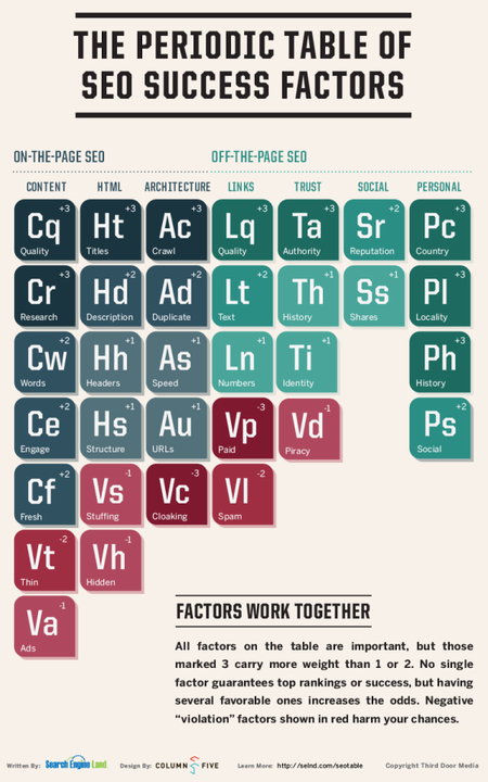
Two years ago, Search Engine Land released their “Periodic Table of SEO Ranking Factors”, but we all know that SEO doesn’t stay the same for that long, especially with the bigger changes that Google has been pushing out lately. That is why the periodic table was recently updated, clarified, and re-branded “The Periodic Table of SEO Success Factors”.

When you hear that Google has over 200 “signals or ranking factors” and over 10,000 “sub-signals” it is easy to get overwhelmed or confused as to where you should focus your efforts. However, those big numbers are usually created by speculation such as whether or not Google pays any attention to Facebook Likes (the truth is, we don’t know).

While there may be a full 200 signals Google uses, there is a hierarchy to how important each signal is, and we have a pretty good idea of the most important ranking factors that Google relies on. These bigger signals are also the most likely to stay stable over time. If we somehow were to find out the current full list of ranking factors, the system would change again by the time you had their weight and function mapped out. Heck, they may have changed while I typed this sentence.

Search Engine Land’s periodic table doesn’t attempt to focus on the small things, but instead shows you the areas that have the biggest impact on rankings and visibility. As the creators see it, the table is a starting point for new SEO and a friendly reminder for the veterans. The simple version of the periodic table is below, but you can find the expanded table as well as the key for understanding the image here.

Periodic Table of SEO Success

Reading a BookOver the weekend, I got on a reading kick, but often the biggest challenge in those instances is picking the best book to start up. Of course, you could always try to trudge through A Song of Fire and Ice, or some other fiction, but lately I’ve been hoping to get a little more out of my reading.

Thankfully, there are practically an unlimited number of books for designers and developers that there is no shortage of information or discussion for me to choose from. The best part is, the most recent wave of books have almost entirely been ebooks that cut out all the production costs and are available for free.

You can look into any design topic you want and almost certainly find a book focused on that idea. Whether you want to learn a new coding language, research the latest trends, or learn some historical perspective to inform your designs, there is undoubtedly a book on it. Rather than making you do a lot of Googling and vetting to pick the best book for your interest, Paul Andrews put together a list of 19 free ebooks that cover everything you want to know.

Some of the ebooks are simple guides like Mobile Web Design Best Practices from Mobify which (as the title suggests) walks you through 50 of the best ways to build the best mobile site possible. Similarly, you could check out Web Design and Mobile Trends for 2013 from Awwwards if you are looking to catch up on what is all the rage right now.

There are also much more in-depth texts you can dig into such as Learning JavaScript Design Patterns by Addy Osmani. The ebook teaches designers how to write beautiful, organized, and most importantly, maintainable JavaScript through the application of classical and modern design patters to the language.

Whether you’re looking to pick up a new skill or refine and improve your existing ones, there’s an ebook that will take you from start to finish with half the headaches of digging into a myriad of tutorials and online articles from a whole bunch of conflicting sites and writers.

Trash BinEveryone makes mistakes. It is a part of life. Sometimes we catch those mistakes before they get out into the public, but sometimes we spend endless time and energy on something and it just doesn’t work out. That happens with our web designs as well. We spend months working on our next big project, putting in research and extra hours until we think it is perfect. Then, it goes live and nothing happens. Months later, and your site may as well be flat-lining.

Just imagining that scenario can make a designer feel sick to their stomach, but you can’t let mistakes like those get you down. Design is very much about trial and error, and sometimes you have to make a lot of errors before it works out. But, there are some things you can do when a site doesn’t work out. Catalin Zorzini recently posted some steps you can take to get your design back on track.

  1. Ask for Opinions – Sometimes we get a little stuck in our own worlds and inspiration that we forget we aren’t designing for ourselves. We are designing for others, and the best way to find out what they think is by asking. If you have people within your friend or co-worker circle that fits the demographic you are looking for, ask them their opinion. They’ll get you out of your own brain and back on track.
  2. Simplify – Sometimes when we get driven to create a truly great site, we go overboard. It can be exhilarating to combine all your skills all into one amazing page, but when you combine graphics, images, videos, text, and animation all onto a page, it can get pretty jumbled and unattractive. Less is more, especially online.
  3. Make Your Call To Action Clear – What do you want people to do when they come to your site? Do you want them to purchase something or subscribe to a newsletter? Either way, make it clear and easy for your potential customer to do what you want from the moment they enter the page. You don’t want to annoy them with it, but you want it to always be more available than not.
  4. Build Your Credibility – The internet has more than its fair share of cons, misrepresentations, and shady dealers. These people create websites every day, and people are always on the lookout for them, so you have to make it clear when they reach your site that you are a reputable member of your community. Whether you join an organization within your physical community or online industry, having others who will back up your credibility will help your potential customers trust you.
  5. Use Social Media More – Social media is a big force online now, and every company needs to have an established social presence. Not only do you gain an easy way to interact with customers and find out what people think about your brand, you also gain credibility by widening your online foundation.

One of the biggest mistakes you can make in SEO is optimizing your website at the expense of the audience. While it may help get people onto your page, when visitors are met with a page filled with too much content on a bad design, they leave and you lose a sale.

With Google’s latest emphasis on usability, over optimizing may actually hurt your search engine rankings anyways. Jay Taylor recently shared some tips to make sure you are creating websites that customers and search engines alike will love. If you want to get people to come to your page and stay, follow these important rules.

  1. Understand Your Customer – First and foremost, the internet is now more about the user than it ever has been. Google includes aspects of usability such as speed, design, and content in their algorithms as strong indicators of quality sites. Not only that, but obviously you should be trying to appeal to your actual customers, not just your own tastes. The way you percieve your brand may not be the same as how your customers understand your product, so you want to find out why they choose you over your competitors. Once you know that, you know what to play up when introducing potential customers to your brand.
  2. Websites Don’t Have To Be Beautiful – That’s a bit of an overstatement, but it is far more important for a website to be usable and interesting to your target audience than it is to have a website that looks like a work of art. Use visuals that appeal to your customers in a way that solidifies your credibility and appeal to your customers. You want your website to look professional and be extremely usable, not unapproachably artistic.
  3. Create Great Content With a Purpose – The days of creating content stuffed with keywords solely to appease search engines is long gone. Your content should have a purpose to your reader and be aimed at actually informing your audience rather than rambling with specific words to attract crawlers. Poor grammar, unnecessary vocabulary usage, and awkwardly mechanical text turn people off, and can lose you customers. Instead, make sure your content has a purpose, value to your customer, and inspires action of some sort.
  4. Provide Easy-to-Use Navigation – User-friendly navigation is essential to allowing your customers to quickly and easily find what they’re looking for on your site, but it also allows search engines to more effectively index your site. There should be navigation in the header and footer so that customers always have access to it, and you might consider a drop-down menu in the top navigation if you have a lot of pages.
  5. Measure and Improve – Keep track of your key performance indicators such as conversions, contacts from the website, and possibly purchases to see how any new changes may be affecting your performance. You should also be using Google Analytics to watch where your customers are coming from, and what may be causing you to lose conversions.

Let me ask you, did you even know there is a difference between an SEO agency and a content marketing agency? To many, the terms have become synonymous, but the terms actually have different meanings reflecting what you hope to get out of hiring a professional to help you run your web presence. How do you know which agency is the best for you? Amanda DiSilvestro broke down the differences between the two recently, as well as the general pros and cons of both.

SEO agencies tend to be more focused on data and metrics from the search world. While they create content, they are more interested in calculating visibility and traffic and leveraging those with trends in search behavior so that they can create the best content for search engine visibility. Content marketing agencies on the other hand create content based on what what your audience wants most during the current buying cycle. The interest isn’t on search, but rather engaging with the public and achieving a goal.

The biggest differences are where each agencies information is coming from. SEOs use search-driven data and analytics, while content marketing agencies use audience-driven data and general content creation knowledge. Both agencies use data to create excellent content, and in many ways their efforts do overlap, but their methods are different.

What is best for you depends on the needs of your business. DiSilvestro suggests working with a content marketing agency first, so that you understand your audience, buying cycle, and the more broad ideas of creating content before seeking out an SEO company. Once you know how to create great content, an SEO can help you make it visible.

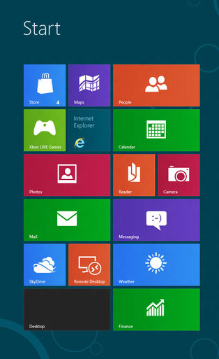
Flat Design WindowsYou’ve no doubt heard about it. All the blogs are talking about it, the big companies are using it, and there has been a visible change on the internet over the past year. Flat design is in, and it appears to be here for the foreseeable future.

Still, unless you’ve been keeping up with the most recent writings about design, it is likely you haven’t even heard of flat design. What does it really mean? Conceptually, the style is all about designing for the screen rather than simulating an increasingly irrelevant physical world.

In the eyes of flat design proponents, skeuomorphism, or design replicating the three dimensional world, was used as a crutch to make computers usable to those unfamiliar with them. At this point, that introductory style design is less needed because children are growing up with technology present in their lives.

Flat design isn’t just a conceptual style though. It has very distinct visual characteristics as well. According to Carrie Cousins, there are five things that make a design “flat.”

  • No Added Effects – Flat design is so-named because it strives to depict two-dimensionality. This is best achieved through a style that rejects all embellishments that have long been used to replicate three-dimensions such as drop shadows, bevels, embossing, and gradients. In flat design, every elements is crisp and and without shadows or feathered edges that blend it into the page.
  • Minimalistic Approach – Flat design attempts to be as simple as possible and thus it is usually accompanied with an overall minimalistic approach. The designs don’t use tons of flash animation or any other over the top design elements. Many sites rely almost entirely on color and text, but others include simple high resolution photography to set the mood.
  • Simple Elements – To create a simple and clear visual hierarchy, flat design uses many simple user interface elements, like buttons and icons. The trend has been using simple shapes such as rectangles, circles, or squares, and allowing each shape to stand on its own. Every UI elements is simple to understand and easy to use, striving for an intuitive experience.
  • Focus on Typography – Flat design is deliberately simple and crisp, which means the designs rely heavily on typography. Luckily, typographical design is also hugely popular at the moment as the internet has made using creative and interesting text much more possible than it ever was in the past. The typeface should always match the design scheme, but also simple, bold, and worded efficiently. Art or vintage fonts work well as embellishment, but it is important not to go overboard.
  • Focus on Color – Because of the simple styling, flat design also relies heavily on color. Pastels gave been very popular within the trending style, but most importantly flat design color palettes are more bright and colorful than other design styles. There is also the possibility to use more colors within a design than is usually utilized on a page. Many sites mostly use two to three colors, but flat design palettes can consist of up to eight equally used colors.