Tag Archive for: Designmodo

All of the big design trends of the year have settled in to the point where they no longer seem new. Responsive design, flat design, responsive typography, and even longshadow design have all reached wide awareness in design. So, obviously that means it is time to find the next big thing. Last week, Paula Borowska asserted that is going to be responsive icons.

What is It?

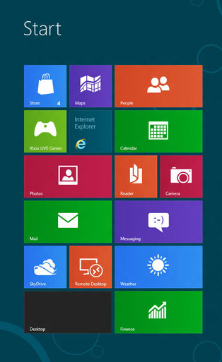
Responsive icons aren’t what you probably imagine. These days, responsive usually indicates a design element that responds to screen size, but responsive icons are only based on the size they are presented in. Because they can be shown in different sizes multiple times on the same page, screensize is irrelevant to determining the appearance of the icons. It is all about the actual size of the icon itself.

Source: Designmodo

Source: Designmodo

The difference between icons is the level of detail. When you’re gifted with a huge icon (500px by 500px), you’re able to squeeze in a lot of detail. But, as you shrink it, you will want to take away a bit of that detail at a time without losing the intended message. At 250px by 250px, you want to keep the general form, but cut some decoration, while a 25px by 25px icon needs to be as simple as possible to keep the message clear.

Why Does This Matter?

With the rise of incredibly high detail screens on all of our devices, it is necessary to make sure every aspect of our pages maintain uniformity while also working in every size. While a responsive icon doesn’t always respond to screen size, a responsive site with responsive icons may resize the icons as it needs while keeping everything looking great.

Font icons, responsive websites, and minimalistic designs have not only raised the popularity of using icons in design, but it has changed how we use them entirely. This gives us the opportunity to take our icons a step further and improve the entire experience of your site.

Borowska offers some deeper analysis on the icons as well as discussing groups attempting to make responsive icons easier to create; right now they are pretty tricky. It may seem like a small unnoticeable flourish, but in web design the details matter most. I’d keep your eyes on these icons going into the next year.

Risk Everything


For much of the history of the internet, one of the biggest guiding pressures was to fit as much content into the immediately visible area of the page while also providing an aesthetically pleasant view. The focus on “above-the-fold” design meant most sites generally have a header taking up 20-30 percent of the screen, including navigation, with content immediately available below. But, these days many designers are eschewing the old ways in favor of going big.

Many web designers are using oversized layouts with large, gorgeous images and videos, and luscious typography to immediately catch visitors’ attention. They make a statement immediately, and encourage users to begin interacting with the site. By opening the composition of your page and expanding everything, you push users to take in the sight and then start scrolling to see more, especially when combined with parallax scrolling and effects. As Carrie Cousins explains, “because the design is divided into screens that are unique, having something supersize on each is a great way to keep users interacting with the content.”

These types of websites also show that the designer or brand pushes past the standard for something more. Rather than relying on stock images, these oversized layouts are based on unique and visually exciting imagery. You get to showcase great visuals, which then showcase your own work.

The copy on your page also gets more attention on oversized layouts. There are less huge blocks of text to overstimulate the user at once, while the impressive layout draws attention to the text. Oversized layouts also allow designers to increase the size of text, demanding the attention of viewers. This is all bolstered by the use of quality typography which is allowed to standout on these types of layouts.

Cousins has a few other tips which will help designers play with the new larger possibilities of web design. While many clients may call for something more traditional, some projects allow you to expand your abilities and demand more of viewers while rewarding them with a gratifying user experience.

Flat Design Example


Flat design is undoubtedly one of the most popular design trends of the moment. You’ll find it online, on your phone, and it is even starting to make its way off the screen and onto posters and physical designs. It has already spit off into sub-categories of flat design like the so called “almost flat design” Apple is employing in their new iOS and the newly popular long shadow design.

But, the design style isn’t perfect. None are. The trendy style has numerous things it achieves very well, but there are far too many people glancing over the more problematic side of using flat design. Carrie Cousins wrote about the pros and cons of flat design, but plenty of people are willing to sell you on the upside of flat design. Today, I wanted to focus on the drawbacks.

It’s Trendy – While being trendy can be a positive – no one wants to be falling behind – you also have to be aware that flat design won’t last forever. As we’ve seen with the splintering into new iterations like long shadow design, the trends are already moving away from completely flat design, and there is no way of knowing when it will suddenly seem out of date entirely.

Usability – The simplification that lies underneath flat design can cause usability problems. Flat design can streamline a site, but it can also cause users to feel confused by the minimalistic interface. Many say they don’t know where they are supposed to click or tap, because the style does not do a good job defining what is and isn’t clickable.

Typography – Great typography looks absolutely marvelous in flat design, but boy does the style make it noticeable when typography is weak. Just look at iOS 7. The initial unveiling used an insanely thin typeface which many complained about. With layouts as simple as these, the eyes immediately go towards problem areas, and there is less to hide any flaws. If you aren’t great with fonts, you might ask for help or consider another style.

Too Simple – Not every site needs minimalism. The reason you haven’t seen flat design on many news sites is that the style isn’t good at conveying large amounts of information visually or textually. The style demands short phrases, impactful concise words, and full paragraphs just don’t tend to fit. The style of your site should entirely depend on the needs of your site. If you fill like you’re having to cut too much to fit into the trend, you should choose another design solution.

Flat Design Text Screenshot

It is no secret that flat design is the biggest trend right now, and it has raised many questions from designers trying to get caught up on the trend. One of the more common questions pertains to fonts, specifically which fonts “work best” with flat design.

Typographic focus in one of the biggest aspects to flat design and the attention to simplicity, so choosing which font you will be working with is an important step. Of course, the main point of good typography of all styles is that it is easy to read and matches the look and style of the page overall, so there is no way to suggest a font that will work in every situation.

However, for flat design you will usually be better off working with very simple fonts and font pairings, as flat design is inherently minimalistic and simple. Whereas past wisdom suggested maxing out at three font pairings per design or page, flat design streamlines it down to two fonts, and sometimes just one.

Because of flat design’s bright color schemes, lettering relies heavily on font weights and clean lines. Designmodo suggests using typefaces with even strokes that contrast against the color palette, and are bold enough to read. You also may want a dash of flair to really bring life to the page.

The trick with flat design is to not fall into boring patterns. The general trend suggests using sans serif typefaces, but it is also possible to work with novelty typefaces as well. The sans serif typefaces are popular for their easy to read nature and great contrast against backgrounds, while serif typefaces come off as formal and against the nature of the simple style, thanks to their usual embellishments.

Novelty typefaces can work well to draw visual interest to areas with bigger text that demands more attention, but it is discouraged to use these for smaller text blocks. Because of this, it is suggested to always choose a second sans serif font if your big text is in a novelty style.

The most forgotten aspect of using text in flat design is that the words you use are just as important as he typeface. Flat design demands simplicity, and overly wordy pages won’t sit within the trend. Use direct language that is brief but effective, and always cut to the point. You don’t need full sentences unless there’s a full paragraph of content. Otherwise, stick to simple word pairings.

There are other serious considerations for designers as well, such as how you use text against color as well as capitalizing on size and space opportunities within flat design. Carrie Cousins discussed those issues earlier this week in her article about typography in flat design, and she even suggested some fonts that lend themselves well to the trend.

Google’s Matt Cutts recently made it very clear that usability is going to be one of their most important ranking factors moving forward, as they emphasize site speed and quality design as the two aspects that aren’t getting the attention they deserve.

Google isn’t the first to pinpoint how important usability is either. It has been one of the most common discussions in web design since its inception, while slowly becoming more important to users.

Quality usability is also at the heart of the of all the biggest start-up success stories. Quality products can be ignored if people get frustrated with the website, while the good or great products that are easy to access or use only attract more people and cement the public perception of a given brand.

You would think usability would have been boiled down to a science by now, or at least be such common sense that it wouldn’t be a big issue, but if it was so easy there wouldn’t be so many of the same usability mistakes all over the web, from big companies to the smallest mom-and-pop shops with an online presence.

Christian Vasile deconstructed these popular mistakes last week and offered options for those that seem to be repeatedly rejecting all the currents standards. Most of these, you’ll notice as bad decisions before you’ve gotten past the headline, but maybe you’ll be surprised to find that you’ve been continuously implementing one of the most hated design techniques around.

Flat Design WindowsYou’ve no doubt heard about it. All the blogs are talking about it, the big companies are using it, and there has been a visible change on the internet over the past year. Flat design is in, and it appears to be here for the foreseeable future.

Still, unless you’ve been keeping up with the most recent writings about design, it is likely you haven’t even heard of flat design. What does it really mean? Conceptually, the style is all about designing for the screen rather than simulating an increasingly irrelevant physical world.

In the eyes of flat design proponents, skeuomorphism, or design replicating the three dimensional world, was used as a crutch to make computers usable to those unfamiliar with them. At this point, that introductory style design is less needed because children are growing up with technology present in their lives.

Flat design isn’t just a conceptual style though. It has very distinct visual characteristics as well. According to Carrie Cousins, there are five things that make a design “flat.”

  • No Added Effects – Flat design is so-named because it strives to depict two-dimensionality. This is best achieved through a style that rejects all embellishments that have long been used to replicate three-dimensions such as drop shadows, bevels, embossing, and gradients. In flat design, every elements is crisp and and without shadows or feathered edges that blend it into the page.
  • Minimalistic Approach – Flat design attempts to be as simple as possible and thus it is usually accompanied with an overall minimalistic approach. The designs don’t use tons of flash animation or any other over the top design elements. Many sites rely almost entirely on color and text, but others include simple high resolution photography to set the mood.
  • Simple Elements – To create a simple and clear visual hierarchy, flat design uses many simple user interface elements, like buttons and icons. The trend has been using simple shapes such as rectangles, circles, or squares, and allowing each shape to stand on its own. Every UI elements is simple to understand and easy to use, striving for an intuitive experience.
  • Focus on Typography – Flat design is deliberately simple and crisp, which means the designs rely heavily on typography. Luckily, typographical design is also hugely popular at the moment as the internet has made using creative and interesting text much more possible than it ever was in the past. The typeface should always match the design scheme, but also simple, bold, and worded efficiently. Art or vintage fonts work well as embellishment, but it is important not to go overboard.
  • Focus on Color – Because of the simple styling, flat design also relies heavily on color. Pastels gave been very popular within the trending style, but most importantly flat design color palettes are more bright and colorful than other design styles. There is also the possibility to use more colors within a design than is usually utilized on a page. Many sites mostly use two to three colors, but flat design palettes can consist of up to eight equally used colors.

Flat Design IconsFlat design doesn’t seem to be going away. The popular use of pastel colors and minimalistic layouts is getting bigger every day, and even the biggest proponents of skeuomorphism (ahem, Apple) seem to be caving to the new focus on designing for the screen rather than designing based on the physical world.

For many designers, this might mean an entire overhaul of your site if you are trying to stick with the trends. However, before you go banging your head against the wall about having to build your site from the ground up, remember that any big web design trend probably has tons of free resources already available to help speed up the conversion.

This is obviously the case with flat design, and while there are scripts to help with making a flat web site responsive or managing navigation, there are also free sets that will help you fill out the details of your site with any icon you need in a style that will match your new page.

Speckyboy recently compiled twenty free icon sets that will help with navigation, social sharing, or payment methods that your users will be seeing. Designmodo also created their own personal set of icons they shared wih their readers designed specifically for social media and sharing.

The icons are all high quality, resizable PNGs or PSD files, and you won’t have to worry so much about the tiny details while you’re working on the bigger picture of your site. Oh, and don’t be confused if you think many of them look like app icons. Rounded corners and geometric shapes are a big part of flat design.

Parallax scrolling was on almost everyone’s list of predictions for this year, but the community has been oddly quiet on the topic for a little while, most likely because it requires more finesse than many of the other trends on the tips of designers’ tongues.

To use parallax scrolling, you have to thoroughly understand what it is and how to use it. You can’t just follow a simple tutorial. You have to design around parallax ideas which requires much more time and focus.

To see the effect in action, click the image.

To see the effect in action, click the image.

For those unfamiliar with the niche trend, parallax scrolling is a technique that happens when multiple layers of information and images are combined and move at different speeds to create movement, depth, or a 3-D appearance. What makes parallax scrolling different from other similar uses of this technique is putting the power in the hands of the user. Instead of an automated effect, the visitor controls the illusion with their mouse.

It is a tricky method to master, and requires quality resources to work properly. A great parallax scrolling page is easily ruined with low quality images. The scrolling can be vertical or horizontal. Though vertical scrolling is by far the more popular, horizontal scrolling is gaining a following slowly.

While it is difficult, parallax has some unique advantages over other types of designs. Many use the technique simply for aesthetics, but it also changes how users interact and read a webpage.

One of the easiest ways to see how parallax changes browsing patters is to look at its storytelling capabilities. Parallax scrolling can turn your average webpage into an interactive storybook that users can move through at their own pace. Where videos usually require sound and complete attention, stories can be told with parallax scrolling that puts the user in control, and won’t be as prone to get visitors in trouble when their at work.

Parallax scrolling is also especially adept at showcasing products. Like an online catalog  parallax techniques can make it appear as if you are flipping through a group of products, or seeing multiple angles of the same item for a better idea of what it really looks like, all while keeping the focus directly on the product by putting it front and center.

Carrie Cousins from Designmodo has a few other ideas of how you can use parallax scrolling, but the best thing to keep in mind about parallax scrolling is, as Cousins says, “the backbone of parallax is user experience.” Parallax techniques engage and intrigue users in a way that makes them feel as if they are experiencing web sites in a new way entirely. Don’t squander it with bad UX.

Despite public perception, web designers and developers know their job is part of a system that relies on multiple people doing their jobs to create a finished product. Web design isn’t just throwing things onto a site in away that looks pleasant and matches the subject matter.

You have to know how to make a website work in a way that users will want to use. Layout, functionality  color palette  and different features are all part of the website as a whole and a single weak part will drag down the entire thing.

That’s why most designers now rely on prototypes and wireframes to work out their designs with clients and coworkers before leaping into a full site design. With prototypes you can lay out potential site maps, application flow, and general makeup of the site without wasting countless hours building the real thing.

rsz_wireframesite

While you can do a lot of this type of work on pen and paper if you want, there are tools out there designed strictly to help with this process which will make your clients feel impressed by a simple idea for a webpage and showcase how the site will function.

John Conor at Designmodo collected ten of the latest and best of these tools for wireframing and prototyping. They all have their own strengths and weaknesses, but that means no matter what problem you are having with brainstorming your website, you have a tool made to fit your needs.

Minimalism is all the rage in web design at the moment, and extra negative space is an essential aspect of the style’s aesthetic  But, is minimalistic design and the white space accompanying it just a trend or is there more to it?

White Space

To the more business minded designers, all the “empty” space could be used for ads, more content, or more usability features that guide a user through the site. If you compress the amount of space between images, columns, and every other visual component, in theory you can fill the page with more of what users want to see, right?

That mindset favors business, but it doesn’t favor aesthetics. As Carrie Cousins puts it, “space is the thread that holds your design together.” White space separates objects, letting users find what they want to more easily. Space between objects groups things together, and it creates a sense of balance that makes a design seem cohesive and professional.

For most designers, there is a rule about keeping white space around content for the sake of making it more readable, but the same is true for just about any aspect on the screen. It draws attention to the most attractive aspects of a site by singling them out from others, while also organizing your site.

Neglecting negative space can make your site seem busy, cluttered, and hard to comprehend. While filling extra space with adds, or squishing everything together to present the reader with more seems like a good idea, in reality less is often more. Readers don’t want everything at once, they just want to be able to easily find what they’re looking for.

But, minimalistic design is not even close to risking using too much white space. Most designers are already thinking about using small amounts of negative space to organize content, but the new design trend is taking that idea to its extremes.

Using huge amounts of white space can have its problems. While it can be used to create stark contrast, white space can also make objects feel small, or detached from the rest of your design, unless you make your negative space feel deliberate.

White space draws attention to one object in a way so forceful users can’t help by stop and notice the object floating in a sea of space, but it is possible to go overboard.

Good use of white space makes the “empty” space feel active or purposeful. Bad white space makes a page feel empty or incomplete. The best place, or at least the most common area, to use white space is the header. When a viewer lands on a site with a lot of negative space in the header, they are met with a striking and simple statement of what the site is all about, all encapsolated in a singled out set of images or text.

If you use negative space in the header, the limits white space can put on content are removed, because content still flows fairly traditionally underneath. Many clients worry about forsaking content for “empty” space, but if the content focused areas of the site still present everything clients would expect to find, negative space won’t detract from the design.

However, if users can’t find what they are looking for on a minimalistic page, they might place the blame on the amount of space not being used to provide a better navigational system.

Not every site needs a minimalistic or negative space heavy approach. These aesthetics are tools just like everything else in a designer’s repertoire, to be pulled out when the time is right. You don’t have to start at the extreme end. Just try letting your content breathe a little and see how you like it.