The best websites are all designed with the unique needs of a business and their customers in mind, but don’t think there isn’t some common ground between them. Web designers have their own process and plan when it comes to making a new site, but they all share some web design elements that simply can’t be left out.
These elements make a site go from boring to exciting and they ensure users are always happy with their online experience. Today, Carrie Cousins shared 10 different parts of a website you can’t neglect if you’re hoping for success.
1. Space
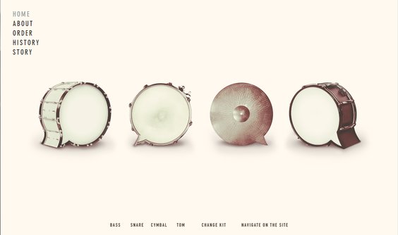
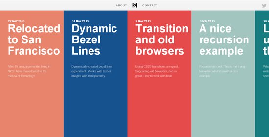
Beatbox Academy
Space is the basis for all web design. Space dictates the flow, readability, mood, and style before you’ve even begun to consider the details of your site. The best designers all have a solid grasp on how to use space and they experiment with space in ways no one else is. Whether designers are playing with the idea of wide open space or creating a more clustered environment, you have to take the time to actively decide how you want to manage space if you want a successful design.
Space also plays a strong role in determining the focus of your page. Any image or text surrounded by open space will automatically seem more important and even larger than a design element crammed next to other aspects fighting for attention.
2. Simple Navigation
Visitors can’t actually use your site if they can’t easily navigate it. Every website should have obvious, easy to use, easily identifiable navigation. Even the most complex sites should be able to be fully explored from a set of five to ten menu items.
Navigation doesn’t always have to come in the form of a menu up at the top. Navigation can also be simply telling your visitors how to use your site, such as adding arrows to a parallax scrolling website.
3. About Us
While it may not be the most exciting part of web design, including an ‘About Us’ page is indescribably important for a smaller business or site owner to tell visitors who they are and what they offer. While it may not be as essential for major companies, you will notice even they tend to include one of these pages.
The trick is to keep it simple. You want to tell visitors enough about your brand and what you bring to the table to interest users, but you don’t want to bore them. This shouldn’t be just a simple template page. It should be kind of like a long-form business card. Short and sweet, but informative, and visually interesting enough to help you stand out without distracting.
4. Contact Information
Without contact information, how are you expecting to get feedback from visitors? Contact information is important for letting your visitors reach out to you, but it also helps validate that you are who you say you are. Nothing makes a site seem sketchy like not being able to find a way to contact a business easily.
To make it easier for users to find and reach out to you, you want your contact information to be highly visible and contain all of the modern ways users might want to connect. A phone number and physical address are absolute musts, but you should consider including social media profiles of yours such as Twitter and obviously an email address is expected for any website.
5. Call to Action
Most websites are created with an objective in mind. Whether you want to make a sale, educate the public, or gather contact information to more thoroughly connect with your audience, there is some goal you are hoping to achieve. A call to action is how you get your users to fulfill your goal, and it should be obvious and strong.
You wan to start out by determining exactly what your objective is, then design it so that action is immediately obvious. Color, contrast, and space are all useful tools for drawing users to the buttons and pages you want.
Even a common signup form is an example of a call to action in web design. The best way to use one of these sigup forms is to place it in a prominent location on the page and make it simple enough to not disuade users from filling it out.
6. Search
It is absolutely shocking how many sites feel they don’t need a search function. Think about all the times you wanted to look up some older information but you weren’t able. Chances are, if you use a site regularly, you will eventually want to search for something, and being stonewalled by a negligent designer can be a real problem.
Implementing search bars is rather common practice, and you all have to do is design that box to be unobtrusive but available. If you want to use an icon, the magnifying glass is accepted shorthand for search, using something else can be confusing.
7. Informational Footer
Many sites use the footer area as a dumping ground for all the information that would otherwise clutter up their site. These unorganized blocks of links aren’t entirely wrong, but they fails to take advantage of the space. Instead, you should try to use the area to communicate a short message or important information in a condensed form, while including those important links in a clear and organized form.
The footer should be simple and streamlined, but it is a good place to include contact information, a small site map, and a selection of important other information. Make it easy to use and understand.
8. Obvious Buttons
It should seem pretty obvious, but every button should look like a button. Pick a visual cue for your site and stick with it so every button is clearly available to users. Not only do you encourage user to click around your site more, but you’ll avoid frustrated users who can’t navigate your page. Using a consistent style is important for web design and branding.
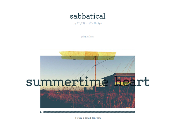
9. High Quality Images
Consider how people are accessing the internet. Smartphones, tablets, and even gaming consoles are all used to browse the web, and most of these have high resolution screens which leave little to the imagination. Users want images to create a visual interest, but you can’t skimp. Low quality images are going to look awful on a ‘Retina’ display. However, with just a few high quality custom images, you can make your site stand out from the crowd.
10. Web Fonts
Just a few years ago, the internet ran on just a few typefaces for everything. They were considered to be the most readable and they solved the issue of making sure every visitor could see text. But, those limitations no longer exist. You can use almost any font you want and you won’t have too many problems.
However there are two reasons web fonts are still important: compatibility and licensing. When you use a web font service, you ensure your search engine optimization won’t be hurt and your site will look consistent on every platform.


