Tag Archive for: flat design

SkeuoVsFlatBanner

As a business trying to keep up with the constantly changing internet, it can be hard to decide which trends to follow and what works best for your business. It is important to have a modern and up-to-date website, but if you chase every trend you’ll often end up falling behind and adopting practices that don’t suit your own business.

The biggest decision many web designers and business owners have had to make in recent history is whether or not they should adopt the flat design craze that has swept the web over the past year, or whether they should be using more traditional skeuomorphic design practices for their brand. As the flat design style has become a staple of many big businesses, many brands are also forced whether they run the risk of becoming cliche by picking up flat design or if they will fall behind the times with the older style.

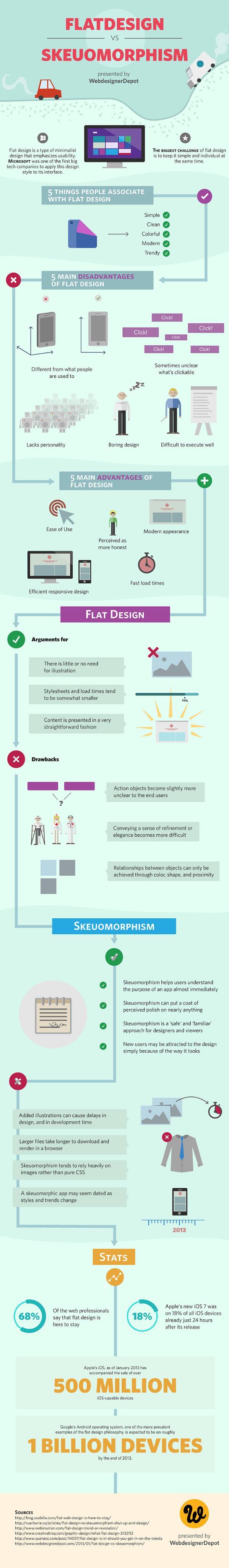
If you aren’t familiar with the whole flat design vs. skeuomorphism debate, there has been a major shift in popular web design trends that really gained steam in 2013. Chances are, your web design has relied on skeuomorphic design principles at some point, even if you’ve never heard the word.

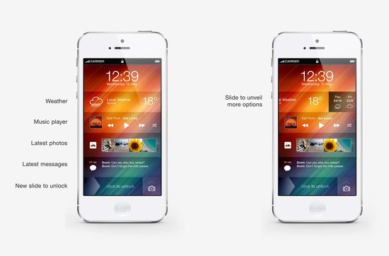
Skeuomorphic designs rely on recreating objects and visual styles from the three-dimensional world in order to make web design more easily relatable to users. By using stylistic cues and layouts from things such as calenders or notepads, users are immediately able to feel familiar with a website or application.

However, as computers, tablets, and smartphones have made technology a constant part of day-to-day life, flat design proponents have pushed for designs that are created “for the screen.” As a guiding principle that is understandable, but flat design activists have translated that mantra into strict stylistic principles as grounded in minimalism as they are web design.

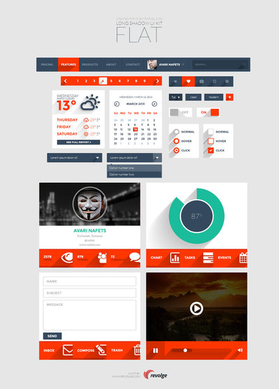
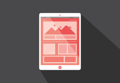
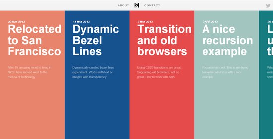
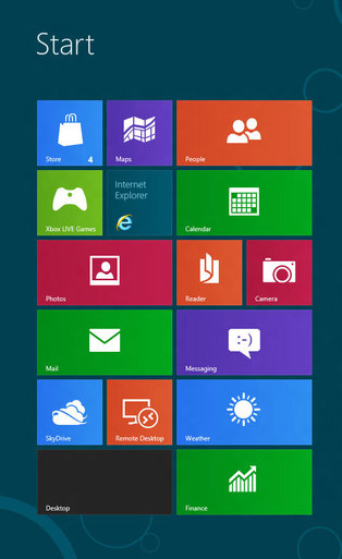
Flat designs use simple elements and a strict two-dimensional approach that eschews all added effects such as drop shadows, bevels, and embossing. Flat design has also been heavily associated with the flourishing popularity of more complex typography.

The loudest voices for flat design have made it sound as if the new design style is a revolution in how we design, and on some levels it is. The basic guiding principles of “designing for the screen” can open up many new ways of thinking about web design which are fertile for innovation. As a style based on minimalism and strict stylistic rules however, flat design is a trend with more lasting power than some of the more fleeting crazes.

It is more important as a business owner to decide what design styles benefit your brand the most, rather than which trends are the most popular at the moment. There are numerous benefits of flat design, but skeuomorphism has been a long standing way of making products and web designs the most usable and familiar they can be for their audience. Plus, as Apple has shown, you can make your designs more flat to benefit usability without entirely going to Flat Design.

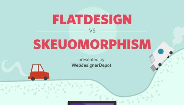
To help you understand which design style benefits your brand and business the most, WebdesignerDepot released an infographic highlighting the biggest advantages and drawbacks to skeuomorphism and flat design. It may help you find which style works for you.

New Image

Flat Design Example


Flat design is undoubtedly one of the most popular design trends of the moment. You’ll find it online, on your phone, and it is even starting to make its way off the screen and onto posters and physical designs. It has already spit off into sub-categories of flat design like the so called “almost flat design” Apple is employing in their new iOS and the newly popular long shadow design.

But, the design style isn’t perfect. None are. The trendy style has numerous things it achieves very well, but there are far too many people glancing over the more problematic side of using flat design. Carrie Cousins wrote about the pros and cons of flat design, but plenty of people are willing to sell you on the upside of flat design. Today, I wanted to focus on the drawbacks.

It’s Trendy – While being trendy can be a positive – no one wants to be falling behind – you also have to be aware that flat design won’t last forever. As we’ve seen with the splintering into new iterations like long shadow design, the trends are already moving away from completely flat design, and there is no way of knowing when it will suddenly seem out of date entirely.

Usability – The simplification that lies underneath flat design can cause usability problems. Flat design can streamline a site, but it can also cause users to feel confused by the minimalistic interface. Many say they don’t know where they are supposed to click or tap, because the style does not do a good job defining what is and isn’t clickable.

Typography – Great typography looks absolutely marvelous in flat design, but boy does the style make it noticeable when typography is weak. Just look at iOS 7. The initial unveiling used an insanely thin typeface which many complained about. With layouts as simple as these, the eyes immediately go towards problem areas, and there is less to hide any flaws. If you aren’t great with fonts, you might ask for help or consider another style.

Too Simple – Not every site needs minimalism. The reason you haven’t seen flat design on many news sites is that the style isn’t good at conveying large amounts of information visually or textually. The style demands short phrases, impactful concise words, and full paragraphs just don’t tend to fit. The style of your site should entirely depend on the needs of your site. If you fill like you’re having to cut too much to fit into the trend, you should choose another design solution.

Flat design has officially become commonplace, but it is hard to tell how long its offspring, long shadow design, will last. At first glance, it seemed long shadow design would just be a small isolated derivative from the popular flat style, but it seems to have taken on a life of its own by providing a sense of depth while still maintaining a flat and minimal aesthetic.

For those who have yet to run into the style, it is characterized by appearing largely similar to flat design, but with a 45 degree angle that extends much further than any standard dropshadow would. Onextra Pixel estimates the shadow is around 2.5 times the size of the object normally.

If you want proof of long shadow design’s spread through the web design community, look no further than the number of free resources being released to make implementation quick and easy. Onextra Pixel has highlighted two over the past week alone, and there are many more included in theirs and other sites’ weekly round-ups of resources.

The first resource is a simple set of icons created by Christopher Behr that cover all you basic needs from music, settings, messaging, mail, and social media icons. They are all clearly inspired by the Apple icon style, while bringing long shadow aesthetics to the table.

The other free offering comes from a Bucharest based design and development studio called Responsive. They are giving away a complete long shadow flat UI kit which will make development a breeze.

Who knows if long shadow design is going to pass out of favor in the coming months, but it is currently riding high on the back of flat design. It certainly offers a solution to flat design’s complete rejection of depth while still providing a sleek and clean design.

Long Shadow UI Kit

Minimalism has been all the rage in web design lately. Flat design is currently one of the most popular design trends around, and it relies strongly on minimalist design principles. If done correctly, minimalism can achieve an experience that will stick in the minds of visitors for some time while doing away with all the sound and fury normally associated with the web.

Obviously, minimalist design techniques require sites that can be parsed down to just a few pages of information, but that has the added benefits of making your site automatically more friendly for mobile loading speeds and making your site easier to read. It can also cut your maintenance time down to a fraction of what is necessary for other larger sites. But, if you have a site that aims to comprehensively cover a topic or multiple topics, minimalism might not be right for your site.

One of the best aspects of great minimalist websites, and one of the biggest reasons flat design is taking off, is that every good minimalist site is built on a unique wireframe and a quality gridding system. When done right, that means your site will be easily made responsive, making the move to a mobile friendly site even easier than ever before.

Flat design is already beginning to branch out and apply more depth to sites that retain their minimalist principles, so it makes sense to get to know the ideas behind the broader style of design being co-opted for the new mobile-friendly internet. Mohammed Shakeri took the task of exploring how minimalism functions, some of its history (including Ludwig Mies van der Rohe’s famous “less is more”), and he even helps explain how to begin the transition to a minimalist website.

If you’ve been considering hopping on the latest trend to streamline sites, but haven’t been able to figure out what all the fuss is about, it’s never to late to find out. Or, as Frank Rossitano sings, “It’s never too late for now.”

long shadow design

Source: Web Designer Depot

Flat design is established to the point where many are starting to iterate and experiment with the basic principles in ways that break some of the basic rules of flat design while still clearly relying on the style for the overall effect. Apple’s new iOS7, for example, is heavily influenced by flat design, but as many have noted, is not even close to being completely flat.

One flat design inspired trend that is quickly gaining some popularity is “long shadow” design. It’s hard to call it a full design trend, but it is certainly a unique effect that is starting to pop up across the web.

Long shadow design “produces an effect like looking at an object late on a Winter’s day,” as Ben Moss from Web Designer Depot so poetically described it. It replicates when shadows draw out to dramatic proportions adding significant depth while not completely detracting from an overall flat aesthetic.

The trend is typified by a 45 degree shadow that extends far out, gradually evaporating. The look is very similar to the early Soviet style used on posters and collages by designers such as Kazimir Malevich, which makes it great for icons and branding.

Long shadow design isn’t going to grow legs outside of flat design, but it is a sign that flat design isn’t going to stay completely flat for long.

Flat Design Text Screenshot

It is no secret that flat design is the biggest trend right now, and it has raised many questions from designers trying to get caught up on the trend. One of the more common questions pertains to fonts, specifically which fonts “work best” with flat design.

Typographic focus in one of the biggest aspects to flat design and the attention to simplicity, so choosing which font you will be working with is an important step. Of course, the main point of good typography of all styles is that it is easy to read and matches the look and style of the page overall, so there is no way to suggest a font that will work in every situation.

However, for flat design you will usually be better off working with very simple fonts and font pairings, as flat design is inherently minimalistic and simple. Whereas past wisdom suggested maxing out at three font pairings per design or page, flat design streamlines it down to two fonts, and sometimes just one.

Because of flat design’s bright color schemes, lettering relies heavily on font weights and clean lines. Designmodo suggests using typefaces with even strokes that contrast against the color palette, and are bold enough to read. You also may want a dash of flair to really bring life to the page.

The trick with flat design is to not fall into boring patterns. The general trend suggests using sans serif typefaces, but it is also possible to work with novelty typefaces as well. The sans serif typefaces are popular for their easy to read nature and great contrast against backgrounds, while serif typefaces come off as formal and against the nature of the simple style, thanks to their usual embellishments.

Novelty typefaces can work well to draw visual interest to areas with bigger text that demands more attention, but it is discouraged to use these for smaller text blocks. Because of this, it is suggested to always choose a second sans serif font if your big text is in a novelty style.

The most forgotten aspect of using text in flat design is that the words you use are just as important as he typeface. Flat design demands simplicity, and overly wordy pages won’t sit within the trend. Use direct language that is brief but effective, and always cut to the point. You don’t need full sentences unless there’s a full paragraph of content. Otherwise, stick to simple word pairings.

There are other serious considerations for designers as well, such as how you use text against color as well as capitalizing on size and space opportunities within flat design. Carrie Cousins discussed those issues earlier this week in her article about typography in flat design, and she even suggested some fonts that lend themselves well to the trend.

Flat Design WindowsYou’ve no doubt heard about it. All the blogs are talking about it, the big companies are using it, and there has been a visible change on the internet over the past year. Flat design is in, and it appears to be here for the foreseeable future.

Still, unless you’ve been keeping up with the most recent writings about design, it is likely you haven’t even heard of flat design. What does it really mean? Conceptually, the style is all about designing for the screen rather than simulating an increasingly irrelevant physical world.

In the eyes of flat design proponents, skeuomorphism, or design replicating the three dimensional world, was used as a crutch to make computers usable to those unfamiliar with them. At this point, that introductory style design is less needed because children are growing up with technology present in their lives.

Flat design isn’t just a conceptual style though. It has very distinct visual characteristics as well. According to Carrie Cousins, there are five things that make a design “flat.”

  • No Added Effects – Flat design is so-named because it strives to depict two-dimensionality. This is best achieved through a style that rejects all embellishments that have long been used to replicate three-dimensions such as drop shadows, bevels, embossing, and gradients. In flat design, every elements is crisp and and without shadows or feathered edges that blend it into the page.
  • Minimalistic Approach – Flat design attempts to be as simple as possible and thus it is usually accompanied with an overall minimalistic approach. The designs don’t use tons of flash animation or any other over the top design elements. Many sites rely almost entirely on color and text, but others include simple high resolution photography to set the mood.
  • Simple Elements – To create a simple and clear visual hierarchy, flat design uses many simple user interface elements, like buttons and icons. The trend has been using simple shapes such as rectangles, circles, or squares, and allowing each shape to stand on its own. Every UI elements is simple to understand and easy to use, striving for an intuitive experience.
  • Focus on Typography – Flat design is deliberately simple and crisp, which means the designs rely heavily on typography. Luckily, typographical design is also hugely popular at the moment as the internet has made using creative and interesting text much more possible than it ever was in the past. The typeface should always match the design scheme, but also simple, bold, and worded efficiently. Art or vintage fonts work well as embellishment, but it is important not to go overboard.
  • Focus on Color – Because of the simple styling, flat design also relies heavily on color. Pastels gave been very popular within the trending style, but most importantly flat design color palettes are more bright and colorful than other design styles. There is also the possibility to use more colors within a design than is usually utilized on a page. Many sites mostly use two to three colors, but flat design palettes can consist of up to eight equally used colors.
iOS7 concept by Andre Almeida

iOS7 concept by Andre Almeida

It appears that flat design is taking the lead over skeuomorphism, as Apple’s new iOS is rumored to be receiving a huge overhaul in the near future. The most recent speculation claims that the new iOS look is going to be largely monotone and understated, as well as abandoning the textures and “realistic” drop shadows of the past.

Web Designer Depot reported the claims which have also been going around most design blogs, which also state that the new mobile OS is rumored to be announced at the Apple WDDC on June 10th, where there is also speculation about a new iPhone announcement.

One of the leading reasons many designers have been slowly migrating is that it is incredibly easy to make a flat design also responsive, especially compared too skeuomorphic designs. Flat design follows the ideology that effects simulating the 3D world such as drop shadows or textures that mimic real objects are not only deceitful, but becoming increasingly irrelevant in an online world.

This isn’t to say that skeuomorphism is completely dead; there are still many designers promoting the strategy. But, Apple has long been cited as one of the biggest proponents of the trend, with their iconic mobile OS styles.

The rumors all started when Apple tapped Jonathan Ive to head the design of iOS7. Ive, Apple’s Vice President of Industrial Design and the man responsible for the iPhone, iPad, and iPod touch hardware, is known to have a strong dislike of skeuomorphic design, which was heavily promoted in the company by Steve Jobs and former iOS head Scott Forstall.

No one will know for sure what is coming with the Apple conference until the 10th, and many skeptics claim that Apple is likely to be implemented incrementally rather than suddenly with an iOS update.

There are so many articles out there fawning over the design of Apple’s products. Starting with the third or fourth version of the iPod, every new product has gotten nothing but love for their revolutionary design, all the way up to the iPad. Every part of the iPad’s design, including the interface, have been broken down and critiqued.

There is one aspect of the iPad that Apple can’t control, however. Apple designs a few apps, but the vast majority are made by other companies. Sure, a good amount of them are cheaply designed, but there are also high quality apps made by designers that care, and it is in those apps that you can learn some of the best rules for modern design. Carrie Cousins collected ten things she learned from iPad apps at Design Shack, and they can be transferred over to any other medium today.

It all begins with an emphasis on simplicity, and Cousins pinpoints one of the most undeniable reasons why web design has taken a turn towards minimalism. Too much on a small screen can overwhelm the user, and simple, easy to use designs help the on-the-go user access what they want, when they want it.

Almost every major trend in web design is also observable through iPad apps. Simple color schemes, and flat designs are all the rage right now, reflecting the continued push towards simplicity on these small screens and it is hard to deny how effective the design changes are. Apple has never been a proponent of flat design, but recent redesigns by CNN and Facebook show that flat design looks great on tablet screens.

CNN App

The unforgiving Retina Display of the iPad will also teach any lazy web designer a good lesson very quickly. You can’t cut corners on any visual aspect of an app. One low quality icon will stick out like a sore thumb on an otherwise crisp and clear interface, and one small shoddy image will destroy the value of your content just like a crack in the foundation of a house will one day destroy that home.

There are plenty more lessons to learn from iPad apps. Cousins has a few more in her article, but if you are critical of iPad apps as you use them, you’ll learn even more. The best part is, because apps are constantly updating their designs, and new innovative apps are coming out every day, you will be able to keep up to date with design so long as you keep killing time on your tablet.

Now, I know what you’re thinking. “It’s March! It’s too late to be making predictions for 2013!” You’re right, and I normally write off any list coming out at this point, but a full ebook analyzing what is coming up in web design trends should perk the ears of any web designer trying to stay up to date.

The team at Awwwards released an ebook called Web Design and Mobile Trends for 2013 in mid February with some analysis, but they weren’t done there. They took the feedback they received on their opinions, created a new list with ten key trends web designers should be aware of and re-released the ebook with corrections last week.

Their list doesn’t reinvent the wheel. I’ve already written about a fair number of their trends such as flat design supposedly usurping skeuomorphism, device or technology agnostic designs, and content first approaches. What the list does is show what the public is talking about, and what web designers are doing.

For example, I scarcely believe that any style of design like flat design or skeuomorphism will ever be monolithic on the web, but there are a few aesthetic and technical reasons to believe flat designs will continue to become more prominent. First, web design is refining itself towards a more minimalistic layout as designers are learning that clutter is an enemy. Secondly, The wide variety and quality of devices connecting to the internet creates a need for designs that will look and perform great on fancy new retina displays as well as on mobiles in the non-western market with likely slower internet connections and eReaders.

Meanwhile, predictions like going content first on your website seem like they should always have been common sense, but less advanced algorithms couldn’t favor in the past. As Google has improved their spam fighting campaign, questionable backdoor habits have been thrown out in favor of creating websites people will want to see.

It is always best to let the people making their predictions qualify them, and Awwwards is a great source of intelligent conversation on web design, so I highly advise reading their ebook and checking out their list.