Making Responsive Design Easy With Just a Few Tools
 You’ve heard all about the pros and cons of responsive web design. You know it creates a consistent experience across different devices, and how it will save you from developing many different versions of the same site, but you’ve also heard that it “isn’t easy.”
Well responsive design may not be something a toddler can do, but Kendra Gaines has a way to make responsive design easy enough for almost every competent web designer out there. Thanks to the endless tools, frameworks, and plug-ins, responsive design is possible for everyone without too much fussing over the little details.
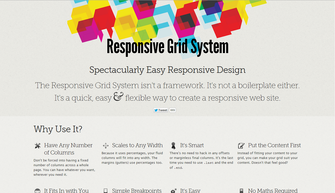
Gaines gathered 13 different responsive design tools you can use, and if you implement them all in your work flow, making your site responsive will be a simple matter you don’t have to fret over.
Even better, normally when you trade pure hard design work for tools, scripts, and other free resources, you end up sacrificing control and precision. The wide selection of these tools as well as the niche abilities of many of them make it so that you don’t have to compromise any longer.
Responsive websites are quickly becoming the standard, so it is imperative to learn how to adapt your sites to the new design world. You can still get away with your special, mobile-optimized websites if you so desire, but you are giving away consistency and features. Don’t give users a lite version. Use these easy resources to make your full website fit into anyone’s pocket.

Leave a Reply
Want to join the discussion?Feel free to contribute!