Tag Archive for: typography

Web design changes all the time. New trends come and old trends go as quickly as the crowd catches up to them. Some of these trends can be long lasting and have a huge impact on how we interact with the internet like responsive design, others can be more fluid and fleeting like flat design. The design community has made its name by always pushing to create the most visually exciting and effective user experience the technology allows, but that means we also have to let go of bad habits as we grow.

As the new year draws closer, designers are reflecting on the changes web design has undergone in the past year. While many are using this reflection to predict what is going to be popular next year, Maryam Taheri looks at what we need to get rid of to improve looking forward.

Homepage Sliding Banners

Rotating Banners

The sliding banners have become a hallmark of news and culture websites across the web, as well as many retailers. But, the banners are becoming dangerously close to cliche and users seem to be mixed in their response. Many find them to be distracting and annoying. While there may be ways to make these sliding banners more enjoyable for users, it could very well be in our best interests to instead turn to more interactive design methods such as single-page scrolling.

Extensive Fill-Out Forms

While we will always have to fill out lengthy forms for legitimate purposes like online shopping (at least the first time!), there is no need to make users fill out a full length form for optional areas of your site. Chances are, they will just avoid that area of your site to avoid giving personal information, and it could severely hurt your trust with many of your online customers. Asking for an e-mail address is fine. Asking for their life story isn’t. Thankfully, the majority have already realized this.
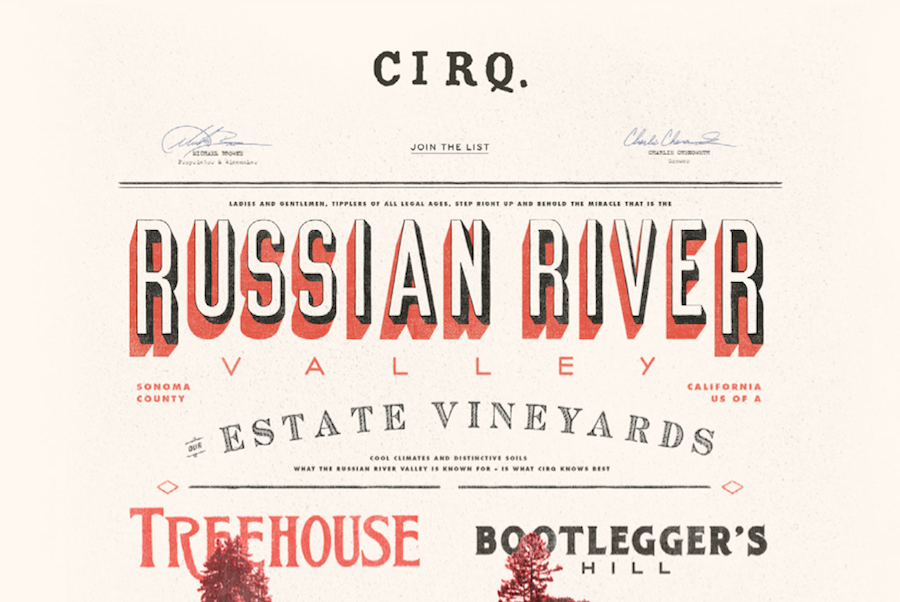
Overuse of Fonts

Sketchbook Typography

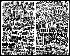
It works in a sketchbook, not on your site.
Source: Carolyn Sewell

Typography is enjoying a new wave of interest in all areas of design, but it has its limits. A good designer can match a select number of fonts (no more than three) to create a pleasing website. But, it is far to common for less experienced designers to choose the “more is better” approach to diminishing returns. A mish-mash of fonts only makes a site look cluttered and schizophrenic. If you want to make your header or your copy pop but don’t know much about fonts and typfaces and kerning, it is wise to limit yourself to two fonts. If you can make two fonts compliment each other, you’re design won’t need any more.

Complicated Design

If there is one thing the favored trends of the past year have shown us, it is that users want their web experience simple. This seems like common sense for the large number of mobile users accessing the web while out and about, but it also stands true for desktop users. You don’t have to choose flat design or convert to the church of minimalism, but successful websites are increasingly focused on creating the best experience for users. If your website confuses or overwhelms, you’re doing it wrong.

Typography has become a fundamental part of design in every way, even making its way into web design over the past few years. You can’t just spill out words and letters onto a page and expect it to look good, and designers have turned the art of making typography look great into a science over hundreds of years.

Somehow, designer Ben Barrett-Forrest manages to condense all of this into a five minute long fun and informative stop motion animation about the history of fonts and typography, called… The History of Typography.

The short film starts out at Guttenberg and Blackletter, but manages to trace the history all the way through Futura, to pixel type and the technology that allows everyone to create their own typeface if they desire.

Barrett-Forrest used 291 paper letters, 2,454 photographs, and 140 hours of work to create the film.

Nexus FontIf you haven’t heard from me and every other web design writer, typography is a really big deal in web design right now. How you decide to use typography on your website can affect how your audience perceives you and judges your quality. But there are so many options. Your font should always be legible, but it also needs to be charming and visually interesting.

If you use the correct font in a design, you can greatly enhance the finished product. But, if you are careless and choose a font that doesn’t fit, it will stick out like a sore thumb. To put it simply, websites are absolutely reliant on typography.

As any designer can tell you however, a font collection can quickly become a huge pain. There are constantly new free and premium fonts coming out that you have to keep up with, or at least regularly browse. Then, you have to actually manage to organize and sort these, then figure out which to use in your next project. This can mean making lists, and doing constant comparisons between fonts.

Wouldn’t you like a tool or program to help you with all this? Of course you would, and of course the web design community has you already taken care of you with many options for both Mac and Windows. Andra Postolache collected a few of the best font management tools. Some are costly, while others are free. The only way to know whats right for you is to try them out.

Mix and Match Typography Example

Typography has become more important in web design than ever before. Technological advancements have made it possible and practical to use nearly any font that you want on the web.

With the rise of interesting and well-thought out typography in web design, we have also seen new trends popping up in how people are using this typography. The first and most notable instance of this is the wave of retro typography on vintage style websites that is still prevalent across the web.

A newer trend we are starting to see has been around for a while in other types of design, but it becoming very popular for websites who want to establish their brand in bold and visually interesting ways. This “Mix and Match” typography relies on the designer’s ability to choose the right fonts to complement not just the message, but the other typographic styles in use.

Some designers opt to use subtly different fonts that are only minutely unique from each other to establish a visual hierarchy of interest while maintaining cohesiveness. Others opt to go all out and harshly contrast fonts against each other to create a visual friction and energy.

Marcin Treder collected 15 examples of this “Mix and Match” typography so you can get some inspiration to try out the style yourself. The rule of thumb for using fonts in web design has long been to never use more than three fonts in a design. It is clear that modern designers are finding ways to break that rule while creating classy and attractive designs.

Sprout Serif


There is something inherently nostalgic and sweet about handwritten fonts in design projects. Not only do they make designs feel more personal and loan some much needed personality to your projects, they immediately draw the eye in ways that your more standardized and formal typefaces don’t. They elicit emotion and a personal connection. You can’t say the same for Times New Roman, for sure.

Of course, handwritten fonts are all unique and can be used for a huge array of design projects. There are script fonts with extensive flourishes which look right at home on wedding invitations and greeting cards, but there are also the more shaky fonts designed to recreate the look and feel of journal entries or rushed messages. There might literally be a handwritten styled font for every occasion.

Naturally, these fonts work as well in digital or web design as they do in print media. Websites can strongly benefit from the more intimate appearance their copy adopts when using a handwritten font. You can charm visitors or make them feel more comfortable with the right font selection, but the key is knowing how to pick and use these styles.

For instance, many of the fonts that look handwritten push the bounds of legibility. There are those which look scrawled out in thick marker, as well as the extravagant scripts which can be obscured by their own ornamentation. These styles can absolutely work well, but they are best reserved for headers or isolated small blocks of text intended to make an impact, because readers absolutely won’t spend their time trying to make sense of blog articles or extensive copy that is hard to read. These styles attract visual interest, but don’t work in excess.

There are plenty of handwritten fonts that do work for blurbs or more extensive copy, though you have to walk a fine line when using them. It is still best to use traditional fonts for comprehensive blogs or anything that will take more than a handful of seconds to read, but front page sections such as navigation or small “about us” blurbs can be made more interesting with a immediately legible but unique handwritten style.

Maryam Taheri collected 12 handwritten fonts that work in a variety of situations. You won’t find the swirly decorative script fonts most tend to imagine when they think of handwritten typefaces, but you will find a wide variety of fonts which will make your site seem charming, intimate, and unique.

WhatIsFont Screenshot

Choosing the right font has always been one of those tasks that sounds deceptively easy, but can slowly drive you crazy. It has become easier thanks to new websites with better searchability, but if anything we are now dealing with the problem of too many options. While we used to have to scavenge for the best fit from the low quality fonts available for graphic design ten or fifteen years ago, now we have to choose the exact best fit from countless options.

Thankfully, as with all design quandaries, there is a new tool to help us out. WhatFontIs allows you to find the exact font you are looking for by uploading an image containing the font or directing the tool towards a URL with the font present on the page.

All in all, the whole thing only takes around 10 seconds. You upload the image or enter a URL, then you confirm the letters the website recognized. From there, you’ll be given a list of font options that you can easily download. It is as easy as it sounds, and if for some reason, you can’t find the exact font you’re looking for, you will almost definitely be given an option that will get the job done well. They currently have a database cataloguing around 280,000 fonts, so you’ll always have options.

Flat Design Text Screenshot

It is no secret that flat design is the biggest trend right now, and it has raised many questions from designers trying to get caught up on the trend. One of the more common questions pertains to fonts, specifically which fonts “work best” with flat design.

Typographic focus in one of the biggest aspects to flat design and the attention to simplicity, so choosing which font you will be working with is an important step. Of course, the main point of good typography of all styles is that it is easy to read and matches the look and style of the page overall, so there is no way to suggest a font that will work in every situation.

However, for flat design you will usually be better off working with very simple fonts and font pairings, as flat design is inherently minimalistic and simple. Whereas past wisdom suggested maxing out at three font pairings per design or page, flat design streamlines it down to two fonts, and sometimes just one.

Because of flat design’s bright color schemes, lettering relies heavily on font weights and clean lines. Designmodo suggests using typefaces with even strokes that contrast against the color palette, and are bold enough to read. You also may want a dash of flair to really bring life to the page.

The trick with flat design is to not fall into boring patterns. The general trend suggests using sans serif typefaces, but it is also possible to work with novelty typefaces as well. The sans serif typefaces are popular for their easy to read nature and great contrast against backgrounds, while serif typefaces come off as formal and against the nature of the simple style, thanks to their usual embellishments.

Novelty typefaces can work well to draw visual interest to areas with bigger text that demands more attention, but it is discouraged to use these for smaller text blocks. Because of this, it is suggested to always choose a second sans serif font if your big text is in a novelty style.

The most forgotten aspect of using text in flat design is that the words you use are just as important as he typeface. Flat design demands simplicity, and overly wordy pages won’t sit within the trend. Use direct language that is brief but effective, and always cut to the point. You don’t need full sentences unless there’s a full paragraph of content. Otherwise, stick to simple word pairings.

There are other serious considerations for designers as well, such as how you use text against color as well as capitalizing on size and space opportunities within flat design. Carrie Cousins discussed those issues earlier this week in her article about typography in flat design, and she even suggested some fonts that lend themselves well to the trend.

Random TypographyIt’s easy to take text for granted as a designer. However for most users, text is the most common component across the web. Designers can lose focus or patience on text when we want to get to the more fun aspects of design, but you can’t communicate effectively in any way without good typography, and good type is built upon a few basic principles.

Web Designer Depot set down a list of rules that designers can follow for excellent typography, or at least prevent the most basic mistakes. While some of these considerations may seem unimportant or odd when you begin trying to work them into your page compositions, before long they will be second nature to you.

  • Establish a Typographic Hierarchy – Text is all about conveying information, and readers on the internet want to obtain that information quickly. They scan and look for the most interesting or important parts, which they can’t easily do without an organized typographic hierarchy. Even for readers who don’t skim, the hierarchy keeps information organized and accessible.
  • Keep Text Large Enough To Read – While 12pt. fonts may have been acceptable on the web a few years ago, no one wants to be squinting at a computer screen anymore. Make your text large enough for people to easily read. I’d suggest 16pt. fonts, but certainly no smaller than 14pt.
  • Choose Appropriate Fonts For Body Texts – Conveying information is also all about legibility. Choosing a flowery, superfluous, or otherwise hard to read font for body copy is off-putting to visitors and will keep them from sticking around the page for long. There is a time and a place for extravagant fonts, but that isn’t in the body paragraphs.
  • Don’t Use Too Many Fonts On One Page – The web ran on only a handful of fonts years ago, but now we have the abilities to work with a practically endless number of fonts in our designs. That doesn’t mean every one of those fonts should go into a single design. Using too many fonts in a single design can be clashy, distracting, and just plain ugly. The old rule is too stick to two or three fonts. I don’t suggest using more.
  • Give Your Text Some Room To Breathe – Just like on school essays, having extra space between each line of text makes everything much easier to read than trying to make sense of jumbled cluttered letters. The problem is evenly solved too, all by increasing line-heights. Be careful not to overdo it though, too much space can be bad.

Web Designer Depot has a few other rules on their page, but these basic rules will be enough to protect you from the biggest typographic sins. Remember, text is the best way to convey information to your visitors, so make the text easy to read above all else.

TypelateWeb designers can never have enough tools and kits for making their websites look great quickly. With the rise of typography, there are numerous kits coming out that help designers catch up to the huge advances in a robust area of design. In the past, designers were limited to a select few fonts, so extensive knowledge of typography wasn’t necessary. Now, there is a steep learning curve when it comes to using text to enhance your design.

Smashing Magazine just released a new free-range and open-source typographic starter kit to help designers do just that. The goal of the framework, called Typeplate is to assist designers without forcing them into any sort of mold. Pattern libraries quickly make a design look good, but they tend to have generic results, and normal web frameworks force you to code “their way.”

Instead, this “starter kit” helps give your project a jump start, but making no assumptions about how you write code. Typelate lets you set base styles with conventional typographic features, created with solid markup and extra flexible styling. It isn’t meant to be a framework you add a little information to and expect a finished product. Instead, it is meant to be extended and customized while allowing designers to make the process of instituting typography onto their page a little faster.

Typography is one of the most deceptively complex components of design imaginable. I mean, to the outsider, it is just arranging letters and picking fonts. The uninitiated have no idea about the complexities and the history of typography; they don’t know typography has a rule book all its own.

Now, I’ve said infographics will tell you “all you need to know” about a couple different design aspects, but the truth is, you can never learn too much about design, and just about every part of design has books upon books worth of material to learn. But, reading books about design seems kind of boring right? Everyone in the field at this point got into it because we love looking at awesome images.

Instead of reading a book about typography – which you should totally do – you can always look at infographics which will put all of that information in visually stimulating ways. Typography lovers and experts certainly love making them.

Jacob Gube collected ten different infographics from across the web on Design Instruct. I am posting one of the ten below, but you’ll have to go to their site to see the rest. The one I’m showing you is “A Brief Introduction to Typography”, which you will notice is not particularly brief. That should give you an idea just how much there is to say about the “simple science” of “arranging letters”. Click on the image to see the full size.

Brief Introduction