accelerated-mobile-pages

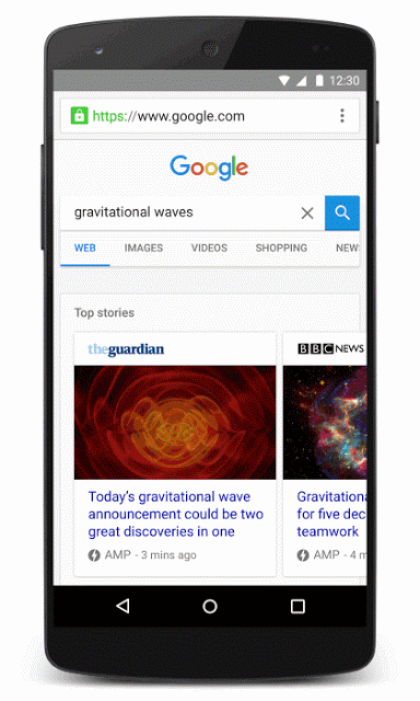
The Accelerated Mobile Pages project says it has made its stripped-down superfast mobile pages even more versatile with the ability to support forms in AMP HTML.

AMP uses a simplified version of HTML to provide pages faster than usually possible on mobile devices – where speed matters most to users. However, the format offers limited features compared to full-fledged web pages. Until now, one of those limitations was the lack of ability to include forms.

Now, AMP users can include everything from the standard e-mail address capture form to more complex forms or even interactive polls. In addition to making it easier to communicate or gain information from your visitors, the support for forms can help with allowing customers to select colors or other details on e-commerce product pages.

form-error

As the AMP project says in its announcement, support for forms “enables building experiences ranging from a product color picker on an e-commerce detail page to an email field to capture newsletter signups to an interactive poll to engage readers within an article.”

If you want to start running your own AMP pages to deliver content faster to on-the-go users or you want to start adding forms to your already existing accelerated mobile pages, check out the AMP project’s official guides and documentation.

You can also see live examples of what the forms may look like on your site at AMP by Example.

The AMP project says it plans to continue to expand the functionality of AMP pages and AMP forms based on user feedback, but the overall focus is still on providing functional and engaging web pages to users as fast as possible.

Mobile Internet Usage

Mobile internet usage has been steadily gaining ground for years, and just last month it hit another milestone. According to a press release issued yesterday from StatCounter, mobile and tablet internet usage has finally exceeded total desktop usage for the first time ever.

Last month, mobile and tablet devices made up 51.3% of total internet usage compared to 48.7% by desktop. This is the first time worldwide monthly mobile internet usage has overtaken desktop according to StatCounter’s measure.

mobileusage

It is almost guaranteed this trend will continue in the long-term, but the short-term gains may not hold up. Mobile web usage has historically increased leading up to the holiday season and may deflate in the first part of next year. Even if this happens, the new milestone shows mobile usage is still consistently growing and will likely be the dominant way to access the web in the coming years.

Aodhan Cullen, CEO of StatCounter, says the new numbers should show businesses how important it is to make mobile a priority now, rather than later:

“This should be a wake up call especially for small businesses, sole traders and professionals to make sure that their websites are mobile friendly. Many older websites are not.”

Of course, mobile usage varies by country. While major markets like the US and the UK still primarily rely on desktop computers. Emerging markets like India overwhelmingly use mobile devices for internet usage and show no signs of slowing down.

christmas-desk

A new study published by ad tech company Fluent shows the holiday season is looking to be more mobile than ever.

According to the report, nearly 40% of all US consumers are already planning to make at least one purchase this holiday season from a mobile device. Unsurprisingly, younger consumers appear to be more likely to make purchases from mobile devices compared to older individuals.

fluent-3-800x369

For the survey, the company asked almost 2,000 US consumers questions about their holiday shopping plans in late September. The responses showed 39% plan to make at least one purchase on a mobile device, with younger shoppers being increasingly likely to go mobile.

Just less than half of consumers between the ages of 18-44 say they plan to shop on mobile devices, compared to 33% of those 45-years-old or older.

fluent-1-800x363

The survey also provides insight into how consumers will be researching their purchases ahead of time, both online and offline. In total, approximately 54% will do the majority of their research online, while 47% will continue to do their research in traditional physical stores.

fluent-2-800x349

While online research is becoming a big part of the holiday season, brick-and-mortar stores will still be where shoppers are spending the majority of their money. The survey results show 78% of consumers will do at least half their shopping in stores, while 22 percent said they will do at least half their shopping online.

The survey shows a small discrepancy between genders, as well. Fluent says men are slightly more likely to research products online compared to women.

google-mobile

Google is making a huge change to their search engine that could have huge implications for the future of search.

Until now, Google has maintained a single search index, which cataloged the entire web for Google’s algorithm to sort through. However, that will be changing soon as Google’s Gary Illyes announced the search engine would be releasing a separate mobile search index.

The new mobile index will become Google’s “primary” index that it uses to deliver the majority of search results. At the same time, the company will continue to maintain a separate desktop search index which will be slightly less up-to-date.

The announcement came last week during a keynote address at Pubcon from Gary Illyes, webmaster trend analyst with Google. While Illyes later confirmed to Search Engine Land the rollout of the new index would be coming within “months,” he was otherwise short on details of how the mobile index will work.

It is also unclear in which circumstances Google will use which search index or just how behind the desktop index is. What is clear is that Google sees mobile as the future of search despite still seeing significant desktop usage.

Most likely, the new index means Google will be switching from a system which selectively pulls information from the single index for mobile results to a new system which uses the separate index for queries coming from mobile devices.

More information is likely to come in the near future, but for now, all we know is Google is gearing up for big changes to further prioritize mobile searchers.

In the wake of the one-year anniversary of the release of AMP (accelerated mobile pages), Google has released a new testing tool to help content publishers ensure their AMP pages are properly set-up and displaying correctly.

The tool is directly available at https://search.google.com/search-console/amp and can be accessed through the Google Search Console.

The testing tool is designed to work on mobile devices and uses Google’s live web-search infrastructure” to assess any AMP page using real Googlebots to provide real-time evaluations.

Specifically, it checks the AMP markup and structured data on the page for issues, then highlights any part of the source-code that could be creating errors. You can then click on the issues for more details about the issue.

The testing tool also allows you to see a live preview of how the page may appear in Google’s search results.

Below you can see screenshots of the tool in action, taken by Barry Schwartz:

google-amp-testing-tool-614x600

google-amp-preview-tool

mobileonly

It is no secret that the majority of people online change devices several times a day, but new research from Google shows that a growing number of users are adopting a “mobile only” lifestyle.

The new “cross-device” research shows that while plenty of people still move from desktop to mobile to tablet as they need to throughout the day, but almost 40% of searchers have dropped desktop devices from their online search process entirely.

Google says the study is based on “behavioral measurement of a convenience sample of 11,964 opt-in Google users between January 1, 2016 and March 31, 2016,” and that the data was “calibrated to reflect a U.S. demographic of 18 to 49-year-old cross-device users.”

screen-shot-2016-10-06-at-2-43-45-pm-800x558

According to the findings, the average user spends 170 minutes on their smartphone every day, compared to 120 minutes on PC’s and approximately 75 minutes on tablets (that user owns a tablet). They most often use their smartphones at four physical locations:

  1. Home
  2. Work
  3. Stores
  4. Restaurants and Bars

Every day, approximately 80% of users search the internet on their smartphones, while 67% use PC’s. Over half (57%) move between devices throughout the day and 21% are likely to use more than one device simultaneously.

But, perhaps the most surprising finding of the study is that approximately 39% of people who conduct searches on an average day use only smartphones, compared to 32% who search only on PC. When measuring all internet use, rather than just searches, 27% of users are smartphone-only.

The report shows mobile usage varies by industry with year-over-year growth of mobile search for different markets.

screen-shot-2016-10-06-at-4-05-36-pm-800x353

If you want to find out more, check out the full report here.

google-amp

Google’s Accelerated Mobile Pages (AMP) are starting to appear in organic search results, after months of only appearing in the ‘top stories’ carousel.

What is Google AMP?

As the internet becomes increasingly mobile, Google has made site speed a top priority within its search results. Part of their effort to speed up the web has included the launch of its Accelerated Mobile Pages technology, which allows publishers to create pages using a stripped down version of HTML and JavaScript that emphasizes site speed.

amp_v6_phone_cropped-mov

Other platforms including Twitter and Facebook have launched their own versions of Accelerated Mobile Pages with their own unique features and structure.

The coding framework allows Google to pre-load numerous assets with the goal of allowing publishers to deliver content extraordinarily quickly without sacrificing style or ad revenue.

What Does This Mean For You?

In the past, Google only showed a small fraction of the 600 million AMP documents published online within the limited ‘top stories’ carousel at the top of search results. Now, all AMP pages have a chance to appear in search engine results pages (SERPs) as organic search results.

By default, Google will display AMP versions of pages in mobile search results when available.

While AMP pages do not automatically rank better than other results, they are likely to provide strong competition in SERPs. AMP pages are not a direct search ranking signal, but page speed is. Considering AMP pages take less than one second to load on average, it is likely that high-quality AMP pages could dominate mobile results in the near future.

How to Get Started Using Google AMP

If you want to start using Accelerated Mobile Pages to deliver your content to mobile visitors, you have a few options. You can manually publish two separate versions of your content – one with your standard website code, and one using Google’s streamlined version of HTML.

Or, you can use a number of plug-ins to automatically create and publish AMP versions of your content when you publish your normal version. With the WordPress AMP plugin from Automattic, you can immediately publish AMP pages with a single click. You don’t have to spend any time stressing or maintaining duplicate versions of your pages or digging into code to start publishing lightning-fast content to mobile searchers.

FacebookVideo

Your site’s speed on mobile devices will soon be a factor deciding how many people see your Facebook ads, according to an announcement from the social network this week.

In Facebook’s words:

“Over the coming months, we’re working to improve ad experiences for people by considering website performance and a person’s network connection in our ad auction and delivery system.”

While it isn’t clear exactly how site speed and page performance will be implemented into Facebook’s algorithm for displaying ads, the social network is already introducing features to help brands deliver content more quickly across Facebook.

In addition to the use of Accelerated Mobile Pages, Facebook is introducing prefetching to help users see the content they are interested in as quickly as possible. This week’s announcement explains that prefetching starts loading mobile content in the Facebook in-app browser before a user ever clicks a link.

According to their estimates, this speeds up mobile site load time by as much as 29 percent and decreases the rate of site abandonment during the loading process.

The new Facebook help page dedicated to prefetching goes a bit more in-depth about how the system actually works:

“For each News Feed mobile ad, Facebook attempts to predict how likely a person is to click on an ad. If the prediction score meets the requirements, we prefetch the initial HTML page when the story first appears on a person’s screen. This content is cached locally on the person’s device for a short amount of time. If the person clicks on the ad, Facebook loads the initial page from the cache. The initial page then makes regular web requests to the publisher’s server to load the remainder of the page. We currently only cache the initial HTML page. Keep in mind that the CSS, Javascript or images on the website are not cached.”

Ultimately, Facebook’s changes are aimed at improving their overall ad performance and increasing engagement with ads. Advertisers with slow-performing sites tend to also underperform in many ad metrics.

While Facebook’s new feature will improve content delivery speed across the board, the company also offered five tips for tuning up your site:

  • Minimizing landing page redirects, plugins and link shorteners
  • Compressing files to decrease mobile rendering time
  • Improving server response time by utilizing multi-region hosting
  • Using a high-quality Content Delivery Network to reach audiences quickly
  • Removing render-blocking javascript

Google Mobile

Since the launch of Accelerated Mobile Pages, Google has indexed over 150 million AMP pages from over 650 thousand unique domains. You probably wouldn’t know that from looking at the search results, though. Instead, searchers have only been shown the small number of AMP pages featured in the “Top Stories” carousel on some search results.

AmpBlueLinksDemo_v3_garciarobert-1

That is starting to change. Google is giving a preview of search results with considerably more Accelerated Mobile Pages in the organic search results. The pages are still marked with their usual blue lightning bolt, but now they aren’t restricted to carousels.

You can see for yourself what the expanded AMP support looks like in Google’s demo showing what their search pages will look like as AMP pages become more common in search results in the near future.

Google makes it clear the inclusion of AMP pages in organic search results doesn’t mean they are implementing an algorithmic change to how they rank sites. Ranking will work as it has been, but with these faster pages included in the possible results.

The change makes AMP pages considerably more attractive to a number of new markets, including e-commerce. For example, Disney, Genius, and Reddit have all used AMP pages, but they were unlikely to ever be found through search because they were not likely to be included in the “Top Stories” carousel.