[INFOGRAPHIC] Quality Score

The quality score of your site is extremely important. If you’ve got a high score, Google makes it easy for your page to prosper. You’ll appear higher in search results, your ads can appear in the top, shaded region of results and it will cost you less per click of your ads.

As Neil Spencer reports for Business2Community, in order to ensure you get these advantages, you need to know how Google judges your site and how you can improve it.

Your ads should be specific and highly targeted. Google is looking for the relevance of the keywords you’ve chosen to your landing page and your ads. Also, make sure your landing page contains relevant, original content that’s updated often and is easy to navigate.

The included infographic is courtesy of DigitalNetAgency

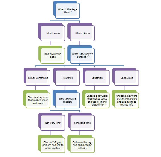
While we’ve been talking about how to optimize content quite a bit, there really are no guidelines out there for more broad questions you should be asking when going through the process of optimization. Jenny Halasz from Search Engine Land realized this, and created a flow chart for the optimization process, complete with what questions you should be asking yourself.

Optimization Flow Chart

“What is the page about?” – This is a really simple question, and if you can’t answer it, you probably shouldn’t be building the site. For your page to have any value, you have to know what it is about, obviously.

“What is the purpose of this page?” – Are you trying to create a blog post? Or maybe a sales pitch? How about a press release? No matter what the purpose is, you certainly need to have one, and be able to identify it while working on the page. Thinking about this before hand will help you put your content into context.

“How long will this content remain relevant?” – Educational pieces stay relevant until more information is found. Depending on the field, this could be years or just a few months. Product pitches on the other hand, stay relevant until your next line is due to be released, which can last as much as a year or two. Either way, adapt your content to the time frame it will still be important.

“What makes sense for optimization?” – The previous questions should be considered when creating the page, but now we’re at optimizing the site for search. Are the keywords you’re using relevant? How are you handling linking? Make sure you actually consider these factors rather than “going through the motions.”

The flow chart and questions should help you focus your process to reflect your client’s needs. Every step needs to be planned, and every question should be answered. If you’re optimizing right, the answers should come to mind pretty quickly.


Implementing tags to measure traffic and visitor behavior on your site is a great way to learn about your audience and improve your site. But, managing those tags can be cumbersome and time-consuming. As Joab Jackson reports for ComputerWorld, that’s why Google recently launched ‘Tag Manager’ to streamline and simplify the process.

Much like AdWords and Analytics, Google Tag Manager is easy to use and it’s completely free. After embedding a small section of code to your site, Google will take care of providing appropriate tags for each page.

Tags that overlap can slow down your site’s load time and potentially lose you visitors. Google employs a way to eliminate that possibility and, of course, offers many ways for you to customize your experience.

Though Google is not the first to offer a tag management system, the number of websites that use one is expected to skyrocket in the coming months.


Facebook Paid Ads are a great way to spread the word about your business. They also help drive people to your company’s Facebook page, where you can share content and your messages at no cost. Why wouldn’t you want a captive audience of consumers who actively seek out your message? Well, Mona Elesseily, of Search Engine Land, has five ways to get them by effectively utilizing Facebook Ads.

1. Target your target

Be as specific as possible when using targeting features. Instead of limiting your ads to ‘only men’ or ‘only under 30’, narrow it down further by using education level, specific interests or workplace. The idea is to make a user feel as if your ad is speaking directly to him or her.

2. Use effective goals

While I think using ads to drive users to your fan page is a great idea, you need to set specific goals and track your progress to get the most from your effort. Exactly how many fans do you want to add each month? Exactly what demographic do you want to see improved growth from?

If you’re the type who wants to see their Facebook fans turn into conversions, you can set goals for that too. For every 50 fans on Facebook, how many conversions do you want to see?

Set specific, trackable goals, then be sure to follow up and tweak your strategies to discover what works and what isn’t worth your time and money.

3. Grab users’ attention

Put yourself in a typical Facebook user’s shoes. Your eyes aren’t focused on the sidebar where the ads are located. You are reading your friends status updates and looking at their latest pictures.

In order to steer their eyes away from their timeline, you’ll need bold colors. You can try using a colored border for your ad, but I tend to think this has been done so much, users are starting to tune it out.

Images of celebrities, especially female celebs, still tend to get a few looks, however.

Once you have a user’s attention, be sure to give them a reason to click on your ad. Put an immediacy to your ad with phrases like ‘Act now’ in order to take advantage of a specific, limited-time offer or special.

4. Images plus text

An ideal ad combines a brightly colored, eye-catching image with big, bold font that is easy to read. Again, the message should compell users to act.

5. Don’t get stale

I mentioned users tuneing out, or glossing over ad styles they’ve grown accustomed to, so take that lesson to heart. Change your ads often so users don’t get so used to seeing them that they stop even noticing.

You don’t necessarily have to reinvent your ad on a weekly basis. Instead, change details like color of your logo, font or just a different image.

Imagine being able to point your phone’s camera down a normal city street and see a video game type environment complete with puzzle boxes and coins up for grabs. That’s the reality that a San Diego based start-up, called Cachetown, hopes to bring to fruition.

The positive spin here is that once you’ve created interactive games for people to play, you can add in an advertising angle and use this “augmented reality” to offer deals and promotions for stores on the other side of a user’s lens. Maybe you point your phone at a restaraunt and see an opportunity to get half off your next meal.

Tom Cheredar has more at this story at VentureBeat, including a commercial produced by Cachetown. The most interesting thing about the video is that it even seems to realize the one, looming drawback to this technology. No one wants to walk around the streets looking at their phone. Whether it’s a reluctance to look like a tourist, holding up your phone in your own town or a fear of walking into a bevy of obstacles, most people would likely be reluctant to fully embrace Cachetown’s current model.

The idea is sound, however, and could have some interesting implementations coming very soon.

I’ve talked a lot about how important it is to try to think like your customers. It’s always important to find out what people are thinking, what questions they are asking, etc., but I didn’t offer any specific ways to accomplish this. But today I have one method of finding out what questions people are asking about topics important to you.

Justin Arnold from The Mighter Pen suggests using Twitter because it offers real time feedback on what people are talking and thinking about relative to keywords.

Of course, this is pretty common knowledge, but what people don’t realize is Twitter has some key features built into its search engine that really benefit the person looking for questions people are asking.

Finding out what questions people are asking is as simple as adding a space and a question mark after a querie. Suppose you are writing about painting. You can search ‘painting’ but you probably will get a lot of extraneous posts not of interest to you. If you search ‘painting ?’ however, Twitter filters your results to only include tweets with questions.

Now, the problem we are faced with is Twitter is used pretty heavily for promotion. Don’t you wish you could filter out any tweet containing links to avoid all of the ads? Well, you can. Just add ‘-filter:links’ to your searches to do away with all of the promotions. What you have now is a list of questions users are asking about a topic in real time.

This is just one way to try to get into the minds of your audience. Trying to gain some perspective is always important when creating content.


Imagine taking up the cause of a young boy with cancer only to discover that the boy never existed. That’s the reality of hundreds of Facebook users after a recent scam concocted by a Florida restaraunt owner was brought to light.

As Melanie Eversley reports for USA Today, Cindy Choi, 28, created the profile of ‘Kevin San Roman’, a boy living in Spain with leukemia. She also created a profile for his younger brother, ‘Lucas’.

Choi is most likely suffering from a version of Munchausen Syndrome, which makes her motive the attention and sympathy garnered from her false personas.

Though many young girls were “online girlfriends” with the fake profiles, Choi reportedly never met up with any of them. It appears as if playing on the sympathies of others was Choi’s only real wrong doing.

This is certainly not an isolated case. There have been a number of similar stories exposed recently and one would imagine there are currently other scams that continue on Facebook. Hopefully, stories like these make users more wary of who they put their trust in.

There is one simple color rule that has helped me endlessly in my designs, and I learned it in junior-high school. Unless you absolutely need to, never use black. It sounds strange to many, but it is a rule I live by now.

When you see dark things, it is common to assume they are black. It is actually very hard to find things that are pure black. It is possible, but most of the common things you will think of aren’t. Roads, for example, are not black no matter how recently they were paved.

Not even shadows are black. Any good painter knows this. Shadows are tints of a background color, and they are pretty much never actually black. They also reflect what type of light is being cast.

Now the reason it is important to note how hard it is to find a pure black is because pure black always overpowers other colors by comparison. It just does not naturally sit with most color palettes.

This goes double for web design. Even in apps or sites that seem to have black as a prominent part of the color scheme actually use dark grays, which are muted so they sit better in the composition.

Ian Taylor Storm, co-founder of Segment.io, also warns about the importance of saturation. Adding some color to grays helps liven them up a little. If you have a really dark gray, saturate it really heavily. Light grays will only need around 3%-5% usually.

The design for Facebook is a great example of this idea. All of the grays are saturated with the trademark Facebook Blue. The same goes for Facebook’s apps.

There is always a time and place for pure black, but it should be a rare occasion. Usually, a more natural color will suit your needs much better.


Google’s Dan Friedman recently took to the Google AdWords blog to discuss new integration between AdWords and Google Analytics. As David A. Utter reports for eCommerce Bytes, Friedman also shared a few tips for how users could benefit from the data gleaned from Analytics.

High Engagement Groups

Analytics allows you to discover ad groups that, on average, stay on your site longer and visit more pages per visit. Typically, those numbers would suggest a group with high levels of engagement and one that would give you great returns with an increase in your ad budget.

High Engagement, Low Conversions

You may notice a group or page that seems to have high engagement, but isn’t yielding enough conversions. Use this information to target those users with promotions or any other way to light the fire beneath them and get them to turn into a conversion.

Short Visits and High Bounce Rates

Monitoring for pages that aren’t doing so well is important too. But you can turn a negative into a positive. If you notice a certain page isn’t yielding the results you’d hoped for, use that page for A/B testing. You may discover a way to improve your site as a whole.