Many considered it only a matter of time before advertising would find its way onto Instagram, since Facebook purchased the app. However it took much longer than most expected. Instagram has remained ad-less until now, but over the next few months you will finally see that change. Instagram announced late last week that advertising would begin rolling out within the Instagram photo stream over the next few months.
This doesn’t mark the first possible attempt to monetize Instagram. Jennifer Slegg reminds us of late last year when Instagram altered its terms to suggest that Instagram would all the rights to all photos posted on it, implicating that Instagram would begin selling those photos to advertisers. The response was massive and overwhelmingly negative, as users began to flee from the service until the terms were reverted.
Since then, the waters have been quiet, but it was heavily expected that Facebook would attempt to turn Instagram into a revenue generating service, seeing as it cost Facebook $1 billion.
This attempt is a little more direct than their change to their terms, but it appears they will be slowly integrating advertisers. They are clearly more cautious this time around – Instagram even emphasized that there would be no changes to how image or video ownership would be viewed.
The company is starting with just a limited number of U.S. advertising firms only showing small and occasional ads. All ads are required to use high-quality images and videos, so they should blend in on the feed.
Seeing photos and videos from brands you don’t follow will be new, so we’ll start slow. We’ll focus on delivering a small number of beautiful, high-quality photos and videos from a handful of brands that are already great members of the Instagram community.
Our aim is to make any advertisements you see feel as natural to Instagram as the photos and videos many of you already enjoy from your favorite brands. After all, our team doesn’t just build Instagram, we use it each and every day. We want these ads to be enjoyable and creative in much the same way you see engaging, high-quality ads when you flip through your favorite magazine.
Expect the ads to be similar to the sponsored posts you see in Facebook, but designed for Instagram. The company will also be heavily soliciting feedback from users about the types of advertising being tested and shown, including the ability to hide them.
00TMOhttps://www.tulsamarketingonline.com/wp-content/uploads/2018/07/TMO-Logo.pngTMO2013-10-07 12:35:252013-10-07 12:35:25Instagram Begins Including Ads In Your Photo Stream
Google AdWords announced yesterday a major reporting update to conversion tracking called Estimated Total Conversions will be rolling out over the next few weeks. The new feature provides estimates of conversions which take place over multiple devices and adds this to the conversion reporting we are already accustomed to.
Once enhanced campaigns launched earlier this year, search advertisers have had more control to combine mobile and desktops with the ability to further modify bids by mobile as well as other targeting considerations. There was a missing piece limiting the effectiveness of campaigns. We had limited data on how consumers actually navigate and convert across multiple device options.
What is a Cross-Device Conversion?
The widespread use of mobile and tablet devices to browse and shop online has greatly influenced how we actually interact with businesses. From our couch, we can have three options for achieving our online goals within reach, and it has been shown that we choose different devices for different tasks.
A study from Google last month found that more than 90 percent of multi-device consumers move sequentially through several screen like mobile to desktop, or mobile to tablet in order to complete transactions. There are even those who move from desktop screen to desktop screen, likely going from work to home computers. Anytime a person begins the actions that initiate a conversion on one screen, only to complete the conversion later on another screen, that is a cross-device conversion.
How Estimated Total Conversion is Calculated
Google calculates these types of conversions for advertisers based on how their customers convert when they are logged in. Then, they use this data to extrapolate out data to estimate what the total conversions from cross devices may be. The data is only used in aggregate and is not personally identifiable according to Search Engine Watch.
00TMOhttps://www.tulsamarketingonline.com/wp-content/uploads/2018/07/TMO-Logo.pngTMO2013-10-02 13:20:352013-10-02 13:20:35New AdWords Update Includes Estimated Total Conversions
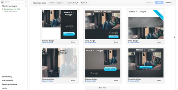
Google made some changes to how you can design display ads to help ease the challenges advertisers and SEM agencies have been complaining about for what seems like forever. Today they rolled-out Ready Image Ads within AdWords, which aims to make it easier to create ads for multiple sizes that look good across all devices. The tool is currently Google’s best attempt to solve this issue and they hope to get more AdWords advertisers to run display campaigns, according to Ginny Marvin.
The tool works by simply entering a URL from your website. From there, the Ready Image Ads tool automatically pulls images from your site to create various ads in various IAB standard sizes. These ads are also HTML5, making them compatible for viewing on mobile and desktop devices alike.
Ready Ads can also be used to create dynamic ads, engagement ads (including hover-to-play and lightbox ads), video ads, and general purpose ads from a variety of templates. View Google’s introduction video for Ready Ads below:
Logo design is one of the most deceptively difficult jobs in all of design. It sounds so easy, pick a font, type out the company name, and maybe underline or circle it. There are designers out there who really do think that way. But, if you actually care about delivering a quality product, its much more complicated.
There are endless brands and logos out there today, and the vast majority fall away into the noise. To create a truly successful logo in the modern day, you have to design something simple but brilliant enough to make people instantly take note. In the best logos, the viewers don’t even realize why they are so attracted to the logo.
But, how do you actually create a logo that accomplishes this? It takes some studied knowledge of design and a bit of ingenuity. Joshua Johnson from Design Shack has a few ways you can approach logo design to create something truly remarkable.
1) The Visual Double Entendre
Many of my favorite logos can be interpreted in at least two ways. The visual entendre is exactly this tactic, which wraps two images into the same visual object. There are quite a few examples of this design strategy out there, but the example Johnson uses is too perfect to ignore, the WinePlace logo.The logo is shaped like a thumbtack, seemingly marking a place or location, but if you look for more than a split second you will easily see the object also looks like an upside down wine glass. This sort of visual “trickery” encourages viewers to look a little longer and absorb the image (and brand name) more than the average glance. It is memorable for its creativity, but also because you force people to pay attention for longer.
Another added benefit of the strategy is that by nature your design must be simple to play two objects into the same image. As you’ll see, simplicity is a great rule of logo design.
2) Pay Attention to Color
One of the most basic facts of design is that color is not simply an aesthetic decision. Every color and tint carries a specific set of meanings and ideas, which often seem so embedded in our brains that our reactions are subconscious.
Many brands will have already noted this and might very well require you to stick to a very specific brand palette, but thats not always the case. On the chance that you have freedom to choose the colors of the design, you will want to pay close attention to picking the colors that will not only look good together, but also represent the nature of the brand.
On top of this, you should make sure the logo will also look clear and distinguishable if it must be printed in grayscale. Not every memo and press release will be full color, and you don’t want to lose the impact or recognizability of the logo just because someone xeroxed a company report.
3) Avoid Cliches
Trends are something that are unavoidable, but you might think twice before playing into what is hot at the moment with your logo design. Sure a popular styled logo might gain you some favor in the moment, but your logo is intended to represent your brand for years to come. You want it to be memorable enough that your logo outlives the current trends.
The current example is the dramatic overuse of the circular logo, generally styled vaguely like an old college patch or badge. Circles are popular in design and these types of logos are slightly retro, but just modern enough to have become a terribly common site across the web. But, it also means they are all interchangeable. I don’t remember any brand using the style because they all look the same eventually.
4) Custom Type Never Goes Out Of Style
Some of the most popular logos throughout time rely on very little to be successful. Just think of Coca-Cola’s logo. All they need is their signature red color and a custom typeface so notable it has become the source of countless rip-offs and parodies.
The best part of using custom type is that it isn’t immediately able to be copied. Designers looking for a quick and easy way to jump on a potentially successful bandwagon are quick to begin using a font. But, if you have your type hand-designed, it takes a lot more effort to mimic. The irregularities that make custom type so special also make it too unique for a simple conversion to a font.
5) Keep It Simple
While custom fonts are certainly a simple but effective way to make your mark, some designers don’t specialize in illustration or typography. That doesn’t mean they are out of luck. Many of the most famous logos in the modern day don’t feature any type whatsoever.
These logos take design to an even simpler stage, where all you need are simple shapes that are as iconic as they are refined. Apple began with their trademark bit apple shape, but originally it was striped with color. Gradually, they began to shift the logo to what looked like a brushed metal apple, but these days you won’t find any of those flourishes. All they need to be memorable is the silhouette of the apple, with that special bite taken out.
Conclusion
There are of course many other approaches you can take to making a memorable logo. For example, Johnson also brings up a discussion of symmetry and proportion in logo design that is better fit for a more in-depth analysis. Simply put, great logos don’t leave things to chance. But the truth is, if you want a truly memorable logo, you might start by trying to create something unlike those before.
00TMOhttps://www.tulsamarketingonline.com/wp-content/uploads/2018/07/TMO-Logo.pngTMO2013-09-26 12:58:112013-09-26 12:58:11How Do You Design A Truly Great Logo?
Online advertising could possibly become even more profitable over the next few years as it appears consumers’ trust in ads that show up in search engine results, online video, and social networks appears to be on the rise. A recent report from Nielsen, Truth in Advertising 2013 found that 48 percent of consumers trust these ads, up from previous years.
The report shows that consumers around the world are gradually becoming more accepting and trusting to online media, and advertising from trusted sources is equally seen as trustworthy. Ads on branded websites are now 69 percent trusted this year, making it the second most trusted format. In 2007 it received 9 percent trusted and ranked fourth-place.
The most favorable form of advertising stays the same, with 84 percent of global respondents saying word-of-mouth recommendations from friends and family are the most trustworthy.
The survey also found that 42 percent trust online banner ads, compared to 26 percent in 2007, which may be why advertisers spent 26 more percent on this type of advertising in the first quarter of this year, according to ClickZ. Display ads on mobile devices has also gone up, with 45 percent saying they trust these ads more than text ads.
00TMOhttps://www.tulsamarketingonline.com/wp-content/uploads/2018/07/TMO-Logo.pngTMO2013-09-25 10:44:502013-09-25 10:44:50Nielsen Study Shows Consumers Are Trusting Online Ads More
Pinterest may only be the fourth most popular social media platform out there, but it may become a significant part of your online marketing strategy in the near future. Last Thursday, Pinterest CEO and co-founder Ben Silbermann announced the company is beginning testing promoted pins, their version of paid advertising.
The site is primarily popular with females, but it is well loved by social media marketers because its users have shown time and time again that they are more willing to purchase than the demographics using any other social media platform. Facebook may have over eight times the traffic of Pinterest, but they aren’t purchasing at anywhere close to the same rate of the Pinners. However, in the almost four years since its creation, Pinterest has never included any paid advertising.
Silbermann discussed the decision to finally venture into paid advertising in a post titled “Planning for the Future” on the Pinterest blog. He also lays out a clear idea of exactly what this monetization will look like. They haven’t established all of the details, but Silbermann does say ads will be:
Tasteful –No flashy banners or pop-up ads
Transparent – Pinterest will “always let you know if someone paid for what you see.”
Relevant – Pinterest is aiming to ensure the ads you’re seeing are relevant to the content you are actually looking for.
Improved based on feedback – The company plans to take user feedback into heavy consideration while rolling out paid advertising, as well as working to improve the experience.
The first promoted pins are being tested in search results and category feeds. If you search for “Halloween” you might get promoted pins for costumes.
Pinterest definitely isn’t leaping into the advertising options, but they are beginning a change which could be very lucrative for enterprising social media marketers in relevant fields.
According to an announcement from Google late last week, you can now opt out of five new ad format options when creating AdSense ads.
Their announcement said:
“These enhancements are designed to improve the performance of your ads, but we know that sometimes you may prefer not to include them. Based on your requests for more control over the ways ads are served on your site, we’re happy to let you know that you can opt out of the following advanced ad format features[…]”
Similar Sized Display Ads – This feature shows smaller ads that are performing highly in larger ad units
Enhanced Text Ads – Displays text ads with performance enhancing features such as product ads or clickable arrow icons.
Expandable Ads – Displaying rich media ads that can expand beyond the original ad size after a user-initiated action.
Enhanced Display Ads – Shows display ads with performance-enhancing features such as mouseover highlights.
Animated Display Ads – This feature allows you to display non-static ads that were created using Flash or animated Gif formats.
AdSense obviously isn’t rolling back these new features, but simply trying to give publishers more control over their ads. More control is never a bad thing, right?
https://www.tulsamarketingonline.com/wp-content/uploads/2018/07/TMO-Logo.png00TMOhttps://www.tulsamarketingonline.com/wp-content/uploads/2018/07/TMO-Logo.pngTMO2013-08-28 11:22:172013-08-28 11:22:17AdSense Lets You Opt Out of Five New Ad Formats
Regardless of how well you plan your social media strategy, you’re bound to make some missteps along the way. Erin Lynch, of Multichannel Merchant, points out the recent JC Penny uproar over a tea kettle resembling a certain German dictator. JC Penny couldn’t be expected to foresee that outcome, but they handled it impeccably. The tea pot was pulled from the store’s website and they used their social media profiles to apologize, with some good natured humor included.
The worst possible move in this type of situation is to ignore it. Had JC Penny’s social media team remained silent while the internet made the photo of their tea pot viral, they may not have escaped unscathed. Remember that in your own social media policies. When unhappy customers come calling, respond politely and apologetically. If it all possible, remedy the problem and report back so they, and others, can see how well you handled the issue. If ignoring problems is the worst move, then debating or challenging customers is a close second. The customer is always right, especially when your conversation is on a public, social media forum.
https://www.tulsamarketingonline.com/wp-content/uploads/2018/07/TMO-Logo.png00TMOhttps://www.tulsamarketingonline.com/wp-content/uploads/2018/07/TMO-Logo.pngTMO2013-06-10 21:37:332013-06-10 21:37:33Handling Social Media Errors: Don’t Feed The Trolls
There’s Facebook, Twitter, Google+, LinkedIn and Pinterest. All offer something unique and a unique demographic to those that create a presence for their business there. So which one is best suited for the needs of your company?
Jen Wilson, of Business Journal, recently published an in-depth look at who exactly is using each site and what type of company will flourish there. Here’s a quick rundown of the findings.
Facebook: Best suited for established brands with a dedicated following that will share success stories. Ages 18-55.
Twitter: Great for developing relationships with customers and for PR. Younger demographic than Facebook with an added bonus of well-known personalities among the users.
LinkedIn: B2B sales is perfect here, but it can also be used to establish yourself as an expert in a given field. Wide age range, but users are college educated and often advanced in their careers.
Google+: Tech companies, internet services and gaming works great considering there’s a high concentration of young, tech savvy males here. Also, get a boost in search as your picture appears with your articles or web site.
Pinterest: Any image driven company, specifically fashion or design but could even be adapted for certain types of sales. The best place to market to women under 50.
https://www.tulsamarketingonline.com/wp-content/uploads/2018/07/TMO-Logo.png00TMOhttps://www.tulsamarketingonline.com/wp-content/uploads/2018/07/TMO-Logo.pngTMO2013-05-30 21:15:562013-05-30 21:15:56Breaking Down The Big 5 Social Media Platforms
One of the advantages of your business’s social media profile that almost no one is talking about is that it can reveal the flaws in your business. Whether it’s through negative feedback or a general lack of participation, the problems that arise on social media usually point to problems that need to be fixed at your physical location.
Carrie Kerpen, of Inc., calls social media “a mirror. A reflection of your company and how you’re doing today.” Basically, this means that if you see an abundance of negative comments, it’s because you’re doing something wrong. This is a pretty simple idea. After all, if you were getting an abundance of phone calls from customers complaining about your service, wouldn’t you assume something was wrong with your service? This is simply an example of how some business owners are not translating social media activity correctly, or perhaps simply undervaluing its importance.
After you’ve come up with solutions to your business’s shortcomings, be sure to let those naysayers on social media know about it. Negative comments that are left unanswered are far more damning than those that receive an apologetic, professional response detailing how your business is adapting and dealing with the problem. Sometimes, it can even be a simple reassurance that changes in your business won’t affect the quality product your customer is used to. Or, maybe you can apologize for a perceived shortcoming that can’t be changed while pointing out some advantages your customer has yet to notice.
When used correctly, social media is a way to make your business better and enhance the relationship you have with your customers.
https://www.tulsamarketingonline.com/wp-content/uploads/2018/07/TMO-Logo.png00TMOhttps://www.tulsamarketingonline.com/wp-content/uploads/2018/07/TMO-Logo.pngTMO2013-05-28 21:18:432013-05-28 21:18:43Flaws Revealed By Social Media And How To Fix Them
 Google AdWords announced yesterday a major reporting update to conversion tracking called Estimated Total Conversions will be rolling out over the next few weeks. The new feature provides estimates of conversions which take place over multiple devices and adds this to the conversion reporting we are already accustomed to.