It seems like everything looks different over at Google these days. Not only has their logo subtly flattened out, but the way we see a significant number of searches has been greatly altered with the introduction of the Google Carousel. Now, AdWords seems to be following suit as reports have started to come in of a new logo and web UI design.
As Search Engine Land reported, Rick Galan tweeted out a screenshot of the new appearance. The logo is now integrated directly into the navigation bar and the green coloring of the bar has been replaced by Google’s widely used desaturated blue-grey.
The new AdWords logo might by signaling a redesign of all Google product logos towards a more flat design, such as what they have done with their flagship logo. Their old logo is below for comparison.
It could also simply just be a test as Google has not released any public statement or announcement for the logo, so much is unclear, especially how long a roll out might take. No one knows when we will see the change, but don’t be surprised if your AdWords experience looks different in the near future.
00TMOhttps://www.tulsamarketingonline.com/wp-content/uploads/2018/07/TMO-Logo.pngTMO2013-10-10 14:15:042013-10-10 14:15:04New Google AdWords Logo and Web UI Begins to Appear
Logo design is one of the most deceptively difficult jobs in all of design. It sounds so easy, pick a font, type out the company name, and maybe underline or circle it. There are designers out there who really do think that way. But, if you actually care about delivering a quality product, its much more complicated.
There are endless brands and logos out there today, and the vast majority fall away into the noise. To create a truly successful logo in the modern day, you have to design something simple but brilliant enough to make people instantly take note. In the best logos, the viewers don’t even realize why they are so attracted to the logo.
But, how do you actually create a logo that accomplishes this? It takes some studied knowledge of design and a bit of ingenuity. Joshua Johnson from Design Shack has a few ways you can approach logo design to create something truly remarkable.
1) The Visual Double Entendre
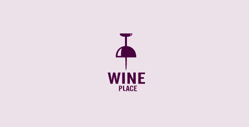
Many of my favorite logos can be interpreted in at least two ways. The visual entendre is exactly this tactic, which wraps two images into the same visual object. There are quite a few examples of this design strategy out there, but the example Johnson uses is too perfect to ignore, the WinePlace logo.The logo is shaped like a thumbtack, seemingly marking a place or location, but if you look for more than a split second you will easily see the object also looks like an upside down wine glass. This sort of visual “trickery” encourages viewers to look a little longer and absorb the image (and brand name) more than the average glance. It is memorable for its creativity, but also because you force people to pay attention for longer.
Another added benefit of the strategy is that by nature your design must be simple to play two objects into the same image. As you’ll see, simplicity is a great rule of logo design.
2) Pay Attention to Color
One of the most basic facts of design is that color is not simply an aesthetic decision. Every color and tint carries a specific set of meanings and ideas, which often seem so embedded in our brains that our reactions are subconscious.
Many brands will have already noted this and might very well require you to stick to a very specific brand palette, but thats not always the case. On the chance that you have freedom to choose the colors of the design, you will want to pay close attention to picking the colors that will not only look good together, but also represent the nature of the brand.
On top of this, you should make sure the logo will also look clear and distinguishable if it must be printed in grayscale. Not every memo and press release will be full color, and you don’t want to lose the impact or recognizability of the logo just because someone xeroxed a company report.
3) Avoid Cliches
Trends are something that are unavoidable, but you might think twice before playing into what is hot at the moment with your logo design. Sure a popular styled logo might gain you some favor in the moment, but your logo is intended to represent your brand for years to come. You want it to be memorable enough that your logo outlives the current trends.
The current example is the dramatic overuse of the circular logo, generally styled vaguely like an old college patch or badge. Circles are popular in design and these types of logos are slightly retro, but just modern enough to have become a terribly common site across the web. But, it also means they are all interchangeable. I don’t remember any brand using the style because they all look the same eventually.
4) Custom Type Never Goes Out Of Style
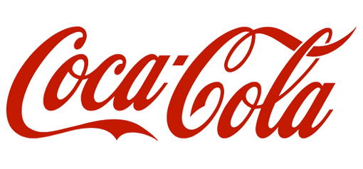
Some of the most popular logos throughout time rely on very little to be successful. Just think of Coca-Cola’s logo. All they need is their signature red color and a custom typeface so notable it has become the source of countless rip-offs and parodies.
The best part of using custom type is that it isn’t immediately able to be copied. Designers looking for a quick and easy way to jump on a potentially successful bandwagon are quick to begin using a font. But, if you have your type hand-designed, it takes a lot more effort to mimic. The irregularities that make custom type so special also make it too unique for a simple conversion to a font.
5) Keep It Simple
While custom fonts are certainly a simple but effective way to make your mark, some designers don’t specialize in illustration or typography. That doesn’t mean they are out of luck. Many of the most famous logos in the modern day don’t feature any type whatsoever.
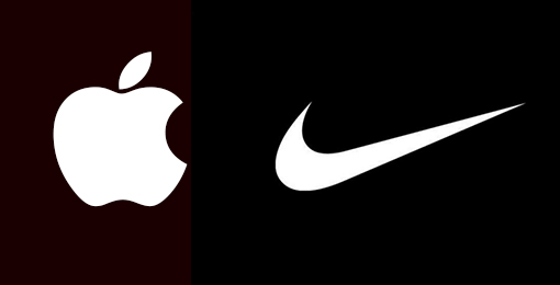
These logos take design to an even simpler stage, where all you need are simple shapes that are as iconic as they are refined. Apple began with their trademark bit apple shape, but originally it was striped with color. Gradually, they began to shift the logo to what looked like a brushed metal apple, but these days you won’t find any of those flourishes. All they need to be memorable is the silhouette of the apple, with that special bite taken out.
Conclusion
There are of course many other approaches you can take to making a memorable logo. For example, Johnson also brings up a discussion of symmetry and proportion in logo design that is better fit for a more in-depth analysis. Simply put, great logos don’t leave things to chance. But the truth is, if you want a truly memorable logo, you might start by trying to create something unlike those before.
00TMOhttps://www.tulsamarketingonline.com/wp-content/uploads/2018/07/TMO-Logo.pngTMO2013-09-26 12:58:112013-09-26 12:58:11How Do You Design A Truly Great Logo?
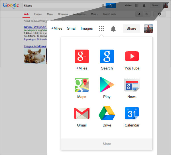
Yesterday you may have noticed a couple changes when you opened up Google. The first is the most obvious – it was accompanied by a little help box explaining the change – but Google has officially implemented their new app launcher in the main Google navigation bar for quick and easy access to other Google products.
You’ll be familiar with this app launcher if you use Android devices or Chromebook computers. Search Engine Land also reports that the grid-style launcher has been in testing since February or earlier.
The other change is a lot more subtle, but still of note for the design community. Google has flattened their logo, keeping up with the hot trend. Flat design is especially popular at the moment as Apple’s new flat iOS also rolled out earlier this week. The colors in the Google logo are also slightly different, but you won’t be too thrown off by the tweaks.
Many will have already seen the updates, but if you’re Google page still looks the same as it always has, be patient. Google says it should be completely rolled out over the next couple months on most Google products.
00TMOhttps://www.tulsamarketingonline.com/wp-content/uploads/2018/07/TMO-Logo.pngTMO2013-09-20 10:33:162013-09-20 10:33:16Google Officially Rolls Out Their New Logo and App Launcher
What if I told you there was a simple five step process you can use to create great quality logos? Seems to good to be true? It kind of is. There are no shortcuts to great logos, because you always have to put the work in during every step, but if your problems stem from not knowing where to get started rather than simply skimping on the effort, Martin Christie’s five step process may be just what you need.
Every designer might have their own work flow, but if you don’t have one in place you are sacrificing efficiency and most likely quality. Christie’s process starts where every good design should, with a design brief, and walks you through every step all the way up to the presentation. He simplifies it into the image below, but to get the full idea of the process, you should see it in his own words over at Design Instruct.
00TMOhttps://www.tulsamarketingonline.com/wp-content/uploads/2018/07/TMO-Logo.pngTMO2013-04-30 12:42:042013-04-30 12:42:04The Five Step Process To Great Logos
One of the most crucial design decisions for a new company is the logo. Great logos are instantly recognizable and evoke the brand image with just one image. When anyone discusses McDonald’s, Apple, Nike, or NBC, it is hard not to imagine the Golden Arches, iconic apple, or swoosh because they are so deeply ingrained in their corporate image.
Creating a logo that perfect is deceptively difficult to do however. The business world is awash with bad logos that no one will ever remember. There is no magic recipe for a great logo, but there are some rules to follow that will help a logo stick out. I’ve given some tips on logos before, but Sarah Clare from Vandelay Design had some suggestions designers should keep in mind.
One of the most common mistakes is just over-doing the logo. Clean lines and simple contrast are striking and easily able to be replicated in any format, neon sign to stationary. Text can be included but only when necessary, and limit it to the brand name. Even if you’ve been in business for 200 years and you’re doing a logo redesign, your icon isn’t the place to tell people that.
It is hard to understate how important it is that your logo is able to be reproduced anywhere. Something may look good on a computer screen, but logos are sometimes printed on endless materials like pens, paper, mugs, and even mints, and stress balls. You want people to be able to recognize the logo whether it is 1″ x 1″ on a memo, or plastered on a billboard.
While a logo has to be simple, it also has to convey the tone and personality of your business. A high tech company with a childish logo may have trouble convincing potential customers of their abilities, especially because everyone in tech hates comic sans. Usually bright colors are reserved for companies more associated with children as well, but Google’s logo shows why that isn’t a hard rule.
As a business owner, you will see your logo more than you actually see your brand name, or at least it will feel like it. If you want your brand to be successful in the marketplace, you need a logo people will instantly be able to identify and connect with. It seems like a small task, but being lazy on the logo can torpedo a new brand.
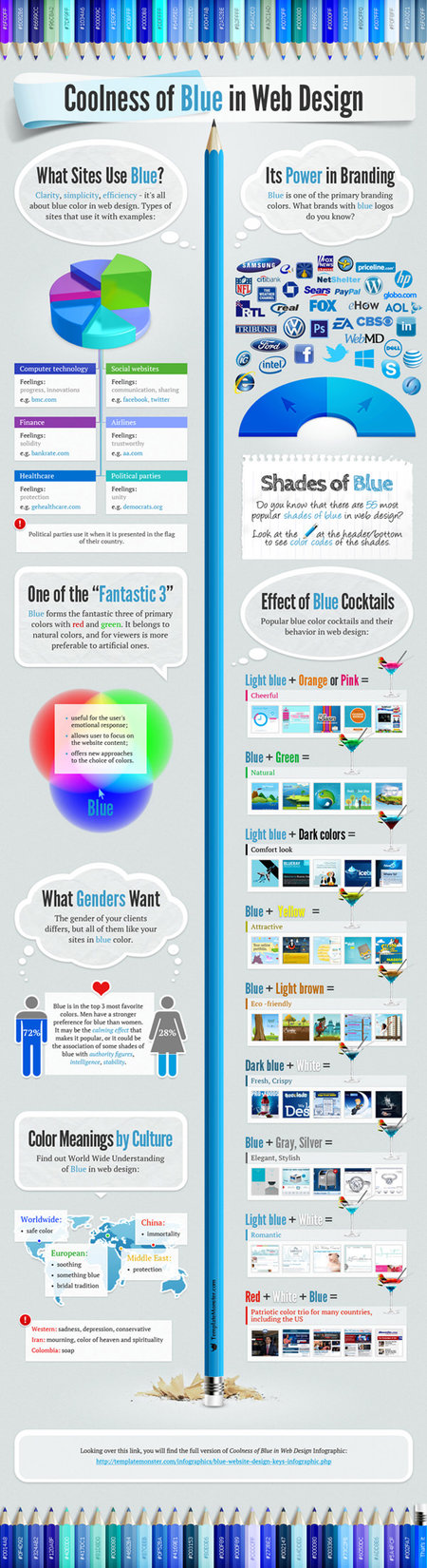
Think of logos for the biggest businesses right now. Maybe you’re thinking of Facebook, or Twitter, or maybe you went towards technology manufacturers like Intel, Philips, or Dell. You may have even thought of a huge company like GE. Either way, the logos you thought of were most likely blue.
The colors of a logo are always important, as they decide how viewers will respond to your company. Restaurants or people handling food will often use green to convey a healthy image, or red because it supposedly stimulates appetite. While those colors work for that market, blue works for almost any non-food related business.
Helen Bailey from Web Designers Blog wrote one of many articles exploring why blue works so well for branding, but if you really want to explore the use of blue for branding, check out the infographic from Template Monster. The static version is below, but they have an interactive version at their site.
The word easy isn’t something designers normally associate with logo design, right? If you do, that is a silly idea to have.
A logo encapsulates a brand’s identity, and should require real planning and thought to create a simple and memorable image. It isn’t just a doodle you push out. A good logo takes time.
Luckily, I have some tips that will at least make logo design easier. The tips are broken into two groups – what you should do, and what you should not do.
What You Should Do When Designing a Logo
Keep It Simple – Nike has one of the most memorable logos on the planet. That swoosh is embedded into minds literally around the world, from the USA to China. The logo is so synonymous with Nike that most of the time, it doesn’t even require text. As Sufyan bin Uzayr at 1stWebDesigner puts it, a logo is supposed to be an emblem of your brand, not a manifesto. It should be what is left when you boil down evereything your brand is about. A complicated logo will just leave your target audience disinterested, and maybe confused.
Be Dynamic – Flexibilty and adaptability are hugely important for any creative field. Keeping a static logo forever is reflective of no growth or improvement within the company. That’s not to say your logo should change every week, or even every month, but you should still be flexible when creating it. A rigid approach to logo design will appeal to only one type of audience – the one you would fall into. That’s not a good approach for design, and you should be willing to accomodate preferences and tastes of lots of different audiences.
Be Versatile – Your logo should be able to adapt to whatever you need it to. No one wants a logo that looks good in only one place. If it is strictly tied to a color scheme, for example, it won’t fit any time it is used outside of that palette. Apple’s logo is a great example of a versatile logo. The apple with the bite out of it looks great whether it is rainbow colored like the more retro logo, or the simple white or black outline present on their computers and other devices.
Be Unique – I apologize to any PC fans for using Apple’s logo as an example twice, but it is a great case of a unique but simple logo. Look at any picture of an apple you want. It probably won’t look very special to you. But using the simple outline, with the subtle bite taken out, suddenly that apple is a great logo. It is a minor change to what would otherwise be a dull logo, and now it is one of the most iconic images in the modern world. Don’t try to be crazy with your design to be “unique”, try to bring the boring into the realm of the uncommon through little changes.
Be Meaningful – Your logo should tell some sort of story. Ideally, it should actually tell two – The first story being the obvious, and the second being more hidden. Like I said, a logo shouldn’t just be a branded doodle, but it should consist of well thought out iconology and history. The Toyota logo helps explain this point a little better. Of course, the three ovals of the logo form a T, for Toyota. However, the company states that each individual oval has its own meaning. The overlapping ovals symbolize faith and trust between the company and customer, while the outer oval is to represent the global expansion plans of Toyota.
What You Should Not Do When Designing a Logo
Do Not Overestimate Color – While being a slave to a color scheme isn’t a good idea for a logo, that doesn’t mean you should keep all of your logo designs black and white. Colors can have a huge effect on the emotional response to your design. You should let the target demographic for your logo influence the colors. Keep in mind the age, gender, and cultural information of your audience.
Do Not Over-Innovate – This is pretty comparable to “keep it simple,” but it is important to note. Innovation is always a great thing. It keeps you from becoming stale or repeating yourself. The question to ask when trying to innovate should be “is this practical?” Often, if you innovate too much in your design, it no longer is clearly associated with the brand you are designing for. If you’ve reached that point, you clearly have innovated too much.
Do Not Underestimate Custom Typography – Every design should have a typeface that is unique. While there are thousands of free fonts out there to use, it’s important to realize that there are also thousands of designers using them. A handdrawn font on the other hand, will not only keep plagiarists from ripping off your logo, it is also more identifiable than any logo you will find online.
Do Not Be Predictable – As said before, any logo should tell more than one story. Part of figuring out how to tell these stories is making sure you tell them in new ways. If your company designs umbrellas, maybe referencing weather as a broad idea is a good start, but you don’t want to make a design that shouts “It’s gonna rain!”
Do Not Design a Cliché – Logo design has trends just like any other industry. Trying to follow these trends will usually end up in creating a boring logo that is as cliché as any meme you will find online today. Instead, if you make something unique as well as representative of the brand, your client will be much happier than being delivered the same logo for the fourth time.
Of course, any logo design will take time, but it is important to know where to actually invest the energy. If you put too much work into making a wild new logo, you may just confuse your client, but if you are lazy across the board, your client will be equally disappointed.
I’ve spoken a bit in the past about why your own preferences should often be ignored when designing. Logos are the embodiment of your entire business and they communicate a lot to the audience. Logos can build trust by making your brand appear credible and legitimate.
Logos are also the essence of “professionalism”. Bad logo design can make your business seem unstable, not credible, or worst of all, forgettable. Logos are an important part of creating a positive brand reputation, especially when done correctly.
This is why many designers create logos based on their own preferances. It is natural to think that making a logo that is attractive to you will result in a logo that works in the market. And that is why you are wrong.
Jitu Purohit over at ArtAtm has a list of reasons why your own aesthetic tastes shouldn’t be a factor in your logo design, and it can be broken down to a few key points.
Logos are designed to attract and please customers, not you. Try to think like your clients and understand what they see when they look at logos.
If you can define your brand and what your goals are within a simple logo, you probably have a great one. Still be sure to highlight what makes you better than your competitors. The design should be able to stand on its own, while including the key aspects of the business.
Of course, there is a field of designers that specialize in Logo Design, and they will often be your best bet. They are well aware of what makes an attention grabbing and interesting logo. There are also lots of opportunities in that area for designers, and working as a logo design reseller can help get you decent rates on logo designs.
There are lots of opportunities for designers creating logos, but you have to understand the business aspect before you can be successful. As with all design, you always want to make something that looks good to you, but you can never forget that the customer is the target.
https://www.tulsamarketingonline.com/wp-content/uploads/2018/07/TMO-Logo.png00TMOhttps://www.tulsamarketingonline.com/wp-content/uploads/2018/07/TMO-Logo.pngTMO2012-10-10 08:45:032012-10-10 08:45:03Why You Should Keep Your Preferences Out Of Logo Design
 It seems like everything looks different over at Google these days. Not only has their logo subtly flattened out, but the way we see a significant number of searches has been greatly altered with the introduction of the Google Carousel. Now, AdWords seems to be following suit as reports have started to come in of a new logo and web UI design.