Do you remember the very first time you ever got online? You might remember the lovely screeching tones of dial-up modems or possibly waiting ages for pages to load, but do you actually remember how the internet looked? (f you don’t, the web site for the movie Space Jam is the closest thing to hopping in a time machine you could ask for.
In an age when online style trends come and go with increasing frequency, it can be easy to forget just how far we’ve come. At the outset of the internet there was no “flat design” or “parallax scrolling.” There weren’t even any images!
In the 25 years since the launch of the World Wide Web we’ve come a long way. The way sites are designed and created has been altered completely to grant designers near infinite freedom with their own webpages, but time has also taught designers that less can be more.
In this infographic, AmeriCommerce explores the exciting history from 1990 to today. You’ll see all the old trends you used to love (and loathe), and you might even learn something new about the technological advances that have facilitated the advancement of the internet to where it is today.
00Taylor Ballhttps://www.tulsamarketingonline.com/wp-content/uploads/2018/07/TMO-Logo.pngTaylor Ball2015-03-10 13:40:212015-03-10 13:40:21Remembering How The Internet Used To Look [Infographic]
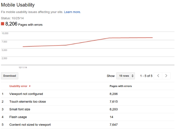
Google has been emphasizing the importance of mobile design and usability over the past year and now the search giant has added mobile usability reports to Webmaster Tools. Many believe this could be a sign that Google may be making mobile usability a ranking factor sooner rather than later.
The tool is intended to show whether your mobile site has any of the common usability issues that degrade a user’s mobile browsing experience.
John Mueller from Google’s Webmaster Trends Analyst team based in Zurich said they “strongly recommend you take a look at these issues in Webmaster Tools.”
Of course, Mueller could simply be encouraging this because it improves user experience, but there is strong evidence to suggest Google will eventually make mobile user experience a ranking signal within search engine algorithms.
00Taylor Ballhttps://www.tulsamarketingonline.com/wp-content/uploads/2018/07/TMO-Logo.pngTaylor Ball2014-10-30 14:58:132014-10-30 14:58:13Google Webmaster Reports Now Warns About Mobile Usability Mistakes
Adobe Flash and mobile devices go together like oil and water. Since the release of the first iPhone it was clear that Flash, Adobe’s multimedia based web site technology, would not be coming to cell phones any time soon.
Years later, after the release of several generations of smartphones and the release of tablets, and it is even clearer that Flash is all but dead and will never be a part of the modern ‘device agnostic’ approach to web design. Unfortunately many webmasters still use it.
That may not be the case for long, as Google has stepped up their fight against the technology. Google announced that starting today they will be warning mobile searchers when the search engine’s algorithms detect a web site is not supported on the device they are using due to Flash.
Rather than outright omit sites utilizing Flash from the search engine – which would garner heavy criticism – those using smartphones and tablets to search may see a warning that allows the user to attempt to view websites using Flash or to look for alternate search results.
The warning reads “Uses Flash. May not work on your device. Try anyway | Learn more.”
It seems pretty unlikely that many users will choose to press on knowing that the site likely won’t work for them.
In lieu of using Flash, Google highly recommends updating to HTML5 and upgrading sites to support that technology because it works in mobile devices and desktop browsers alike.
Google’s Keita Oda, Software Engineer, and Pierre Far, Webmaster Trends Analyst said, “fortunately, making websites that work on all modern devices is not that hard: websites can use HTML5 since it is universally supported, sometimes exclusively, by all devices.” Google simultaneously launched two new resources to help webmasters make the upgrade:
00Taylor Ballhttps://www.tulsamarketingonline.com/wp-content/uploads/2018/07/TMO-Logo.pngTaylor Ball2014-07-15 13:19:462014-07-15 13:19:46Google Gives You Another Reason To Not Use Flash With Warnings For Mobile Users
At this point, it is undeniable that any business with a website should have some form of mobile optimization, whether that means a responsive website, separate mobile URLs, or dynamic serving. But, many businesses with limited resources are attempting to solve this issue by essentially tacking on mobile optimization as an afterthought.
According to a new report from BrightEdge, 27 percent of sites have some form of errors from improper mobile implementation. Even more so, the report claims that sites with mobile implementation errors can cost websites up to 68 percent of smartphone traffic, an increasingly important segment of traffic.
BrightEdge’s Mobile Share Report examined the various types of mobile solution available and sought to uncover which configurations are the most likely to have some form of errors, as well as how these errors impact issues like rankings and traffic.
Notably, Google has indicated that responsive design, dynamic serving, and separate mobile URLs are all accepted forms of mobile implementation, although they have also deemed responsive websites as their preferred solution. As such, BrightEdge was especially interested in seeing if sites with responsive design was less likely to result in errors or had a better chance of ranking.
Interestingly, according to BrightEdge there was no significant difference between smartphone rankings based on mobile configuration.
“Data from BrightEdge’s Data Cube shows that for a given keyword, on average, a website’s rank for smartphone users varies only slightly based on the type of mobile configuration a website has implemented,” the report said. “So, for example, if a site is ranked No. 3 on a desktop, it would rank 3.5 (on average) on a smartphone device. This data represents the average across billions of keywords studied.”
Notably, the report indicates any difference in rank is likely due to local search results pushing other more universal results down on the SERP.
So, with sites using all mobile solutions ranking relatively even, why would Google endorse responsive design?
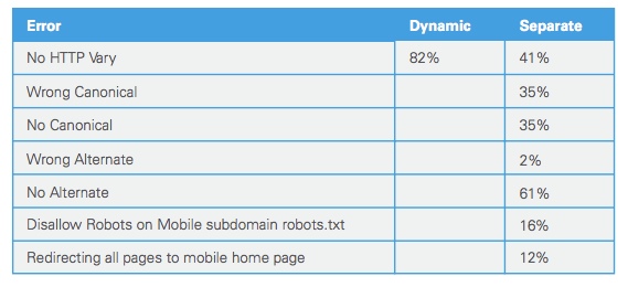
Responsive design showed the least chance for mobile errors, especially over using separate mobile URLs. In fact, 72 percent of sites using separate mobile URLs had errors, while responsive design showed a minuscule number of sites with errors. Dynamic serving rested nicely in the middle with a 30-percent error rate.
Some of the most common errors can be seen below:
“For separate mobile URLs, there are a handful of common mistakes made in implementation,” the report said. “BrightEdge research showed that no HTTP Vary header was a common mistake amongst two approaches: dynamic serving (82 percent) and separate mobile URLs (41 percent). And among the separate mobile URL approaches, not having an alternate URL tag was the most common error 61 percent of the time.”
These errors are important because they create a poor user experience, which can push traffic away. Even worse, Google has outright said that sites who don’t provide a good mobile experience may not be able to compete in search results overall.
While sites using the various mobile implementation options correctly are ranking fairly evenly, it is obvious that responsive design is still the safest bet. Any option can work, but you are significantly more likely to avoid errors that could cause you problems by simply choosing the least error-prone option: responsive design.
00Taylor Ballhttps://www.tulsamarketingonline.com/wp-content/uploads/2018/07/TMO-Logo.pngTaylor Ball2014-06-25 14:17:512014-06-25 14:17:51If You Don’t Do Mobile Implementation Right, You Are Probably Losing Traffic
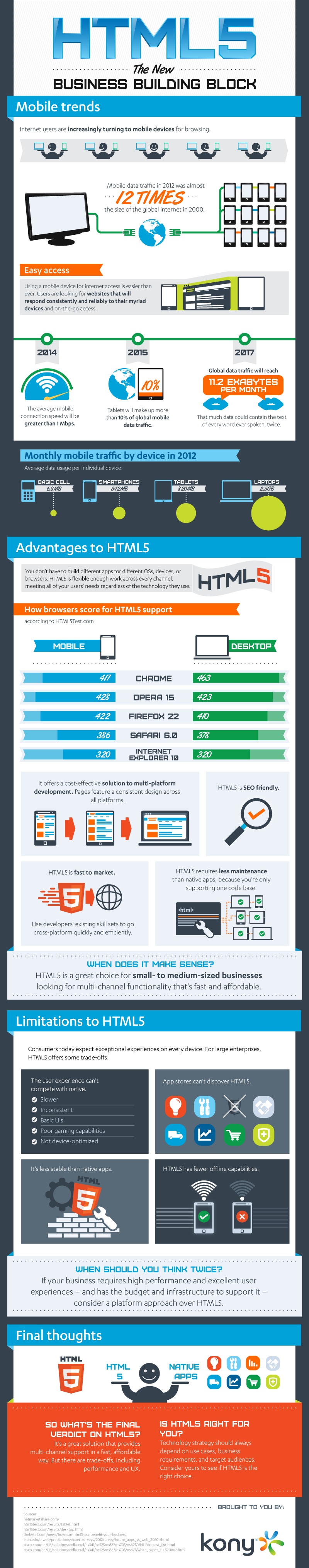
HTML5 has been called one of the most important web design languages in history, and some go so far as to call it nearly perfect. But, as you’ve probably guessed, a fair amount of that was hyperbole and overstatement. HTML5 has some great benefits, but there is no such thing as an ideal design language. This infographic, designed by Kony, breaks through the gimmicks and PR to examine the real pros and cons of HTML5, as well as the current and projected trends to come.
If you don’t have a website for your small business, you are certainly missing out on potential business and growth for your company. But, some business owners are nervous about branching out and getting online because they are afraid to lose money on a venture they don’t entirely mistake.
It is a fair concern. There are countless thrown together websites that litter the web, neglected and forgotten by everyone except the bots search engines send out. But, that shouldn’t be enough to stop you from reaching out with your own company. The majority of sites that have gone unnoticed and cost their businesses money share a number of fatal flaws that will stop any traffic from trusting you or returning to your company’s site.
Today, we are going to discuss the most common mistakes that drag down websites that have the potential to engage and excite visitors, and how we can help brands turn their struggling website into a real platform to expand your customer base and engage with your audience in new ways.
Visual Mistakes
Hidden Contact Information: For smaller businesses a website serves as an entry point for customers. While your website should demonstrate your expertise and services, the most important thing on all of your site is your contact information. Far too often, this information is stuffed and hidden away at the bottom of the front page or an obscure tab. Instead, put the contact information front and center, or at least above the fold. Visitors should be able to contact you within seconds from the front page of your site.
Crowding the Page: In web design, less can certainly be more. Your front page shouldn’t look like a crowded advertisement you send out to local papers or a mishmash of information crowded into as little space as possible. With online design you never really run out of space, so don’t be afraid to let your site breathe and let the white space of the page shine through where it needs to. If your page gets too busy, ask yourself what is essential, and prioritize what information should be immediately visible when your page loads. Then build from there.
Dead Links: Nothing says “this website is not well maintained” to a customer like a site filled with links that no longer work. But, if you only work on your site from one computer or network, you might not ever know the links are broken. Regularly check your site from a different computer and check to make sure all the sites you are linking to are still up to date and don’t lead to pages that no longer exist.
Animated Logos: When you visit websites for highly respected brands or prominent companies, do you ever see logos that spin, flash, or shoot glitter? While Google’s animated “Doodles” are a popular feature of their site, the vast majority of successful sites put their animated logos out to pasture years ago. Just use your professional logo in the cleanest looking format you can.
Content Mistakes
Typos and Grammatical Errors: There should NEVER be grammatical errors or typos on your page, especially on your front page. Yet, I still see this all the time, and audiences notice. If you have to hire someone to proof read all copy you publish, do it. The bottom line is that visitors and readers automatically respect and trust you less when they notice errors on the digital face for your company.
Stale Content: One of the biggest ways to push away your audience is to appear out of date. If you have content that is just sitting there and is never udpated, visitors will start to wonder if you are still in operation, and if so, why did you leave your website and content to rot? Regularly publishing fresh content shows that your business is up-to-date, in touch with its customer base, and an expert in your field.
Outdated Calendars: The same problems with stale content are inherent in outdated calendars, but worse. If a visitor sees your online calendar hasn’t been updated since November of 2011, they will assume that is the last time your website was updated. Similarly, they will assume you have either neglected your site or gone out of business. If you don’t have enough events to fill a calendar, cut it. If not, then start updating the calendar with all your events so your audience can join in on the fun.
The Big Picture
Yes, there is plenty of room for failure online. But, with a little bit of wisdom and a skilled hand to guide you through the process, it is actually much easier to gain a bit of traction online than you probably think. But, you can’t use full measures. By waiting to get online you are just missing out on potential customers, but a poorly done website projects disinterest in your own business or a lack of professionalism that won’t attract any new faces. Most importantly, you won’t see any new sales with a site like that.
00Taylor Ballhttps://www.tulsamarketingonline.com/wp-content/uploads/2018/07/TMO-Logo.pngTaylor Ball2014-04-23 13:18:522014-04-23 13:18:52Common Website Mistakes Businesses Make and How We Can Help
It appears we are currently in redesign season for most major search engines and social media platforms. Over the past month, Google and Bing have announced redesigns of their search results pages (Bing’s is still in testing, but has been confirmed). Meanwhile, Facebook rolled out the latest version of their site, and now Twitter has announced a new design for profile pages, complete with a slew of new features.
It seems obvious that one of the major motivators for the redesign was to improve organization of the site. Marketing Land recently conducted a study that found one of the biggest reasons for people to quit Twitter was the lack of sorting, filtering and media, which are all major focuses of the new layout.
Source: Marketing Land
The biggest and most notable change however, is the huge profile header that spans the full width of the screen. The huge header is easily the biggest visual change, but the most important updates all fall below. The new features allow users to pin Tweets to the top of the page, which is the first feature that allows users to break the chronological flow of their page ever. You can also filter the tweets you view by three categories:
Tweets
Tweets and Photos/Videos
Tweets & Replies
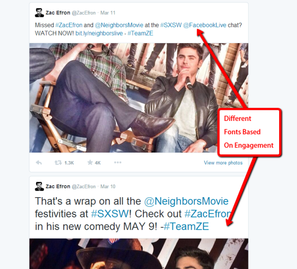
One of the last updates is a bit more subtle than the rest. Tweets with more engagement have gained more prominence on the screen as fonts get bigger based on activity. The Tweets getting the most attention get bigger, while less popular updates will continue to be shown at the normal font size.
Source: Marketing Land
The new profile design and functionality is currently limited to a small group of prominent users such as Weezer, Zac Efron, & Michelle Obama, but Twitter promises all users will have access in the “coming weeks.”
00Taylor Ballhttps://www.tulsamarketingonline.com/wp-content/uploads/2018/07/TMO-Logo.pngTaylor Ball2014-04-09 13:37:482014-04-09 13:37:48Twitter is the Latest Site to Roll Out a Major Redesign
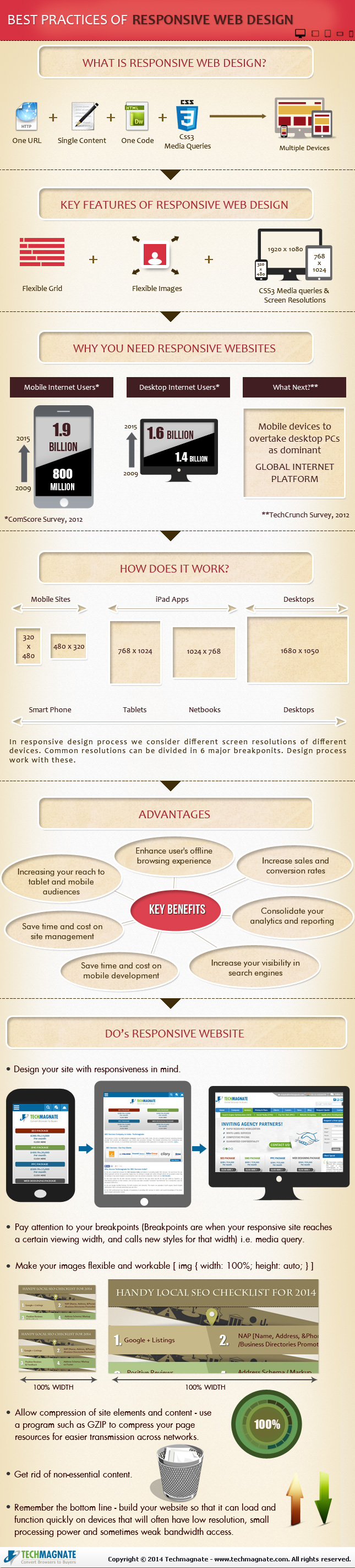
Responsive design is the popular title for a website designed to respond or adapt to users across multiple platforms. The idea is to make a responsively designed website equally as functional on your smartphone as it is on your desktop.
Of course, one way to make a website function properly on smartphones and desktops is to create a unique version of your site for each platform. What makes responsive design so special is its ability to take one site and make it work across devices, without the alternate versions.
With current estimates suggesting traffic from mobile devices may tie the numbers for desktop traffic, it is no mystery why it would be important for your brand to ensure your website is accessible and functional for everyone attempting to view it. Responsive design seems like the natural fit to solve this problem, and in many cases it is. But there are some drawbacks and problems you may need to be aware of before you start thinking responsive design is any kind of magic solution.
Tech Magnate created an infographic to explore the advantages and disadvantages of responsive design, as well as a guide for the common best practices used in the industry. If your business is online, but doesn’t have a site designed for a mobile experience, the infographic you see below can help you decipher whether responsive design is right for you.
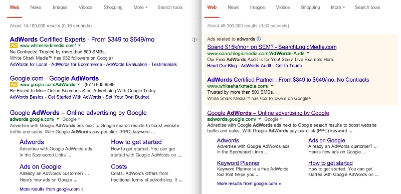
By now you’ve probably noticed your search results don’t look like they used to. Google told the public their new look was just an experiment earlier this week, but now everyone is getting to see Google’s search results pages with the new design.
Jon Wiley, Google’s lead designer for Google Search basically made the announcement the new style was rolling outto desktop when he said on Google+. “you may have noticed that Google Search on desktop looks a little different today.” He specifies desktop users because the style was showing up much more prominently on mobile before the full roll-out.
As many have noted, the new SERPs have much larger titles and the underlines have been removed. Jon also notes that Google “evened out all the line heights,” which he claims “improves readibility and creates an overall cleaner look.”
Most of those changes won’t have a huge impact on the usability of the search engine, but visitors will have to become accustomed to a different way of marking ads. Google has used smaller yellow tags to pinpoint which results were part of ads on mobile, but desktop users have still been relying on the lightly colored boxes Google has relied on for years to mark ads. Google says the change is intended to unify the mobile and desktop search experience. Jon explained:
Improving consistency in design across platforms makes it easier for people to use Google Search across devices and it makes it easier for us to develop and ship improvements across the board.
There are bound to be plenty of complaints about the redesign. I personally don’t enjoy it as much as the old style, but most will acclimate to it fairly quickly. But, it isn’t a high-profile site redesign unless people initially throw a small tantrum in the meantime.
00Taylor Ballhttps://www.tulsamarketingonline.com/wp-content/uploads/2018/07/TMO-Logo.pngTaylor Ball2014-03-14 13:37:292014-03-14 13:37:29Google Rolls Out New Search Results Design for Everyone
Keeping your website design fresh and modern is an important part of your brand, but it is also essential for SEO success. Search engines tend to favor sites which are regularly refining their site to offer new features and better user experience, as Matt Cutts recently confirmed in one of his Webmaster Chat videos.
But, there is a lot to consider before redesigning or modifying your website. A good website should be able to feel modern for at least a couple of years before needing another serious overhaul, and you are investing considerable resources into having the site designed in a way that communicates your brand well while keeping up with modern design styles.
There are also several factors behind the scenes you need to consider. Great usability and style are important, but several modern design practices seemingly go against some of the biggest search engines suggested practices. If you aren’t careful, you may do some damage to your SEO while trying to improve your site.
Kannav Chaudhary recently broke down how some of the most popular web design practices of the moment can affect your SEO. Usability and keeping your brand modern are important, but finding the right style for your brand also means choosing the paradigm which won’t hurt your other efforts.
Parallax Design
Parallax design recently became popular with web designers for it’s unique way of restructuring a site in a visually exciting way. You build your entire website onto one page, but with responsive scrolling which delivers the content in impressive style. Sites with parallax design are incredibly easy for most users to navigate, as they simply have to scroll through the page, but it raises some issues with optimization.
Simply put, most modern SEO practices rely on creating a lot of content over numerous pages so increase the impact of keywords. You show off your skill and reputation through your content, while showing search engines you are relevant for these keywords. When all of your content is on one page, it can dilute the impact of those keywords, and Google can be unsure about how to view your site.
The key is really understanding when to use parallax design. It is great for product or contest pages, because there isn’t much content on those types of sites in the first place. Parallax design can showcase a product and rank for a few key phrases, but it will struggle with presenting a full website to the search engines.
Infinite Scrolling
If you are pumping out a lot of content on a regular basis, but want it to be easily available from a single page, infinite scrolling can be the perfect solution Social Media sites like Facebook and Twitter popularized the design practice, but it can be found all over the web these days, especially on blogs.
If you use the wrong method of implementation for infinite scrolling, you may run into some SEO issues, but the current practices avoid the lion’s share of drawbacks. Most web designers use frameworks such as Backbone or Bootstrap with crawlable AJAX so you can present your information on one page, while avoiding the problems of parallax design. Best of all, it loads quickly, so everyone will be happy.
Fixed Width Navigation
Navigation will always be an important part of web design, and lately many designers have been using fixed width navigation to keep their menus in place while users move down the page. This way, you can always jump to another part of the site you want to find, even when you’re at the bottom of an article.
Thankfully, this design practice has very little effect on SEO. Your content will still be spread over plenty of pages, but you’ll want to make sure your navigation widget is indexable so that Google can also explore your site.
Conclusion
At the end of the day, you’ll always want to fully understand the new design trends before implementing them for your brand. Most of the time their SEO drawbacks can be mitigated with careful practice, but occasionally you will find one that just isn’t right for your site. As long as you keep user experience as the highest priority, you’ll be able to manage any of the SEO problems that pop up along the way.
00Taylor Ballhttps://www.tulsamarketingonline.com/wp-content/uploads/2018/07/TMO-Logo.pngTaylor Ball2014-01-28 14:12:282014-01-28 14:12:28How Does Modern Web Design Affect SEO?


 That may not be the case for long, as Google has stepped up their fight against the technology.
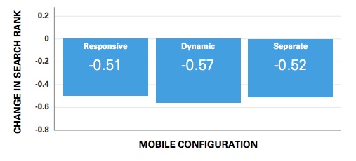
 If you don’t have a website for your small business, you are certainly missing out on potential business and growth for your company. But, some business owners are nervous about branching out and getting online because they are afraid to lose money on a venture they don’t entirely mistake.
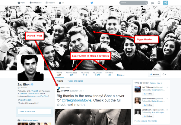
