A new survey of US consumers has some surprising findings about what customers expect out of business websites.

The results from 1,013 respondents between the ages of 18-60 show that consumers have high expectations when it comes to how frequently your website is updated, what features are implemented, and how you are advertising your business online.

What Consumers DON’T Want in a Website

Of the respondents, more than 80% say they view a brand more negatively if their website is out of date. Additionally, 39% of consumers say they would reconsider buying a product or service if the website isn’t current.

The issue of advertising is also a prickly subject for consumers, based on the survey results.

Less than 10% approved of brands showing ads on social media based on a person’s browsing activity. Meanwhile, approximately 26% feel negatively about ads appearing on their social media feeds based on their browsing or device history – saying it is an invasion of privacy.

On the other hand, 41% of consumers say they don’t mind if websites keep personal data, but only if it is secured on used exclusively to improve the user experience.

Overall, consumers are largely conflicted. Approximately 50% of respondents say that they like the convenience of brands keeping data for to improve ads and user experience, but they are concerned about how else it might be used.

What Consumers DO Want in a Website

In general, consumers say ease of use should be the top priority in making their online experience better.

Approximately 50% of the respondents said they prefer user-created content like reviews and photos to help inform their purchasing decision.

Meanwhile, 25% say their favorite website feature is receiving a reminder when they have left a product in their shopping cart.

Perhaps surprisingly, a major feature desired by users is an on-site search engine. Nearly one-third of respondents say they are put-off if a site does not have a search box, while more than 40% say a search box is the most important feature on a site.


The survey includes a number of interesting findings about consumer behavior and desires online covering a wide range of topics. You can read all the details from Blue Fountain Media here.

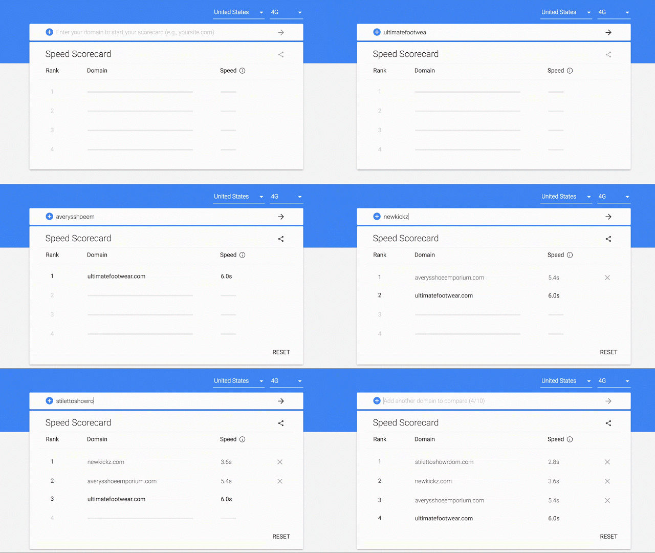
 

Google has been banging the drum for speeding up mobile websites for what seems like forever now, and they’ve released numerous tools to try to help webmasters do just that. This week, at the Mobile World Congress in Barcelona, the search engine announced two more resources to show websites how they are performing – a new “Mobile Scorecard” and Conversion Impact Calculator.

The tools present marketers and webmasters with visual-heavy depictions of how their website stacks up to the competition and what they may be missing out on by not being quicker to load pages

Google’s Mobile Scorecard

The Mobile Scorecard uses data from the Chrome User Experience Report to compare the speed of several sites on mobile. This allows you to directly compare your site against your closest competitors in a race for the fastest website. According to Google, the Mobile Scorecard can give information on thousands of sites across 12 countries.

Even if you’re the leader of the pack, Google recommends making sure your site loads and becomes usable within five seconds on most mobile devices and within three seconds on 4G connections.

Google Conversion Impact Calculator

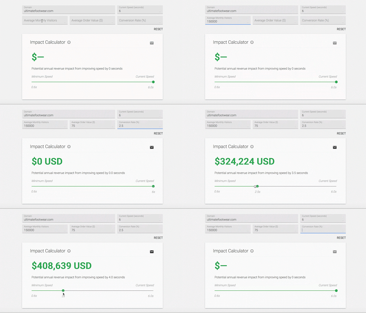
Of course, the biggest thing keeping most businesses from enhancing their websites for mobile devices is money. To help sway you towards making the investment, Google is launching the new Impact Calculator which shows how much revenue you could be missing out on because of a slow loading speed.

The calculator uses data from The State of Online Retail Performance report from April 2017. This report found that every second it takes for your web pages to load can hurt conversions by up to 20 percent.

The tool calculates your potential lost conversion revenue based on your average monthly visitors, average order value, and conversion rate.

Both the Mobile Scorecard and Impact Calculator are available to check out here.

Single-page websites have taken over the internet lately. More and more businesses are choosing to streamline their sites to get straight to the point, and newer brands are opting to avoid paying to create a dozen or more pages. The question is whether single-page websites are actually good for you and your brand.

Admittedly, there are a few clear benefits from single-page websites. They tend to work well on mobile devices and load more quickly than a site with numerous pages. Since more than half of all searches are now coming from mobile sources, these can help you ensure people on smartphones don’t have to wait to check out your stuff.

There are also a variety of free tools that can help set-up a stylish one-page site, while designing a full multi-page site can cost thousands of dollars.

However, it’s not all roses and sunshine when it comes to single-page websites. Here are a few things to consider before you decide to go minimalist with a one-page website for your brand:

Lack of info

The biggest problem with single-page websites is simply cramming everything your potential customers want to know all on one page.

On a multiple-page website, you can publish all sorts of content and valuable information that helps your visitors become informed and excited about your products or services. When you cut all that down to one page, you lose a lot of the details that can be a deciding factor in turning someone from a visitor to a customer.

Even with a great layout that includes separate sections for different topics or types of services, it is nearly impossible to include everything your variety of visitors want to find.

SEO limitations

Since you can’t fit in as many types of content or information, it is also hard to target as many keywords or phrases as you have in the past. Sites with lots of pages of content can cover a huge range of keywords related to your business, helping you rank on diverse search pages that might draw in different parts of your audience.

On that note, it can also be hard to keep your site looking “active” since you are only updating it for new products or when you change your business’s phone number. Rather than keeping people up-to-date, single-page websites are typically planned to be “evergreen” and need minimal updating. That may sound nice, but search engines tend to prefer sites that are regularly adding new information and resources – not stagnant sites that are only updated a few times a year at most.

Cost vs. Effect

One of the most common reasons I hear for going single-page is that it is cheaper. You don’t have to hire a web designer to customize numerous pages with unique layouts and images or have a writer fill all those pages with copy and content.

That can all be tantalizing, but as the saying goes: “you get what you pay for.” If you use a free or cheap template for your single-page website, you risk looking bland and forgettable because others are using that exact same layout.

Even if you hire someone to create a great single-page layout, it becomes hard to make your page effective. Strategized approaches get cut to fit within the limited mold, and your copy becomes broad to cover as much as possible as quickly as you can.

All-in-all, single-pages require a ton of work to be anywhere as effective as a traditional website. You have to fight an uphill battle to optimize your site for search engines and hope your content is so insanely precise that you aren’t missing any details your customers want. So, if you are choosing a one-page site for its low-cost, you should realize it will cost you one-way or the other down the road.

The final verdict

As with any trend, it can be hard to resist the urge to be up-to-date and hip. But, trends are fleeting because they often aren’t fully thought through. There will always be a small number of brands who benefit from going to a single-page site, but most discover it’s not as great or easy as they thought it would be.

Do you have a website for your business? If you’re like 60% of small business owners around the world, the answer is no. Whether it is because you lack the expertise or can’t afford it, Google wants to help.

This week, Google officially released a simple one-page website builder designed to make getting your brand online quick, easy, and (most importantly) free.

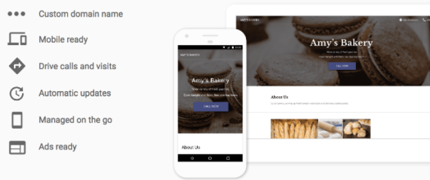
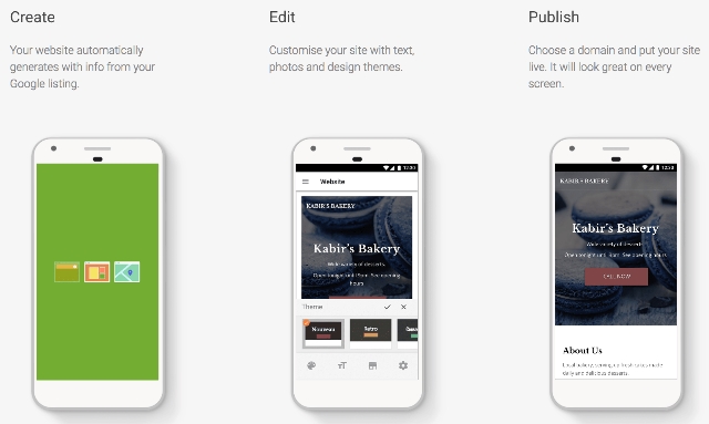
The new feature, called “Website”, allows you to create and edit a basic website for your business in just a few minutes. You can even make your site on a smartphone, as well as from a desktop device or tablet.

Website is being touted as a new part of Google My Business, meaning you will have to sign-up and fill out business information before you can use the tool. However, this also makes the process of making a site easier, since Google automatically uses this information to fill out your website. From there, you can customize it with a selection of themes, pictures, and customizable text.

If you don’t already have a GMB listing for your business, Google will automatically ask if you’d like to create a site when you sign-up. Those with existing listings on GMB can click the “Manage location” tab and select Website from the menu to get started. You can also skip right to making your website by clicking here.

The process is extremely simplified. Google will walk you through the steps and you can spend as much or as little time as you want tweaking your page before publishing it onto the web. You don’t even have to worry about hosting.

Any sites made with Website will have a URL following the structure “yourcompanyname.business.site” by default, but you can also purchase a custom domain through Google My Business within the Settings menu.

Once your website is online, any changes you make to your GMB listing will automatically be applied to your website as well.

Of course, the tool is designed to be used for very basic websites and lacks many of the features you would expect from a more comprehensive website management system. You won’t be able to create additional pages to highlight specific products or services, let alone operate a blog or robust sales page. On the upside, having a simple website for free is still better than nothing at all.

Google Logo

Do you have an on-site search engine to help visitors find the products and content they want? Do you rely on Google’s Site Search service for your search engine? If so, you should begin making plans for a replacement.

Google has confirmed it will be shutting down the Google Site Search product and discontinuing support by the fourth quarter of 2017.

Google Site Search powered internal search engines with Google’s own search technology, charging users based on monthly query volume for the product.

The paid site search product wasn’t Google’s only on-site search product. The company is directing consumers using the company to use either the ad-powered free custom search engine or cloud search product.

In a statement to Search Engine Land, a Google spokesperson said:

We are winding down the Google Site Search product over the next year, but will provide customer and technical support through the duration of license agreements. For GSS users whose contract expires between April 1st and June 30th, 2017, we are providing a free 3-month extension with additional query volume to allow more time for them to implement the necessary changes to their site. GSS customers may also take advantage of our Custom Search Engine solution, an ads-supported model that offers similar functionality. We continue to build out new functionality and invest in new technology that make enterprise search a great experience for our customers. Just recently, we introduced the general availability of Google Cloud Search for G Suite customers.

accelerated-mobile-pages

The Accelerated Mobile Pages project says it has made its stripped-down superfast mobile pages even more versatile with the ability to support forms in AMP HTML.

AMP uses a simplified version of HTML to provide pages faster than usually possible on mobile devices – where speed matters most to users. However, the format offers limited features compared to full-fledged web pages. Until now, one of those limitations was the lack of ability to include forms.

Now, AMP users can include everything from the standard e-mail address capture form to more complex forms or even interactive polls. In addition to making it easier to communicate or gain information from your visitors, the support for forms can help with allowing customers to select colors or other details on e-commerce product pages.

form-error

As the AMP project says in its announcement, support for forms “enables building experiences ranging from a product color picker on an e-commerce detail page to an email field to capture newsletter signups to an interactive poll to engage readers within an article.”

If you want to start running your own AMP pages to deliver content faster to on-the-go users or you want to start adding forms to your already existing accelerated mobile pages, check out the AMP project’s official guides and documentation.

You can also see live examples of what the forms may look like on your site at AMP by Example.

The AMP project says it plans to continue to expand the functionality of AMP pages and AMP forms based on user feedback, but the overall focus is still on providing functional and engaging web pages to users as fast as possible.

phone-875488_640

Does it seem like your ‘Contact Us’ page never actually leads to contact with customers or interested consumers? These days, every business with a website has a contact page, but few are putting the time and care into these pages that they invest in other areas of their site.

I couldn’t count the number of stylish and modern websites I’ve found with contact pages that look weeks or even years old. Sometimes the web design looks distinctly dated, like a forgotten room in a house that has since undergone numerous renovations. Even more worrying, some businesses forget to update their contact information after address or phone number changes.

Any of these issues can deter potential customers from contacting you or purchasing your products or services in the blink of an eye. The good news is, they are also easily fixable. Today, I wanted to offer you some quick ways to turn your ‘contact us’ page from one of the least effective pages on your site to a consistent source of leads and customer engagement.

Be Consistent

The most important factor when listing your contact information anywhere online is consistency. Your business name, address, phone number, and all other contact information should be exactly the same whether they are on your contact page, Facebook, or Yelp. Not only does it provide huge SEO benefits, but showing consistency and a clear identity for your business helps build trust with consumers.

Try Some Variety

Just about every ‘contact us’ page lists a local address and phone number, but often there isn’t much else on the page. While these are both important, you are also missing out if these are the only ways you are encouraging consumers to contact you.

Potential customers aren’t always in a place where they can easily make a phone call and they are not always able to make it out to your physical location. Instead, they may want to drop a quick message to you over Facebook or Twitter. Providing many different ways for your customers to contact you will make you seem more available and allow more people to reach out when they need to.

Show Some Personality

The biggest problem with the vast majority of contact pages I see are that they are just plain boring and tell nothing about who you really are. If someone comes to your ‘contact us’ page, they are looking to learn more about you. If your page is just a simple list of email addresses and phone numbers, you are missing a huge chance to build your brand identity and reinforce who you are.

Don’t Ask Too Much Too Quickly

Some contact pages include forms which ask for small amounts of user information. These can be helpful for keeping messages organized, but being overzealous can drive people away. Your contact page isn’t necessarily the best place to build your email list or ask for detailed user information. Test out shorter forms that ask less of customers initially or make signing up for email subscriptions optional. Otherwise you may find your contact page is actually pushing interested people away.

For far too many businesses, a contact page is treated as an afterthought when they should really be a priority. They are one of the most important pages on your site and act as a foundation for you to start building a relationship with consumers. If you want to really start hearing from consumers, invest time in your contact page to turn it into a page that is as welcoming and informative as the rest of your site.

It may seem like everyone is online these days, but somehow some businesses still don’t have websites. Your business might even be one of them.

If your business has gone this long without a website, you probably have your reasons. You may think you don’t have the money or you simply don’t need one. Neither of those is correct.

A website is a fundamental part of running a business in 2016 and many consumers won’t consider purchasing from a business if they can’t find information about them online. That’s true even for brick and mortar stores. In this connected age,people will even Google stores from their parking lot to make sure the trip inside will be worth their time.

Rapid Web Launch put together an infographic breaking down every reason you might have for not having a website and why it is wrong. I know you’ve gone this long without one and your business may be doing fine, but there’s nothing to lose and everything to gain by getting one set up today.

Check out the infographic below or at Rapid Web Launch.

NoWebsite

Google Logo

While loading speed is a crucial issue for most mobile internet users, Google’s “Mobile-Friendly Algorithm” isn’t currently using it as a ranking factor for mobile pages. However, that is likely to change when Google releases their next mobile-friendly update.

According to reports from the recent Search Marketing Summit in Sydney this week, Google Webmaster Trends Analyst Gary Illyes confirmed Google would be including page speed as a factor in the next mobile update. But, it may be months until that update arrives.

The inclusion of page speed seems like common sense. The majority of mobile users are likely to leave a page if it doesn’t load within five seconds, and some are even more impatient. From Google’s perspective, including page speed as a factor means they are more likely to help users find a site they will be happy with on the first click as often as possible.

It also makes sense considering Google introduced their version of Accelerated Mobile Pages recently.

Want to know how your site stacks up in terms of page speed or other mobile friendly factors? Google has also released updated versions of their mobile-friendliness and page speed tests for both desktop and mobile in one place.

The new tool, available here, combines all the free site evaluation tools Google offers in one easy-to-read report. You can also get a more extensive report emailed to you for deeper analysis.

Your homepage is the face of your business. It is the first thing most visitors see when they visit your site for the first time and it is where you make your first impressions. If you already have a solid homepage with killer copy, that can be great news. But, there is a good chance your site is missing one of the several things users expect to see when they come to your site.

Having a homepage without critical features and elements is a bit like having a mouth full of broken, chipped, and missing teeth. No matter how hard you try to smile and make a good impression, a lot of people are going to be put off.

While dental work can be costly and painful, fixing up your homepage doesn’t have to be. HubSpot put together an infographic – seen below – detailing 12 features and elements that are absolutely critical to have on your homepage, and the majority are easy to implement without needing to call in the pros.

 HomepageInfographic