While you won’t meet a web designer who doesn’t know about responsive design, its still relatively new. According to Webdesigner Depot, the term was only coined three years ago by web designer Ethan Marcotte who writes for A List Apart.
While some still treat responsive design as a passing trend, it appears that responsive design isn’t going anywhere until new technology requires a new design methodology or we find a better solution. Responsive design aims to make the user experience as enjoyable as possible, and while that pleases users Google has also made it clear that UX is going to be a major consideration in site rankings going forward.
The internet used to be confined to desktops, but we all know that time is long gone. We access the web from countless devices with constantly changing screen sizes and browsers, often from our phone or tablet while at work, on a bus, or watching tv at home. Responsive design strives to make the experience as gratifying and problem-free as possible no matter what platform you are using.
Mashable called this the year of responsive design, and in many ways they are right. It is clear that numerous hugely popular websites have implemented responsive design, and there are many signs it may be considered standard within just a few more years. If you’re still not caught up with this fairly new design method, Marc Schenker recently broke down the facts everyone needs to know about it.
https://www.tulsamarketingonline.com/wp-content/uploads/2018/07/TMO-Logo.png00TMOhttps://www.tulsamarketingonline.com/wp-content/uploads/2018/07/TMO-Logo.pngTMO2013-06-20 13:33:022013-06-20 13:33:02What You Absolutely Need To Know About Responsive Design
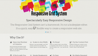
You’ve heard all about the pros and cons of responsive web design. You know it creates a consistent experience across different devices, and how it will save you from developing many different versions of the same site, but you’ve also heard that it “isn’t easy.”
Well responsive design may not be something a toddler can do, but Kendra Gaines has a way to make responsive design easy enough for almost every competent web designer out there. Thanks to the endless tools, frameworks, and plug-ins, responsive design is possible for everyone without too much fussing over the little details.
Gaines gathered 13 different responsive design tools you can use, and if you implement them all in your work flow, making your site responsive will be a simple matter you don’t have to fret over.
Even better, normally when you trade pure hard design work for tools, scripts, and other free resources, you end up sacrificing control and precision. The wide selection of these tools as well as the niche abilities of many of them make it so that you don’t have to compromise any longer.
Responsive websites are quickly becoming the standard, so it is imperative to learn how to adapt your sites to the new design world. You can still get away with your special, mobile-optimized websites if you so desire, but you are giving away consistency and features. Don’t give users a lite version. Use these easy resources to make your full website fit into anyone’s pocket.
00TMOhttps://www.tulsamarketingonline.com/wp-content/uploads/2018/07/TMO-Logo.pngTMO2013-04-16 12:05:522013-04-16 12:05:52Making Responsive Design Easy With Just a Few Tools
Mobile optimization has fallen out of popularity a little bit as the new responsive design trend makes the need for a secondary mobile website obsolete. Of course, there are many businesses that have opted to have a specific mobile website, but there is no denying that responsive design is gradually merging mobile and desktop optimization.
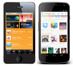
What responsive design doesn’t negate is the possible need for an app. There are over 600,000 apps in the Apple App Store alone, and more businesses are deciding to create an app for their products every day.
What many don’t realize is that apps require optimization just like websites. With the huge number of apps out there, you can’t simply get your app approved and expect to see a huge number of people downloading it.
Over the past few weeks, there has been a discussion about ASO (App Store Optimization) stemming from a Techcrunch article claiming ASO is the new SEO. We use apps more every day, relying on them for weather, news, entertainment, shopping, and organization, but I was initially skeptical as to whether ASO will ever achieve some sort of dominance.
Then I started considering my tablet usage throughout each day. I check a number of news sources including CNN and Vice, skim through the more lighthearted Buzzfeed and Cracked, and often browse Reddit. The only one of those activities I don’t do in an app is read news from Vice only because there isn’t one to use and I have checked more than once to see if an app existed (there is one for the iPhone however).
The thing is, I use these apps regularly in the morning and evenings when I’m away from work. For more casual viewers, these apps may not be used enough to justify the space they take up. Most of the apps I acquire either serve a distinct purpose, or allow me quicker access to content I would normally have to open in a web browser. The only type of apps I download without already being familiar with a company are tools.
None of this is to say apps do not have their purpose, or that optimization should be an important part of creating and managing an app, as well as reaching out to the public. However, there are many markets where the apps largely serve to make frequent visitors’ interaction with your content more efficient, and won’t reach as many uninitiated consumers as other markets would.
If you decide an app is an important product you release to the public however, ASO is practically required to keep your app from going nowhere. There are simple steps you can take such as making sure to clearly advertise the app on your website and sharing it on social media, but you can also do keyword research and find out what people are searching for.
While ASO certainly has its place, the debate over whether it will be the “new” SEO seems kind of silly to me. We may reach a point where it is important for every company to have an app, though I don’t think we are quite there. Even then, ASO will only be a small portion of what we do. SEO applies to every business online, and I don’t see it going away any time soon.
00TMOhttps://www.tulsamarketingonline.com/wp-content/uploads/2018/07/TMO-Logo.pngTMO2013-04-08 12:34:472013-04-08 12:34:47App Store Optimization: Is It Really The New SEO?
Responsive design is one of the most popular website design methods out right now. Users like having a consistent experience across different devices, without having to worry about pinching, zooming, or being restricted to a downsized version of a website. But, going responsive raises some concerns for the SEO professional managing a site.
Bonnie Stefanick explores some of the issues of high importance to SEOs when redesigning a site to be responsive, but before dealing with the questions she separates redesigns into two categories – cosmetic and full redesigns.
The main distinction between a cosmetic redesign and going all the way is URL management. If URLs are going to be changing during your redesign, you have substantially more issues than just updating the appearance of your site. The issues raised by Stefanick run closer to cosmetic redesigns, as complete redesigns have their own, much larger, can of worms to deal with.
Responsive design has its own unique style and appearance, and some times it can conflict with the best SEO practices. Such is the case with the area above the fold. Responsive design relies on negative space and giving elements area to breathe and move, but navigation and critical linking elements often get pushed down by big banners popular in responsive designs.
These large banners designers constantly put in responsive designs lead to important SEO elements being under the fold, only reached by scrolling down to find menus By talking to the designer before the prototype is made and establishing where you main categories are on your homepage, you can avoid losing the SEO elements.
Another issue with the content above the fold in responsive designs is simply that there is no actual content. Responsive design is intrinsically visual, and designers favor the visual design elements over delivering content directly to users. Search engines notice when none of your content is above the fold, and can rank sites differently for their efficiency in directing users to the content they are trying to reach.
There are plenty of other major considerations for responsive redesigns. Clear communication with designers through the entire process can help manage many of them, but you will also have to pull your own weight to make sure your new design is working as well within your SEO strategy as your last design.
https://www.tulsamarketingonline.com/wp-content/uploads/2018/07/TMO-Logo.png00TMOhttps://www.tulsamarketingonline.com/wp-content/uploads/2018/07/TMO-Logo.pngTMO2013-03-27 11:25:192013-03-27 11:25:19Responsive Redesign SEO Considerations: Above The Fold
It is no secret how important a mobile SEO strategy is in today’s market, especially with predictions coming out stating mobile internet usage will overtake desktop internet usage in the next year.
Eventually, mobile search could catch up to desktop search, and users aren’t just staying on any website they find. Two-thirds of consumers say they are more likely to purchase from a website that has a mobile-friendly website, and more than a few survey has shown how low-quality sites or long load times repel searchers like a disease.
You probably knew all this. The debate over the importance of a mobile SEO strategy is over. The real question for most web designer’s is how do I achieve a mobile-friendly website? You have two options: a responsive web design, or an entirely separate mobile website.
There are pros and cons to both methods of course, but gradually it appears responsive designs are winning, especially when SEO is a factor. Jay Taylor, writer for Search Engine Watch, breaks down three reasons why responsive design seems to be taking the lead.
The biggest reason stems from a big endorsement from Google. It is an SEO professional’s job to please the almighty Google, since they command more searches than all of the other engines combined, and Google loves responsive design so much they called it the best practice for the industry.
Google’s preference for responsive design is likely because responsive sites have one URL and the same source code, regardless of how it is viewed, which makes the site easier for Google to crawl and contextualize. Separate mobile sites, on the other hand, have separate URLs and HTML, which complicates everything for the search engine.
Further more, content on responsive sites is easier for users to interact with and share than content that is separated between different websites. If that seems weird, imagine what happens when you get a link over Facebook from a friend who was on their phone. If you open that link on your desktop, you might get sent to a stripped-down mobile website if they use the separate website method.
When Google recommends a method for achieving your mobile SEO strategy, it is always best to do as they say, but there are other reasons responsive design is slowly taking over the search market. It allows a more uniform experience across devices, and makes managing your entire strategy easier. Everyone likes their work to be easy right?
00TMOhttps://www.tulsamarketingonline.com/wp-content/uploads/2018/07/TMO-Logo.pngTMO2013-03-25 10:37:162013-03-25 10:37:16Why Responsive Design Is Winning The Mobile SEO Debate
Responsive design is definitely the most talked about web design method right now, especially when discussing designing for mobile. It isn’t the only option though. There are three real options currently and each has its own pros and cons to them. Choosing the way you interact with mobile customers should reflect the type of business you are running and what you hope to accomplish.
Responsive Design – Though it is well covered, responsive websites are those that adapt to different sized screens across all platforms, from mobile to tablet to desktop. The idea is that you only build one website for everyone rather than different sites for all different devices. That time you would have spent designing sites for different platforms will have to be spent testing your one site on all of the devices. It also removes some of the ability to customize sites for certain devices.
Mobile Sites – A mobile site is optimized for that specific section of on-the-go customers. The sites are usually minimal, with large, finger-friendly buttons, and they load faster than responsive sites. This allows more direct control of how sites appear on different devices, but more importantly, the content selected to appear is tailored for the mobile demographic accessing it.
Native Mobile Apps – If you own a smartphone, you know what an app is. They are specific to their platforms so they have the benefit of being able to curate mobile content like websites do while further focusing on the differing needs of different platform users.
All three have their merits. Responsive websites create a sense of consistency and deliver the full experience of a desktop website in an accessible form for a specific device. Some hail it as a time saver, which isn’t quite true, but it does allow you to spend equal time on a site for all devices. Mobile sites and apps load faster and cater to specific audiences, while allowing them to act immediately.
Diksha Arora compares the three against each other at Vandelay Design. If you don’t know what is best for your business, she can help you identify your needs.
00TMOhttps://www.tulsamarketingonline.com/wp-content/uploads/2018/07/TMO-Logo.pngTMO2013-02-20 13:47:272013-02-20 13:47:27What Mobile Design Method to Use? Responsive vs. Mobile vs. Apps
Just because we are a month into the year, it doesn’t mean some aren’t still giving their predictions for what will be popular this year. Jake Rocheleau is a little late to the fray, but he makes a couple predictions which pique my interests, especially because he stays away from the standard for this years’ lists, responsive design.
Instead of just repeating that responsive design will be big this year, Rocheleau suggests responsive design is going to shift our workflows to starting on mobile and building sites up from there. Mobile first design allows you to identify what is important from the beginning, then flesh out the site for other platforms. The traditional method of starting on desktop usually turns into a game of squishing and cutting elements when scaled down for mobile.
Rocheleau also uses a popular implement for many social media websites as a sign that soon infinite scrolling will be common on the web. Facebook, Tumblr, Pinterest, and Twitter have all popularized the layout style, and even Reddit’s most popular add-on, Reddit Enhancement Suite, adds in infinite scrolling, as well as numerous other features. This style doesn’t work for every type of site, but it certainly is spreading.
His other predictions aren’t as interesting as the last two advancements. White space and minimalist designs have had a niche following for years in web design, and while many sites use this style, it is hard to see it becoming widespread. The idea behind using minimalist designs or a lot of negative space is that it removes clutter and helps users focus more on pages. Clutter on a webpage is never good, but most companies will continue to opt for other solutions, if the trend continues as it has been.
The same goes for big photography. In the circles extra large photography online benefits, big photography has been common in some form for years. Design portfolios and personal websites have long organized their main pages around large, high quality images. The newer high definition displays out there definitely make these types of pages pop a little more than they used to, but it is hard to see it becoming any more common than it already is.
It is always interesting to look at predictions or annual lists that arrive a little behind the rest of the pack. Most lists for 2012 that came out in early January or late December tended to focus on responsive design and parallax scrolling. Those two design implements are keeping their foothold, but as this list shows, we’re already moving further with design.
I’ve explained what responsive design is fairly exhaustively. We all know its benefits and at this point it is one of the biggest buzzwords in web design around. But, with any hugely popular web design method, a fair amount of misunderstandings came with the rise in popularity.
Many people have read about what responsive design is, and they understand that information fairly well, but what most people don’t understand is what responsive design is not. Jeff Orlor helps clarify what responsive design is and isn’t, and by pointing out what responsive design can’t do, it is a lot easier to understand exactly what the method is as a whole.
One of the biggest misunderstandings is the idea that responsive design provides the exact same experience on every screen. This isn’t possible, and if it was, you wouldn’t like it because all text and images would be absolutely tiny. If you’ve ever come across an un-optimized page which you’ve had to pinch and pull at to see anything, you have an idea what it would be like if a page looked the exact same on every device.
Instead, responsive design squeezes the content from a big screen into a smartphone at the expense of some content – namely images and graphics. Responsive design doesn’t recreate the site exactly, but tries to replicate the experience in the best way possible.
It is also widely believed that responsive design is a huge time saver, because designers don’t have to design a page over and over for different devices. This means, yes, designers may save time in the actual designing stage, but responsive design isn’t a miracle time saver. Testing is still required for every device to make sure everything is working properly. That testing takes time.
If you look at the tags for most articles on responsive design, you will notice the way most writers connect responsive design to mobile design. Thinking of responsive design as a mobile design method kind of misses the point however.
When Ethan Marcotte first coined the term ‘responsive design’, he wrote, “responsive design is not about ‘designing for mobile’. But it’s not about ‘designing for the desktop’, either. Rather, it’s about adopting a more flexible, device-agnostic approach to designing for the web.”
So what exactly is device-agnosticism? It is the main selling point of responsive design. The device-agnostic approach to design is designing for every device at the same time, or focusing on no specific device. PC Magazine defines it simply as saying the approach is “not tied to a particular device.”
I won’t say more about the benefits of thinking agnostically about devices, as it is alreadycovered in just about every article I’ve done about responsive design. But, what I will say is I made the same mistake many have by slipping responsive design under the idea of mobile design. Thinking that way still focuses on the needs of devices. Instead, as Sarita Harbour from Web Designer Depot, explains, you should stop thinking about the needs of devices, and start thinking about the needs of the consumer. Isn’t that what is most important anyways?
00TMOhttps://www.tulsamarketingonline.com/wp-content/uploads/2018/07/TMO-Logo.pngTMO2013-01-09 08:45:012013-01-09 08:45:01What Is The Device-Agnostic Approach To Design?
We’re officially in 2013 now, and it is time to plan for the year ahead, if you haven’t started already. Planning means trying to predict the biggest trends that will hit design before they get here, which can be tricky, but there are plenty of lists already out there of people making their predictions.
The one I believe is the most accurate is Andrew Kuchariavv’s article on Intechnic. He starts with the same item that has topped just about every list I’ve seen, and seems less like a prediction than a statement. Yes, responsive and adaptive design will only be more important in the next year. There are a few drawbacks, but the bottom line is responsive design means a quality design will look good, if not great, on any display from an iPhone to a desktop.
Predicting parallax scrolling will be more common in 2013 however is a bit more of a reach. Parallax scrolling is a technique where multiple layers of a website scroll at different speeds, creating a 3D effect. For an example, check out Bagigia’s website. There have been sites with parallax scrolling for a short while now, but it is only now beginning to catch on, because it works great for product presentations and looks excellent on smart phones or tablets.
Probably my favorite prediction Kuchariavv made might be more of a hope than a foresight, but it is still fairly probable Flash could finally die in the next year. Javascript, HTML 5, and CSS3 enable just about every animation effect you could make with Flash, but without the need for plug-ins, and compatibility issues with mobile devices.
The next year looks promising for web design, and I personally am excited to see what comes out. There are always the new things we can’t see before they get here, but just these trends suggest websites will keep getting sleeker and more fun to use.
https://www.tulsamarketingonline.com/wp-content/uploads/2018/07/TMO-Logo.png00TMOhttps://www.tulsamarketingonline.com/wp-content/uploads/2018/07/TMO-Logo.pngTMO2013-01-04 08:45:022013-01-04 08:45:02What’s Next In Web Design This Year


