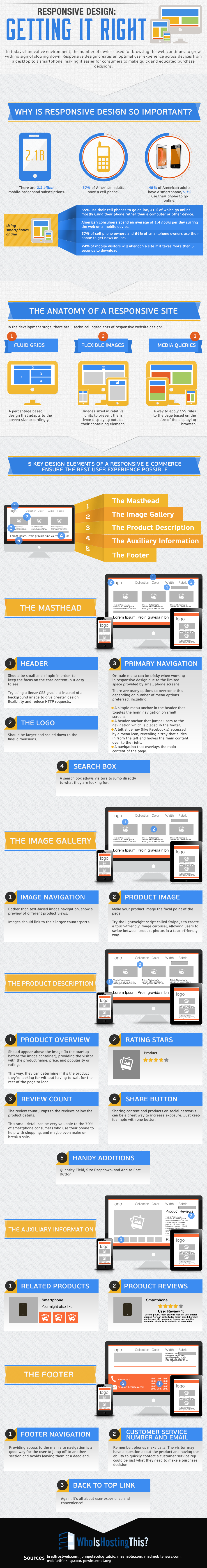
At this point, it is undeniable that any business with a website should have some form of mobile optimization, whether that means a responsive website, separate mobile URLs, or dynamic serving. But, many businesses with limited resources are attempting to solve this issue by essentially tacking on mobile optimization as an afterthought.
According to a new report from BrightEdge, 27 percent of sites have some form of errors from improper mobile implementation. Even more so, the report claims that sites with mobile implementation errors can cost websites up to 68 percent of smartphone traffic, an increasingly important segment of traffic.
BrightEdge’s Mobile Share Report examined the various types of mobile solution available and sought to uncover which configurations are the most likely to have some form of errors, as well as how these errors impact issues like rankings and traffic.
Notably, Google has indicated that responsive design, dynamic serving, and separate mobile URLs are all accepted forms of mobile implementation, although they have also deemed responsive websites as their preferred solution. As such, BrightEdge was especially interested in seeing if sites with responsive design was less likely to result in errors or had a better chance of ranking.
Interestingly, according to BrightEdge there was no significant difference between smartphone rankings based on mobile configuration.
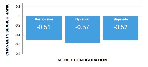
“Data from BrightEdge’s Data Cube shows that for a given keyword, on average, a website’s rank for smartphone users varies only slightly based on the type of mobile configuration a website has implemented,” the report said. “So, for example, if a site is ranked No. 3 on a desktop, it would rank 3.5 (on average) on a smartphone device. This data represents the average across billions of keywords studied.”
Notably, the report indicates any difference in rank is likely due to local search results pushing other more universal results down on the SERP.
So, with sites using all mobile solutions ranking relatively even, why would Google endorse responsive design?
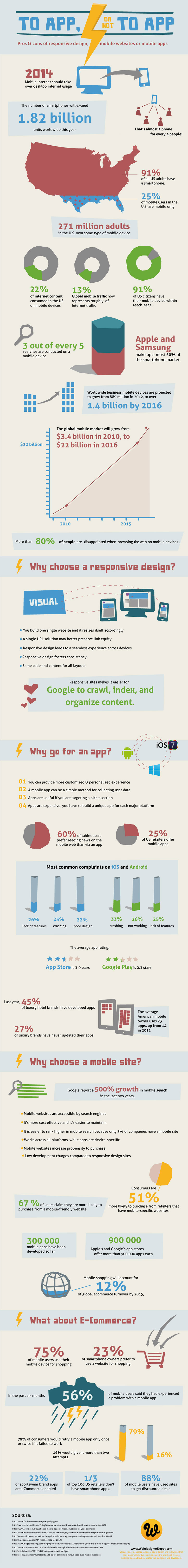
Responsive design showed the least chance for mobile errors, especially over using separate mobile URLs. In fact, 72 percent of sites using separate mobile URLs had errors, while responsive design showed a minuscule number of sites with errors. Dynamic serving rested nicely in the middle with a 30-percent error rate.
Some of the most common errors can be seen below:
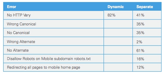
“For separate mobile URLs, there are a handful of common mistakes made in implementation,” the report said. “BrightEdge research showed that no HTTP Vary header was a common mistake amongst two approaches: dynamic serving (82 percent) and separate mobile URLs (41 percent). And among the separate mobile URL approaches, not having an alternate URL tag was the most common error 61 percent of the time.”
These errors are important because they create a poor user experience, which can push traffic away. Even worse, Google has outright said that sites who don’t provide a good mobile experience may not be able to compete in search results overall.
While sites using the various mobile implementation options correctly are ranking fairly evenly, it is obvious that responsive design is still the safest bet. Any option can work, but you are significantly more likely to avoid errors that could cause you problems by simply choosing the least error-prone option: responsive design.


