Tag Archive for: Apple

I recently wrote about the current debate over skeuomorphism and flat design, but after investigating more into the topic, I don’t feel like I explained skeuomorphism as well as possible. Of particular interest to me was Paula Borowska’s article for Designmodo specifically looking at skeuomorphism.

The biggest misconception about skeuomorphism is also the one I failed to address in my original definition of the concept. Skeuomorphism isn’t simply mimicking the way something looks. It is copying the aesthetic properties of the material, the shape, and most importantly, the functionality. Those apps using faux leather backgrounds aren’t part of skeuomorphic design.

More than anything, Skeuomorphic design is about functionality and shape, not texture. The object doesn’t have to physically do something, but it has to convey the idea of functionality  For example, a paperclip on a “stack” of photos is skeuomorphic design, because it appears to be holding them together.

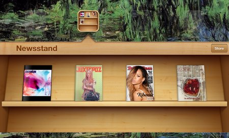
Apple, always noted for their use of skeuomorphism, have the newsstand, the most famous case of the design technique. It, of course, has the wooden texture of a bookshelf, but it also used the newsstand shape and shelved to organize the magazines like they would be on an actual newsstand. Sure, it looks pretty, but it also uses the idea of a real object to better help you understand and interact with the content.

The debate between skeuomorphism and flat design is most likely just posturing. Despite proponents on either side, neither style is inherently better than the other. Most importantly, the web is not a cohesive entity. Neither style of design is going to eradicate the other, though they may fluctuate in popularity. If the internet can’t seem to completely rid itself of Geocities style pages from 1998, neither of these techniques will be disappearing any time soon.

Retina Displays have become a buzzword for design and Apple alike, as it has managed to become synonymous with any display able to show high definition graphics, but many don’t actually understand what Retina means. For starters, “Retina Display” is just Apple’s term for any devices that can put out the high quality graphics, but almost every other brand of mobile device has devices with the same capability.

In other words, asking if your PC has a Retina capable display is like asking if HP makes an iPad.

The misunderstanding, combined with Apple’s penchant for promoting the capability without stating what it actually means in their ads, has made a huge number of people think they understand the term, without knowing the details.

Retina Display is Apple’s brand name for liquid crystal displays that show pixels at higher densities than ever before. These high definition displays pack twice the number of pixels in the same amount of space a normal display would show. This causes text, icons, and even even optimized pictures to look crisper and less blurry than before.

Source: Designmodo

This raises a couple problem however. Most websites haven’t optimized for Retina Displays, so instead many pictures and text will appear pixelated, and the new set of display capabilities adds to the already huge variance of screen resolutions and sizes accessing websites.

Paula Borowska knows how to fix these issues though, and the solution is already one of the most popular design methods available right now. Her article at Designmodo covers the different ways you can create Retina graphics and text that utilize responsive design.If you want your site to look as crisp and beautiful as it can, creating Retina level graphics is the way to go, and it can be surprisingly easy.

In just a few years, mobile browsing has gone from laughably tedious to one of the fastest growing ways we access the internet. With that meteoric rise to popularity comes misunderstandings thanks to generalizations, but the reality of mobile browsing is much more complex.

Karolina Szczur wades through the misconceptions about mobile browsing and design, attempting to clarify the truth about mobile design and show how believing these inherently false ideas leads to designs that don’t really work for the current web.

The biggest misconception is that mobile is well-defined or even monolithic. This isn’t helped by most articles which suggest tips for mobile design which lump all devices, browsers, and even tablets all into one category. It is easy to forget when we write about mobile browsing like this, that ‘mobile’ doesn’t actually refer to the handheld devices. It it refers to the user, according to Barbara Ballard, author of Designing the Mobile User Experience.

Focusing on devices when designing for mobile misses the more important factors surrounding users. Context defines more of what mobile users are doing than their devices. The most wide-held view of mobile users focuses on out-and-about shopping, but studies have shown that 70% of Americans use their phones in the bathroom, and just as many use them while sitting on the sofa, away from their desktop.

The usual decision when thinking about mobile users as “on the go” is to streamline everything on a site, but this forgets that mobile users are often trying to perform complicated transactions or reach full length articles from areas where a desktop isn’t feasible.

This monolithic attitude about mobile browsing also leads people to think that mobile browsing is dominated by Apple devices. While those with iOS devices are the most high profile smartphones and tablets, Google owns roughly 53% of the smartphone market in the US.

The difference is, Apple uses one standard device, whereas Google’s smartphones are spread across a vast array of Android devices with wildly different display sizes. Designing just for Apple is actually designing for less than half of the market out there, and ignores the huge variances available. When you then include the number of browsers available on smartphones and tablets, designing strictly thinking about Apple’s Safari browser is focusing on just a small share of users.

These are just two of the wide-held misconceptions about mobile browsing, and they spawn from generalizations meant to make the field of mobile browsing seem digestable, but it ignores every big of fact available. The reason for the huge boom in responsive design over the past year is a reaction to just this problem, and it serves a strong solution. Mobile browsing is anything but singular, and design now has to take into consideration the hugely different ways we all browse.

The internet relies on agreements and standards to work, especially web design. With the constant barrage of new devices and input types, there is the need for each design to follow these agreed upon practices, less our entire system fall apart. This is why it confuses designers when a device or browser seems to ignore those practices.

The iPad Mini is a huge problem for many designers. The device-width viewport tag is set to the same values as the original (and obviously larger) iPad, which means that every button, logo, and line of text, appears 40 percent smaller. To someone using the tablet, this means everything is tiny.

That’s not to say the iPad Mini is the only rule breaker out there, but it is the latest high profile case which makes us all have to reconsider how we do design. The writers from A List Apart have used the issue to try to understand just what the issue is, and why breaking the agreed upon practices could actually be good for designers.


Since the release of Apple’s retina capable displays, the internet has been running behind the devices accessing it. Instead of improving the way browsing the web looks, the end result of using retina devices to look at the internet is usually blurry images.

Some have begun upscaling their images so that higher resolution images will be loaded only on these high resolution displays, but these images will only look good until screen resolution makes another leap forward. Basically, upscaling images is just optimizing your site for two different kinds of displays, and not preparing for the future.

Adam Fairhead has a different option that may help designers be prepared for future advances, as well as promising a great experience for users right now. By using Scalable Vector Graphics (SVGs) you can create images that are responsive to displays. Rather than hardcoding every pixel to an individual color, these graphics act as instructions for the display to show the image in the best way possible for that resolution.

If you want to not just upgrade your site to the current display standards (which most of the web has yet to actually do), you can upgrade your site’s images to hopefully be able to stand up to any advances future displays throw at us.

Retina capable displays don’t seem to be going anywhere, and every new analysis of mobile browsing shows that Apple dominates the mobile browsing market. Add to that the number of people using new MacBook Pros, and you have a fairly large audience using very powerful screens.

For the designer, this poses an issue. How are you supposed to go about creating graphics at high enough resolutions for these screens? Even worse, how are you supposed to make your old website look good on these new screens?

Well Chris Spooner has made a tutorial available at Line25 to help you through this, and he makes it much easier than you probably thought. From creating new graphics to optimizing those old images, the tutorial covers just about everything you need to know, including the code.

The tablet market looks like it is getting crowded from a distance, but the data from a new study from mobile publishing platform Onswipe suggests there really is no contest as to what tablet is driving meaningful amounts of web traffic.

According to Onswipe’s study, the iPad is the source of a whopping 98 percent of all tablet based traffic. Now, before the Android lovers begin sharpening their pitchforks, this data is supported by other recent studies as well.

The data also shows that iPad owners spend more time online per session compared to their iPhones, and are more active. Also interesting is the iPad creates more traffic than iPhone and Android devices combined, despite there being hugely more iPhones and Androids out in consumers’ hands.

Slowly, we are beginning to see a trend in mobile browsing, and what is resulting is a very complex picture, despite these seemingly clear-cut findings. Onswipe also found that Kindle Fire users spend more time with their devices than iPad users, however they do not spend as much time online for obvious reasons.

Marketing Land has some graphs to help you visualize the Onswipe’s findings.


When Siri was announced with the iPhone 4S, it didn’t bring about a revolution in search activity on phones. Most still search by typing keywords into Safari or Chrome. However, gradually, Siri and mobile apps are changing search habits and creating new opportunities for search marketers.

The Alchemy Viral crew gives us an infographic which helps cover everything about searching with Siri and mobile searching in general.

There is one error, which Search Engine Land helps point out. The infographic says Siri draws from social services, but Siri can only help users post things to Twitter or Facebook. It can’t help them get information back from those social sites.

With mobile searching poised to overtake desktop within two years, this infographic can be helpful to anyone interested in mobile searching.

Oh, and the creator of the infographic isn’t bad with spelling. They are just British, hence “optimisation,” instead of the American spelling.

Most designers are aware of Dieter Rams’ Ten Principles of Good Design, and, if you aren’t, you should definitely check it out. Rams created the entire visual language Apple is still using, and products he designed over fifty years ago are still being made today. He made the ten principles in 1970, when he decided he needed an objective way to criticize his own designs.

The list was originally made to critique physical products, but lately web designers have been using the principles for interactive design. While the list works wonderfully with interactive design, there is one issue stemming from how long ago the principles were established. In Rams’ time, there was no interaction design, UI, or UX. It doesn’t take into consideration the constantly changing software out today.

Fourty years ago, when Rams created the ten principles, designs were mostly for print or physical products, which rarely were updated. This is as far from true now as imaginable. That’s why Wells Riley, designer for Kicksend, has proposed an eleventh principle of design. 

Good Design is Iterative

Iterative design is flexible, and reduces the friction created from growth and change. It is common to think of every project with an “end date.” Designers usually consider themselves finished when they hand in a design, and get their money. Unfortunately, that manner of working will usually result in a total breakdown when it comes time to integrate new features.

Fixed, complex designs lead to complete disasters when it is time to update. Big companies have the money to invest to overcome this issue. Small companies, which normally need to update at a much quicker rate than huge corporations, can’t afford to not iterate on design just as quickly as engineers can code.

So how do you make an interative design from day one?

  1. Responsive Web – Responsive layouts allow pages to respond to different mobile and desktop browsers, which makes for much easier design changes. Sites using responsive layouts can make small changes constantly to continuously mold their entire product and brand image.
  2. Less is More – Designers love to build complex and interesting sites, but aside from possibly confusing visitors, these intricacies are also blocking fast updates from happening. Instead, stick with only what is essential. Minimalistic approaches to design allow for innovation. Think about Google’s front page. It is simple and clean, which makes it spectacular when Google Doodles show up to highlight an important day in history. If the page was cluttered with extra nonsense, the doodles would be harder to implement, and their effect would be severely diminished.
  3. Ship Every Day – Don’t ever let your design go stagnant. As any art student knows, there is always room for improvement in a design, and you should always be working on improving it. Use customer feedback and research, as well as your constantly growing knowledge of what is new, so that your designs grow at the same rate you grow as a designer.

The Ten Principles Rams set down 40 years ago are still an important way to critique your own designs, but, as with any list 40 years old, it needed an update. By adding a focus on iterant design, you will be able to criticize your own work objectively while making sure it works for the constantly changing field of web design.