Since its launch in 2010, Apple’s ad service known as iAd has seemed largely like an afterthought. In fact, the company had announced earlier this year that iAd’s services were being discontinued. This all makes the iPhone maker’s latest announcement a bit of a surprise.
Ahead of this year’s Worldwide Developer Conference (WWDC), Apple announced it is revamping its App Store. One major part of this reworking is the introduction of paid search ads for apps in the company’s app store.
Apple is starting small by adding a single paid ad to the top of search results within the App Store for users in the US. However, there already appears to be pushback from users and developers who say they would prefer improvements to the organic search results before including paid ads.
In an interview with the Telegraph, Apple’s senior vice president of marketing, Phil Schiller, explained that the company believes paid search ads will allow developers to focus their marketing budgets specifically in places where people are most likely to download their apps.
“There are hundreds of millions of searches on the App Store every week, and 65pc of app downloads are driven by search,” he said. “It’s a very valuable tool for users and developers. For developers, this will be very efficient marketing.”
The ads will be available in a self-serve auction-based platform similar to Google’s AdWords with no initial minimum spends.
To prepare for the revamp of the app store, Apple is adding ad features like its Search Match feature, which is comparable to Google AdWords Universal App Campaigns. The feature allows advertisers who aren’t familiar with the platform or are limited on time to create an ad campaign in as few steps as possible.
Apple Search Ads will not officially launch until the fall, but the company is allowing developers and marketers to get familiar with the platform through an opt-in beta from Apple’s developer portal.
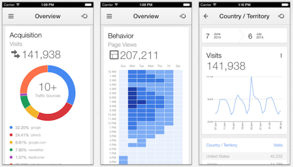
It’s been a long time coming, but starting yesterday you can download the official Google Analytics app for iPhone and iPod Touch. The Android version of the app has been available for quite a while, but naturally there was a delay before Google pushed it out to Apple devices.
While the app can run on the majority of Apple mobile devices, it is optimized for the iPhone 5 and requires a device running iOS 6.0 or later.
There aren’t a bunch of new features, but the app opens the opportunity for webmasters to keep up to date with Analytics on the go. You’ll find features such as sources, page views, visits, and TechCrunch says users will even have access to Real Time reports, which will allow you to monitor data as it occurs.
00Taylor Ballhttps://www.tulsamarketingonline.com/wp-content/uploads/2018/07/TMO-Logo.pngTaylor Ball2014-07-18 14:23:582014-07-18 14:23:58Google Analytics Comes to iOS
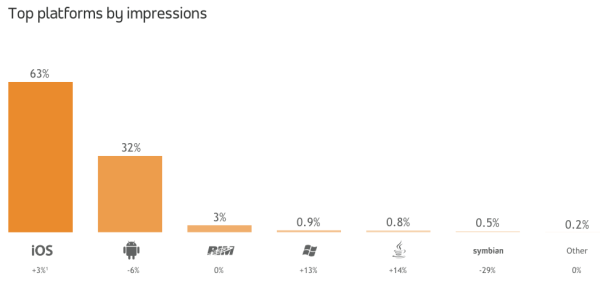
Android phones may be outselling the iPhone, but proof that iOS users are more engaged with their devices just keeps coming. The latest confirmation that iPhone users are on their devices more often with more engaged usage comes from a third-quarter “Global AdMetrics” report from mobile DSP and ad buying platform Adfonic. Their study claims that in Q3, on a global basis, Android and Apple devices accounted for 95 percent of all add impressions on mobile devices.
However, Apple and Android weren’t as close as you would normally think. Apple claimed nearly two-thirds of all mobile ad impressions, while Android only received 32 percent, a 6 percent decline from the previous quarter. This wouldn’t be so interesting, except Android has a huge advantage over Apple in the global market share. According to Greg Sterling at Marketing Land, around 80 percent of all global smartphone shipments in Q3 were Android devices.
Previous reports have shown that iPhone users are more likely to purchase, spend more time with their devices, and are more engaged with their device when using it. It is obvious that there is a large difference between the types of people purchasing mobile devices, and their needs certainly aren’t uniform. Android may have the lead on sales, but it can be assumed that many of their customers simply choose an Android phone without the intention to utilize all of its capabilities, while iPhone users are more likely to desire a phone they can rely on for all of their mobile and online needs.
00Taylor Ballhttps://www.tulsamarketingonline.com/wp-content/uploads/2018/07/TMO-Logo.pngTaylor Ball2013-12-04 15:05:252013-12-04 15:05:25Android May Sell More Smartphones, But Apple Users Engage More Ads
Last week, Apple announced their new iPads, the iPad Air, a thinner, lighter, and more powerful version of their full-size tablet, as well as an updated iPad mini with Retina Display. The broad public response to Apple’s latest products seems to be underwhelming, but it hasn’t seemed to sway how popular Apple products are with consumers.
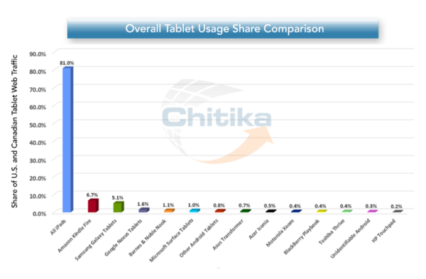
The day of Apple’s big announcement, ad network Chitika released their analysis of tablet traffic from North America, and it appears the negative market analysis has done little to diminish Apple’s grip on mobile traffic. The iPhone owned mobile traffic through the entire rise of smartphones, and now it seems the iPad has just as strong of a stranglehold on tablet traffic, raking in 81 percent of the market.
According to Marketing Land, this is actually a decrease from their 84 percent traffic share in June, but Chitika says no other single competitor has directly benefited. Their traffic may be down, but not a remarkable level by any means.
Recent data from the Pew Research Center says that 35 percent of Americans over the age of 16 own a tablet, and clearly the iPad is the most popular option for browsing the internet. However, the Kindle has proven to be the most successful Android tablet in North America, so it may be that consumers are simply choosing the tablet most suited for their needs: e-books or the internet.
Logo design is one of the most deceptively difficult jobs in all of design. It sounds so easy, pick a font, type out the company name, and maybe underline or circle it. There are designers out there who really do think that way. But, if you actually care about delivering a quality product, its much more complicated.
There are endless brands and logos out there today, and the vast majority fall away into the noise. To create a truly successful logo in the modern day, you have to design something simple but brilliant enough to make people instantly take note. In the best logos, the viewers don’t even realize why they are so attracted to the logo.
But, how do you actually create a logo that accomplishes this? It takes some studied knowledge of design and a bit of ingenuity. Joshua Johnson from Design Shack has a few ways you can approach logo design to create something truly remarkable.
1) The Visual Double Entendre
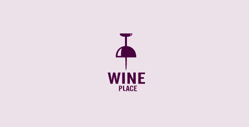
Many of my favorite logos can be interpreted in at least two ways. The visual entendre is exactly this tactic, which wraps two images into the same visual object. There are quite a few examples of this design strategy out there, but the example Johnson uses is too perfect to ignore, the WinePlace logo.The logo is shaped like a thumbtack, seemingly marking a place or location, but if you look for more than a split second you will easily see the object also looks like an upside down wine glass. This sort of visual “trickery” encourages viewers to look a little longer and absorb the image (and brand name) more than the average glance. It is memorable for its creativity, but also because you force people to pay attention for longer.
Another added benefit of the strategy is that by nature your design must be simple to play two objects into the same image. As you’ll see, simplicity is a great rule of logo design.
2) Pay Attention to Color
One of the most basic facts of design is that color is not simply an aesthetic decision. Every color and tint carries a specific set of meanings and ideas, which often seem so embedded in our brains that our reactions are subconscious.
Many brands will have already noted this and might very well require you to stick to a very specific brand palette, but thats not always the case. On the chance that you have freedom to choose the colors of the design, you will want to pay close attention to picking the colors that will not only look good together, but also represent the nature of the brand.
On top of this, you should make sure the logo will also look clear and distinguishable if it must be printed in grayscale. Not every memo and press release will be full color, and you don’t want to lose the impact or recognizability of the logo just because someone xeroxed a company report.
3) Avoid Cliches
Trends are something that are unavoidable, but you might think twice before playing into what is hot at the moment with your logo design. Sure a popular styled logo might gain you some favor in the moment, but your logo is intended to represent your brand for years to come. You want it to be memorable enough that your logo outlives the current trends.
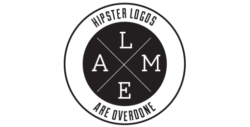
The current example is the dramatic overuse of the circular logo, generally styled vaguely like an old college patch or badge. Circles are popular in design and these types of logos are slightly retro, but just modern enough to have become a terribly common site across the web. But, it also means they are all interchangeable. I don’t remember any brand using the style because they all look the same eventually.
4) Custom Type Never Goes Out Of Style
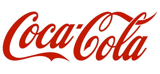
Some of the most popular logos throughout time rely on very little to be successful. Just think of Coca-Cola’s logo. All they need is their signature red color and a custom typeface so notable it has become the source of countless rip-offs and parodies.
The best part of using custom type is that it isn’t immediately able to be copied. Designers looking for a quick and easy way to jump on a potentially successful bandwagon are quick to begin using a font. But, if you have your type hand-designed, it takes a lot more effort to mimic. The irregularities that make custom type so special also make it too unique for a simple conversion to a font.
5) Keep It Simple
While custom fonts are certainly a simple but effective way to make your mark, some designers don’t specialize in illustration or typography. That doesn’t mean they are out of luck. Many of the most famous logos in the modern day don’t feature any type whatsoever.
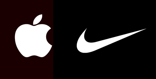
These logos take design to an even simpler stage, where all you need are simple shapes that are as iconic as they are refined. Apple began with their trademark bit apple shape, but originally it was striped with color. Gradually, they began to shift the logo to what looked like a brushed metal apple, but these days you won’t find any of those flourishes. All they need to be memorable is the silhouette of the apple, with that special bite taken out.
Conclusion
There are of course many other approaches you can take to making a memorable logo. For example, Johnson also brings up a discussion of symmetry and proportion in logo design that is better fit for a more in-depth analysis. Simply put, great logos don’t leave things to chance. But the truth is, if you want a truly memorable logo, you might start by trying to create something unlike those before.
00TMOhttps://www.tulsamarketingonline.com/wp-content/uploads/2018/07/TMO-Logo.pngTMO2013-09-26 12:58:112013-09-26 12:58:11How Do You Design A Truly Great Logo?
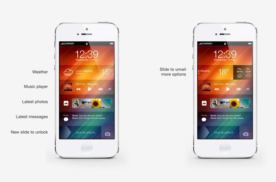
As Apple announced last Tuesday, iOS 7 will be here September 18, and everyone with an iPhone or iPad will be seeing drastic aesthetic changes to their device. The redesign also inspired quite a bit of controversy and argument, but at this point there is little use fighting the new “almost flat” design requirements for apps and the Apple interface. The new iOS will be here in a few days, and designers have to either get on board or get left behind.
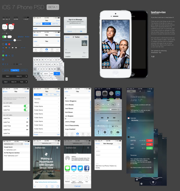
With a new iOS comes a complete redesign of most apps as well. Apple has already released guidelines for users to update their apps, and many have already shown drastic changes. But, many designers are still trying to figure out how to adapt their old app to the new style and interface requirements. But, there are many tools to help you along with the redesign. Alvaris Falcon compiled 10 of the best high quality tools and UI kits that will speed up the whole process. Best of all, all of the tools listed are free.
Many of these tools are designed to help you with the entire process all at once. The iPhone GUI from Teehan+Lax, for example, included everything you could need to update an app for the latest version of iOS. Others are more specialized. There is Home Screen, which offers an editable iPhone mockup, complete with home screen designs and icons. The App Icons Template similarly offers a simple template which aims to ensure your new icon looks great and fits all the requirements.
There are plenty of other options at your fingertips and it is up to you to choose the best tools for the way you design. Some will want to rely heavily on complete toolkits, while other designers are only looking for templates and inspiration for their creative jumping off point. Either way, if you choose any of the resources listed by Falcon, you’ll know you’re using a quality tool.
00TMOhttps://www.tulsamarketingonline.com/wp-content/uploads/2018/07/TMO-Logo.pngTMO2013-09-13 14:46:562013-09-13 14:46:5610 Resources That Will Help You Update to iOS7
There is a lot of talk going on about Apple’s new mobile operating system iOS 7, even though it is at least a couple months away from actually being unleashed on the public. Most of the discussion is centered around the new flatter aesthetics Apple has adopted, especially the new icons. But, there are quite a few other changes designers are concerned with, namely the actual app redesigns necessary to keep up to date with the update and how much influence iOS 7’s new UI should have on the redesigns.
Many believe that the Apple’s new style should be a heavy influence on the new app designs so that they will appear more native. But, other brands have put a ton of energy and resources into designing their own style and appearance and they don’t want to throw all of their independence and unique brand identity away. To make it even more confusing, there is a fair amount of confusion over how strict Apple’s iOS Human Interface Guidelines are.
This puts designers in a place where they aren’t sure what they are required to do to continue to be accepted by Apple’s app store, and what is simply suggested to keep in step with Apple’s style. Sam Jones from Web Designer Depot decided to tackle all the questions designers have during the transition period, and his article will give designers a good idea of where to go from here.
Jones also pulled quotes from Apple’s iOS 7 Transition Guide which help clear up exactly what Apple expects from their apps. If you want to know the exactly what apps must do, and what Apple suggests for moving forward, the information from the Transition Guide is about as clear as can be.
Things Apps Must Do
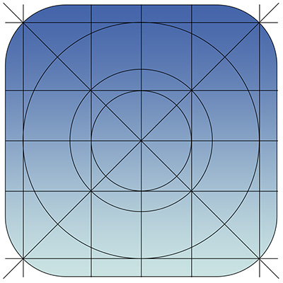
Update the app icon. In iOS 7 app icons are 120 x 120 pixels in high resolution, rather than the 114 px they’ve been using for the Retina capable iPhones.
Every app must update the launch image to unclude the status bar area, if the app doesn’t already do so.
All apps are also expected to support Retina displays and iPhone 5 dimensions in all artwork and designs
Things Apps Should Do
Apple would like all app content to be discernible through translucent UI elements such as bars and keyboards, as well as the transparent status bar. In iOS 7, view controllers use full-screen layout.
iOS 7’s bar button icons are lighter in weight and displayed in a new style, and as such they would like designers to redesign their own custom bar button icons.
Prepare for borderless buttons by moving away from supplying button background images and reassessing how to handle them within your layout.
Examine your app for hard-coded UI values—such as sizes and positions—and replace them with those you derive dynamically from system-provided values. Use Auto Layout to help your app respond when layout changes are required.
Examine your app for places where the metrics and style changes of UIKit controls and views affect the layout and appearance. For example, switches are wider, grouped tables are no longer inset, and progress views are thinner.
In iOS 7, users can adjust the text size within apps, and as such designers should move to adopt dynamic type, so that text responds appropriately.
Ensure your app doesn’t respond inappropriately to the new Control Center gesture or to a navigation controller’s swipe to go back gesture.
Keeping in line with Apple’s new flatter style, they would like designers to reassess their use of drop shadows, gradients, and bezels. Apple’s new aesthetic puts way less emphasis on visual effects that attempt to make UI elements look physical.
00TMOhttps://www.tulsamarketingonline.com/wp-content/uploads/2018/07/TMO-Logo.pngTMO2013-07-12 12:46:402013-07-12 12:46:40What Do Designers Need To Do Before iOS 7?
Apple’s keynote event earlier this month made news across the world, and few were impacted by the announcement of the new mobile operating system iOS7 more than designers and developers. While consumers will be receiving an updated user experience and new aesthetics on their phones and iPads in the next few months, designers are rushing to update apps and icons to keep their content up to date and optimized for the new operating system.
These designers won’t be forced to redesign from the ground up, however. There are already numerous resources available to help update to the new iOS. Designmodo is gradually collecting the best of these resources, and they recently highlighted two different icon grids for iOS, which are templates which you build icons on top of.
Beyond offering a few simple grids to assist the icon redesign process, there are also tons of examples of updated icons to help get designers steered in the right direction before the public has even gotten a hands-on turn at the operating system.
It appears that flat design is taking the lead over skeuomorphism, as Apple’s new iOS is rumored to be receiving a huge overhaul in the near future. The most recent speculation claims that the new iOS look is going to be largely monotone and understated, as well as abandoning the textures and “realistic” drop shadows of the past.
Web Designer Depot reported the claims which have also been going around most design blogs, which also state that the new mobile OS is rumored to be announced at the Apple WDDC on June 10th, where there is also speculation about a new iPhone announcement.
One of the leading reasons many designers have been slowly migrating is that it is incredibly easy to make a flat design also responsive, especially compared too skeuomorphic designs. Flat design follows the ideology that effects simulating the 3D world such as drop shadows or textures that mimic real objects are not only deceitful, but becoming increasingly irrelevant in an online world.
This isn’t to say that skeuomorphism is completely dead; there are still many designers promoting the strategy. But, Apple has long been cited as one of the biggest proponents of the trend, with their iconic mobile OS styles.
The rumors all started when Apple tapped Jonathan Ive to head the design of iOS7. Ive, Apple’s Vice President of Industrial Design and the man responsible for the iPhone, iPad, and iPod touch hardware, is known to have a strong dislike of skeuomorphic design, which was heavily promoted in the company by Steve Jobs and former iOS head Scott Forstall.
No one will know for sure what is coming with the Apple conference until the 10th, and many skeptics claim that Apple is likely to be implemented incrementally rather than suddenly with an iOS update.
There are so many articles out there fawning over the design of Apple’s products. Starting with the third or fourth version of the iPod, every new product has gotten nothing but love for their revolutionary design, all the way up to the iPad. Every part of the iPad’s design, including the interface, have been broken down and critiqued.
There is one aspect of the iPad that Apple can’t control, however. Apple designs a few apps, but the vast majority are made by other companies. Sure, a good amount of them are cheaply designed, but there are also high quality apps made by designers that care, and it is in those apps that you can learn some of the best rules for modern design. Carrie Cousins collected ten things she learned from iPad apps at Design Shack, and they can be transferred over to any other medium today.
It all begins with an emphasis on simplicity, and Cousins pinpoints one of the most undeniable reasons why web design has taken a turn towards minimalism. Too much on a small screen can overwhelm the user, and simple, easy to use designs help the on-the-go user access what they want, when they want it.
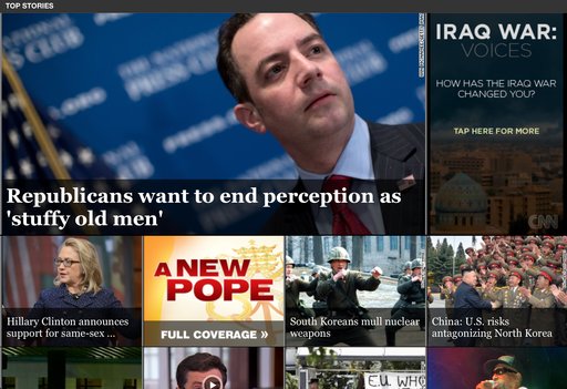
Almost every major trend in web design is also observable through iPad apps. Simple color schemes, and flat designs are all the rage right now, reflecting the continued push towards simplicity on these small screens and it is hard to deny how effective the design changes are. Apple has never been a proponent of flat design, but recent redesigns by CNN and Facebook show that flat design looks great on tablet screens.
The unforgiving Retina Display of the iPad will also teach any lazy web designer a good lesson very quickly. You can’t cut corners on any visual aspect of an app. One low quality icon will stick out like a sore thumb on an otherwise crisp and clear interface, and one small shoddy image will destroy the value of your content just like a crack in the foundation of a house will one day destroy that home.
There are plenty more lessons to learn from iPad apps. Cousins has a few more in her article, but if you are critical of iPad apps as you use them, you’ll learn even more. The best part is, because apps are constantly updating their designs, and new innovative apps are coming out every day, you will be able to keep up to date with design so long as you keep killing time on your tablet.