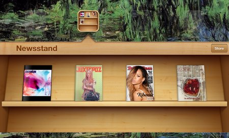
Understanding Skeuomorphism a Little Better
I recently wrote about the current debate over skeuomorphism and flat design, but after investigating more into the topic, I don’t feel like I explained skeuomorphism as well as possible. Of particular interest to me was Paula Borowska’s article for Designmodo specifically looking at skeuomorphism.
The biggest misconception about skeuomorphism is also the one I failed to address in my original definition of the concept. Skeuomorphism isn’t simply mimicking the way something looks. It is copying the aesthetic properties of the material, the shape, and most importantly, the functionality. Those apps using faux leather backgrounds aren’t part of skeuomorphic design.
More than anything, Skeuomorphic design is about functionality and shape, not texture. The object doesn’t have to physically do something, but it has to convey the idea of functionality For example, a paperclip on a “stack” of photos is skeuomorphic design, because it appears to be holding them together.
Apple, always noted for their use of skeuomorphism, have the newsstand, the most famous case of the design technique. It, of course, has the wooden texture of a bookshelf, but it also used the newsstand shape and shelved to organize the magazines like they would be on an actual newsstand. Sure, it looks pretty, but it also uses the idea of a real object to better help you understand and interact with the content.
The debate between skeuomorphism and flat design is most likely just posturing. Despite proponents on either side, neither style is inherently better than the other. Most importantly, the web is not a cohesive entity. Neither style of design is going to eradicate the other, though they may fluctuate in popularity. If the internet can’t seem to completely rid itself of Geocities style pages from 1998, neither of these techniques will be disappearing any time soon.


Leave a Reply
Want to join the discussion?Feel free to contribute!