iPad 2

Source: Matthew Downey

There is a big push recently to ensure that websites are optimized for mobile devices, especially after Google has openly stated they plan to begin punishing sites that don’t properly accommodate mobile traffic.

There are really two solutions for making a site work great on smartphones. Designers can either create an entirely separate and unique version of their site specifically for mobile phone users to access, or they can choose the more popular responsive design solution which promises to “work on every device.” Both have their perks and drawbacks, but can lead to great smartphone internet experiences when done properly.

The devices everyone forgets to discuss are tablets. While we’re ensuring sites work wonderfully on smartphones and desktop devices, the normal solution is to simply direct tablets to the desktop version of the site and be done with it. While that may sound fine initially, it actually leads to sub-par experiences for a quickly growing market.

According to Mobify’s ebook Tablet Design Best Practices, over half a billion tablets are estimated to be shipped in 2013 and 2014 combined, and that number could end up being higher as prices drop and new options become available. Not only that, tablet users continuously show remarkably high quality of traffic and are more earnest to make bigger purchases than smartphone or desktop users.

If you aren’t optimizing sites for tablet users, you are leaving quality traffic and willing consumers to mediocre experiences that can lead them to take their business elsewhere.

Designing sites that work well on tablets doesn’t require much more time than ensuring you are also delivering a quality smartphone internet experience, and often builds on the same responsive or adaptive framework. Most desktop sites do in fact work on tablets, so long as they aren’t overloaded with Flash, but they become frustrating to use. Buttons are too small or scrunched together, text becomes tiny, and images can become pixelated messes when viewed on the high pixel density screens that are becoming standard.

If you want to create a site that will actually excite and draw in tablet users, you can choose to minorly alter your desktop site with small adaptive enhancements and basic media queries, or you can strip your site down to its basics and rebuild a tablet option that creates a uniquely usable site.

For companies without a lot of resources to spend on creating multiple versions of their sites, improving your desktop site to make it enjoyable for tablet users is often the best option. It can be as simple as making buttons a bit bigger and incorporating the zooming and pinching that tablet users are constantly doing. Text also has to be bigger, but that can be easily solved by increasing font sized to 16 pt minimum. But, there are even smaller changes you can make that can make the site easier to use.

Typing on tablets can be incredibly difficult without any tactile response and overzealous autocorrect, but it isn’t difficult to make your site light on text input or create shortcuts that will save the fingers some effort. It is also a snap to enable contextual keyboards with some simple code adjustments.

But, webmasters who want to really engage tablet users and have the resources to do so can find huge benefits from going above and beyond, taking the basic structure and layout of their site and remixing it with adaptive frameworks to really make the site tablet friendly. It is entirely possible to create an adaptive tablet site without even changing the desktop site, and you rarely have to create entirely new elements for the site. It is more about using the elements you have on your site in new ways.

For example, sites with tons of images can make it so that these high quality images can be pinched and zoomed endlessly, while the rest of the page maintains its original size and clarity. You can also re-imagine your navigation for your site to fit how visitors will be using your site. Similarly, you can attempt to replicate the app style on your website with smooth transitions and panel menus hidden away, but always available at the tap of a button or swipe of a finger.

It is hard to suggest specific techniques for creating great adaptive tablet websites that go beyond simply editing your original desktop page, but that only goes to show how slowly the internet is adapting to one of its most fruitful markets. There are massive opportunities for us to completely redesign the tablet experience for the people actually using them, but designers can be stunted by the need to work for multiple clients, limited resources, and general willingness to rest on “acceptable” sites rather than truly exciting experiences.

Hopefully, as businesses recognize the potential of the market, designers can begin to truly explore the potential for design on these great devices.

Reddit AlienSocial media marketers have been aware of Reddit for a long time, and many have even tried to take advantage of the large community. But, the site is notorious for rejecting any attempts to disguise marketing, not to mention being confusing for new users and too streamlined for marketers to track any meaningful data.

Now, Marketing Land reports a free new tool called Reddit Insight has been created by Hack Reactor to help Redditors and marketers alike analyze their accounts, posts, keywords, and subreddits.

The tool can analyze an entire profile or a single post simply by entering the username or URL. It displays where users are gaining Karma or Upvotes (signs of approval on the site that also increase visibility of posts)as well as detailed information on numerous other site specific information, such as how keywords are faring by subreddit through word clouds and topic clusters.

The tool allows marketers and analysts to explore the data from as large or small of a scale as you want. While you can overview entire subreddits or user histories, you can also break down how users are reacting to specific comments and interactions.

They present it all in bright colorful graphs that are easy to immediately understand which makes the data both accessible but also great for explaining your social media tactics and their results to clients.

It isn’t uncommon for webmasters or SEOs who operate numerous sites in a network to ask how many of them they can link together without bringing down the ax of Google. Finally that question made its way to Google’s head of Webspam who responded in one of his regular YouTube videos.

The question was phrased “should a customer with twenty domain names link it all together or not?” While blog networks can easily find legitimate reasons to link together twenty or more sites (though Cutts advises against it), it seems interesting to use the number in question to discuss normal webpages. As Cutts put it, “first off, why do you have 20 domain names? […] If it is all, you know, cheap-online-casinos or medical-malpractice-in-ohio, or that sort of stuff… having twenty domain names can look pretty spammy.”

When I think of networks with numerous full sites within them, I think of Gawker or Vice, two online news sources who spread their news out across multiple sites that are more focused on unique topics. For example, Vice also runs Motherboard, a tech focused website, as well as Noisey, a site devoted to music. Gawker on the other hand runs Deadspin, Gizmodo, iO9, Kotaku, and Jezebel, among a couple others. Note, at most those networks run 8 unique sites. There is little reason any network of unique but connected sites with more parts than that.

However, there are times when having up to twenty distinct domain names could make sense without being spammy. Cutts points out that when you have many different domain names that are all localized versions of your site, it is ok to be linking to them. Even in that scenario however, you shouldn’t be linking them in the footer. The suggested fix is to place them in a drop down menu where users have access.

Creative CloudFor the past decade or more, Adobe and Photoshop have been staples in the vocabulary of any designer. Adobe has been by our side constantly upgrading, and draining our wallets, but not really causing much of a stir. Not even the Flash vs. Apple conflict really shook the boat that much.

Simply put, Photoshop and its partners in the Creative Suite have been the go-to applications for a huge number of the people working in web development, photography, design, and video.

With their latest new release however, that all could change.

As you may have heard, Adobe has decided to stop releasing physical software in favor of a move to a cloud-based subscription service called Creative Cloud. What you might not have heard is that there is already a petition signed by over 37,000 angry people begging Adobe to abandon their plans.

The move to the Creative Cloud would mean that Adobe would drop all support for older versions of their software, specifically the Creative Suite (They will continue to add support for CS6 for now). However, the Creative Cloud would function essentially the same as the old software. It won’t be a set of web apps, and you will still have to download and install the software to your hard drive. But, all your files and data will be in sync across multiple computers and devices.

The monthly subscription service will be $29.99 for existing CS customers, and $49.99 for new users. But, you could also buy just a single program for $19.99 a month each. For that price, you’ll also get 20GB of cloud storage.

Basically, Adobe has found a way to attack piracy and increase their profits by making users continuously pay for the software and not distribute or manufacture physical objects. And that is why users are upset. While the subscription fee is obviously a fair deal lower than the cumulative price we payed for previous releases, over time this means Creative Cloud will be much more expensive than ever before.

It also creates a new (more expensive) option for all other design software companies to follow. Adobe has always been the trendsetter in this area and it is likely even the alternatives spurned Photoshop users turn to will eventually follow suite. Or, this could be the end of Adobe as the gold standard. As Corey Siegel from Design Instruct puts it, this is Adobe’s “all in” bet.

Yesterday was the big day. July 22 marked the deadline for the roughly 2 million Adwords campaigns that have held out on converting to Adwords Enhanced and will be automatically upgraded. Google had blatantly stated the that yesterday was a hard deadline for the last 25 percent of Adwords users to migrate, but as per usual, the process will actually occur over a long period.

In an Inside Adwords blog post about the change, Google explained, “…starting today, we will begin upgrading all remaining campaigns automatically, bringing everyone onto the new AdWords platform. As with many product launches, the rollout will be gradually completed over several weeks.”

The forced upgrade brings about quite a few changes in how you should manage your campaigns, and to help everyone get started, Search Engine Watch brought together a group of professionals in the field to offer their advice.

Google also offered their own suggestions.

  1. Review your mobile bid adjustments – For most campaigns, the auto-upgrade default is based on bids from similar advertisers. You will need to visit the ‘Settings’ tab to optimize for your business.
  2. Identify unwanted keyword duplication in overlapping campaigns – If you previously were using similar legacy campaigns for every device type, it is suggested you identify matching campaigns and remove any unwanted duplicate keywords in the enhanced campaign.
  3. Review Display Network campaigns – You will want to verify that your display ads are reaching users on all desired devices and that you are using the correct bidding strategies.
  4. Explore the Enhanced Campaign features – It is recommended you try out upgraded sitelinks and upgraded call extensions to start. Then you can further boost results by creating mobile preferred ads and setting bid adjustments for location and time.
Image Courtesy of Martin Pettitt

Image Courtesy of Martin Pettitt

Despite telling us that Google would no longer confirm when new Panda updates occur, they announced today that they were rolling out a new update that is “more finely targeted” than the original release of Penguin 2.0.

Unlike many Penguin updates, most webmasters actually seem happy to see the new version, as they are already claiming recovery from the original algorithm.

Google has said that their plan is to release Panda algorithm updates monthly over a ten day period, but Matt Cutts, head of Google’s Webspam team, implied there way a delay for this refresh because they wanted to ensure the signals would be loosened up a little from the last release.

The official statement from Google simply says, “In the last few days we’ve been pushing out a new Panda update that incorporates new signals so it can be more finely targeted.”

Search Engine Journal says the update has resulted in

  • Increase in impressions but same amount of CTR’s (viewable when logged into Google’s Webmaster Tools)
  • Informational sites such as Wikipedia and About.com have seen big impacts in their rankings
  • Authority sites are more prominent in SERPs.
  • Sites using Google+ are getting better rankings

Their suggestions for the future? It’s reaching the point where not using Google+ can hurt your site, and it is time to enable Google Authorship.

Establishing yourself on social media and gaining plenty of followers and friends has numerous benefits for your search engine optimization and even site traffic, but just being retweeted and getting plenty of likes doesn’t necessarily translate to paying customers or conversions.

As Entrepreneur shared, Wishpond, creator of numerous social-media focused marketing applications, surveyed companies and found that roughly 77 percent of business-to-consumer (B2C) marketers have gained customers through Facebook, but business-to-business (B2B) marketers tend to be more successful on LinkedIn.

Just knowing that little bit of information can help focus your social media strategy and mold it to fit your marketing strategy, but it is just the tip of the iceberg. An under-informed social media campaign is like blindly shooting at a target and hoping to get a bullseye. Sure, it’s possible, but you have much better chances if you keep your eyes open and aim your weapon.

Thankfully, Wishpond created an infographic (seen below, click to enlarge) with tons of information which can help you create an informed socia media marketing campaign, and turn likes into conversions. With all this information, you can create an effective social media campaign that matches your marketing strategy.

How To Use Social Media To Create Conversions

Click to Enlarge

Paper Fanatic Style

Source: Speckyboy

Gathering inspiration is the first step of almost every design job, and those of us really invested in design are doing it constantly. We take inspiration from signs in store fronts, billboards, other websites, nature, photography, videos, and everywhere else we can. We are literally surrounded by inspiration at all times, which we then filter through our own tastes, skills, and preferences to deliver our take on what inspires us.

Those innate preferences can have a big effect on what we turn in. Some designers are drawn to grungy, dark looks, while others like the sleek modernism that results from a mix of 70’s sci-fi design and current modern art sensibilities. Others opt to go an entirely different direction, directly playing with retro styles and designs.

Normally, we take these inspirations from the world around us and apply them to the screen. Even as skeuomorphism is dissipating as the leading design style practice, we use our environment and the images we’re exposed to for our designs. It doesn’t have to be linear. Even flat, minimalistic designs can be inspired by the colors of nature or the mood of a relaxed summer day.

But, what happens when you take inspiration from graphic and web design and apply it to real life? We obviously can’t put a filter on a bike ride or sunset (though good sunglasses can come close), but architectural design often incorporates graphic inspiration into physical objects and environments which can make you feel as if you’ve stepped directly into a design style.

Speckyboy contributor Victor Balasa took this idea and collected several buildings and architectural designs that portray real-life versions of web design styles we play with every day. There are grungy interiors that portray the gritty hardline style of grunge web design without sacrificing class, and even the “paper fanatic” style you would never imagine could come to life. If you ever wanted to know what the world could look like if it was styled by grahic designers, these images can give you a pretty interesting depiction.

Google has been very clear about their stance on manipulative or deceptive behavior on websites. While they can’t tackle every shady practice sites have been enacting, they have narrowed their sites on a few manipulative acts they plan on taking down.

The first warning came when Google directly stated their intention to penalize sites who direct mobile users to unrelated mobile landing pages rather than the content they clicked to access. While that frustrating practice isn’t exactly manipulative, it is an example of sites redirecting users without their consent and can be terrible to try to get out of (clicking back often just leads to the mobile redirect page, ultimately placing you back at the page you didn’t ask for in the first place).

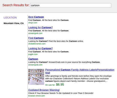
Now, Google is aiming at a similar tactic where site owners have been inserting fake pages into the browser history, so that when users attempt to exit, they are directed to a fake search results page that is entirely filled with ads or deceptive links, like the one below. It is basically a twist on the tactic which keeps placing users trying to exit back on the page they clicked to. The only way out is basically a flurry of clicks which end up putting you much further back in your history than you intended. You may not have seen it yet, but it has been popping up more and more lately.

Fake Search Results

The quick upswing is probably what raised Google’s interest in the tactic. As Search Engine Watch explains, deceptive behavior on sites has pretty much always been against Google’s guidelines and for them to make a special warning to sites adopting the practice suggests this practice is undergoing widespread dissemination to sites that are okay pushing Google’s limits.

A website redesign can be unbelievably exciting, but it can also be dangerous to your traffic. If you don’t communicate well with them, designers and creative teams can accidentally throw out all your hard work on optimization in favor of purely visual aspects of the site. You can lose content, functionality, and all the other optimization that has won you the favor of search engines.

With a few considerations and regular contact with the design team, all of these problems can be prevented. Brad Miller pointed out seven factors you should consider when tackling a redesign. Just don’t get to eager to delve into changing how your site looks, and you can end up with a great looking site that works as well or better as your old design.

  1. Always start with research – Any design that is going to give you results is built on research. You need to know who you’re targeting, what the best functionality practices are, the current standards, and doing extensive market research. This shouldn’t come part of the way through the design or after the site is built. It should always be the very first move you make.
  2. A Redesign Changes Your Site Structure – A quality redesign can be much more than a new coat of paint on an old frame. It gives you the opportunity to change how your site is structured entirely, which should be used as an opportunity to optimize your site for visibility and conversions. Consider what pages are succeeding and what isn’t on your page and reassess how you can efficiently design your site.
  3. Redirects – Before redesigning begins, you should make an inventory of every page and incoming links on your site, including subdomains. As the structure of your site is changed, including the URLs, a strategy will need to be put into place for redirects to protect any SEO rankings. Audit where links are coming from and going to, then map out all your pages as well as their new redirects.
  4. Navigation – You need to consider how people will be finding your site from the start, and putting that information into your URL structure. Can you shorten URLs or make them more streamlined? As sites grow, URLs can become unweildly, and should be trimmed as much as possible. Once you have people on your site, however, you need to understand how they will navigate around the site. Where are they entering your site from? What do you want visitors to do? If you know how visitors navigate your site, you can design it to direct them where you want.
  5. How is the Content Going to Be Presented? – Content is the keystone to a successful online marketing campaign, but it is still an afterthought for many site designs. Content should be visible and worth the attention of your viewers. Decide before hand whether you will have a blog and how that blog is going to be used.
  6. Technical SEO – Way too many redesigns play with factors that need to be controlled for proper optimization. They build sites that look great, but take ages to load losing visitors and credibility with search engines. However, you can use the redesign to toy with some behind the scenes factors like ensuring your site is compliant with all the standard best practices of design and SEO and cleaning up your code to make sure search engine crawlers will be able to easily understand your site.
  7. Testing – Test everything you can afford to. Not only do you gain invaluable data about your consumers and how your site is actually being used, but you get the chance to actively connect with customers and mold your new site to their needs.