Tag Archive for: News

Endless CodeIt is a little ironic that most web designers hate coding. We’re all familiar with it, and we’ve all spent sleepless night chugging coffee and endlessly editing code until we feel like we’ve lost touch with reality. But, the best coders realized the entire process can be simplified and sped up with all the free tools available online.

Web Design Ledger created a “cheat sheet” of tools and resources designers can use to cut through the fog of coding. You’ll never be able to completely escape coding, but you can at least make it as painless as possible.

Code Editors

One of the main tools any designer should already have is a code editor such as Sublime Text 2. Back in the dark days of coding, many designers were forced to create Notepad files that seemed to endlessly drag on as they were filled with line upon line of code, but no one should know that pain in these days. Code editors can help you quickly jump between the tags you want to work on, and best of all, they highlight problems in your code as you write. To anyone who has ever searched for hours trying to find the proverbial needle in the haystack, that alone is reason to find a new editor to use.

CSS Pre-Processors

CSS is notorious for spiraling into obscenely long and confusing script that becomes eventually unworkable. Sass (Syntactically Awesome Style Sheets) is a meta-language that can be put on top of the original CSS to clean up all that messy code and make it workable and lightweight again. If you combine Sass with Compass, an open-source CSS authoring framework, you can easily create responsive designs with cross-browser friendly scripts to keep everything simple.

Code for Humans

We all have to deal with our own code, but writing for yourself or entirely for machines can leave the code hard to understand when you come back to it later. If you get caught up using entirely your own coding style, colleagues may not be able to make sense of it all, but if you write exactly as computers read it, your code can become difficult to update and read. Instead, write in a way that will keep everything easy to find and understand, with small file names and consistent organization. You can use Codekit (Mac) or Mixture (Mac/Windows) to convert it all into computer-friendly language later.

Use GoMockingbird

Wireframing is one of the first steps designers go through when constructing a site and creates the entire foundation you will build the site upon. These foundations are also used to present site designs to clients, so using sketches and doodles is a bit too unprofessional of an option. Instead, GoMockingbird creates professional looking wireframes that can portray even the more tricky elements of a page to everyone who needs to approve the design. You can include widgets, sliders, check boxes, and even social buttons, so that clients get a clear and complete understanding of how their site will end up.

Conclusion

There are tons of other tools included in Nicola Allen’s cheat sheet over at WDL. The ones I highlighted here can make the biggest effect on the time spent slaving over code, but every shortcut helps. There are tools and resources for every design task, including creating Lorem Ipsum dummy text so that you don’t have to. If you want to design, but hate the long nights associated with coding, you’ll appreciate everything the cheat sheet offers.

Google has begun the process of pushing over the last few stragglers to Adwords Enhanced, and to reflect the big changes taking place, they’ve also been updating just about everything related to AdWords. Over the past week, they’ve redesigned the AdWords Help Center, as well as making some changes to how AdWords quality scores are reported.

AdWords Help Center Redesign

AdWords Help Center Graphic

The AdWords Help Center has always been an important resource for both new and old PPC campaign managers. Just as Google offers best practices for SEO, the help center for AdWords helps break down exactly how managing ads works and the best suggestions for those just getting started. The new redesign came with three major updates aimed to improve how the help center works and update the information contained within.

  1. Improved Navigation – To start out, Google has made the site much easier to get around, making the information more readily available. From the main navigation, you can now find portals to information on setting up and basic AdWords info, managing ads, community resources, and guides to success.
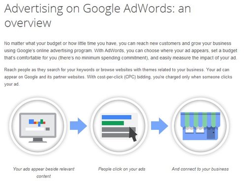
  2. More Visual Help – Google has openly said they will be making the Help Center more visual by filling it with infographics and screenshots. But, the Search Engine Journal report on the update found very little visual additions from the update. It is possible these additions are taking longer to implement, or that they have stepped away from this addition, but there are some new graphics to help explain AdWords, such as the one above.
  3. Guides to Success – Google has added a collection of instructional guides and tips to help get greener PPC managers started with their AdWords campaigns, but the information can also provide a helpful refresher for AdWords veterans who might not have checked up on Google’s latest suggestions.

Quality Score Reporting Revisions

The more functional change Google has made is an update to how the AdWords quality scores are reported within accounts. The company says these changes are aimed at making it easier for advertisers to adjust and revise any ads based on quality score, and to make it easier for users to gain more information on what is and isn’t working.

In their announcement, Google said:

As part of our ongoing efforts to help improve the quality of our ads, we’re announcing an update that changes how each keyword’s 1-10 numeric Quality Score is reported in AdWords. Under the hood, this reporting update will tie your 1-10 numeric Quality Score more closely to its three key sub factors — expected clickthrough rate, ad relevance, and landing page experience. We expect this update to reach all advertisers globally within the next several days.
We’re making this change so that the Quality Score in your reports more closely reflects the factors that influence the visibility and expected performance of your ads. We hope that providing you more transparency into your 1-10 Quality Score will help you improve the quality of your ads.

The way Google is calculating quality scores hasn’t changed at all, so there isn’t a great need to suddenly change how you’re running your campaigns, but they are simply changing the way these scores are reported to us and expanding on the information available.

However, advertisers using quality scores as part of automated rules will need to change or correct how the rules are interfacing with the new display methods.

Site audits can be ugly work. Nothing can be more disastrous to a client-SEO relationship than informing someone of all the issues wrong with their site in too harsh of a way. They’ve spent time and money having a site created that they think works well for their business, and then we audit the page and everything under the hood and have to break the news that their site is sick or badly put together.

The process is similar to playing “website mechanic” as Stuntdubl SEO put it. We offer diagnostic information and recommendations that are absolutely critical to keeping a site relevant and valuable to organic search, but many people don’t want to hear how bad of shape their car or website are in. Not only will it be costly to fix, but they’ve developed a sentimental relationship to the site they have.

To be able to break the news in the best way possible, we have to be as prepared and informed as possible, which means running extensive auditing and answering a lot of questions. This also means understanding all of the tools at your disposal so that you can get the best answers in the fastest way possible.

Todd Malicoat took 50 of the most important questions for site audits, and identified the best tool available for answering every inquiry. Not only will this speed up your data collection and auditing, it will make you more prepared to create a better site and communicate properly with the clients you are working with.

Hotel FrontEverybody talks about SEO as if it is a monolithic entity. At most, you might hear conversation about local SEO and every few weeks someone will chime in to remind us about international SEO, but the vast majority of the dialogue just refers to SEO as a whole.

But, ignoring its constantly changing nature, SEO is also a lot harder to pin down. Great optimization bends and molds to match the client and the unique needs of a market. What works for a nearby plumbing company may not translate to a small tech startup or a healthcare provider. The absolute basics are the same, but all of these companies have different online needs that can’t be handled with a “one-size-fits-all” mentality.

Hotels are one market with especially unique needs, and now that summer is winding down and many people are trying to squeeze in a vacation before the kids return to school, now is as relevant a time to talk about SEO as any. Aleh Barvsevich broke down the topic in detail, covering how search results for hotels are chosen and displayed and what opportunities hotel clients have in PPC and SEO.

Duplicate content has always been viewed as a serious no-no for webmasters and search engines. In general, it is associated with spamming or low-quality content, and thus Google usually penalizes sites with too much duplicate content. But, what does that mean for necessary duplicate content like privacy policies, terms and conditions, and other types of legally required content that many websites must have?

This has been a bit of a reasonable point of confusion for many webmasters, and those in the legal or financial sectors especially find themselves concerned with the idea that their site could be hurt by the number of disclaimers.

Well of course Matt Cutts is here to sweep away all your concerns. He used his recent Webmaster Chat video to address the issue, and he clarified that unless you’re actively doing something spammy like keyword stuffing within these sections of legalese, you shouldn’t worry about it.

He said, “We do understand that a lot of different places across the web require various disclaimers, legal information, and terms and conditions, that sort of stuff, so it’s the sort of thing where if were to not to rank that stuff well, that would hurt our overall search quality. So, I wouldn’t stress out about that.”

It isn’t uncommon for webmasters or SEOs who operate numerous sites in a network to ask how many of them they can link together without bringing down the ax of Google. Finally that question made its way to Google’s head of Webspam who responded in one of his regular YouTube videos.

The question was phrased “should a customer with twenty domain names link it all together or not?” While blog networks can easily find legitimate reasons to link together twenty or more sites (though Cutts advises against it), it seems interesting to use the number in question to discuss normal webpages. As Cutts put it, “first off, why do you have 20 domain names? […] If it is all, you know, cheap-online-casinos or medical-malpractice-in-ohio, or that sort of stuff… having twenty domain names can look pretty spammy.”

When I think of networks with numerous full sites within them, I think of Gawker or Vice, two online news sources who spread their news out across multiple sites that are more focused on unique topics. For example, Vice also runs Motherboard, a tech focused website, as well as Noisey, a site devoted to music. Gawker on the other hand runs Deadspin, Gizmodo, iO9, Kotaku, and Jezebel, among a couple others. Note, at most those networks run 8 unique sites. There is little reason any network of unique but connected sites with more parts than that.

However, there are times when having up to twenty distinct domain names could make sense without being spammy. Cutts points out that when you have many different domain names that are all localized versions of your site, it is ok to be linking to them. Even in that scenario however, you shouldn’t be linking them in the footer. The suggested fix is to place them in a drop down menu where users have access.

Creative CloudFor the past decade or more, Adobe and Photoshop have been staples in the vocabulary of any designer. Adobe has been by our side constantly upgrading, and draining our wallets, but not really causing much of a stir. Not even the Flash vs. Apple conflict really shook the boat that much.

Simply put, Photoshop and its partners in the Creative Suite have been the go-to applications for a huge number of the people working in web development, photography, design, and video.

With their latest new release however, that all could change.

As you may have heard, Adobe has decided to stop releasing physical software in favor of a move to a cloud-based subscription service called Creative Cloud. What you might not have heard is that there is already a petition signed by over 37,000 angry people begging Adobe to abandon their plans.

The move to the Creative Cloud would mean that Adobe would drop all support for older versions of their software, specifically the Creative Suite (They will continue to add support for CS6 for now). However, the Creative Cloud would function essentially the same as the old software. It won’t be a set of web apps, and you will still have to download and install the software to your hard drive. But, all your files and data will be in sync across multiple computers and devices.

The monthly subscription service will be $29.99 for existing CS customers, and $49.99 for new users. But, you could also buy just a single program for $19.99 a month each. For that price, you’ll also get 20GB of cloud storage.

Basically, Adobe has found a way to attack piracy and increase their profits by making users continuously pay for the software and not distribute or manufacture physical objects. And that is why users are upset. While the subscription fee is obviously a fair deal lower than the cumulative price we payed for previous releases, over time this means Creative Cloud will be much more expensive than ever before.

It also creates a new (more expensive) option for all other design software companies to follow. Adobe has always been the trendsetter in this area and it is likely even the alternatives spurned Photoshop users turn to will eventually follow suite. Or, this could be the end of Adobe as the gold standard. As Corey Siegel from Design Instruct puts it, this is Adobe’s “all in” bet.

Google has been very clear about their stance on manipulative or deceptive behavior on websites. While they can’t tackle every shady practice sites have been enacting, they have narrowed their sites on a few manipulative acts they plan on taking down.

The first warning came when Google directly stated their intention to penalize sites who direct mobile users to unrelated mobile landing pages rather than the content they clicked to access. While that frustrating practice isn’t exactly manipulative, it is an example of sites redirecting users without their consent and can be terrible to try to get out of (clicking back often just leads to the mobile redirect page, ultimately placing you back at the page you didn’t ask for in the first place).

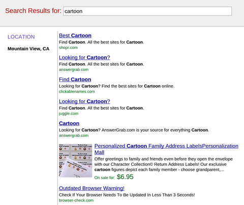
Now, Google is aiming at a similar tactic where site owners have been inserting fake pages into the browser history, so that when users attempt to exit, they are directed to a fake search results page that is entirely filled with ads or deceptive links, like the one below. It is basically a twist on the tactic which keeps placing users trying to exit back on the page they clicked to. The only way out is basically a flurry of clicks which end up putting you much further back in your history than you intended. You may not have seen it yet, but it has been popping up more and more lately.

Fake Search Results

The quick upswing is probably what raised Google’s interest in the tactic. As Search Engine Watch explains, deceptive behavior on sites has pretty much always been against Google’s guidelines and for them to make a special warning to sites adopting the practice suggests this practice is undergoing widespread dissemination to sites that are okay pushing Google’s limits.

Bing has been regularly growing its market share over the past year, but don’t think it is at the expense of Google. In June, Bing’s share of all searches went up to 17.9 percent, but it was Yahoo who dropped to 11.4 percent, according to comScore. Yahoo lost exactly as much search as Bing gained, which may not have been what Yahoo CEO Marissa Mayer was hoping for when they signed the search deal with Microsoft.

Earlier this year, Mayer said, “One of the points of the alliance is that we collectively want to grow share rather than just trading share with each other. We need to see monetization working better because we know that it can and we’ve seen other competitors in the space illustrate how well it can work.”

Meanwhile, as Search Engine Watch reports, Google has held steady with exactly two-thirds of the market share, though it is down .1 percent from last year’s June share of 66.8 percent.

In 2012, Bing held 15.6 percent of the market, but they have been making regular gains, almost exclusively at the expense of smaller search engines. Yahoo on the other hand is at an all-time low, down from 13 percent last year.

Any SEO professional who has been around for a couple design trends knows what its like to bump heads with designers about the design methods and usability. There are certain innovative design trends that can be wonders for usability, but are completely at odds with standard SEO practices. According to Janet Driscoll Miller, that doesn’t mean we have to throw out both, we just have to be creative with our solutions to integrate creative design.

Parallax design is the most popular trend that runs into this issue with usabilty and SEO. It has actually been around for a few years, but it has recently gained quite a bit of notoriety as designers have used it to animate pages in a way that scrolling makes the entire page change what is being shown. It’s really easier to show people than to describe.

The most commonly seen site with this design style is the Spotify front page which essentially moves layers as the viewer scrolls downwards.

Spotify Screenshot


What makes parallax design so popular is it basically allows the site to walk a visitor through a story by scrolling down the page. Google has even used the style for their big “How Search Works” site, where Google tried to explain how it works to the average internet user. It directs how visitors view the site, rather than letting visitors click around at will.

The big problem is that parallax designs are essentially extremely large one page websites, which is extremely difficult to optimize for many search terms. All of your keywords have to be concentrated onto one page, rather than spread out across many as Google is used to. On top of that, inbound links to your site all point to a single page, not specific content.

Another interesting problem is that parallax design doesn’t work on mobile phones of any kind. As mobile traffic rises, that means more and more people aren’t able to use pages in this style. It also means site owners have to basically create an entire separate mobile version of their site. Many companies already do this, as Google did for the “How Search Works” site. Until responsive design popped up, it was common practice to build a second mobile site.

None of this means we should immediately cut out parallax design. As stated before, parallax design is unparalleled at telling stories, and some site don’t have to rely heavily on SEO to drive traffic. There is also an approach which allows you to use parallax design and a multipage site, by creating accomying sub-pages, like Spotify did. The home page is a parallax design, but the links take you to content on separate, static pages. That creates a static URL for different content and allows keywords to be more spread out.

Deciding whether or not to hop on these trends all depends on what you intend to achieve with your site. If you intend to tell a story or direct visitors through your site in a linear fashion, parallax design is possibly the best answer.