Tag Archive for: mobile optimization

Google is sending emails to webmasters that are being migrated to the search engine’s new mobile-first index. If your site gets indexed, Google will start choosing the mobile version of your site as the default choice – meaning your site is fast enough and optimized for mobile users.

The search engine first said they would start sending notifications to websites being migrated into the mobile-first index, but the emails have only started being actually seen in the wild over the past few days.

The notifications are coming a bit late, considering Google has confirmed that it began moving websites over to the mobile-first index months ago.

You can see a copy of the email as shared by The SEM Post or read the full text below:

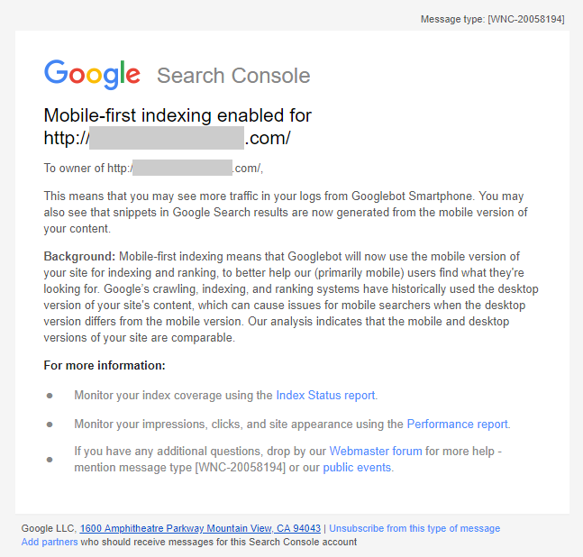
”Mobile-first indexing enabled for <URL>

To owner of <URL>

This means that you may see more traffic in your logs from Googlebot Smartphone. You may also see that snippets in Google Search results are now generated from the mobile version of your content.

Background: Mobile-first indexing means that Googlebot will now use the mobile version of your site for indexing and ranking, to better help our (primarily mobile) users find what they’re looking for. Google’s crawling, indexing, and ranking systems have historically used the desktop version of your site’s content, which can cause issues for mobile searchers when the desktop version differs from the mobile version. Our analysis indicates that the mobile and desktop versions of your site are comparable.”

FacebookVideo

Your site’s speed on mobile devices will soon be a factor deciding how many people see your Facebook ads, according to an announcement from the social network this week.

In Facebook’s words:

“Over the coming months, we’re working to improve ad experiences for people by considering website performance and a person’s network connection in our ad auction and delivery system.”

While it isn’t clear exactly how site speed and page performance will be implemented into Facebook’s algorithm for displaying ads, the social network is already introducing features to help brands deliver content more quickly across Facebook.

In addition to the use of Accelerated Mobile Pages, Facebook is introducing prefetching to help users see the content they are interested in as quickly as possible. This week’s announcement explains that prefetching starts loading mobile content in the Facebook in-app browser before a user ever clicks a link.

According to their estimates, this speeds up mobile site load time by as much as 29 percent and decreases the rate of site abandonment during the loading process.

The new Facebook help page dedicated to prefetching goes a bit more in-depth about how the system actually works:

“For each News Feed mobile ad, Facebook attempts to predict how likely a person is to click on an ad. If the prediction score meets the requirements, we prefetch the initial HTML page when the story first appears on a person’s screen. This content is cached locally on the person’s device for a short amount of time. If the person clicks on the ad, Facebook loads the initial page from the cache. The initial page then makes regular web requests to the publisher’s server to load the remainder of the page. We currently only cache the initial HTML page. Keep in mind that the CSS, Javascript or images on the website are not cached.”

Ultimately, Facebook’s changes are aimed at improving their overall ad performance and increasing engagement with ads. Advertisers with slow-performing sites tend to also underperform in many ad metrics.

While Facebook’s new feature will improve content delivery speed across the board, the company also offered five tips for tuning up your site:

  • Minimizing landing page redirects, plugins and link shorteners
  • Compressing files to decrease mobile rendering time
  • Improving server response time by utilizing multi-region hosting
  • Using a high-quality Content Delivery Network to reach audiences quickly
  • Removing render-blocking javascript

SmartphoneNot long ago Google announced its upcoming mobile-friendly algorithm change, but the search engine is making efforts to help webmasters prepare as well as possible. Google has been offering a steady stream of information helping webmasters avoid common mistakes while converting websites to mobile-friendly designs.

After answering questions over Twitter, Google also decided to directly ask webmasters what they were confused about and what problems they were encountering. Then, Google compiled the most common mistakes and shared them in a simple and easy to explore list.

According to Google, the most commonly mentioned mobile mistakes are:

  • Blocked JavaScript, CSS and image files: In order for Googlebot to see your site as a real user would, always allow access to these files in your site’s robots.txt.
  • Unplayable content: This consists of certain types of videos, or other content, that are not playable on mobile devices, such as license-constrained media or media that requires Flash.
  • Faulty redirects: If you have separate mobile URLs, you must redirect mobile users on each desktop URL to the appropriate mobile URL.
  • Mobile-only 404s: Some sites serve content to desktop users accessing a URL but show an error page to mobile users. Instead, redirect mobile users to an equivalent mobile page to avoid 404s.
  • App download interstitials: This is when websites block the view of pages with a prompt to download the site’s native app. Instead, use a small HTML banner at the top of the page.
  • Irrelevant cross-links: This is when users are linked to desktop-optimized pages from the mobile version of the site, and vice versa. Check your links to make sure that they point to the correct equivalent page.
  • Slow mobile pages: In order to avoid user frustration, ensure your mobile pages load quickly. You can check your page speed with Google PageSpeed Insights.

You can learn more from the complete guide here.

rsz_1377498_16940838Google has made it very clear that mobile SEO is going to play a big part in their plan moving forward. Last month, Google’s webspam team leader Matt Cutts stated as such during the SMX Advanced Conference in Seattle and Google’s own Webmaster Central Blog confirmed the changes will be here very soon. A recent update told webmasters, “We plan to roll out several ranking changes in the near future that address sites that are misconfigured for smartphone users.”

It isn’t like these changes are coming out of nowhere. Analysts have been encouraging site owners and SEO professionals to pay attention to their mobile sites for years and mobile traffic increases show no signs of slowing down. So, you would think most companies with a fair amount of resources would already be ahead of the curve, but a recent assessment run by mobile marketing agency Pure Oxygen Labs shows that the top 100 companies on the Fortune 500 list are actually in danger of Google penalties in the near future.

Pure Oxygen Labs used their proprietary diagnostic tools to evaluate sites against Google’s best-practice criteria, according to Search Engine Land. They hoped to see how many sites redirected smartphone users to mobile pages, how these redirects are configured, and how widely responsive design was actually being used to reach mobile users.

Only six of the 100 Fortune 500 companies had sites that properly follow Google’s best-practices. The report stated that 11 percent of the sites use responsive design techniques, while only 56 percent of the sites served any sort of content formatted for their mobile users. That means 44 percent had absolutely nothing in the way of mobile optimized sites or content.

The six that actually completely complied with Google’s policies included Google, so it should be noted that means only five outside companies were safe from future penalties at the moment.

There were multiple reasons sites were ill-equipped, but the most common problems were faulty redirects and lack of responsive design, both issues Google has singled out recently as their primary targets for future attacks on poorly configured mobile sites.

I’ve heard this question asked a few times, and it is a pretty fair question. Should I invest my limited resources to a mobile website or an app? The debate is a complicated one.

Mobile optimized websites offer different looks, functionality, and content based on what device is viewing them. Many companies seem to treat mobile websites as “lite” versions of their desktop pages. They have less links, but are still hopefully filled with content.

Mobile applications on the other hand can allow more integrated experiences, offering compatibility with smartphone cameras and information on the phone. They are platform specific, but not necessarily device specific.

The answer to which you should invest in relies on what your needs are. If you aim to deliver steady content to your users, a mobile website is the obvious choice for its ability to be steadily updated. Entertainment businesses on the other hand will likely find applications advantageous because you can control the interface more fully.

Rohit Singhal from Designer Fix has a list of positives and negatives, but a quick look at the trend in your specific market will likely help guide you toward the best choice.


While I’ve written extensively about why you should have an optimized site for mobile, I’ve rarely directly mentioned the two most obvious points for why you should. Websites that aren’t mobile friendly annoy visitors and it’s bad business.

Mobile users have more immediate needs, and they look for content that is designed to fit their needs.

A recent Google survey of mobile users says that 72% emphasized the importance of websites that are mobile-friendly. However, as important as mobile optimized sites are to users, 96% said they have visited a site that doesn’t work properly on their device.

The survey had 1,088 US participants who own smarphones and use them for internet browsing, and the survey was performed by independant groups.

Roughly three-quarters of respondents said they are more likely to visit a mobile optimized site than one that isn’t mobile-friendly, and they are five times more likely to give up on their task if the site isn’t optimized for mobile needs.

Following with those numbers, most customers said they are more likely to buy online when the site they find meets their mobile needs. Unfortunately, 61% are more likely to leave if the site isn’t mobile friendly. Even worse, when visitors find sites that aren’t mobile friendly, they are disappointed in the company itself.

So what are the needs of mobile users? They want sites that load in less than 5 seconds, big finger-friendly buttons and quick access to business contact information. They also want the pages to be designed to fit their screen, and links to the company’s social media profiles.

Basically, they want pages that work easily on a mobile interface, with easily accessible information and efficient designs. Mobile users want to be able to act immediately and most aren’t doing research on their mobile devices. They want ways to make contact and take action.

If your page isn’t meeting these needs, you are probably losing customers.

If you want to read the actual list of what the survey says mobile-users want, read Miranda Miller’s article at Search Engine Watch.

Just about everyone has a smart phone by now, so why is mobile SEO still a poor facsimile of desktop SEO? Even the most basic stats show that mobile SEO is worth paying attention to, as mobile devices accounted for 13% of all searches in June 2012 with 20% of clicks.

The problem is creating a mobile site isn’t easy, and effectively optimizing any given site for a mobile audience relies on several criteria.

SEO consultant Aleyda Solis at the BrightonSEO conference listed seven of the criteria you should consider when optimizing a site for mobile SEO, and we’re here to help you through it.

  1. How does your audience behave on your site? – Before you invest time and money into a mobile site, it’s first important to know if you even have enough of a mobile audience to make it worth your effort. Using Google Analytics, you can create a segment for organic mobile traffic, which will allow you to look at the volume of visits, devices used, and the landing pages they tend to hit, as well as what are the most popular keywords. If you know what type of content is most popular with mobile users, you can prioritize it when creating a mobile website.
  2. Where does your site appear in mobile search results? – Where your site appears in mobile search results is helpful in knowing what content you need to optimize for mobile use. Investigating these statistics, as well as what keywords and pages are already gaining visibility will help you prioritize.
  3. How does your audience use mobile search? – Knowing how your target audience uses mobile search allows you to make yourself more visible to them and increase your traffic. You can use Google’s Keyword Tool to find the keywords your audience are using, and Our Mobile Planet lets you check how consumers are using their mobile devices.
  4. How does your site render on mobile devices? – Testing your content on mobile devices is essential when designing a site because if your content doesn’t render correctly, visitors will promptly leave. Using Google’s Getmometer, PageSpeed Insights and the ‘Fetch as Google mobile bot’ in Webmaster tools, you can see how mobile users and bots see your website.
  5. What content and products are you offering to your mobile audience? – Mobile users are often looking for different content than your desktop visitors are. Identifying what your mobile customers are after, lets you know if you are catering to their needs. Often, mobile users focus more on localized content. If that is true for your audience, are you offering localized content? If you’re not, are you able to create some?
  6. Do you have the technical capacity to develop a mobile site? – If your website isn’t rendering correctly on mobile devices, you need to consider if you have enough of a budget to make it responsive, dynamically serve content or build a parallel mobile version. Each method has its pros and cons, but ideally you need to use responsive design. That’s not always possible though, depending on technical capacity, budget, and content needs.
  7. Based on these criteria, decide what type of mobile site you need – Depending on your site’s needs and abilities, you will know how you need to respond to creating a mobile site. David Moth at Econsultancy has a flowchart to use to make it easy for you.

There are different ways to handle mobile optimization, and hopefully this list has helped you identify the best route for you, but there is one thing that is true no matter what. Mobile SEO is becoming more important every day, and ignoring it is only hurting yourself.


Where is your phone? If you’re reading this, there is a good chance it’s in your hand. Over the past few years, Internet users have made a huge shift to mobile browsing as tablets and smart phones have made it easier to access the web while running errands, dining out or even talking with your friends.

This is why it’s important to make sure your website is optimized for mobile browsers. With almost fifty percent  of your audience using mobile devices as their primary way to browse the web, not having a mobile optimized website can cost you serious traffic and money.

So what do you do if you don’t have an optimized site for smart phones and tablets?

Well first, don’t just create a miniaturized version of your site. Users don’t want to be forced to try to pinpoint tiny buttons with their clumsy fingers and they definitely don’t want to read walls of text. Even more important is making sure the site loads quickly. Over half of all mobile users expect websites to load as quickly, if not even faster, on their mobile devices as they do on their computers. To make your site load quickly, make your mobile homepage streamlined with only essential content with minimum JavaScript and CSS files.

When optimizing your site for the Internet, it is also important to make sure your website works properly on every device. Ensuring your site supports every mobile operating system protects every visitor from having a bad experience with the site.

If you don’t already have a developer with experience in mobile sites, it’s time to get one. If anything, it is a little late. Your competition most likely already has an optimized version of their website for mobile devices and if your site isn’t ready for mobile browsing, your customers will leave you for your competition.  While it may seem daunting and costly to update your site for mobile surfing, making sure your customers have a pleasant experience with your site will save you much more money.