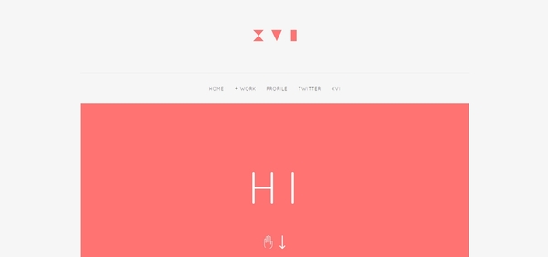
The Downsides of Flat Design
Flat design is undoubtedly one of the most popular design trends of the moment. You’ll find it online, on your phone, and it is even starting to make its way off the screen and onto posters and physical designs. It has already spit off into sub-categories of flat design like the so called “almost flat design” Apple is employing in their new iOS and the newly popular long shadow design.
But, the design style isn’t perfect. None are. The trendy style has numerous things it achieves very well, but there are far too many people glancing over the more problematic side of using flat design. Carrie Cousins wrote about the pros and cons of flat design, but plenty of people are willing to sell you on the upside of flat design. Today, I wanted to focus on the drawbacks.
It’s Trendy – While being trendy can be a positive – no one wants to be falling behind – you also have to be aware that flat design won’t last forever. As we’ve seen with the splintering into new iterations like long shadow design, the trends are already moving away from completely flat design, and there is no way of knowing when it will suddenly seem out of date entirely.
Usability – The simplification that lies underneath flat design can cause usability problems. Flat design can streamline a site, but it can also cause users to feel confused by the minimalistic interface. Many say they don’t know where they are supposed to click or tap, because the style does not do a good job defining what is and isn’t clickable.
Typography – Great typography looks absolutely marvelous in flat design, but boy does the style make it noticeable when typography is weak. Just look at iOS 7. The initial unveiling used an insanely thin typeface which many complained about. With layouts as simple as these, the eyes immediately go towards problem areas, and there is less to hide any flaws. If you aren’t great with fonts, you might ask for help or consider another style.
Too Simple – Not every site needs minimalism. The reason you haven’t seen flat design on many news sites is that the style isn’t good at conveying large amounts of information visually or textually. The style demands short phrases, impactful concise words, and full paragraphs just don’t tend to fit. The style of your site should entirely depend on the needs of your site. If you fill like you’re having to cut too much to fit into the trend, you should choose another design solution.


Leave a Reply
Want to join the discussion?Feel free to contribute!