Tag Archive for: design trends

Keeping your website design fresh and modern is an important part of your brand, but it is also essential for SEO success. Search engines tend to favor sites which are regularly refining their site to offer new features and better user experience, as Matt Cutts recently confirmed in one of his Webmaster Chat videos.

But, there is a lot to consider before redesigning or modifying your website. A good website should be able to feel modern for at least a couple of years before needing another serious overhaul, and you are investing considerable resources into having the site designed in a way that communicates your brand well while keeping up with modern design styles.

There are also several factors behind the scenes you need to consider. Great usability and style are important, but several modern design practices seemingly go against some of the biggest search engines suggested practices. If you aren’t careful, you may do some damage to your SEO while trying to improve your site.

Kannav Chaudhary recently broke down how some of the most popular web design practices of the moment can affect your SEO. Usability and keeping your brand modern are important, but finding the right style for your brand also means choosing the paradigm which won’t hurt your other efforts.
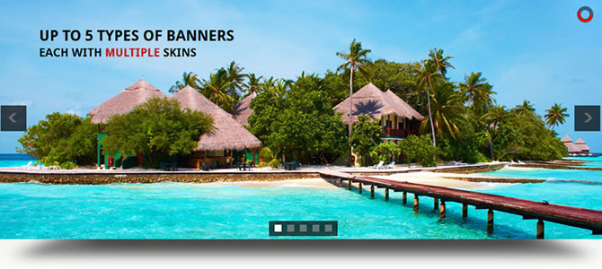
Parallax Design

bagigia

Parallax design recently became popular with web designers for it’s unique way of restructuring a site in a visually exciting way. You build your entire website onto one page, but with responsive scrolling which delivers the content in impressive style. Sites with parallax design are incredibly easy for most users to navigate, as they simply have to scroll through the page, but it raises some issues with optimization.

Simply put, most modern SEO practices rely on creating a lot of content over numerous pages so increase the impact of keywords. You show off your skill and reputation through your content, while showing search engines you are relevant for these keywords. When all of your content is on one page, it can dilute the impact of those keywords, and Google can be unsure about how to view your site.

The key is really understanding when to use parallax design. It is great for product or contest pages, because there isn’t much content on those types of sites in the first place. Parallax design can showcase a product and rank for a few key phrases, but it will struggle with presenting a full website to the search engines.

Infinite Scrolling

Etsy

If you are pumping out a lot of content on a regular basis, but want it to be easily available from a single page, infinite scrolling can be the perfect solution Social Media sites like Facebook and Twitter popularized the design practice, but it can be found all over the web these days, especially on blogs.

If you use the wrong method of implementation for infinite scrolling, you may run into some SEO issues, but the current practices avoid the lion’s share of drawbacks. Most web designers use frameworks such as Backbone or Bootstrap with crawlable AJAX so you can present your information on one page, while avoiding the problems of parallax design. Best of all, it loads quickly, so everyone will be happy.

Fixed Width Navigation

Fixed Width Navigation

Navigation will always be an important part of web design, and lately many designers have been using fixed width navigation to keep their menus in place while users move down the page. This way, you can always jump to another part of the site you want to find, even when you’re at the bottom of an article.

Thankfully, this design practice has very little effect on SEO. Your content will still be spread over plenty of pages, but you’ll want to make sure your navigation widget is indexable so that Google can also explore your site.

Conclusion

At the end of the day, you’ll always want to fully understand the new design trends before implementing them for your brand. Most of the time their SEO drawbacks can be mitigated with careful practice, but occasionally you will find one that just isn’t right for your site. As long as you keep user experience as the highest priority, you’ll be able to manage any of the SEO problems that pop up along the way.

SkeuoVsFlatBanner

As a business trying to keep up with the constantly changing internet, it can be hard to decide which trends to follow and what works best for your business. It is important to have a modern and up-to-date website, but if you chase every trend you’ll often end up falling behind and adopting practices that don’t suit your own business.

The biggest decision many web designers and business owners have had to make in recent history is whether or not they should adopt the flat design craze that has swept the web over the past year, or whether they should be using more traditional skeuomorphic design practices for their brand. As the flat design style has become a staple of many big businesses, many brands are also forced whether they run the risk of becoming cliche by picking up flat design or if they will fall behind the times with the older style.

If you aren’t familiar with the whole flat design vs. skeuomorphism debate, there has been a major shift in popular web design trends that really gained steam in 2013. Chances are, your web design has relied on skeuomorphic design principles at some point, even if you’ve never heard the word.

Skeuomorphic designs rely on recreating objects and visual styles from the three-dimensional world in order to make web design more easily relatable to users. By using stylistic cues and layouts from things such as calenders or notepads, users are immediately able to feel familiar with a website or application.

However, as computers, tablets, and smartphones have made technology a constant part of day-to-day life, flat design proponents have pushed for designs that are created “for the screen.” As a guiding principle that is understandable, but flat design activists have translated that mantra into strict stylistic principles as grounded in minimalism as they are web design.

Flat designs use simple elements and a strict two-dimensional approach that eschews all added effects such as drop shadows, bevels, and embossing. Flat design has also been heavily associated with the flourishing popularity of more complex typography.

The loudest voices for flat design have made it sound as if the new design style is a revolution in how we design, and on some levels it is. The basic guiding principles of “designing for the screen” can open up many new ways of thinking about web design which are fertile for innovation. As a style based on minimalism and strict stylistic rules however, flat design is a trend with more lasting power than some of the more fleeting crazes.

It is more important as a business owner to decide what design styles benefit your brand the most, rather than which trends are the most popular at the moment. There are numerous benefits of flat design, but skeuomorphism has been a long standing way of making products and web designs the most usable and familiar they can be for their audience. Plus, as Apple has shown, you can make your designs more flat to benefit usability without entirely going to Flat Design.

To help you understand which design style benefits your brand and business the most, WebdesignerDepot released an infographic highlighting the biggest advantages and drawbacks to skeuomorphism and flat design. It may help you find which style works for you.

New Image

Web design changes all the time. New trends come and old trends go as quickly as the crowd catches up to them. Some of these trends can be long lasting and have a huge impact on how we interact with the internet like responsive design, others can be more fluid and fleeting like flat design. The design community has made its name by always pushing to create the most visually exciting and effective user experience the technology allows, but that means we also have to let go of bad habits as we grow.

As the new year draws closer, designers are reflecting on the changes web design has undergone in the past year. While many are using this reflection to predict what is going to be popular next year, Maryam Taheri looks at what we need to get rid of to improve looking forward.

Homepage Sliding Banners

Rotating Banners

The sliding banners have become a hallmark of news and culture websites across the web, as well as many retailers. But, the banners are becoming dangerously close to cliche and users seem to be mixed in their response. Many find them to be distracting and annoying. While there may be ways to make these sliding banners more enjoyable for users, it could very well be in our best interests to instead turn to more interactive design methods such as single-page scrolling.

Extensive Fill-Out Forms

While we will always have to fill out lengthy forms for legitimate purposes like online shopping (at least the first time!), there is no need to make users fill out a full length form for optional areas of your site. Chances are, they will just avoid that area of your site to avoid giving personal information, and it could severely hurt your trust with many of your online customers. Asking for an e-mail address is fine. Asking for their life story isn’t. Thankfully, the majority have already realized this.

Overuse of Fonts

Sketchbook Typography

It works in a sketchbook, not on your site.
Source: Carolyn Sewell

Typography is enjoying a new wave of interest in all areas of design, but it has its limits. A good designer can match a select number of fonts (no more than three) to create a pleasing website. But, it is far to common for less experienced designers to choose the “more is better” approach to diminishing returns. A mish-mash of fonts only makes a site look cluttered and schizophrenic. If you want to make your header or your copy pop but don’t know much about fonts and typfaces and kerning, it is wise to limit yourself to two fonts. If you can make two fonts compliment each other, you’re design won’t need any more.

Complicated Design

If there is one thing the favored trends of the past year have shown us, it is that users want their web experience simple. This seems like common sense for the large number of mobile users accessing the web while out and about, but it also stands true for desktop users. You don’t have to choose flat design or convert to the church of minimalism, but successful websites are increasingly focused on creating the best experience for users. If your website confuses or overwhelms, you’re doing it wrong.

Risk Everything


For much of the history of the internet, one of the biggest guiding pressures was to fit as much content into the immediately visible area of the page while also providing an aesthetically pleasant view. The focus on “above-the-fold” design meant most sites generally have a header taking up 20-30 percent of the screen, including navigation, with content immediately available below. But, these days many designers are eschewing the old ways in favor of going big.

Many web designers are using oversized layouts with large, gorgeous images and videos, and luscious typography to immediately catch visitors’ attention. They make a statement immediately, and encourage users to begin interacting with the site. By opening the composition of your page and expanding everything, you push users to take in the sight and then start scrolling to see more, especially when combined with parallax scrolling and effects. As Carrie Cousins explains, “because the design is divided into screens that are unique, having something supersize on each is a great way to keep users interacting with the content.”

These types of websites also show that the designer or brand pushes past the standard for something more. Rather than relying on stock images, these oversized layouts are based on unique and visually exciting imagery. You get to showcase great visuals, which then showcase your own work.

The copy on your page also gets more attention on oversized layouts. There are less huge blocks of text to overstimulate the user at once, while the impressive layout draws attention to the text. Oversized layouts also allow designers to increase the size of text, demanding the attention of viewers. This is all bolstered by the use of quality typography which is allowed to standout on these types of layouts.

Cousins has a few other tips which will help designers play with the new larger possibilities of web design. While many clients may call for something more traditional, some projects allow you to expand your abilities and demand more of viewers while rewarding them with a gratifying user experience.

Mix and Match Typography Example

Typography has become more important in web design than ever before. Technological advancements have made it possible and practical to use nearly any font that you want on the web.

With the rise of interesting and well-thought out typography in web design, we have also seen new trends popping up in how people are using this typography. The first and most notable instance of this is the wave of retro typography on vintage style websites that is still prevalent across the web.

A newer trend we are starting to see has been around for a while in other types of design, but it becoming very popular for websites who want to establish their brand in bold and visually interesting ways. This “Mix and Match” typography relies on the designer’s ability to choose the right fonts to complement not just the message, but the other typographic styles in use.

Some designers opt to use subtly different fonts that are only minutely unique from each other to establish a visual hierarchy of interest while maintaining cohesiveness. Others opt to go all out and harshly contrast fonts against each other to create a visual friction and energy.

Marcin Treder collected 15 examples of this “Mix and Match” typography so you can get some inspiration to try out the style yourself. The rule of thumb for using fonts in web design has long been to never use more than three fonts in a design. It is clear that modern designers are finding ways to break that rule while creating classy and attractive designs.

Flat Design Example


Flat design is undoubtedly one of the most popular design trends of the moment. You’ll find it online, on your phone, and it is even starting to make its way off the screen and onto posters and physical designs. It has already spit off into sub-categories of flat design like the so called “almost flat design” Apple is employing in their new iOS and the newly popular long shadow design.

But, the design style isn’t perfect. None are. The trendy style has numerous things it achieves very well, but there are far too many people glancing over the more problematic side of using flat design. Carrie Cousins wrote about the pros and cons of flat design, but plenty of people are willing to sell you on the upside of flat design. Today, I wanted to focus on the drawbacks.

It’s Trendy – While being trendy can be a positive – no one wants to be falling behind – you also have to be aware that flat design won’t last forever. As we’ve seen with the splintering into new iterations like long shadow design, the trends are already moving away from completely flat design, and there is no way of knowing when it will suddenly seem out of date entirely.

Usability – The simplification that lies underneath flat design can cause usability problems. Flat design can streamline a site, but it can also cause users to feel confused by the minimalistic interface. Many say they don’t know where they are supposed to click or tap, because the style does not do a good job defining what is and isn’t clickable.

Typography – Great typography looks absolutely marvelous in flat design, but boy does the style make it noticeable when typography is weak. Just look at iOS 7. The initial unveiling used an insanely thin typeface which many complained about. With layouts as simple as these, the eyes immediately go towards problem areas, and there is less to hide any flaws. If you aren’t great with fonts, you might ask for help or consider another style.

Too Simple – Not every site needs minimalism. The reason you haven’t seen flat design on many news sites is that the style isn’t good at conveying large amounts of information visually or textually. The style demands short phrases, impactful concise words, and full paragraphs just don’t tend to fit. The style of your site should entirely depend on the needs of your site. If you fill like you’re having to cut too much to fit into the trend, you should choose another design solution.

long shadow design

Source: Web Designer Depot

Flat design is established to the point where many are starting to iterate and experiment with the basic principles in ways that break some of the basic rules of flat design while still clearly relying on the style for the overall effect. Apple’s new iOS7, for example, is heavily influenced by flat design, but as many have noted, is not even close to being completely flat.

One flat design inspired trend that is quickly gaining some popularity is “long shadow” design. It’s hard to call it a full design trend, but it is certainly a unique effect that is starting to pop up across the web.

Long shadow design “produces an effect like looking at an object late on a Winter’s day,” as Ben Moss from Web Designer Depot so poetically described it. It replicates when shadows draw out to dramatic proportions adding significant depth while not completely detracting from an overall flat aesthetic.

The trend is typified by a 45 degree shadow that extends far out, gradually evaporating. The look is very similar to the early Soviet style used on posters and collages by designers such as Kazimir Malevich, which makes it great for icons and branding.

Long shadow design isn’t going to grow legs outside of flat design, but it is a sign that flat design isn’t going to stay completely flat for long.

Design Trends

For those who aren’t watching closely, it can be hard to tell how much the color trends in design change. With such a diverse range of sites using different design styles from neons to earth tones, monotones to color clashing, how can you tell what is part of a trend or just a personal designer’s unique choice?

The truth is, most designers are influenced by design trends. We have to be, as we design for others. We have to keep up with what everyone likes visually, even when they aren’t quite aware what they like about it. This year has seen several distinctive trends either popping up out of almost nowhere, and a few who are finally catching on after slowly spreading. Brandon Hill from Design Madness broke down the color palettes and stylings we’ve been seeing all year, to help you design for what audiences are subconsciously loving.

1) All Emerald Everything – One of the biggest trends of the year isn’t inspired so much by popular tastes but by a simple influential recommendation from Pantone. Every year Pantone chooses a single color as their “Color of the Year” and this year Emerald won the distinctive title, and since then it’s been hard to ignore how prevalent it has become. It works well as a strong background color, accent, contrast, and in many other ways, while still feeling fresh. We’ve recently covered the ways designers are enlivening emerald, but suffice to say the color of the year could quite possibly stick around a while.

2) Blacks and Blues – The web has traditionally been set upon a white or like background color as text has usually been a focus. However, thanks to an increased attention on images, and more flexibility with text styling, dark colors like black, browns, and dark blues have become popular for “edgy” or “aggressive” sites. Whether you want to create a mood of foreboding or mystery, black has become a much more viable way to make your site seem cool or intense.

3) Grays and Accents – Gray has long been a loved neutral color for website designers. It doesn’t feel as empty as white when used as a background, and it pairs well with anything. Lately, designers have been choosing to pair this gray with neons and pastels to create heightened accents and playfulness. The rise of this style could be in part helped by flat design, as it works great as a simple neutral that still makes a page feel full.

4) Monochrome – Blame Facebook and Twitter, but the monochrome look is peaking this year, especially when combined with natural colors such as blues, greens, and often grays. It isn’t uncommon for designers to spice up this style with one or two accent colors to draw attention to important site elements like a call to action, but the monochrome look also creates a sense of cohesiveness which many brands find attractive.

5) Color blocking – Color blocking has come and gone in web design before, but its recent rise has been one of the most noticeable changes in design over the past year. The biggest difference between now and past trends that favored color blocking is the trend is now being used more for website functionality than aesthetics. Color blocks are being used as signifying icons of navigation menus, blocks of content you can select from, site categories, and every other way a designer may geometrically organize their site.

The through line of all of these is a recent focus on simplicity. Flat design is growing, and designers have been streamlining and employing minimalism more and more. The color trends of the year reflect this, while also bringing diverse design techniques that make simple color styles feel exciting and new.

Flat Design WindowsYou’ve no doubt heard about it. All the blogs are talking about it, the big companies are using it, and there has been a visible change on the internet over the past year. Flat design is in, and it appears to be here for the foreseeable future.

Still, unless you’ve been keeping up with the most recent writings about design, it is likely you haven’t even heard of flat design. What does it really mean? Conceptually, the style is all about designing for the screen rather than simulating an increasingly irrelevant physical world.

In the eyes of flat design proponents, skeuomorphism, or design replicating the three dimensional world, was used as a crutch to make computers usable to those unfamiliar with them. At this point, that introductory style design is less needed because children are growing up with technology present in their lives.

Flat design isn’t just a conceptual style though. It has very distinct visual characteristics as well. According to Carrie Cousins, there are five things that make a design “flat.”

  • No Added Effects – Flat design is so-named because it strives to depict two-dimensionality. This is best achieved through a style that rejects all embellishments that have long been used to replicate three-dimensions such as drop shadows, bevels, embossing, and gradients. In flat design, every elements is crisp and and without shadows or feathered edges that blend it into the page.
  • Minimalistic Approach – Flat design attempts to be as simple as possible and thus it is usually accompanied with an overall minimalistic approach. The designs don’t use tons of flash animation or any other over the top design elements. Many sites rely almost entirely on color and text, but others include simple high resolution photography to set the mood.
  • Simple Elements – To create a simple and clear visual hierarchy, flat design uses many simple user interface elements, like buttons and icons. The trend has been using simple shapes such as rectangles, circles, or squares, and allowing each shape to stand on its own. Every UI elements is simple to understand and easy to use, striving for an intuitive experience.
  • Focus on Typography – Flat design is deliberately simple and crisp, which means the designs rely heavily on typography. Luckily, typographical design is also hugely popular at the moment as the internet has made using creative and interesting text much more possible than it ever was in the past. The typeface should always match the design scheme, but also simple, bold, and worded efficiently. Art or vintage fonts work well as embellishment, but it is important not to go overboard.
  • Focus on Color – Because of the simple styling, flat design also relies heavily on color. Pastels gave been very popular within the trending style, but most importantly flat design color palettes are more bright and colorful than other design styles. There is also the possibility to use more colors within a design than is usually utilized on a page. Many sites mostly use two to three colors, but flat design palettes can consist of up to eight equally used colors.

Website designers share a lot of information with each other, but there are some hard truths many designers still don’t seem to understand. Sometimes, people just don’t want to hear the truth, or at least it isn’t easy to accept. Designrfix shared some of those things designers don’t like to talk about, but its best you hear them anyways.

  1. You Can’t Innovate All The Time – The large majority of web designers get into the field because we love to be creative and push our skills, but for the most part we are at the will of our clients, and sometimes they don’t want to push the envelope. Many clients would much rather play it safe and use established design solutions. There are times when you’ll be able to use your creativity, but it may not be your next job you take on.
  2. Every Aspect of the Design Matters – This can’t be stressed enough. If you slack on a single part of your design, it will be the aspect your client and users fixate on and hate. A website is like a puzzle and a sub-par piece of the site is like a missing piece in the puzzle.
  3. Hosting Consideration Matters – Without a host, you don’t have a site. Hosting considerations need to be a part of your strategy from the pitch to the finished project. You have to maintain your host to be able to deliver content to the public, so make sure you choose wisely.
  4. Trends Are Not Our Friends – Design follows trends like leaves get caught up in the wind. With every passing gust, we get blown in a new direction. Staying up to date and creating modern designs is usually good, especially in a commercial field where becoming outdated is career death. But, if you spend all your time following what is popular, you won’t ever be ahead of the curve. Try something new. Risks may scare some clients, but that doesn’t mean you can’t try something new in your free time.
  5. Users Matter More Than You – As a designer it is easy to get caught up in your own wants and preferences, but it is important to remember you aren’t the target demographic most of the time. Your design serves to solve your client and your users’ needs, not to be your own personal creation.