Tag Archive for: Web Designer Depot

Everyone wants their landing page to make a splash, but how do you make an impressive header, include navigation, and not end up covering up too much of your page?

This used to be an issue solved by sidebar navigation, or other secondary navigation systems, but it seems there may be a way to show your readers a big visually stimulating header/menu bar combo that gets out of the way when viewers begin looking at your content.

Websites like This is the Brigade and All You have implemented this dynamic, animated menu that resizes as you scroll down, shrinking the navigation to let your content breathe.

It gives you the opportunity to show your brand or logo, and make a huge first impression, but then you can move the focus to what really matters to readers. Antonio Pratas has a tutorial at Web Designer Depot for anyone who wants to try this new style of header out.

For web designers, the focus is normally on how things look. But, for users, when you strip everything to its most essential parts, all you are left with is content and navigation between that content. The internet, in its barest form, is nothing but text, and clicking links to travel to pages with more text and links.

With today’s internet, you can’t have a website without a great layout, but coherent and easily understandable navigation will always be a necessity for every web page. Usable navigation is as important as the content on your page.

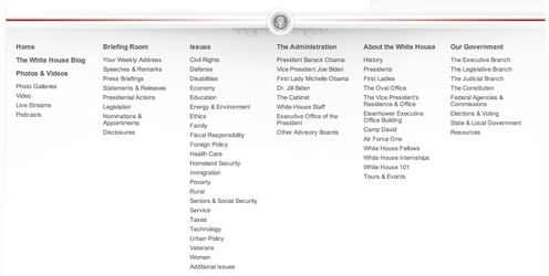
Different websites will try to achieve good navigation a variety of different ways. Some will relegate a large amount of “boring” information to a few links hidden away at the bottom of the page, like Terms of Use or Privacy Policy. I’ve also seen contact links hidden in the bottom links, employment information, and a few other “boring” but often very important facets of a website.

White House Navigation


It kind of makes sense. Clutter is bad, and you don’t want people to see things they won’t be excited by. However, if you have to hide links in a secondary navigation bar, you aren’t doing navigation correctly.

Dan Rajan, writer for Web Designer Depot, knows how to make effective navigation systems for websites that don’t rely on hiding information or secondary navigation bars. By just following his five tips, you will be able to fit everything you need into one navigation system, keeping everything more cleanly organized, and helping customers use your site more easily.

If your company is trying to establish itself on the internet, a low quality site isn’t an option any more. If you want your business to stand a chance online, you must have a quality design that is as professional as it is memorable.

But, as a business owner that doesn’t focus on web design, getting a great looking professional website can be hard. A lot of startups, hoping to save by not hiring a professional, push a non-designer into the role of developer. Others settle for a shoddy website or no site at all, hoping to have the extra resources to do it properly. Neither works well.

There are ways for startups to get the professional website they want, however there isn’t a magic formula. Getting a great website that will draw in customers takes a lot of hard work and time, but it pays off well. To help get you started, Lior Levin gives some tips on how to work towards the design you want and save a little time and money while you’re doing it. With his tips, all you will need is a competent designer and the drive to create a webpage people will want to visit.

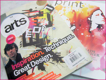
Magazine DesignSometimes I find myself, as well as plenty of others, writing about web design as if it is entirely separate from other mediums. Sure, there are plenty of things that distinguish web design, such as coding and even specific layout patterns for the internet, but there are a lot of principles of layout and design that can be easily transferred onto every medium.

Cameron Chapman got her start in magazine publishing, but she is now a web and graphic designer and prolific blogger. She knows better than anyone that good design rules can often transcend the medium they were established in and help designers across the board. She used her experience in magazine publishing to choose a few design principles that almost any design grad has heard and shows how easily they can be applied to web design.

The first principle seems to be common sense, but a simple background makes reading easier. This is why magazine background colors are almost always white, or at the very most a simple solid color. Readers give up if text is hard for them to read, but yet some less well known websites still present their text over busy images or colors without enough contrast to offset the text. Even if your page’s background is a large image, it is easy to offset your text with a simple text box to deliver your message.

Some websites have numerous pages that all look like different versions of a website. The “about” page may be professional looking and understated, while their “services” or “product” pages are vibrant and sometimes cluttered. If you look at a magazine, every page or section retain several cues from other areas of the magazine. Fonts remain the same, layouts are fairly standardized, and images are shown in the same style. While each page of your site can be a little different from others, it is important to establish consistency by presenting the bulk of your information in similar formats.

One of the most important rules that websites break all the time is clearly marking advertising. In magazines, it is tradition to clearly separate the advertising from the actual content. Even if the advertising is designed to match the style of the magazine in some ways, as some magazine ads have begun doing, there are clear labels added to ensure readers know where the articles end and the ads begin. The same should be implemented in web design, but some sites allow their ads to either be entirely intrusive or sometimes indistinguishable from the content. When readers can’t tell if you are selling them something or delivering them information, they stop trusting your content.

There are plenty of other design rules that web design can learn from, and Chapman explores more of them in her article for Web Designer Depot, but she doesn’t want you to focus on the specific rules she outlines. The most important thing she hopes for you to understand is that any design rule you learn should be at least experimented with in other mediums. Sometimes it won’t transfer well, but most of the time it will make your site look better.

Lately, some designers have been championing flat design as the new frontier for layouts and interfaces, opposed to the skeuomorphism we have all come to know and love (even if we didn’t know the name for it). Since flat design may be a new bandwagon in the next year, let’s talk about what the two terms mean.

Flat design is basically what it sounds like. It is a style of interface and design that makes no attempts to cross into three dimensional realism. Microsoft 8 is the easiest example, because it is truly entirely flat. Flat design uses no gradients, bevels, shadows, or any other ways of simulating depth, instead relying on strictly designing for the two dimensional screen.

Of course, flat design has been around a while. Facebook and Google both use the style to different extents, but why are some thinking it is the best, “honest” approach to screen-based design? Wouldn’t you think designs that simulate familiar real world objects seem more user-friendly?

As Mike Redaelli puts it in his comparison of the two, “Why not make the notepad look like a legal pad if that will help your average tech user to understand the concept of the application in one glance?”

The answer to this whole debate is sadly the same as it is to most cases where someone claims a certain style is the savior we’ve all been waiting for who will revolutionize web design. Both styles are entirely valid, and can be used in wonderful exciting ways, but it really relies on what you are trying to accomplish, and who you are designing for. If your audience can’t use the design, no matter how cool it looks, it is a failure.

Email marketing is considered one of the old standards for online marketing. It has existed since the internet boom, and it still works today. Basically, email marketing is making specialized custom emails to generate leads, promote your brand or a specific offer, and initiate deals with consumers.

However, there is a common mistake many marketers are still making that diminishes your brand’s reputation and credibility. Many email marketers are still not creating proper email templates that are optimized for typical inboxes. Simply put, seeing a poorly formatted or designed email sends consumers looking for the button leading back to the inbox, or worse, looking to label your email as spam.

Web Designer Depot writer Lior Levin has a list of 10 ways marketers fail to properly structure their emails, ranging from writing the body copy of the email in a word processor (which attaches extra HTML code that will likely ruin the layout) to forgetting to create a plain text copy for those who require it.

With how long email marketing has existed, you would think most would have it down already. But, judging from my inbox littered with random emails that look terrible or don’t load, it seems some at least need a refresher.

Web designers find themselves continuously facing the largest issue for anyone in an artistic career. It is often difficult to start a career making work you love while earning enough money to live comfortably. Every artist is used to cutting costs when they have to, like eating Ramen noodles for a week or two to afford a program or drawing tablet.

Of course, there are less drastic ways to save money so that you can be a successful designer. One of the biggest costs for designers is software. $400 Adobe products that get updated every year can take a huge chunk out of your budget, but there are plenty of small software developers creating cheap or free alternatives. For $50-$100 you can find software that can accomplish nearly everything that $1000 dollar Creative Suite can do.

Speaking of free resources, the design community also serves as one of the greatest methods to get free textures, photography, icons, WordPress themes, and any sort of plug-in you could imagine. Searching for blogs and sites that offer these types of free resources also gives you an opportunity to interact with others in your community which can lead to strong professional relationships down the road. Just a simple, friendly “thanks” for the free stuff leaves a nice impression.

The active design community offers another type of resource that can save you tons of money on books and classes as well. There are all sorts of free tutorials and workshops online you can participate in that will keep you up to date on the latest design standards while putting you in direct interaction with others in the community.

Brian Spero from Web Designer Depot has plenty of other ways designers  can keep their costs down. If you are a recent graduate or a newer freelancer, these ideas are definitely better than living off of Ramen.

If you look at the tags for most articles on responsive design, you will notice the way most writers connect responsive design to mobile design. Thinking of responsive design as a mobile design method kind of misses the point however.

When Ethan Marcotte first coined the term ‘responsive design’, he wrote, “responsive design is not about ‘designing for mobile’. But it’s not about ‘designing for the desktop’, either. Rather, it’s about adopting a more flexible, device-agnostic approach to designing for the web.”

So what exactly is device-agnosticism? It is the main selling point of responsive design. The device-agnostic approach to design is designing for every device at the same time, or focusing on no specific device. PC Magazine defines it simply as saying the approach is “not tied to a particular device.”

I won’t say more about the benefits of thinking agnostically about devices, as it is already covered in just about every article I’ve done about responsive design. But, what I will say is I made the same mistake many have by slipping responsive design under the idea of mobile design. Thinking that way still focuses on the needs of devices. Instead, as Sarita Harbour from Web Designer Depot, explains, you should stop thinking about the needs of devices, and start thinking about the needs of the consumer. Isn’t that what is most important anyways?


Online branding ruins everything you thought you knew about branding. It is no longer strictly a marketing activity for multinationals with million dollar budgets. Online branding is simple and practically free.

The internet allows businesses of all sizes to participate with their webpages, secondary sites, social media outlets, and company blogs. These areas are also exactly where it is important to establish a successful branding strategy. But how?

It is first important to remember branding is a lot more than a name and a logo. It is a philosophy encompassing the values and way of doing things. Branding alone can increase the perceived value of any kind of product by creating an image that depicts the product as more than its actual value. Gucci is just a clothing designer, but because of the image cultivated around the brand, their products are perceived as higher value than most others.

Ray Vellest, writer for Web Designer Depot, argues the most important aspect of creating this type of image is consistency. Making sure all of your messages are on point establishes an idea in potential customers’ minds.

People associate Gucci with luxury because they only present images of their products with luxury settings. The people in their ads are always dressed in some form of high fashion, and in an extravagant setting.

Similarly, Louis Vuitton has had a long running campaign of images of pop culture icons with their luggage, and they choose these celebrities carefully. Sean Connery, Madonna, and Keith Richards have all been in ads for Louis Vuitton, and the imagery suggests that of the “rebellious” upper class.

When bringing this strategy online, think digital presence consistency. Start with your username, or profile. Using the same username across the web is a big step towards creating brand consistency online. It brings continuity to interactions customers have with the persona or company through various methods.

Another method of establishing consistency is visually. You begin working with the company’s logo, keeping it absolutely consistent across all platforms. But it is also important to design a secondary logo that will fit within the square profile image space alloted by social media platforms. The second logo has to be a visual continuation of the first.

When interacting with potential customers online, you need to be keeping a consistent voice as well. Many companies have multiple people handling their social media accounts, but their voice needs to match the voice of the company. To do this, define your tone by finding one that matches your brand image. Law firms should maintain a serious and formal tone, while a record store, for instance, has more liberty to be less formal and maybe opinionistic.

By creating a consistent image all across the web, you can begin to cultivate the type of branding that huge corportations spend millions on every year. It is as simple as keeping everything focused in the same direction, and sending the same message.