Tag Archive for: Web Designer Depot

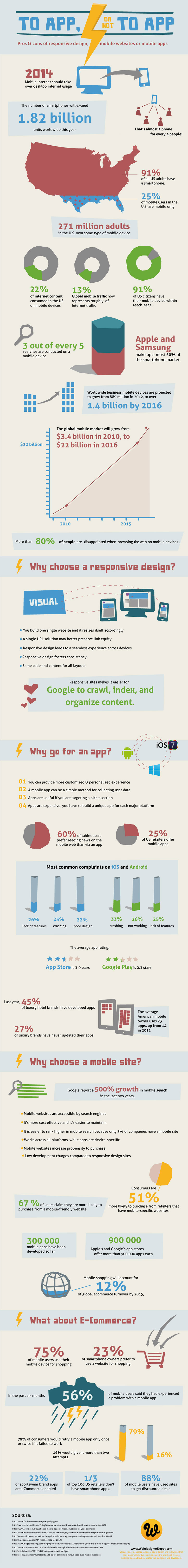
Every brand with a reasonable web presence should be aware of the importance of making your content accessible to the legions of smartphone wielding consumers out there. Nearly everyone has a smartphone now, and mobile web use shows absolutely no signs of slowing down.

But, “going mobile” isn’t exactly an exact science. There are many options for a mobile strategy with pros and cons for each. Of course, at this point the most popular options are building responsively, building a mobile only site, or building a mobile app.

Responsive design takes a bit of a one-size-fits-all approach and relies on the assumption that everyone wants to interact with your content in the same manner, but mobile sites split traffic and create numerous logistical issues. Building a mobile app on the other hand can be an incredible part in establishing yourself on the mobile web, but it simply can’t replace having an actual website.

So how do you decide what approach to take? For most brands, I personally would suggest an approach combining responsive websites and a mobile app, but many companies don’t have the resources to do both as well as they need to be done. That’s when it becomes decision time. To help make the decision, the folks at Web Designer Depot put together an infographic (seen below) to show the facts about mobile design, and going into more detail about the benefits and drawbacks.

To App or Not to App Infographic

iOS 7 Icon

There is a lot of talk going on about Apple’s new mobile operating system iOS 7, even though it is at least a couple months away from actually being unleashed on the public. Most of the discussion is centered around the new flatter aesthetics Apple has adopted, especially the new icons. But, there are quite a few other changes designers are concerned with, namely the actual app redesigns necessary to keep up to date with the update and how much influence iOS 7’s new UI should have on the redesigns.

Many believe that the Apple’s new style should be a heavy influence on the new app designs so that they will appear more native. But, other brands have put a ton of energy and resources into designing their own style and appearance and they don’t want to throw all of their independence and unique brand identity away. To make it even more confusing, there is a fair amount of confusion over how strict Apple’s iOS Human Interface Guidelines are.

This puts designers in a place where they aren’t sure what they are required to do to continue to be accepted by Apple’s app store, and what is simply suggested to keep in step with Apple’s style. Sam Jones from Web Designer Depot decided to tackle all the questions designers have during the transition period, and his article will give designers a good idea of where to go from here.

Jones also pulled quotes from Apple’s iOS 7 Transition Guide which help clear up exactly what Apple expects from their apps. If you want to know the exactly what apps must do, and what Apple suggests for moving forward, the information from the Transition Guide is about as clear as can be.

Things Apps Must Do

  • Update the app icon. In iOS 7 app icons are 120 x 120 pixels in high resolution, rather than the 114 px they’ve been using for the Retina capable iPhones.
  • Every app must update the launch image to unclude the status bar area, if the app doesn’t already do so.
  • All apps are also expected to support Retina displays and iPhone 5 dimensions in all artwork and designs

Things Apps Should Do

  • Apple would like all app content to be discernible through translucent UI elements such as bars and keyboards, as well as the transparent status bar. In iOS 7, view controllers use full-screen layout.
  • iOS 7’s bar button icons are lighter in weight and displayed in a new style, and as such they would like designers to redesign their own custom bar button icons.
  • Prepare for borderless buttons by moving away from supplying button background images and reassessing how to handle them within your layout.
  • Examine your app for hard-coded UI values—such as sizes and positions—and replace them with those you derive dynamically from system-provided values. Use Auto Layout to help your app respond when layout changes are required.
  • Examine your app for places where the metrics and style changes of UIKit controls and views affect the layout and appearance. For example, switches are wider, grouped tables are no longer inset, and progress views are thinner.
  • In iOS 7, users can adjust the text size within apps, and as such designers should move to adopt dynamic type, so that text responds appropriately.
  • Ensure your app doesn’t respond inappropriately to the new Control Center gesture or to a navigation controller’s swipe to go back gesture.
  • Keeping in line with Apple’s new flatter style, they would like designers to reassess their use of drop shadows, gradients, and bezels. Apple’s new aesthetic puts way less emphasis on visual effects that attempt to make UI elements look physical.

Minimalism has been all the rage in web design lately. Flat design is currently one of the most popular design trends around, and it relies strongly on minimalist design principles. If done correctly, minimalism can achieve an experience that will stick in the minds of visitors for some time while doing away with all the sound and fury normally associated with the web.

Obviously, minimalist design techniques require sites that can be parsed down to just a few pages of information, but that has the added benefits of making your site automatically more friendly for mobile loading speeds and making your site easier to read. It can also cut your maintenance time down to a fraction of what is necessary for other larger sites. But, if you have a site that aims to comprehensively cover a topic or multiple topics, minimalism might not be right for your site.

One of the best aspects of great minimalist websites, and one of the biggest reasons flat design is taking off, is that every good minimalist site is built on a unique wireframe and a quality gridding system. When done right, that means your site will be easily made responsive, making the move to a mobile friendly site even easier than ever before.

Flat design is already beginning to branch out and apply more depth to sites that retain their minimalist principles, so it makes sense to get to know the ideas behind the broader style of design being co-opted for the new mobile-friendly internet. Mohammed Shakeri took the task of exploring how minimalism functions, some of its history (including Ludwig Mies van der Rohe’s famous “less is more”), and he even helps explain how to begin the transition to a minimalist website.

If you’ve been considering hopping on the latest trend to streamline sites, but haven’t been able to figure out what all the fuss is about, it’s never to late to find out. Or, as Frank Rossitano sings, “It’s never too late for now.”

long shadow design

Source: Web Designer Depot

Flat design is established to the point where many are starting to iterate and experiment with the basic principles in ways that break some of the basic rules of flat design while still clearly relying on the style for the overall effect. Apple’s new iOS7, for example, is heavily influenced by flat design, but as many have noted, is not even close to being completely flat.

One flat design inspired trend that is quickly gaining some popularity is “long shadow” design. It’s hard to call it a full design trend, but it is certainly a unique effect that is starting to pop up across the web.

Long shadow design “produces an effect like looking at an object late on a Winter’s day,” as Ben Moss from Web Designer Depot so poetically described it. It replicates when shadows draw out to dramatic proportions adding significant depth while not completely detracting from an overall flat aesthetic.

The trend is typified by a 45 degree shadow that extends far out, gradually evaporating. The look is very similar to the early Soviet style used on posters and collages by designers such as Kazimir Malevich, which makes it great for icons and branding.

Long shadow design isn’t going to grow legs outside of flat design, but it is a sign that flat design isn’t going to stay completely flat for long.

iOS7 concept by Andre Almeida

iOS7 concept by Andre Almeida

It appears that flat design is taking the lead over skeuomorphism, as Apple’s new iOS is rumored to be receiving a huge overhaul in the near future. The most recent speculation claims that the new iOS look is going to be largely monotone and understated, as well as abandoning the textures and “realistic” drop shadows of the past.

Web Designer Depot reported the claims which have also been going around most design blogs, which also state that the new mobile OS is rumored to be announced at the Apple WDDC on June 10th, where there is also speculation about a new iPhone announcement.

One of the leading reasons many designers have been slowly migrating is that it is incredibly easy to make a flat design also responsive, especially compared too skeuomorphic designs. Flat design follows the ideology that effects simulating the 3D world such as drop shadows or textures that mimic real objects are not only deceitful, but becoming increasingly irrelevant in an online world.

This isn’t to say that skeuomorphism is completely dead; there are still many designers promoting the strategy. But, Apple has long been cited as one of the biggest proponents of the trend, with their iconic mobile OS styles.

The rumors all started when Apple tapped Jonathan Ive to head the design of iOS7. Ive, Apple’s Vice President of Industrial Design and the man responsible for the iPhone, iPad, and iPod touch hardware, is known to have a strong dislike of skeuomorphic design, which was heavily promoted in the company by Steve Jobs and former iOS head Scott Forstall.

No one will know for sure what is coming with the Apple conference until the 10th, and many skeptics claim that Apple is likely to be implemented incrementally rather than suddenly with an iOS update.

Random TypographyIt’s easy to take text for granted as a designer. However for most users, text is the most common component across the web. Designers can lose focus or patience on text when we want to get to the more fun aspects of design, but you can’t communicate effectively in any way without good typography, and good type is built upon a few basic principles.

Web Designer Depot set down a list of rules that designers can follow for excellent typography, or at least prevent the most basic mistakes. While some of these considerations may seem unimportant or odd when you begin trying to work them into your page compositions, before long they will be second nature to you.

  • Establish a Typographic Hierarchy – Text is all about conveying information, and readers on the internet want to obtain that information quickly. They scan and look for the most interesting or important parts, which they can’t easily do without an organized typographic hierarchy. Even for readers who don’t skim, the hierarchy keeps information organized and accessible.
  • Keep Text Large Enough To Read – While 12pt. fonts may have been acceptable on the web a few years ago, no one wants to be squinting at a computer screen anymore. Make your text large enough for people to easily read. I’d suggest 16pt. fonts, but certainly no smaller than 14pt.
  • Choose Appropriate Fonts For Body Texts – Conveying information is also all about legibility. Choosing a flowery, superfluous, or otherwise hard to read font for body copy is off-putting to visitors and will keep them from sticking around the page for long. There is a time and a place for extravagant fonts, but that isn’t in the body paragraphs.
  • Don’t Use Too Many Fonts On One Page – The web ran on only a handful of fonts years ago, but now we have the abilities to work with a practically endless number of fonts in our designs. That doesn’t mean every one of those fonts should go into a single design. Using too many fonts in a single design can be clashy, distracting, and just plain ugly. The old rule is too stick to two or three fonts. I don’t suggest using more.
  • Give Your Text Some Room To Breathe – Just like on school essays, having extra space between each line of text makes everything much easier to read than trying to make sense of jumbled cluttered letters. The problem is evenly solved too, all by increasing line-heights. Be careful not to overdo it though, too much space can be bad.

Web Designer Depot has a few other rules on their page, but these basic rules will be enough to protect you from the biggest typographic sins. Remember, text is the best way to convey information to your visitors, so make the text easy to read above all else.

Like most designers and web design bloggers, I try to keep up to date with the latest tools and resources available, and I try to pass them along when I get the chance. One of the best places to find the latest and greatest tools, extensions, apps, and kits is Web Designer Depot’s monthly compilation for designers and developers. Most of them are free, and almost all of them can be of use in your workflow.

This month’s wrap up has everything from web apps, jQuery plygins and JavaScript resources to wireframing kits and coding resources. As always, there are also some awesome fonts, most of which you can get on a budget.

WireKitOne of my favorite resources, though one of the least directly usable on this list, is a free ebook called The Productivity Manifesto, which is filled with tips on upping your productivity. All you have to do to get the ebook is sign up for the free newsletter.

If you’re looking for more practical tools, you’ll like WireKit, a set of Photoshop shape layers for iPhone apps, or the interactive usability checklist Userium that comes with categories for user experience, homepage, accessibility, navigation, and every other facet of site usability.

Those couple tools are just scratching the surface of what is offered at Web Designer Depot this month, and I highly advise you check out everything else they are showcasing this month. You’re bound to find at least one tool you like.

Responsive Screen CaptureYou’ve heard all about the pros and cons of responsive web design. You know it creates a consistent experience across different devices, and how it will save you from developing many different versions of the same site, but you’ve also heard that it “isn’t easy.”

Well responsive design may not be something a toddler can do, but Kendra Gaines has a way to make responsive design easy enough for almost every competent web designer out there. Thanks to the endless tools, frameworks, and plug-ins, responsive design is possible for everyone without too much fussing over the little details.

Gaines gathered 13 different responsive design tools you can use, and if you implement them all in your work flow, making your site responsive will be a simple matter you don’t have to fret over.

Even better, normally when you trade pure hard design work for tools, scripts, and other free resources, you end up sacrificing control and precision. The wide selection of these tools as well as the niche abilities of many of them make it so that you don’t have to compromise any longer.

Responsive websites are quickly becoming the standard, so it is imperative to learn how to adapt your sites to the new design world. You can still get away with your special, mobile-optimized websites if you so desire, but you are giving away consistency and features. Don’t give users a lite version. Use these easy resources to make your full website fit into anyone’s pocket.

Image courtesy of Web Treats

Image courtesy of Web Treats

Icons are essential for web design, especially when it comes to navigation. But, a problem comes with these icons. They look great at their normal size on a website, but as soon as you start pinching and zooming on a mobile device, the begin to blur similar to how pictures become more abstract the more you zoom in.

Considering these mobile devices are quickly reaching a standard with Retina or similarly high definition displays which bring attention to every low quality, blurry, or pixelated image and icon on a page, even the tiniest icon with a bad resolution when you zoom in is a big eyesore. Even when you use the Retina optimization trick of using images that are twice as large as normal and displaying them at half their actual size doesn’t protect your icons.

There is a solution however. If you notice when you are using a smartphone or tablet with a high resolution screen, when you zoom in the text maintains its integrity. Even the most scaled letters look crisp and clear. This is because fonts use a different technique to make what are essentially vector graphics in smaller file sizes so that the “image”of the letter rescales as you pinch and zoom. Luckily, your symbols and icons can be turned into these types of “icon fonts.”

The process is mostly painless and there are some clear advantages to icon fonts such as smaller file sizes, and compatibility with all modern browsers, including older versions. There is also the added benefit of not having to keep huge collections of differently sized versions of the same icons.

Web Designer Depot will help you get started turning all your vector icons into web fonts with the use of a free web app called IcoMoon.

Jquery-mobile-logo

jQuery Mobile just released their newest version as a stable release, working to completely incorporate responsive web design into its library. According to Web Designer Depot, jQuery Mobile 1.3 comes with several new widgets optimized for mobile devices including smooth panel overlays, dual-handle range sliders, and two different options for responsive tablets.

The new panel widget opens up many options such as allowing hidden information to be displayed is a smooth, attractive way. There are three transitioning modes, all controlled by a swipe of the finger, or press of a keyboard.

One of the most notable new features of the list view is autocomplete. When searching for your criteria, you simply have to start typing and it will do the rest for you, just like Google’s search bar does.
jQuery has been a favorite for simplifying complex JavaScript tasks, but it has had difficulty bringing that to mobile devices, especially with their separate implementations for different platforms which confused many designers.

Many have wondered whether they should be using responsive web design or jQuery Mobile, but the new version makes it clear that their answer is simply to use both at the same time.