Not long ago Google announced its upcoming mobile-friendly algorithm change, but the search engine is making efforts to help webmasters prepare as well as possible. Google has been offering a steady stream of information helping webmasters avoid common mistakes while converting websites to mobile-friendly designs.
After answering questions over Twitter, Google also decided to directly ask webmasters what they were confused about and what problems they were encountering. Then, Google compiled the most common mistakes and shared them in a simple and easy to explore list.
According to Google, the most commonly mentioned mobile mistakes are:
Blocked JavaScript, CSS and image files: In order for Googlebot to see your site as a real user would, always allow access to these files in your site’s robots.txt.
Unplayable content: This consists of certain types of videos, or other content, that are not playable on mobile devices, such as license-constrained media or media that requires Flash.
Faulty redirects: If you have separate mobile URLs, you must redirect mobile users on each desktop URL to the appropriate mobile URL.
Mobile-only 404s: Some sites serve content to desktop users accessing a URL but show an error page to mobile users. Instead, redirect mobile users to an equivalent mobile page to avoid 404s.
App download interstitials: This is when websites block the view of pages with a prompt to download the site’s native app. Instead, use a small HTML banner at the top of the page.
Irrelevant cross-links: This is when users are linked to desktop-optimized pages from the mobile version of the site, and vice versa. Check your links to make sure that they point to the correct equivalent page.
Slow mobile pages: In order to avoid user frustration, ensure your mobile pages load quickly. You can check your page speed with Google PageSpeed Insights.
00Taylor Ballhttps://www.tulsamarketingonline.com/wp-content/uploads/2018/07/TMO-Logo.pngTaylor Ball2015-03-24 12:59:212015-03-24 12:59:21Google Helps Webmasters Avoid Common Errors When Switching To Mobile
At this point, it is undeniable that any business with a website should have some form of mobile optimization, whether that means a responsive website, separate mobile URLs, or dynamic serving. But, many businesses with limited resources are attempting to solve this issue by essentially tacking on mobile optimization as an afterthought.
According to a new report from BrightEdge, 27 percent of sites have some form of errors from improper mobile implementation. Even more so, the report claims that sites with mobile implementation errors can cost websites up to 68 percent of smartphone traffic, an increasingly important segment of traffic.
BrightEdge’s Mobile Share Report examined the various types of mobile solution available and sought to uncover which configurations are the most likely to have some form of errors, as well as how these errors impact issues like rankings and traffic.
Notably, Google has indicated that responsive design, dynamic serving, and separate mobile URLs are all accepted forms of mobile implementation, although they have also deemed responsive websites as their preferred solution. As such, BrightEdge was especially interested in seeing if sites with responsive design was less likely to result in errors or had a better chance of ranking.
Interestingly, according to BrightEdge there was no significant difference between smartphone rankings based on mobile configuration.
“Data from BrightEdge’s Data Cube shows that for a given keyword, on average, a website’s rank for smartphone users varies only slightly based on the type of mobile configuration a website has implemented,” the report said. “So, for example, if a site is ranked No. 3 on a desktop, it would rank 3.5 (on average) on a smartphone device. This data represents the average across billions of keywords studied.”
Notably, the report indicates any difference in rank is likely due to local search results pushing other more universal results down on the SERP.
So, with sites using all mobile solutions ranking relatively even, why would Google endorse responsive design?
Responsive design showed the least chance for mobile errors, especially over using separate mobile URLs. In fact, 72 percent of sites using separate mobile URLs had errors, while responsive design showed a minuscule number of sites with errors. Dynamic serving rested nicely in the middle with a 30-percent error rate.
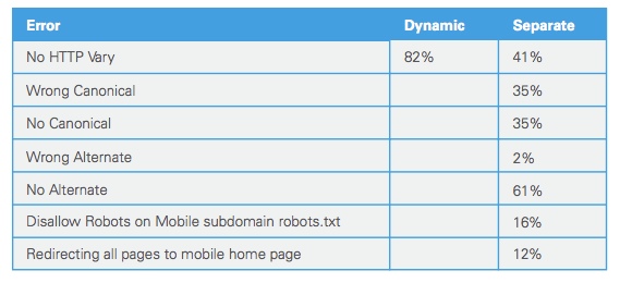
Some of the most common errors can be seen below:
“For separate mobile URLs, there are a handful of common mistakes made in implementation,” the report said. “BrightEdge research showed that no HTTP Vary header was a common mistake amongst two approaches: dynamic serving (82 percent) and separate mobile URLs (41 percent). And among the separate mobile URL approaches, not having an alternate URL tag was the most common error 61 percent of the time.”
These errors are important because they create a poor user experience, which can push traffic away. Even worse, Google has outright said that sites who don’t provide a good mobile experience may not be able to compete in search results overall.
While sites using the various mobile implementation options correctly are ranking fairly evenly, it is obvious that responsive design is still the safest bet. Any option can work, but you are significantly more likely to avoid errors that could cause you problems by simply choosing the least error-prone option: responsive design.
00Taylor Ballhttps://www.tulsamarketingonline.com/wp-content/uploads/2018/07/TMO-Logo.pngTaylor Ball2014-06-25 14:17:512014-06-25 14:17:51If You Don’t Do Mobile Implementation Right, You Are Probably Losing Traffic
Responsive design is the popular title for a website designed to respond or adapt to users across multiple platforms. The idea is to make a responsively designed website equally as functional on your smartphone as it is on your desktop.
Of course, one way to make a website function properly on smartphones and desktops is to create a unique version of your site for each platform. What makes responsive design so special is its ability to take one site and make it work across devices, without the alternate versions.
With current estimates suggesting traffic from mobile devices may tie the numbers for desktop traffic, it is no mystery why it would be important for your brand to ensure your website is accessible and functional for everyone attempting to view it. Responsive design seems like the natural fit to solve this problem, and in many cases it is. But there are some drawbacks and problems you may need to be aware of before you start thinking responsive design is any kind of magic solution.
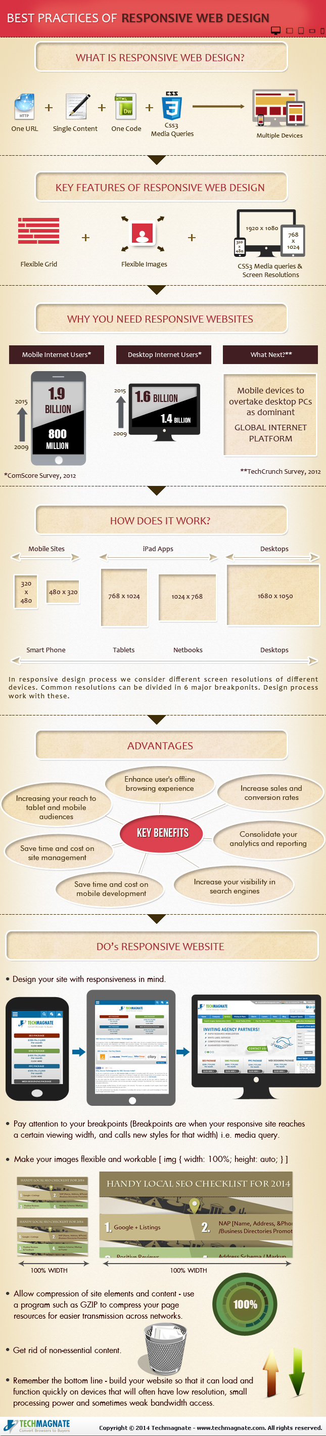
Tech Magnate created an infographic to explore the advantages and disadvantages of responsive design, as well as a guide for the common best practices used in the industry. If your business is online, but doesn’t have a site designed for a mobile experience, the infographic you see below can help you decipher whether responsive design is right for you.
How fast does your website load on mobile devices? Under five seconds? If you said yes to the second question, you are probably pretty happy with your answer. What about under one second? Probably not. But that is how fast Google says sites should load, according to their newest guidelines for mobile phones.
Before you start freaking out at the suggestion their site is supposed to load in under a second, it should be clear that Google isn’t mandating an insane guideline. They don’t actually expect most websites to completely load that quickly. Instead, they are focusing on the “above the fold” content. They think users should be able to get started playing with your page quickly, while the rest can progressively load.
It is probably a wise insight, considering most mobile users say they are more likely to leave a site the longer it takes to load. On smartphones, every second really counts, and if you can get the above the fold content loaded within a second, most users will be happy to wait for the rest of the content while they start exploring.
“…the whole page doesn’t have to render within this budget, instead, we must deliver and render the above the fold (ATF) content in under one second, which allows the user to begin interacting with the page as soon as possible. Then, while the user is interpreting the first page of contents, the rest of the page can be delivered progressively in the background.”
To match with the new guidelines, Google also updated its PageSpeed Insights Tool to focus more on mobile scoring and suggestions over the desktop scoring. They also updated scoring and ranking criteria to reflect the guideline changes.
00TMOhttps://www.tulsamarketingonline.com/wp-content/uploads/2018/07/TMO-Logo.pngTMO2013-08-15 11:18:102013-08-15 11:18:10Google Updates Mobile Guidelines With Focus On Loading Times
Every brand with a reasonable web presence should be aware of the importance of making your content accessible to the legions of smartphone wielding consumers out there. Nearly everyone has a smartphone now, and mobile web use shows absolutely no signs of slowing down.
But, “going mobile” isn’t exactly an exact science. There are many options for a mobile strategy with pros and cons for each. Of course, at this point the most popular options are building responsively, building a mobile only site, or building a mobile app.
Responsive design takes a bit of a one-size-fits-all approach and relies on the assumption that everyone wants to interact with your content in the same manner, but mobile sites split traffic and create numerous logistical issues. Building a mobile app on the other hand can be an incredible part in establishing yourself on the mobile web, but it simply can’t replace having an actual website.
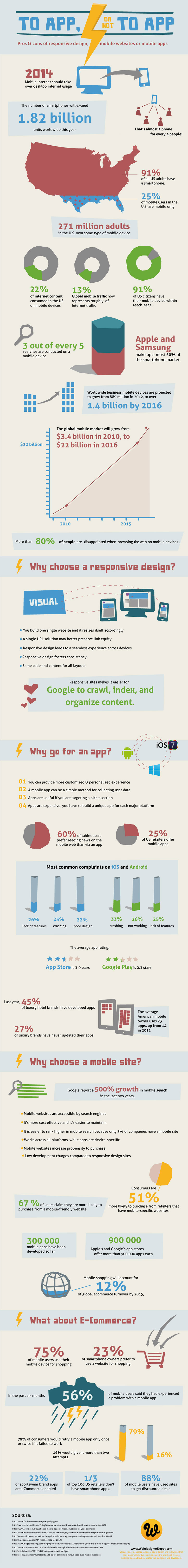
So how do you decide what approach to take? For most brands, I personally would suggest an approach combining responsive websites and a mobile app, but many companies don’t have the resources to do both as well as they need to be done. That’s when it becomes decision time. To help make the decision, the folks at Web Designer Depot put together an infographic (seen below) to show the facts about mobile design, and going into more detail about the benefits and drawbacks.
00TMOhttps://www.tulsamarketingonline.com/wp-content/uploads/2018/07/TMO-Logo.pngTMO2013-08-02 11:08:182013-08-02 11:08:18How Do You Choose The Right Mobile Solution For You?
There is a big push recently to ensure that websites are optimized for mobile devices, especially after Google has openly stated they plan to begin punishing sites that don’t properly accommodate mobile traffic.
There are really two solutions for making a site work great on smartphones. Designers can either create an entirely separate and unique version of their site specifically for mobile phone users to access, or they can choose the more popular responsive design solution which promises to “work on every device.” Both have their perks and drawbacks, but can lead to great smartphone internet experiences when done properly.
The devices everyone forgets to discuss are tablets. While we’re ensuring sites work wonderfully on smartphones and desktop devices, the normal solution is to simply direct tablets to the desktop version of the site and be done with it. While that may sound fine initially, it actually leads to sub-par experiences for a quickly growing market.
According to Mobify’s ebook Tablet Design Best Practices, over half a billion tablets are estimated to be shipped in 2013 and 2014 combined, and that number could end up being higher as prices drop and new options become available. Not only that, tablet users continuously show remarkably high quality of traffic and are more earnest to make bigger purchases than smartphone or desktop users.
If you aren’t optimizing sites for tablet users, you are leaving quality traffic and willing consumers to mediocre experiences that can lead them to take their business elsewhere.
Designing sites that work well on tablets doesn’t require much more time than ensuring you are also delivering a quality smartphone internet experience, and often builds on the same responsive or adaptive framework. Most desktop sites do in fact work on tablets, so long as they aren’t overloaded with Flash, but they become frustrating to use. Buttons are too small or scrunched together, text becomes tiny, and images can become pixelated messes when viewed on the high pixel density screens that are becoming standard.
If you want to create a site that will actually excite and draw in tablet users, you can choose to minorly alter your desktop site with small adaptive enhancements and basic media queries, or you can strip your site down to its basics and rebuild a tablet option that creates a uniquely usable site.
For companies without a lot of resources to spend on creating multiple versions of their sites, improving your desktop site to make it enjoyable for tablet users is often the best option. It can be as simple as making buttons a bit bigger and incorporating the zooming and pinching that tablet users are constantly doing. Text also has to be bigger, but that can be easily solved by increasing font sized to 16 pt minimum. But, there are even smaller changes you can make that can make the site easier to use.
Typing on tablets can be incredibly difficult without any tactile response and overzealous autocorrect, but it isn’t difficult to make your site light on text input or create shortcuts that will save the fingers some effort. It is also a snap to enable contextual keyboards with some simple code adjustments.
But, webmasters who want to really engage tablet users and have the resources to do so can find huge benefits from going above and beyond, taking the basic structure and layout of their site and remixing it with adaptive frameworks to really make the site tablet friendly. It is entirely possible to create an adaptive tablet site without even changing the desktop site, and you rarely have to create entirely new elements for the site. It is more about using the elements you have on your site in new ways.
For example, sites with tons of images can make it so that these high quality images can be pinched and zoomed endlessly, while the rest of the page maintains its original size and clarity. You can also re-imagine your navigation for your site to fit how visitors will be using your site. Similarly, you can attempt to replicate the app style on your website with smooth transitions and panel menus hidden away, but always available at the tap of a button or swipe of a finger.
It is hard to suggest specific techniques for creating great adaptive tablet websites that go beyond simply editing your original desktop page, but that only goes to show how slowly the internet is adapting to one of its most fruitful markets. There are massive opportunities for us to completely redesign the tablet experience for the people actually using them, but designers can be stunted by the need to work for multiple clients, limited resources, and general willingness to rest on “acceptable” sites rather than truly exciting experiences.
Hopefully, as businesses recognize the potential of the market, designers can begin to truly explore the potential for design on these great devices.
00TMOhttps://www.tulsamarketingonline.com/wp-content/uploads/2018/07/TMO-Logo.pngTMO2013-07-25 10:35:082013-07-25 10:35:08Why Aren’t We Talking About Design For Tablets?
There is a lot of talk going on about Apple’s new mobile operating system iOS 7, even though it is at least a couple months away from actually being unleashed on the public. Most of the discussion is centered around the new flatter aesthetics Apple has adopted, especially the new icons. But, there are quite a few other changes designers are concerned with, namely the actual app redesigns necessary to keep up to date with the update and how much influence iOS 7’s new UI should have on the redesigns.
Many believe that the Apple’s new style should be a heavy influence on the new app designs so that they will appear more native. But, other brands have put a ton of energy and resources into designing their own style and appearance and they don’t want to throw all of their independence and unique brand identity away. To make it even more confusing, there is a fair amount of confusion over how strict Apple’s iOS Human Interface Guidelines are.
This puts designers in a place where they aren’t sure what they are required to do to continue to be accepted by Apple’s app store, and what is simply suggested to keep in step with Apple’s style. Sam Jones from Web Designer Depot decided to tackle all the questions designers have during the transition period, and his article will give designers a good idea of where to go from here.
Jones also pulled quotes from Apple’s iOS 7 Transition Guide which help clear up exactly what Apple expects from their apps. If you want to know the exactly what apps must do, and what Apple suggests for moving forward, the information from the Transition Guide is about as clear as can be.
Things Apps Must Do
Update the app icon. In iOS 7 app icons are 120 x 120 pixels in high resolution, rather than the 114 px they’ve been using for the Retina capable iPhones.
Every app must update the launch image to unclude the status bar area, if the app doesn’t already do so.
All apps are also expected to support Retina displays and iPhone 5 dimensions in all artwork and designs
Things Apps Should Do
Apple would like all app content to be discernible through translucent UI elements such as bars and keyboards, as well as the transparent status bar. In iOS 7, view controllers use full-screen layout.
iOS 7’s bar button icons are lighter in weight and displayed in a new style, and as such they would like designers to redesign their own custom bar button icons.
Prepare for borderless buttons by moving away from supplying button background images and reassessing how to handle them within your layout.
Examine your app for hard-coded UI values—such as sizes and positions—and replace them with those you derive dynamically from system-provided values. Use Auto Layout to help your app respond when layout changes are required.
Examine your app for places where the metrics and style changes of UIKit controls and views affect the layout and appearance. For example, switches are wider, grouped tables are no longer inset, and progress views are thinner.
In iOS 7, users can adjust the text size within apps, and as such designers should move to adopt dynamic type, so that text responds appropriately.
Ensure your app doesn’t respond inappropriately to the new Control Center gesture or to a navigation controller’s swipe to go back gesture.
Keeping in line with Apple’s new flatter style, they would like designers to reassess their use of drop shadows, gradients, and bezels. Apple’s new aesthetic puts way less emphasis on visual effects that attempt to make UI elements look physical.
00TMOhttps://www.tulsamarketingonline.com/wp-content/uploads/2018/07/TMO-Logo.pngTMO2013-07-12 12:46:402013-07-12 12:46:40What Do Designers Need To Do Before iOS 7?
Apple’s keynote event earlier this month made news across the world, and few were impacted by the announcement of the new mobile operating system iOS7 more than designers and developers. While consumers will be receiving an updated user experience and new aesthetics on their phones and iPads in the next few months, designers are rushing to update apps and icons to keep their content up to date and optimized for the new operating system.
These designers won’t be forced to redesign from the ground up, however. There are already numerous resources available to help update to the new iOS. Designmodo is gradually collecting the best of these resources, and they recently highlighted two different icon grids for iOS, which are templates which you build icons on top of.
Beyond offering a few simple grids to assist the icon redesign process, there are also tons of examples of updated icons to help get designers steered in the right direction before the public has even gotten a hands-on turn at the operating system.
Responsive design is definitely the most talked about web design method right now, especially when discussing designing for mobile. It isn’t the only option though. There are three real options currently and each has its own pros and cons to them. Choosing the way you interact with mobile customers should reflect the type of business you are running and what you hope to accomplish.
Responsive Design – Though it is well covered, responsive websites are those that adapt to different sized screens across all platforms, from mobile to tablet to desktop. The idea is that you only build one website for everyone rather than different sites for all different devices. That time you would have spent designing sites for different platforms will have to be spent testing your one site on all of the devices. It also removes some of the ability to customize sites for certain devices.
Mobile Sites – A mobile site is optimized for that specific section of on-the-go customers. The sites are usually minimal, with large, finger-friendly buttons, and they load faster than responsive sites. This allows more direct control of how sites appear on different devices, but more importantly, the content selected to appear is tailored for the mobile demographic accessing it.
Native Mobile Apps – If you own a smartphone, you know what an app is. They are specific to their platforms so they have the benefit of being able to curate mobile content like websites do while further focusing on the differing needs of different platform users.
All three have their merits. Responsive websites create a sense of consistency and deliver the full experience of a desktop website in an accessible form for a specific device. Some hail it as a time saver, which isn’t quite true, but it does allow you to spend equal time on a site for all devices. Mobile sites and apps load faster and cater to specific audiences, while allowing them to act immediately.
Diksha Arora compares the three against each other at Vandelay Design. If you don’t know what is best for your business, she can help you identify your needs.
00TMOhttps://www.tulsamarketingonline.com/wp-content/uploads/2018/07/TMO-Logo.pngTMO2013-02-20 13:47:272013-02-20 13:47:27What Mobile Design Method to Use? Responsive vs. Mobile vs. Apps
In just a few years, mobile browsing has gone from laughably tedious to one of the fastest growing ways we access the internet. With that meteoric rise to popularity comes misunderstandings thanks to generalizations, but the reality of mobile browsing is much more complex.
Karolina Szczur wades through the misconceptions about mobile browsing and design, attempting to clarify the truth about mobile design and show how believing these inherently false ideas leads to designs that don’t really work for the current web.
The biggest misconception is that mobile is well-defined or even monolithic. This isn’t helped by most articles which suggest tips for mobile design which lump all devices, browsers, and even tablets all into one category. It is easy to forget when we write about mobile browsing like this, that ‘mobile’ doesn’t actually refer to the handheld devices. It it refers to the user, according to Barbara Ballard, author of Designing the Mobile User Experience.
Focusing on devices when designing for mobile misses the more important factors surrounding users. Context defines more of what mobile users are doing than their devices. The most wide-held view of mobile users focuses on out-and-about shopping, but studies have shown that 70% of Americans use their phones in the bathroom, and just as many use them while sitting on the sofa, away from their desktop.
The usual decision when thinking about mobile users as “on the go” is to streamline everything on a site, but this forgets that mobile users are often trying to perform complicated transactions or reach full length articles from areas where a desktop isn’t feasible.
This monolithic attitude about mobile browsing also leads people to think that mobile browsing is dominated by Apple devices. While those with iOS devices are the most high profile smartphones and tablets, Google owns roughly 53% of the smartphone market in the US.
The difference is, Apple uses one standard device, whereas Google’s smartphones are spread across a vast array of Android devices with wildly different display sizes. Designing just for Apple is actually designing for less than half of the market out there, and ignores the huge variances available. When you then include the number of browsers available on smartphones and tablets, designing strictly thinking about Apple’s Safari browser is focusing on just a small share of users.
These are just two of the wide-held misconceptions about mobile browsing, and they spawn from generalizations meant to make the field of mobile browsing seem digestable, but it ignores every big of fact available. The reason for the huge boom in responsive design over the past year is a reaction to just this problem, and it serves a strong solution. Mobile browsing is anything but singular, and design now has to take into consideration the hugely different ways we all browse.
 Not long ago Google announced its upcoming mobile-friendly algorithm change, but the search engine is making efforts to help webmasters prepare as well as possible. Google has been offering a steady stream of information helping webmasters avoid common mistakes while converting websites to mobile-friendly designs.
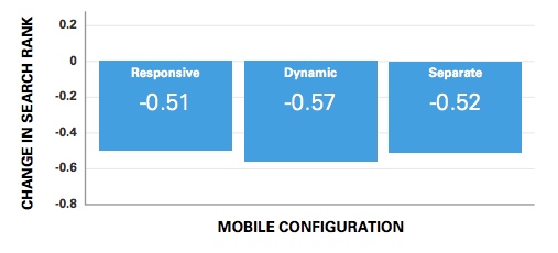


