Everyone gets distracted, or sometimes just a little lazy. When you work online, it is easy to switch tabs in the middle of a project to check your email, and end up completely off track looking at blogs or news. Having a job where you are constantly at a computer offers endless distractions that are constantly refreshing to keep you interested.

This type of distraction can be completely innocent, but it can also become a habit keeping you from getting important work done. There are ways to keep yourself from sliding off course, however. Between tools and lifestyle changes, you can increase your productivity and still be able to get away from your work when you really need to.

Richard Kirk collected five different tools you can use to keep yourself from getting distracted. One, called StayFocused, simply blocks websites you know you visit too much during the day until you are off the clock. Reddit addicts and those that can’t seem to get themselves away from Facebook until the day is over, though that could get in the way of your social marketing.

A similar conundrum is the time killed keeping up with industry news. Every SEO needs to be checking blogs and SEO news sites practically daily to keep up to date with any Google algorithm changes or big announcements, but it can also lead to lots of dead time or reading non-relevant news. Pocket helps you store articles you will want to read later so that you can come back to them when you aren’t supposed to be working. It’s great for train rides or hanging out on the couch at night.

Another option is stripping down your word processor with WriteMonkey, which will help keep you focused while trying to create content like blog posts. Minimizing distracting elements on your screen will help you keep you focused on making your content as good as it can be. If that doesn’t work, you can always download one of the many timers online to set short breaks for yourself, with a reminder when you need to get back to the grind.

Of course, all the tools in the world won’t help if the problem is internal. Most procrastination is caused by us just being lazy. I know this because I suffer from laziness as much as anyone out there. But there are simple ways to get you out of the lazy rut.

I’ve always been a big proponent of music as a motivator and a tool to help focus. Many agree, and refer to the increase in productivity while listening to music as the Mozart effect, though the legitimacy of such an effect has been questioned. Some say it distracts them while working, but in my experience turning on relaxing or more passive music while working will help you keep your mind where it needs to be.

Most also need to make changes in their habits, like using email as a means to constantly be switching tabs and getting away from their project at hand. Kirk suggests limiting your email time with a “surgery hours” model limiting you to checking your mail three times a day. There are times when you may need to respond to an email more urgently, but you can set those types of emails to alert you on your phone if you need to see them immediately. Otherwise, clients will understand a small delay, as long as you respond within a few hours.

The final tip is one you’e heard all your life. Sleeping well is essential to making you feel clear headed and ready to take on every day. Keeping a regular sleep schedule and not letting yourself stay up until two in the morning will keep that groggy feeling we’re all familiar with at bay.

Facebook Post Time Infographic

So you’ve got your page’s social media profile built. You have an audience in place and a message you want to get out. The question is: when is the best time to unleash that message?

There are a number of factors to consider in order to maximize not only the number of eyes on your message, but also the number of users who will interact with the message. Assuming that the message itself is worthy of ‘RT’ and ‘Likes’, you have to think about who it is you are trying to reach and what they will likely be doing when you are trying to reach them.

For most industries, your consumers will likely be at home when they are cruising through social media with time to click and interact with anything they find interesting. This means that sending out your message on weekends or evenings could get you the best results. However, the exception here would be if your key demographic is suburban housewives. If you’re trying to reach individuals who spend their day at home, then you’ll probably want to reach them before their families return to make their lives hectic.

You will probably notice that posting more gets your more interaction and probably builds your audience too. There is a limit though. Having a steady, consistent stream can paint you as a reliable, familiar source, but it’s easy to cross over into an annoying nuisance who users dread seeing in their news feed.

Be sure to take a moment to peruse the included infographic, courtesy of JCK, and think about when the best time to reach your audience would be.

Today is April Fool’s Day, and of course that means every major company has unveiled a new fake product. Google, for example, announced Google Nose, which would let you smell your results, if it worked. That’s the type of prank you normally expect to see from big companies. They’re all in good fun.

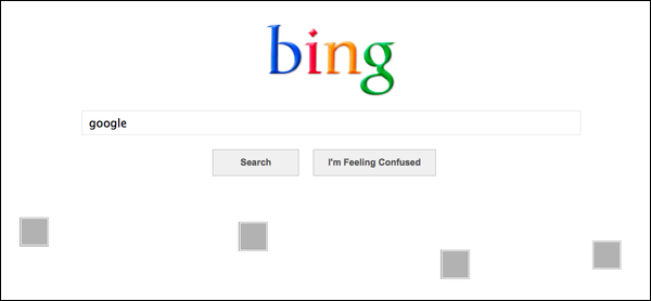
Well, Bing decided to make their April Fool’s Day prank a fake new product and a slam directed obviously at Google all in one. They announced, through a blog post, Bing Basic, a redesign of their front page, only accessible through a special “telltale query”, “you’ll get something a little more bland” than their front page.

If you guessed the “telltale query” was “Google” and that Bing Basic removes the big pictures from their front page in favor of a colorful logo, white space, and a simple search box, you’d be correct.

bing-april-fools-2013

Of course, this Google bashing is far from new for Bing, but it is kind of odd to see a company take a day normally full of nonsensical and sometimes wonderful fake ads, webpages, redesigns, and other fun little jokes and turn it into a swipe at the competition. It certainly isn’t the first time though.
In the meantime, I’ll be dreaming of the day Google Treasure Maps is a real thing.

Responsive_Web_Design

Source: Wikipedia Commons

The more we get used to using responsive web design, the more we learn its limitations. When it first came out, responsive design seemed like the hero web design has been craving since phones have allowed us to browse the internet practically.

They had some reason to think this way. Responsive designs solve all sorts of headaches that otherwise were only solved with creating multiple versions of the same web site. But, responsive design comes with its own set of issues.

Alvaris Falcon decided to dig into some of these imperfections of responsive design. Though he doesn’t discuss the normal “drawback” of responsive web design, if you could call it that, which is responsive web design doesn’t actually save you that much time, when you include testing and tweaking for the assortment of devices out there being used to access the page.

Instead, Falcon points out another way responsive design slows us down, or more specifically slows down the web page. Fast loading times are more important than ever, and studies show that users actually have higher standards for fast loading speeds on their mobile devices. However, responsive design isn’t great for quick loading.

Responsive designs have the benefit of offering all the content your regular website would, instead of a watered down mobile version, but all that extra information, combined with the restrictions of responsive sites, takes much longer to load than those light mobile sites. There are ways to speed the site up, however.

If content is slowing you down, you can start being selective about what you load on what device by using the conditional tag. You could also opt for engineered solutions to optimize loading times, such as Adaptive Images, which dynamically delivers scaled images to users based on screen size.

Some of the problems of responsive design stem from problems already rooted in using mobile devices. The change in screen size breaks advertising models, which can be extremely troublesome because inadvertent changes in ads can also break your contract.

To keep ads placed where they are supposed to be on a responsive site, you would have to change the resolution, which you are contractually unable to do. But, keeping them large makes the ads get shifted down the page causing problems with your layout, and possibly shoving other content or ads off the screen.

Some web designers are solving the problem with ad bundles they sell together, rather than selling single leaderboard style ads for desktop sites. Instead, they include many versions of ads exclusive to different device resolutions in a package deal.

Of course, there are more than just two problems with responsive design. Falcon has three others in his article, but I’m sure plenty of others out there have already found plenty of other limitations frustrating them. What other problems do you think responsive design has?

It can be hard to notice, but Google’s search engine results pages (SERPs) are constantly changing. Sometimes it is a result of new algorithms or updates to Penguin or Panda, but often it is a result of Google’s non-stop tweaking of their formula. If you weren’t consistently studying and analyzing SERPs, you probably haven’t even noticed.

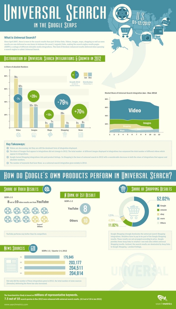
SearchMetrics does just that type of analyzing of SERPs, and they just released their study of last years result pages, and there are some interesting points for all search marketers wanting to know what Google is favoring in their results. The highlights of the study, as pointed out by Search Engine Journal, are:

  • A small decline in video integration
  • A significant increase in image integration
  • A sharp decline in shopping
  • A large increase in news integration

The decline in video integration is one of the most surprising, as I’ve heard more than one analyst predict video will be one of the most popular mediums for content marketing this year. If they’re predictions are true, video makers will have stiff competition getting their content onto the SERPs.

Similarly, eCommerce pages are on the rise, and the data suggests business owners should be considering paying into the Google Shopping network to have their products seen by more people.

On the other hand, the big increase in news shows big opportunities for content creators reporting on events and doing news worthy journalism.

SearchMetrics made an infographic to go along with the release of their study, which you can view below or here.

rsz_universal-search-in-the-google-serps

Did you know there are more than 700-thousand mobile apps for Android or iPhone? How about that the mobile app industry was valued at an estimated $30-billion in 2012? Those are pretty astounding numbers and they suggest that, if you haven’t already gotten into the app game, you should do so soon.

Now, Google is making it easy to find and download your app too with the introduction of a “click to download” ad template in AdWords. It’s part of the “Enhanced Campaigns” you’ve been hearing so much about. Mobile users can download an app with a single click from search listings. iPhone and Android users only, however, as currently, Blackberry and Microsoft are being left out.

Head over to Business2Community where Larry Kim has the particulars on how to set up your mobile app ad in AdWords.

It’s been about six months since Pinterest introduced “business-specific accounts” and their “business support page”. Add that to recent projections that Pinterest, rather than Twitter, will soon be the clear number-2 social media market behind Facebook. These developments suggest that Pinterest is a viable option to gain exposure for your business and Tehmina Zaman writes about how to do so at Business2Community,

There are a number of helpful nuggets in the article. For example, did you know you can schedule pins? Also, what do you know about group boards? They’re a perfect ways to increase the size of your audience, create brand ambassadors and get your message repinned consistently.

Minimalism is all the rage in web design at the moment, and extra negative space is an essential aspect of the style’s aesthetic  But, is minimalistic design and the white space accompanying it just a trend or is there more to it?

White Space

To the more business minded designers, all the “empty” space could be used for ads, more content, or more usability features that guide a user through the site. If you compress the amount of space between images, columns, and every other visual component, in theory you can fill the page with more of what users want to see, right?

That mindset favors business, but it doesn’t favor aesthetics. As Carrie Cousins puts it, “space is the thread that holds your design together.” White space separates objects, letting users find what they want to more easily. Space between objects groups things together, and it creates a sense of balance that makes a design seem cohesive and professional.

For most designers, there is a rule about keeping white space around content for the sake of making it more readable, but the same is true for just about any aspect on the screen. It draws attention to the most attractive aspects of a site by singling them out from others, while also organizing your site.

Neglecting negative space can make your site seem busy, cluttered, and hard to comprehend. While filling extra space with adds, or squishing everything together to present the reader with more seems like a good idea, in reality less is often more. Readers don’t want everything at once, they just want to be able to easily find what they’re looking for.

But, minimalistic design is not even close to risking using too much white space. Most designers are already thinking about using small amounts of negative space to organize content, but the new design trend is taking that idea to its extremes.

Using huge amounts of white space can have its problems. While it can be used to create stark contrast, white space can also make objects feel small, or detached from the rest of your design, unless you make your negative space feel deliberate.

White space draws attention to one object in a way so forceful users can’t help by stop and notice the object floating in a sea of space, but it is possible to go overboard.

Good use of white space makes the “empty” space feel active or purposeful. Bad white space makes a page feel empty or incomplete. The best place, or at least the most common area, to use white space is the header. When a viewer lands on a site with a lot of negative space in the header, they are met with a striking and simple statement of what the site is all about, all encapsolated in a singled out set of images or text.

If you use negative space in the header, the limits white space can put on content are removed, because content still flows fairly traditionally underneath. Many clients worry about forsaking content for “empty” space, but if the content focused areas of the site still present everything clients would expect to find, negative space won’t detract from the design.

However, if users can’t find what they are looking for on a minimalistic page, they might place the blame on the amount of space not being used to provide a better navigational system.

Not every site needs a minimalistic or negative space heavy approach. These aesthetics are tools just like everything else in a designer’s repertoire, to be pulled out when the time is right. You don’t have to start at the extreme end. Just try letting your content breathe a little and see how you like it.

Responsive design is one of the most popular website design methods out right now. Users like having a consistent experience across different devices, without having to worry about pinching, zooming, or being restricted to a downsized version of a website. But, going responsive raises some concerns for the SEO professional managing a site.

Bonnie Stefanick explores some of the issues of high importance to SEOs when redesigning a site to be responsive, but before dealing with the questions she separates redesigns into two categories – cosmetic and full redesigns.

The main distinction between a cosmetic redesign and going all the way is URL management. If URLs are going to be changing during your redesign, you have substantially more issues than just updating the appearance of your site. The issues raised by Stefanick run closer to cosmetic redesigns, as complete redesigns have their own, much larger, can of worms to deal with.

Responsive design has its own unique style and appearance, and some times it can conflict with the best SEO practices. Such is the case with the area above the fold. Responsive design relies on negative space and giving elements area to breathe and move, but navigation and critical linking elements often get pushed down by big banners popular in responsive designs.

These large banners designers constantly put in responsive designs lead to important SEO elements being under the fold, only reached by scrolling down to find menus  By talking to the designer before the prototype is made and establishing where you main categories are on your homepage, you can avoid losing the SEO elements.

Another issue with the content above the fold in responsive designs is simply that there is no actual content. Responsive design is intrinsically visual, and designers favor the visual design elements over delivering content directly to users. Search engines notice when none of your content is above the fold, and can rank sites differently for their efficiency in directing users to the content they are trying to reach.

There are plenty of other major considerations for responsive redesigns. Clear communication with designers through the entire process can help manage many of them, but you will also have to pull your own weight to make sure your new design is working as well within your SEO strategy as your last design.

Website designers share a lot of information with each other, but there are some hard truths many designers still don’t seem to understand. Sometimes, people just don’t want to hear the truth, or at least it isn’t easy to accept. Designrfix shared some of those things designers don’t like to talk about, but its best you hear them anyways.

  1. You Can’t Innovate All The Time – The large majority of web designers get into the field because we love to be creative and push our skills, but for the most part we are at the will of our clients, and sometimes they don’t want to push the envelope. Many clients would much rather play it safe and use established design solutions. There are times when you’ll be able to use your creativity, but it may not be your next job you take on.
  2. Every Aspect of the Design Matters – This can’t be stressed enough. If you slack on a single part of your design, it will be the aspect your client and users fixate on and hate. A website is like a puzzle and a sub-par piece of the site is like a missing piece in the puzzle.
  3. Hosting Consideration Matters – Without a host, you don’t have a site. Hosting considerations need to be a part of your strategy from the pitch to the finished project. You have to maintain your host to be able to deliver content to the public, so make sure you choose wisely.
  4. Trends Are Not Our Friends – Design follows trends like leaves get caught up in the wind. With every passing gust, we get blown in a new direction. Staying up to date and creating modern designs is usually good, especially in a commercial field where becoming outdated is career death. But, if you spend all your time following what is popular, you won’t ever be ahead of the curve. Try something new. Risks may scare some clients, but that doesn’t mean you can’t try something new in your free time.
  5. Users Matter More Than You – As a designer it is easy to get caught up in your own wants and preferences, but it is important to remember you aren’t the target demographic most of the time. Your design serves to solve your client and your users’ needs, not to be your own personal creation.