Great content can do just about anything you want it to. You want to draw in more visitors? They’ll come for quality content. Need more conversions? Get some great content. In the best cases, it can go viral. But how do you know what great content is? How do you know what the public wants?

The internet is so insanely populated with content at this point that it is just getting harder and harder to stand out. There are many lists like this one, and they offer different opinions in different ways, but what makes one of those articles more attractive than all the others? It answers people’s needs.

That sounds so incredibly basic that many would say there’s no way it is the whole story, but in reality answering to people’s needs is much harder than you think. There are no guaranteed right answers, and the only way to truly know if you gave the public what they want it to get it out there, but you can get some hints beforehand, if you look in the right places.

Jason DeMers shared some ways you can find out what your target audience is looking for and create the content they need. If you want your content to stick out from the rest, you need to know how to understand your audience.

  1. Competitors’ Forums – This slightly controversial method is also one of the easiest ways to get in the mind of your target audience, and it is definitely one of the easiest. Just find the competitor in your field with the best web presence, and keep tabs on what their audience is interested in and responding to. Of course, some argue that this leads to blatant copying or spylike business practices, and I suggest discretion with the tactic, but if you are looking for a quick way to find out what your market wants, this will show you.
  2. Comments Sections – Just like your competitors’ forums, any place where your audience can directly interact with you offers boundless opportunities to find out what they want and need. Comments sections on your own website, as well as others out there like Reddit, are filled with people looking for solutions, and they are often vocal about looking for it. If you keep your eye on places where the public is interacting, you should be able to easily discern what is on their minds.
  3. Surveys – Where comment threads create an open forum feeling of interaction, surveys allow your audience to speak directly to you and tell you what they want and need. You don’t even have to do your own survey if you don’t have the resources. Just keep your eyes on other public surveys going on. They are everywhere, just look in your daily newspaper.
  4. Product Forums a.k.a. the Support Boards – If you have a niche product and people are looking for support solutions, chances are there is a support board going on somewhere filled with people voicing their problems and opinions all at the same time. In the best situation, you run these boards and can create some good PR while also helping customers and monitoring their interests simultaneously  but even if your customers are using a public forum, you can benefit from listening in.

The public is often very open about their feelings and desires, you just have to go where they are voicing them. The internet offers many popular options, and it is easier than ever to keep tabs on what your target audience is thinking. There isn’t any excuse to ignore their needs.

In my opinion, you can never read too many opinions and advice columns on how to manage your PPC campaigns. Sure, some may turn out to be full of bad advice, but I believe every bit of information can either guide you to improving your own campaigns, or steer you away from looming mistakes. At the very least, it’s good to see what other people are doing in order to inspire you to come up with your own methods.

With that in mind, how could you avoid Chris Kent’s article at Search Engine Journal called ’10 Golden Rules of AdWords.’ It’s loaded with good information. Some of it is bordering on cliche, such as logging in to your account at least once a day and testing every conceivable movable piece. But, even these have been repeated for a reason. They are important and are a key to building a successful campaign.

My favorite pieces of advice are a suggestion of how to determine how much to bid for certain keywords. For many, this seems to be a guessing game, which is not good. Also, remember to link your PPC ads to the specific page your ad refers to. Don’t just leave traffic at your doorstep, invite them in and put them right where you want them. In other words, bypass your homepage and get users as close to a conversion as you can.

As Facebook establishes itself as an option to gain a piece of your advertising budget, you may find yourself wondering if can actually give you a solid ROI. Because it is a fairly new platform, some are still a bit skeptical about the realistic expectations they should have when they dump money into a Facebook ad.

iMediaConnection set out to investigate this matter and returned with an interesting case study about how Facebook advertising has worked for one specific company. Follow the link and watch the included video interviews with a car dealership’s marketing manager to hear about how they found success through Facebook advertising and parlay that into success with your own campaigns.

emerald-pantone-17-5641What does it mean to be Pantone’s Color of the Year? It seems like an arbitrary designation to many, but if you watch the design trends close enough, it is easy to see how emerald was chosen as this year’s favorite color.

Emerald works great as a base color or as an accent, and it is an easy choice in a year when colors have gone slightly more natural and pastel. It is a favorite of many, and has always been a staple in fashion, beauty, and design. It was really only a matter of time until emerald had its moment in the sun.

Pantone’s emerald chosen as the color of the year is very specific, and very in line with the design trend of subdued light colors that still pack a lot of punch. Emerald 17-5641 is the lush blue-green that works wonders as a background and is a friendly complement to many colors without clashing.

“The most abundant hue in nature, the human eye sees more green than any other color in the spectrum,” said Leatrice Eiseman, executive director of the Pantone Color Institute, following the announcement of the color of the year. “Symbolically, Emerald brings a sense of clarity, renewal and rejuvenation, which is so important in today’s complex world. This powerful and universally-appealing tone translates easily to both fashion and home interiors.”

Green has always been a popular color because it lacks many negative connotations. Greens are common and associated with health, and is a the second most common favorite color, following only blue. We are used to greens and they don’t have the aggressive or overly feminine associations harsh reds or soft yellows do.

Emerald specifically has many positive emotional associations such as soothing, relaxation, and harmony  and there are almost no negative color meanings. The only bad connection that can be drawn is greed or death, which are normally more thought of with more sickly or saturated greens, not the comforting blue-green you’ll find in this type of emerald.

If you want to get inspired or hear some tips on how to use the color of the year, Designshack has created an entire page devoted to uses of the color in design and pop culture, as well as exploring the color’s meaning a little deeper.

ChecklistThings go in and out of favor in SEO all the time, but some things seem to never change. While content creation is the new buzzword and link building is enduring a big face lift, on page optimization stands tall as a piece of tradition surviving on, much as it has for years. Of course, there have been some tweaks, but largely on page optimization remains as one of the easiest methods of site optimization to implement and understand.

On page optimization is also special in SEO in that we know fairly certainly the best ways to handle this type of optimization. Everything else may be up for some level of debate, but on page SEO can be distilled down to a simple checklist, such as the one CanuckSEO recently shared. This checklist works with any type of CMS or page editing method you want to use, all you have to do is make sure you follow through with every step, in order.

  1. Page Title – Each and every page needs a unique and informative page title, and they all need to be less than 70 characters. Okay, the 70 character limit is a guesstimate which many will question, but the point is you need to distill every page into a short and sweet title. Trying to use generic or repetitive titles won’t get anyone, including search engines, interested in what you’re offering.
  2. Keyword importance – When adding tags or keywords, try to keep them arranged left to right, or in descending importance. Search engines read tags and keywords as a hierarchy  so it is best to show them the most important first.
  3. META Descriptions – Each page also needs its own description. Search engines look for these descriptions to understand what your page is essentially about, and searchers are generally hesitant about sites without descriptions in the search engines. Let people know about the content you want them to see.
  4. H1 Headline – Every page needs a headline, just like newspapers and your old school papers. Every page only needs one, but without a title the page is just woefully incomplete.
  5. Body Text – Write your body text as you think others would like to read it, but also be sure to include your keywords. Don’t go crazy and force the keywords in the text in ways that don’t make sense, but make sure you’re keeping your message targeted and using the words you want people to search for. Moderation is definitely key here.
  6. Image SEO – This is where most people get lazy. Images without names, or strings of letters and numbers for their names, don’t have the weight that images with full titles, alt-text, and descriptions will. Keeping content organized and fully tagged is better for search engines, so don’t skimp.
  7. On Page Internal Links – Links are scrutinized by Google just as much as every other page element, if not more, so keep your on page links fully readable and relevant. Trying to pigeonhole links just to squeeze them in will only lower your relevancy overall, so keep links well focused.

Most importantly, the key to good on page SEO is consistency and organization without resorting to using the same titles or headers for every page. Search engines have been able to tell when SEOs slack with their on page SEO, so don’t let yourself fall into that trap. Keeping your pages, images, and links well organized will benefit your work as much as it will help how the search engines see you.

Want to know if your company understands branding? Just ask if you have a brand bible. If you don’t, your business probably has some large flaws in their branding and their marketing.

Every brand, from the smallest startups to the giants you see on your drive to work, should have their “bible” establishing the guidelines and rules of maintaining their corporate image.

 skype1

What is a Brand Bible?

A brand bible is a document shared throughout the company that lays out how the company achieves its personality and public voice across many individuals and different departments. It is, as Designshack explains, “the basis for all interactions on behalf of the company.”

These documents, which range from a few pages to a couple hundred depending on the size and needs of the company, cover every sort of public interaction. Brand bibles or books distinguish what types of marketing should be pursued or taken off the table, letterhead, logo usage, and even the specific colors that can be used for corporate design. This book is how every Facebook employee knows exactly what color blue is Facebook Blue.

Creating a Brand Bible

See, above all, a brand bible is about cohesion and consistency. From the first design or memo you send out, creating a brand bible is as easy as keeping notes on what fonts you use, how you lay out public documents, and how letterhead is arranged. Over time, if you keep good notes, putting together your brand bible will be as easy as arranging these notes into a document to share with your employees.

If you’ve waited to create these guidelines, it isn’t much more difficult. Start keeping notes. Set a standard. It may take longer to get established across the company, but it will speed up marketing and design. If you need more specific ideas on how to establish a brand book, Designshack has a few suggestions in their article.

There are more than a few lists of the most important rules to follow in SEO, and to their credit, they all largely say the same things. This is good for site owners and SEOs getting started, but what do you do when you’ve checked off every one of those standard entries? Is your site perfect? Does that mean there is nothing left to perfect? Of course not.

Your site’s SEO is always able to be improved upon, and some things left off the more popular lists can still hurt you terribly. Bill Slawski created his own list of SEO rules that features suggestions you might not have seen before if you stick with just the biggest websites available.

Slawski’s suggestions approach slightly more technical issues than many will give you, and many of them seem trivial until you understand how picky Google’s crawlers and indexers are. For example, site architecture doesn’t seem that important so long as it is organized in some ways, but in reality there are very specific ways you should have your site set up. Having more than one web address that search engine crawlers are able to visit your site from, for instance, can end up frustrating Google’s bots, and you may even end up with a message in your Google Webmaster Tools telling you to cut it out.

Another common site architecture mistake for commerce sites is creating different product pages for all manner of tiny variances. Some will create individual pages for different sizes and different colors, which only creates a mess for your visitors and Google’s crawlers alike. Keeping the architecture of your site as streamlined and efficient as it can be to fit your needs is always important, and unnecessary bulks of pages don’t attract the search engines.

On-site SEO is also a wide spread problem for many site owners, and that is never more obvious than when you see pages that don’t have unique titles. Titles are supposed to describe a page and explain what is featured on the page. Consider it the title for a book. Would you look for a book with no title? Would libraries be able to organize those books? In this case, searchers are wary of any site that doesn’t make every effort to tell them what they offer before they click onto the page, and search engines are the librarians unable to sort your mess without titles on your pages. Don’t upset the librarian.

Of course, even for Slawski, one of the most common problems is simply that people create sites that are too slow for our current standards. It may look nice, but visitors are impatient and won’t hesitate to hit the back button if your page isn’t loading quickly. This is even more true for mobile users who are on-the-go and don’t want to wait for their content. The slower your page loads, the more prospective visitors you’ve lost.

Those were some of Bill Slawski’s most important rules for SEO. What are the rules you always keep in mind while working on a site?

A PPC war has started between Bing and Google and Microsoft Search Network’s GM fired the most recent shots. David Pann has bashed the effectiveness of AdWords Enhanced Campaigns for larger advertisers because of its bundling of desktop and tablet targeting options.

“For smaller advertisers that don’t distinguish between mobile, tablets and PCs Enhanced Campaigns may make sense. But for larger advertisers which understand that their messages must be different according to the device it will be harder and they will have to create workarounds,” Pann said.

Pann has a point and there have many independent reviewers who have essentially had the same critique since Google unveiled Enhanced Campaigns.

Take his opinions with a grain of salt, however, considering he is working for a direct competitor, who just happens to be rolling out their own version of Enhanced Campaigns in the coming months. Pann says Bing’s version will allow user’s to choose whether to combine mobile and desktop campaigns, or to keep them separate. Bing plans to launch their new product in beta sometime before fall and have a full release by the end of summer 2014.

For more, check out Jessica Davies article at The Drum.

ResponsiveRetinaFriendlyMenu

Responsive websites are all the rage right now, but there are still a lot of common problems with implementation that need to be taken care of. One of the biggest problems is navigation.

Many websites have problems figuring out how to handle shrinking extensive navigation systems so that they can fit onto a smaller device’s screen, but the truth is, if you can’t minimize your navigation tools into few enough buttons to make easily usable on a smartphone screen, you already need to redo your navigation.

It’s true, some web sites need more menus and navigational options than others, but if you have more than two layers of drop down menus or more than seven or eight main navigational categories, you are statistically more likely to be suffering from bad website organization rather than running a sprawling media empire.

Codrops created a tutorial to help solve both problems, and it teaches you how to make an icon font at the same time, just for the sake of it! The tutorial teaches you how to make a more simplified, classy looking responsive menu that is retina-ready, making it perfectly up-to-date with all the current design trends. If you want a quick way to learn all the modern tricks, their tutorial has got it all covered.

The Short Cutts

Are you familiar with Matt Cutts, the head of the Google Webspam team, and his YouTube videos? I share them here frequently, but even the ones I write about are just a selection of some of his best. Since he has started making the short informative videos in 2009, Cutts has made over five hundred of the videos.

Five hundred videos are a lot to sort through, and YouTube isn’t the best at helping you navigate large numbers of videos so Cutts’ videos were starting to get a bit jumbled. That’s why the online marketing company Click Consult created The Short Cutts, a site which organizes all of the Cutts videos into an easily usable resource for all SEO questions you may have.

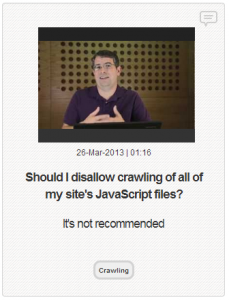
Short Cutts QuestionFor anyone not already aware of Cutts’ YouTube posts, they all follow the fame pattern. A Google user asks a question about a topic, and Cutts answers the question as well as he can within a short two or maybe three minutes. Some question the usefulness of the videos because Cutts often can’t go into depth in the short time limit, but I think anyone can understand how important it is to hear information and answers to common SEO questions straight from his mouth, even if it is a little vague.

Possibly the best part of The Short Cutts is their method of displaying videos above two sets of text which may help give you a quick answer. The first block of text consists of the question Cutts is asked, and the second block of text gives a quick “yes or no” type answer which can help give you the answer to many of the more simple issues.