CSS lets us do wonderful things as designers, but it can sometimes be a hassle. If you are super experienced, you may have learned to avoid the problems, but the majority of us are way to accustomed to beginning with a very simple CSS file, and watching it spiral out of control as you continue development.
As you create your site, your CSS gradually becomes a mess. It looks disorganized, borderline unreadable, and there are inevitably quite a few mistakes spread throughout. It doesn’t mean you’re a bad designer. In fact, this could happen to anyone.
Usually there are two ways to deal with this, you can either regularly stop your site development and clean up the CSS, or you can wait until the end and dive into fixing everything all at once. Either way, it takes forever.
Recently, a third (much faster) way has come up. Why not just use a tool to keep your CSS sorted and formatted? No tool is going to keep your CSS looking perfect, but they can at least keep it organized enough to be readable when it becomes time to edit, and you won’t have to do near as much editing as you did in the past.
Speckyboy Design Magazine collected a whole bunch of different options for keeping CSS code looking clean while you work. While none of them will recognize your unique way of writing the code, but you should be able to find something that fits you well enough to make your life much easier.
00TMOhttps://www.tulsamarketingonline.com/wp-content/uploads/2018/07/TMO-Logo.pngTMO2013-05-30 14:40:302013-05-30 14:40:30Tools For Keeping Your CSS Looking Clean While You Work
You run a small local business with brick and mortar locations. What reason do you have to invest in online marketing? Actually, there are quite a few reasons local businesses can benefit from online marketing.
You want your business to be reaching out to customers everywhere they are looking for you or services like yours, and more and more people are turning to the internet before they make a purchase. If they aren’t buying straight off the web, they are checking reviews and public perception of the products they are looking for.
A recent BIA/Kelsey report said that 97% of consumers use online media before making local purchases, and Google suggests that 9 out of 10 internet searches led to follow up actions such as calling or visiting businesses. That means the majority of consumers are turning to the internet, and if your business isn’t there, they will find others.
Online marketing isn’t as intimidating as many thing, either. Search Engine Land says that 50% of small businesses’ online listings are wrong, and the majority of small business owners claim they don’t have the time to keep online listings up to date. Keeping Google’s information on your business updated only takes a few minutes, and that is where most will find you. You can create a local business listing even if you don’t have a website or sell anything online.
The one step above this is to embrace social media. Many smaller businesses focus almost their entire web presence on Facebook, Google+, and Twitter, because these are where the brands can reach out directly to consumers.
If you do wish to fully capitalize on online marketing, but don’t think you have the time, hiring someone to manage your online brand and website eventually pays itself off in public awareness of your brand and cementing your brand identity as a trusted business in the community. However, you can’t just do a little. A shoddy or out of date website can hurt public perception of your company, so keeping your site up to date with all the current web standards is important to maintaining your brand’s integrity.
https://www.tulsamarketingonline.com/wp-content/uploads/2018/07/TMO-Logo.png00TMOhttps://www.tulsamarketingonline.com/wp-content/uploads/2018/07/TMO-Logo.pngTMO2013-05-30 12:26:372013-05-30 12:26:37Do Local Businesses Really Need Online Marketing?
One of the advantages of your business’s social media profile that almost no one is talking about is that it can reveal the flaws in your business. Whether it’s through negative feedback or a general lack of participation, the problems that arise on social media usually point to problems that need to be fixed at your physical location.
Carrie Kerpen, of Inc., calls social media “a mirror. A reflection of your company and how you’re doing today.” Basically, this means that if you see an abundance of negative comments, it’s because you’re doing something wrong. This is a pretty simple idea. After all, if you were getting an abundance of phone calls from customers complaining about your service, wouldn’t you assume something was wrong with your service? This is simply an example of how some business owners are not translating social media activity correctly, or perhaps simply undervaluing its importance.
After you’ve come up with solutions to your business’s shortcomings, be sure to let those naysayers on social media know about it. Negative comments that are left unanswered are far more damning than those that receive an apologetic, professional response detailing how your business is adapting and dealing with the problem. Sometimes, it can even be a simple reassurance that changes in your business won’t affect the quality product your customer is used to. Or, maybe you can apologize for a perceived shortcoming that can’t be changed while pointing out some advantages your customer has yet to notice.
When used correctly, social media is a way to make your business better and enhance the relationship you have with your customers.
https://www.tulsamarketingonline.com/wp-content/uploads/2018/07/TMO-Logo.png00TMOhttps://www.tulsamarketingonline.com/wp-content/uploads/2018/07/TMO-Logo.pngTMO2013-05-28 21:18:432013-05-28 21:18:43Flaws Revealed By Social Media And How To Fix Them
Web design has more in common with print design than we like to admit. While the web offers endless opportunities and unique design possibilities, print design has been evolving for over 500 years and much of how we approach content of all kinds comes from our longstanding use of print and paper.
Design is really all about connecting with the public and sharing information in an attractive form, whether it be in books, images, or videos. Noupe offered some print design rules that apply in every medium you want to use.
Less is More
Print has always been very aware of size constraints. If you go over the size limit, it means adding more space, which meant using more paper, which means higher costs. The web has the opposite problem. We are given endless space and some designers take that space and try to use as much of it as possible to bombard viewers with everything they have to offer.
When you throw too much at the audience all at once however, you face clutter problems as well as just overwhelming and putting off your audience. Consider a memo or press release, and how corporate designers aim to immediately grab the viewer’s attention with economic design. You can put out information with a strong central theme or message without attacking your audience all at once.
Make Scanning Easy
Very few people read every word on anything. We are skimmers, who jump to and from text littered all throughout or life, and we expect the things we read to make this easy for us. People don’t want to have to search extensively for what they’re looking for. They want the content to be broken up in a way where sections and different types of information are immediately obvious.
Following a typographical hierarchy is one of the best ways to keep your content organized for scanners to find what they are looking for. Headlines and sub-headings guide the eyes and announce the main topic of content sections, while bold and italics draw attention to important areas.
Functionality is More Important Than Style
Managing print functionality doesn’t seem like that much of a task, but part of that comes from our long history of streamlining text into its most legible forms from the birth of the print press. Consider every aspect of print design that keeps text legible; text color, layout, font choice, and even text alignment all have to be considered in order to keep the print “functional” or able to convey the information you’re trying to share.
In web design, functionality is much more of an overt issue, yet the rule remains the same. Some designers try to hard to create lavish sights rich with animation and high quality images, but they sacrifice usability, sped, and practicality in favor of style. Any site that doesn’t work for users isn’t a successful site because people won’t care about fancy design if they can’t use it.
https://www.tulsamarketingonline.com/wp-content/uploads/2018/07/TMO-Logo.png75142TMOhttps://www.tulsamarketingonline.com/wp-content/uploads/2018/07/TMO-Logo.pngTMO2013-05-28 13:18:172013-05-28 13:18:173 Things We’ve Learned From Print Design
While on the surface, creating content is about sharing important information of different kinds with the public, we’d all be lying if we said that we didn’t hope to get the most traffic possible coming to your site thanks to some great blog post or infographic. It isn’t easy. Getting over 100,000 views on a page as a startup is a lot of luck, but it also takes a lot of work to make quality content.
There are no magic tricks to make content that will get you exponentially more site visitors and creating one post that gets that many eyes on it doesn’t mean they will necessarily keep coming back, but it can tell us a lot about what people are looking for on the web and what counts as great quality.
Stephen Kenwright works at Branded3 who recently hit the coveted 100,000 pageview benchmark, and he wrote about what he has learned from the short term success over at SEOMoz. You can learn a lot from their isolated case, and the tips Kenwright offers.
https://www.tulsamarketingonline.com/wp-content/uploads/2018/07/TMO-Logo.png00TMOhttps://www.tulsamarketingonline.com/wp-content/uploads/2018/07/TMO-Logo.pngTMO2013-05-28 11:47:402013-05-28 11:47:40Learning From a Post With 100,000 Views: A Case Study
Well, the big event that the SEO community has been talking about for weeks has finally hit and everything is… mostly the same, unless you run sites known for spammy practices like porn or gambling. Two days ago, Google started rolling out Penguin 2.0. By Matt Cutts’ estimate, 2.3 percent of English-U.S. queries were affected.
While 2.3 percent of searches doesn’t sound like a lot, in all actuality that is thousands of websites being hit with penalties and sudden drops in the rankings, but if you’ve been keeping up with Google’s best practices, chances are you are safe.
None-the-less, in SEO it is always best to stay informed on these types of updates, and Penguin 2.0 does change the Google handles search a bit. To fill in everyone on all the details, Search Engine Journal’s John Rampton and Murray Newlands made a YouTube video covering everything you could want to know about Penguin 2.0.
Oh, and if you’ve been wanting to know why it’s called Penguin 2.0, Cutts says, “This is the fourth Penguin-related launch Google has done, but because this is an updated algorithm (not just a data refresh).”
https://www.tulsamarketingonline.com/wp-content/uploads/2018/07/TMO-Logo.png00TMOhttps://www.tulsamarketingonline.com/wp-content/uploads/2018/07/TMO-Logo.pngTMO2013-05-24 15:48:462013-05-24 15:48:46Penguin 2.0 Is Here
It’s easy to take text for granted as a designer. However for most users, text is the most common component across the web. Designers can lose focus or patience on text when we want to get to the more fun aspects of design, but you can’t communicate effectively in any way without good typography, and good type is built upon a few basic principles.
Web Designer Depot set down a list of rules that designers can follow for excellent typography, or at least prevent the most basic mistakes. While some of these considerations may seem unimportant or odd when you begin trying to work them into your page compositions, before long they will be second nature to you.
Establish a Typographic Hierarchy – Text is all about conveying information, and readers on the internet want to obtain that information quickly. They scan and look for the most interesting or important parts, which they can’t easily do without an organized typographic hierarchy. Even for readers who don’t skim, the hierarchy keeps information organized and accessible.
Keep Text Large Enough To Read – While 12pt. fonts may have been acceptable on the web a few years ago, no one wants to be squinting at a computer screen anymore. Make your text large enough for people to easily read. I’d suggest 16pt. fonts, but certainly no smaller than 14pt.
Choose Appropriate Fonts For Body Texts – Conveying information is also all about legibility. Choosing a flowery, superfluous, or otherwise hard to read font for body copy is off-putting to visitors and will keep them from sticking around the page for long. There is a time and a place for extravagant fonts, but that isn’t in the body paragraphs.
Don’t Use Too Many Fonts On One Page – The web ran on only a handful of fonts years ago, but now we have the abilities to work with a practically endless number of fonts in our designs. That doesn’t mean every one of those fonts should go into a single design. Using too many fonts in a single design can be clashy, distracting, and just plain ugly. The old rule is too stick to two or three fonts. I don’t suggest using more.
Give Your Text Some Room To Breathe – Just like on school essays, having extra space between each line of text makes everything much easier to read than trying to make sense of jumbled cluttered letters. The problem is evenly solved too, all by increasing line-heights. Be careful not to overdo it though, too much space can be bad.
Web Designer Depot has a few other rules on their page, but these basic rules will be enough to protect you from the biggest typographic sins. Remember, text is the best way to convey information to your visitors, so make the text easy to read above all else.
00TMOhttps://www.tulsamarketingonline.com/wp-content/uploads/2018/07/TMO-Logo.pngTMO2013-05-24 15:40:552013-05-24 15:40:55The Guide To Great Typography
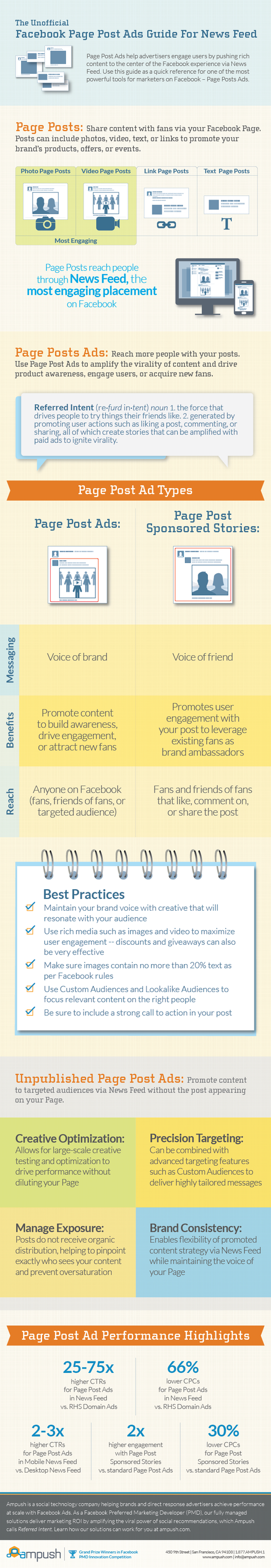
Simply because they are the relative new ad on the block, there seems to be some confusion about how to implement and get the best ROI for Facebook ads. When it comes to Page Post Ads, you’re essentially getting the opportunity to put your message into users’ news feeds, whether they’ve liked your page or not.
To get a better idea of what is possible and how to use Facebook ads, check out the included infographic from Ampush, which comes via Marketing Land.
Like most designers and web design bloggers, I try to keep up to date with the latest tools and resources available, and I try to pass them along when I get the chance. One of the best places to find the latest and greatest tools, extensions, apps, and kits is Web Designer Depot’s monthly compilation for designers and developers. Most of them are free, and almost all of them can be of use in your workflow.
This month’s wrap up has everything from web apps, jQuery plygins and JavaScript resources to wireframing kits and coding resources. As always, there are also some awesome fonts, most of which you can get on a budget.
One of my favorite resources, though one of the least directly usable on this list, is a free ebook calledThe Productivity Manifesto, which is filled with tips on upping your productivity. All you have to do to get the ebook is sign up for the free newsletter.
If you’re looking for more practical tools, you’ll like WireKit, a set of Photoshop shape layers for iPhone apps, or the interactive usability checklist Userium that comes with categories for user experience, homepage, accessibility, navigation, and every other facet of site usability.
Those couple tools are just scratching the surface of what is offered at Web Designer Depot this month, and I highly advise you check out everything else they are showcasing this month. You’re bound to find at least one tool you like.
00TMOhttps://www.tulsamarketingonline.com/wp-content/uploads/2018/07/TMO-Logo.pngTMO2013-05-23 13:31:382013-05-23 13:31:38Free Resources: The Best Tools For Designers This Month
Google is always fighting to maintain diversity on their search engine results pages (SERPs). It has proven difficult over time to walk the line between offering searchers the content they want in easily browsable form, and keep the big established sites from completely dominating the results.
Matt Cutts, head of Google’s Webspam team, recently used one of his YouTube videos to talk about how Google is managing this, and highlight an upcoming change that will hopefully keep you from getting pages full of essentially the same results. No one wants to see eight results from Yelp when they are looking for a restaurant review.
The change Google is making is aimed at making it harder for multiple results from the same domain name to rank for the same terms. Basically, once you’ve seen three or four results from a domain, even over the spread of a few results pages, it will become increasingly harder for any more pages from that domain to rank.
If you don’t quite get what this means, it is easier to understand in context. In the video, Matt walks us through the history of Google’s domain result diversity efforts. It also shows how Google tries to manage bringing you the best authoritative and reputable search results without allowing bigger brands to form monopolies on the results.
You can see the full breakdown of the domain diversity history at Search Engine Land or in Cutts’ video, but basically when Google started out there were no restrictions on the number of results per domain. It was quickly apparent that this system doesn’t work because you will get page upon page of results from the single highest ranked domain. Then came different forms of “host clustering” which prevented more than two results per domain to be shown in the search results, but this was easily worked around by spammers.
More recently, Google has used a sort of tiered system where the first SERPs for a term are as diverse as possible, allowing only a few results from the same domains, however as you progress into the later search result pages, more and more results were allowed from repeat domains. Now, Google is tightening the belt and making it harder for those repeat domains to even get onto the later SERPs.
 CSS lets us do wonderful things as designers, but it can sometimes be a hassle. If you are super experienced, you may have learned to avoid the problems, but the majority of us are way to accustomed to beginning with a very simple CSS file, and watching it spiral out of control as you continue development.