Facebook Post Time Infographic

So you’ve got your page’s social media profile built. You have an audience in place and a message you want to get out. The question is: when is the best time to unleash that message?

There are a number of factors to consider in order to maximize not only the number of eyes on your message, but also the number of users who will interact with the message. Assuming that the message itself is worthy of ‘RT’ and ‘Likes’, you have to think about who it is you are trying to reach and what they will likely be doing when you are trying to reach them.

For most industries, your consumers will likely be at home when they are cruising through social media with time to click and interact with anything they find interesting. This means that sending out your message on weekends or evenings could get you the best results. However, the exception here would be if your key demographic is suburban housewives. If you’re trying to reach individuals who spend their day at home, then you’ll probably want to reach them before their families return to make their lives hectic.

You will probably notice that posting more gets your more interaction and probably builds your audience too. There is a limit though. Having a steady, consistent stream can paint you as a reliable, familiar source, but it’s easy to cross over into an annoying nuisance who users dread seeing in their news feed.

Be sure to take a moment to peruse the included infographic, courtesy of JCK, and think about when the best time to reach your audience would be.

Today is April Fool’s Day, and of course that means every major company has unveiled a new fake product. Google, for example, announced Google Nose, which would let you smell your results, if it worked. That’s the type of prank you normally expect to see from big companies. They’re all in good fun.

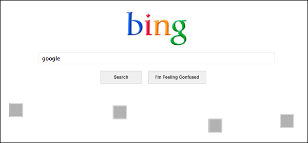
Well, Bing decided to make their April Fool’s Day prank a fake new product and a slam directed obviously at Google all in one. They announced, through a blog post, Bing Basic, a redesign of their front page, only accessible through a special “telltale query”, “you’ll get something a little more bland” than their front page.

If you guessed the “telltale query” was “Google” and that Bing Basic removes the big pictures from their front page in favor of a colorful logo, white space, and a simple search box, you’d be correct.

bing-april-fools-2013

Of course, this Google bashing is far from new for Bing, but it is kind of odd to see a company take a day normally full of nonsensical and sometimes wonderful fake ads, webpages, redesigns, and other fun little jokes and turn it into a swipe at the competition. It certainly isn’t the first time though.
In the meantime, I’ll be dreaming of the day Google Treasure Maps is a real thing.

Responsive_Web_Design

Source: Wikipedia Commons

The more we get used to using responsive web design, the more we learn its limitations. When it first came out, responsive design seemed like the hero web design has been craving since phones have allowed us to browse the internet practically.

They had some reason to think this way. Responsive designs solve all sorts of headaches that otherwise were only solved with creating multiple versions of the same web site. But, responsive design comes with its own set of issues.

Alvaris Falcon decided to dig into some of these imperfections of responsive design. Though he doesn’t discuss the normal “drawback” of responsive web design, if you could call it that, which is responsive web design doesn’t actually save you that much time, when you include testing and tweaking for the assortment of devices out there being used to access the page.

Instead, Falcon points out another way responsive design slows us down, or more specifically slows down the web page. Fast loading times are more important than ever, and studies show that users actually have higher standards for fast loading speeds on their mobile devices. However, responsive design isn’t great for quick loading.

Responsive designs have the benefit of offering all the content your regular website would, instead of a watered down mobile version, but all that extra information, combined with the restrictions of responsive sites, takes much longer to load than those light mobile sites. There are ways to speed the site up, however.

If content is slowing you down, you can start being selective about what you load on what device by using the conditional tag. You could also opt for engineered solutions to optimize loading times, such as Adaptive Images, which dynamically delivers scaled images to users based on screen size.

Some of the problems of responsive design stem from problems already rooted in using mobile devices. The change in screen size breaks advertising models, which can be extremely troublesome because inadvertent changes in ads can also break your contract.

To keep ads placed where they are supposed to be on a responsive site, you would have to change the resolution, which you are contractually unable to do. But, keeping them large makes the ads get shifted down the page causing problems with your layout, and possibly shoving other content or ads off the screen.

Some web designers are solving the problem with ad bundles they sell together, rather than selling single leaderboard style ads for desktop sites. Instead, they include many versions of ads exclusive to different device resolutions in a package deal.

Of course, there are more than just two problems with responsive design. Falcon has three others in his article, but I’m sure plenty of others out there have already found plenty of other limitations frustrating them. What other problems do you think responsive design has?

It can be hard to notice, but Google’s search engine results pages (SERPs) are constantly changing. Sometimes it is a result of new algorithms or updates to Penguin or Panda, but often it is a result of Google’s non-stop tweaking of their formula. If you weren’t consistently studying and analyzing SERPs, you probably haven’t even noticed.

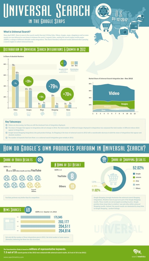
SearchMetrics does just that type of analyzing of SERPs, and they just released their study of last years result pages, and there are some interesting points for all search marketers wanting to know what Google is favoring in their results. The highlights of the study, as pointed out by Search Engine Journal, are:

  • A small decline in video integration
  • A significant increase in image integration
  • A sharp decline in shopping
  • A large increase in news integration

The decline in video integration is one of the most surprising, as I’ve heard more than one analyst predict video will be one of the most popular mediums for content marketing this year. If they’re predictions are true, video makers will have stiff competition getting their content onto the SERPs.

Similarly, eCommerce pages are on the rise, and the data suggests business owners should be considering paying into the Google Shopping network to have their products seen by more people.

On the other hand, the big increase in news shows big opportunities for content creators reporting on events and doing news worthy journalism.

SearchMetrics made an infographic to go along with the release of their study, which you can view below or here.

rsz_universal-search-in-the-google-serps